Intro to Layouts in Sencha Touch 2 from Sencha on Vimeo.
Intro and HBox
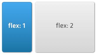
Layouts describe the sizing and positioning on Components in your app. For example, an email client might have a list of messages pinned to the left, taking up one third of the available width, and a message viewing panel in the rest of the screen.
We can achieve this using an hbox layout and its ability to ‘flex’ items within it. Flexing means that we divide the available area based on the flex of each child component, so to achieve our example above we can set up flexes like shown in the following image:
In the code for this layout we need to specify the ‘hbox’ layout on any Container, then supply a flex parameter for each of the child components (Panels in this case) as follows:
Ext.create('Ext.Container', {
    fullscreen: true,
    layout: 'hbox',
    items: [
        {
            xtype: 'panel',
            html: 'message list',
            flex: 1
        },
        {
            xtype: 'panel',
            html: 'message preview',
            flex: 2
        }
    ]
});
This creates a Container that fills the screen, and inside of it creates a message list panel and a preview panel. Their relative flex configs of 1 and 2 respectively means that the message list takes up one third of the available width, with the preview taking the remaining two thirds. If our Container was 300px wide, the first item (flex: 1) will be 100px wide and the second (flex: 2) will be 200px wide.
The hbox layout is one of the most useful layouts, as it can arrange components in a wide variety of horizontal combinations. See the Ext.layout.HBox for more examples.
VBox Layout
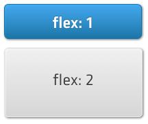
VBox is similar to HBox, just vertical instead of horizontal. Again, we can visualize this easily as a set of stacked boxes:
The code to create this is almost identical to the previous example, we only traded layout: ‘hbox’ for layout: ‘vbox’:
Ext.create('Ext.Container', {
    fullscreen: true,
    layout: 'vbox',
    items: [
        {
            xtype: 'panel',
            html: 'message list',
            flex: 1
        },
        {
            xtype: 'panel',
            html: 'message preview',
            flex: 2
        }
    ]
});
If our Container was 300px tall, the first panel (flex: 1) would be 100px tall, and the second (flex: 2) would be 200px tall. See the Ext.layout.VBox for more examples.
Card Layout
Sometimes you want to show several information screens information on a small device screen. TabPanels and Carousels both enable you to see one screen of many at a time, and underneath they both use a Card Layout.
Card Layout takes the size of the Container it is applied to and sizes the currently active item so as to completely fill the Container. It then hides the rest of the items, allowing you to change which one is currently visible, but only showing one at once:
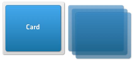
In the previous image, the gray box is the Container, and the blue box inside it is the currently active card. The three other cards are hidden from view, but can be swapped in later. While it is not very common to create Card layouts directly, you can do this as follows:
var panel = Ext.create('Ext.Panel', {
    layout: 'card',
    items: [
        {
            html: "First Item"
        },
        {
            html: "Second Item"
        },
        {
            html: "Third Item"
        },
        {
            html: "Fourth Item"
        }
    ]
});

panel.setActiveItem(1);
In this example we created a Panel with a Card Layout and later set the second item as active (the active item index is zero-based, so 1 corresponds to the second item). In most cases you should however use a Tab Panel or a Carousel.
Fit Layout
The Fit Layout is probably the simplest layout available. All it does is make a child component fit the full size of its parent Container.
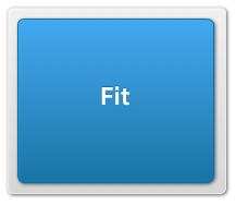
For example, if you have a parent Container that is 200px by 200px and give it a single child component and a ‘fit’ layout, the child component will also be 200px by 200px:
var panel = Ext.create('Ext.Panel', {
    width: 200,
    height: 200,
    layout: 'fit',

    items: {
        xtype: 'panel',
        html: 'Also 200px by 200px'
    }
});

Ext.Viewport.add(panel);
Please note that if you add more than one item into a container that has a fit layout, only the first item will be visible. If you want to switch between multiple items, use the Card layout instead.
Docking
Every layout is capable of docking items inside it. Docking enables you to place additional Components at the top, right, bottom, or left edges of the parent Container, resizing the other items as necessary.
For example, coming back to our first hbox layout from this guide, let us imagine we want to dock another component at the top, like shown in the following image:
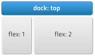
This feature is often used for items such as toolbars and banners, and it is easy to achieve using the docked: ‘top’ configuration:
Ext.create('Ext.Container', {
    fullscreen: true,
    layout: 'hbox',
    items: [
        {
            docked: 'top',
            xtype: 'panel',
            height: 20,
            html: 'This is docked to the top'
        },
        {
            xtype: 'panel',
            html: 'message list',
            flex: 1
        },
        {
            xtype: 'panel',
            html: 'message preview',
            flex: 2
        }
    ]
});
You can add any number of docked items by simply providing the dock configuration on the child components that you want docked. Items can also be docked on any side, for example if we wanted to do this with our previous vbox example:
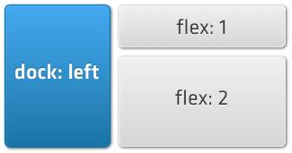
we could achieve this by specifying docked: ‘left’:
Ext.create('Ext.Container', {
    fullscreen: true,
    layout: 'vbox',
    items: [
        {
            docked: 'left',
            xtype: 'panel',
            width: 100,
            html: 'This is docked to the left'
        },
        {
            xtype: 'panel',
            html: 'message list',
            flex: 1
        },
        {
            xtype: 'panel',
            html: 'message preview',
            flex: 2
        }
    ]
});
You can add multiple docked items on each side (for example docking several items in the ‘bottom’ position).
Pack and Align (HBox)
The Pack and Align feature controls how child elements are aligned in a layout. ‘Pack’ refers to the axis of your current layout, while ‘Align’ is the opposite. For example, in an HBox layout, Pack refers to the horizontal axis, and Align to the vertical axis. The following example illustrates the difference:
Ext.application({
    name : 'Sencha',

    launch : function() {
        var container = Ext.create('Ext.Container', {
            fullscreen: true,

            layout: {
                type: 'hbox',
                align: 'start',
                pack: 'start'
            },

            items: [{
                docked: 'top',
                xtype: 'titlebar',
                title: 'HBox Layout'
            },

            {
                docked: 'top',
                xtype: 'toolbar',
                items: [{
                    xtype: 'container',
                    html: 'Pack: ',
                    style: 'color: #fff; padding: 0 10px; width: 85px;'
                }, {
                    xtype: 'segmentedbutton',
                    allowDepress: false,
                    items: [{
                        text: 'Start',
                        handler: function() {
                            layout.setPack('start');
                        },
                        pressed: true
                    }, {
                        text: 'Center',
                        handler: function() {
                            layout.setPack('center');
                        }
                    }, {
                        text: 'End',
                        handler: function() {
                            layout.setPack('end');
                        }
                    }]
                }]
            }, {
                docked: 'top',
                xtype: 'toolbar',
                items: [{
                    xtype: 'container',
                    html: 'Align: ',
                    style: 'color: #fff; padding: 0 10px; width: 85px;'
                }, {
                    xtype: 'segmentedbutton',
                    allowDepress: false,
                    items: [{
                        text: 'Start',
                        handler: function() {
                            layout.setAlign('start');
                        },
                        pressed: true
                    }, {
                        text: 'Center',
                        handler: function() {
                            layout.setAlign('center');
                        }
                    }, {
                        text: 'End',
                        handler: function() {
                            layout.setAlign('end');
                        }
                    }, {
                        text: 'Stretch',
                        handler: function() {
                            layout.setAlign('stretch');
                        }
                    }]
                }]
            },

            {
                xtype: 'button',
                text: 'Btn 1',
                margin: 2
            }, {
                xtype: 'button',
                text: 'Btn 2',
                margin: 2
            }, {
                xtype: 'button',
                text: 'Btn 3',
                margin: 2
            }]
        });

        var layout = container.getLayout();
    }
});
Pack and Align (VBox)
Ext.application({
    name : 'Sencha',

    launch : function() {
        var container = Ext.create('Ext.Container', {
            fullscreen: true,

            layout: {
                type: 'vbox',
                align: 'start',
                pack: 'start'
            },

            items: [{
                docked: 'top',
                xtype: 'titlebar',
                title: 'VBox Layout'
            },

            {
                docked: 'top',
                xtype: 'toolbar',
                items: [{
                    xtype: 'container',
                    html: 'Pack: ',
                    style: 'color: #fff; padding: 0 10px; width: 85px;'
                }, {
                    xtype: 'segmentedbutton',
                    allowDepress: false,
                    items: [{
                        text: 'Start',
                        handler: function() {
                            layout.setPack('start');
                        },
                        pressed: true
                    }, {
                        text: 'Center',
                        handler: function() {
                            layout.setPack('center');
                        }
                    }, {
                        text: 'End',
                        handler: function() {
                            layout.setPack('end');
                        }
                    }]
                }]
            }, {
                docked: 'top',
                xtype: 'toolbar',
                items: [{
                    xtype: 'container',
                    html: 'Align: ',
                    style: 'color: #fff; padding: 0 10px; width: 85px;'
                }, {
                    xtype: 'segmentedbutton',
                    allowDepress: false,
                    items: [{
                        text: 'Start',
                        handler: function() {
                            layout.setAlign('start');
                        },
                        pressed: true
                    }, {
                        text: 'Center',
                        handler: function() {
                            layout.setAlign('center');
                        }
                    }, {
                        text: 'End',
                        handler: function() {
                            layout.setAlign('end');
                        }
                    }, {
                        text: 'Stretch',
                        handler: function() {
                            layout.setAlign('stretch');
                        }
                    }]
                }]
            },

            {
                xtype: 'button',
                text: 'Btn 1',
                margin: 2
            }, {
                xtype: 'button',
                text: 'Btn 2',
                margin: 2
            }, {
                xtype: 'button',
                text: 'Btn 3',
                margin: 2
            }]
        });

        var layout = container.getLayout();
    }
});
Further Reading
Layouts are only a part of the Sencha Touch ecosystem. In order to better understand the framework and how it works, we recommend reading the following guides: