Sencha Touch theming lets you group together CSS styles as a theme so that you can tailor your app’s appearance to match the visual cues of a platform or operating system. In addition, theming provides access to icons as fonts, which lets you display and scale icons in your app quickly with reduced overhead on your app.
Sencha Touch contains the following themes:
- Cupertino theme, which provides styles for iOS7
- CupertinoClassic theme, which provides styles for pre-iOS7 phones.
- MountainView theme, which provides styles for Android
- BlackBerry theme, which provides styles for BlackBerry
These themes augment the existing standard Sencha Touch and Windows Phone themes.
For information on optimizing the use of themes in CSS, see 4 Tricks for Smaller CSS.
Defining a Platform for Your App
Sencha Touch lets you define platforms so that you can load resources in your application depending on the platform on which your app runs.
In the following example from an application’s app.json file, the application loads the sencha-touch.css file when the app runs on Chrome, Safari, iOS, Android, or Firefox:
"css": [
    {
        "path": "resources/css/sencha-touch.css",
        "platform": ["chrome", "safari", "ios", "ios-classic", "android", "firefox"]
    }
]
You can specify multiple platforms and use it to load JS resources. In this example, the vendorfiles.js resource loads when the platform is Chrome, Safari, or iOS:
"js": [
    {
        "path": "vendorfiles.js",
        "platform": ["chrome", "safari", "ios", "ios-classic"]
    }
]
Each loads only if the platform of the device running the app matches a platform you specify for the resource.
You can test this functionality by using the platform parameter in a URL:
http://localhost/sdk/touch/examples/kitchensink/index.html?platform=ie10You can also detect which platform the device is running on from within your application by using platformConfig.
The list of available platforms are:
- android
- blackberry
- chrome
- desktop
- firefox
- ie10
- ios
- ios-classic
- phone
- safari
- tablet
The following example shows an app.json CSS statement for the desktop, Windows, BlackBerry, Cupertino, CupertinoClassic, and MountainView themes:
"css": [
    {
        "path": "resources/css/sencha-touch.css",
        "platform": ["desktop"],
        "update": "delta"
    },
    {
        "path": "resources/css/wp.css",
        "platform": ["ie10"],
        "theme": "Windows",
        "update": "delta"
    },
    {
        "path": "resources/css/cupertino.css",
        "platform": ["ios"],
        "theme": "Cupertino",
        "update": "delta"
    },
    {
        "path": "resources/css/cupertino-classic.css",
        "platform": ["ios-classic"],
        "theme": "CupertinoClassic",
        "update": "delta"
    },
    {
        "path": "resources/css/mountainview.css",
        "platform": ["android"],
        "theme": "MountainView",
        "update": "delta"
    },
    {
        "path": "resources/css/bb10.css",
        "platform": ["blackberry"],
        "theme": "Blackberry",
        "update": "delta"
    }
],
Specifying Values for a Platform With platformConfig
The platformConfig configuration lets you define values for a platform.
The config system in Sencha Touch is incredibly powerful and lets you quickly develop applications with lots of functionality. For more information about the config system, read the Class System guide.
The following example defines a new class Example.view.Login as a simple login form:
Ext.define('Example.view.Login', {
    extend: 'Ext.panel.FieldSet',

    config: {
        title: 'Login'
    },

    platformConfig: [{
        platform: 'ie10',
        title: 'Microsoft Login'
    }]
});
In this example, the value for the FieldSet title is specfied as Login, however by using platformConfig, you can set the value of the title based on the platform - in this case, ie10.
This is a very simple example. A more complex example would display your view differently, or change the items in your view, based on the platform you are running.
Themes
Themes are a set of CSS styles you can set to change an application’s appearance for a device or platform. You can reference the styles as resources in your app.json file for your application.
Getting Started
Sencha Touch provides these themes:
- Base theme you can customize
- Sencha Touch theme
- Cupertino theme with iOS styles
- Mountain View theme with Android styles
- BlackBerry 10 theme
- IE10 theme for Windows Phone and Surface
To code a theme, use Compass and Sass, which are provided when you install Sencha Cmd.
In the following example, the Cupertino theme loads only when the platform is iOS. When the iOS platform loads, your app knows that the current theme is Cupertino:
"css": [
    {
        "path": "resources/css/sencha-touch.css",
        "platform": ["ios"],
        "Theme": "Cupertino"
    }
]
Within your application, you can access a theme name by using Ext.theme.name. If you do not define a theme, the theme name is Default. You can test themes by using the theme parameter in the URL when running your app:
http://localhost/sdk/touch/examples/kitchensink/index.html?theme=AppleImportant: The framework uses the Windows and Blackberry themes to change the functionality of the framework if that theme is in use. If you want to replicate that functionality, and you intend to use either the Windows or Blackberry themes, you should also use those names.
Upgrading Themes From Sencha Touch 2.1
There were many changes from Sencha Touch 2.1 to 2.2, but the upgrade path is rather simple.
The most important change to be aware of is the move away from using mixins for each component.
We found that using mixins for each component was quite slow when compiling your Sass, so we decided to simply move to using @import to just include each component.
Before your stylesheet would have looked like this:
@import 'sencha-touch/default/all';

@include sencha-panel;
@include sencha-buttons;
// and other components…
But in Touch 2.2 it looks like this:
@import 'sencha-touch/default';

@import 'sencha-touch/default/Panel';
@import 'sencha-touch/default/Button';
// and other components
Instead of using @include to include a component mixin, use @import to import the component.
If you want to include all default components in Sencha Touch 2.2, you can use the following code:
@import 'sencha-touch/default';
@import 'sencha-touch/default/all';
However you may want to import from a separate file that includes these imports as described in 4 Tricks for Smaller CSS.
The same goes for when you are using other themes.
Windows:
@import 'sencha-touch/windows';
@import 'sencha-touch/windows/all';
BlackBerry:
@import 'sencha-touch/bb10';
@import 'sencha-touch/bb10/all';
To include only the base theme:
@import 'sencha-touch/base';
@import 'sencha-touch/base/all';
The base theme does not have styling like the Default, Cupertino, Mountain View, Windows, and BlackBerry themes.
Base Theme
Sencha Touch 2.2 introduced the base theme, which is essentially the required styling to lay out components of Sencha Touch. There are no colors or custom styling like gradients and margins and padding. It is simply the starting point of actual themes.
Developing themes for Sencha Touch was made simple with the use of Sass, Compass and their features. This lets you dynamically change colors and measurements using variables, and create new UIs by using mixins. This rapidly speeds up development of custom themes based on the default Sencha Touch theme.
In previous Touch versions, if you wanted to create highly customized themes, you had to override a lot of the styling of the Default theme by using lots of hacks like !important.
Advantages of the new base theme:
No layouts for Sencha Touch components. These are already handled for you in the base. All you have to do is style a component for how you want it.
No overriding default styles, because there are none. The base theme only lays out components, which means it is actually usable. You need to build on the base theme to style it, but there is no longer any need to use hacks to remove the existing styling. Which in turn, reduces the file style of your CSS because you no longer have all that default styling.
Faster CSS compiles. Along with reduced size, themes provide faster compile times. Sencha Touch uses Compass to compile stylesheets from Sass to CSS. In older Sencha Touch versions, Compass could take multiple seconds to compile because it had to compile the default theme along with all your custom styling.
Now that the base is separate, you only have to compile your custom styling - which means compiling themes has dropped to fractions of seconds. This makes writing stylesheets much quicker.
Theme Examples
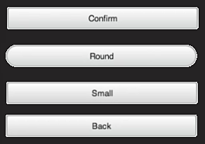
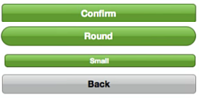
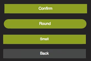
The following illustrates differences in buttons for the BlackBerry, Cupertino, and MountainView themes. For a complete list of each theme, see the KitchenSink example.
| BlackBerry Theme | Cupertino Theme | Mountain View Theme |
|---|---|---|
 |
 |
 |
Using an Existing Theme
Using one of the default themes in your Sencha Touch application is simple. Just include the appropriate theme stylesheet into your app.json file:
"css": [
    {
        "path": "resources/css/wp.css",
        "update": "delta"
    }
]
This example includes only the Windows theme in the wp.css file. Ensure that the path points to the correct stylesheet within the SDK folder.
If you want to load different themes depending on the platform, include them in your app.json file:
"css": [
    {
        "path": "resources/css/sencha-touch.css",
        "platform": ["chrome", "safari", "ios", "android", "firefox"],
        "theme": "Default",
        "update": "delta"
    },
    {
        "path": "resources/css/wp.css",
        "platform": ["ie10"],
        "theme": "Windows",
        "update": "delta"
    },
    {
        "path": "resources/css/bb10.css",
        "platform": ["blackberry"],
        "theme": "Blackberry",
        "update": "delta"
    }
]
In this example, the Windows theme loads on the “ie10” platform and the BlackBerry theme loads on “blackberry”.
All other devices uses the Default Sencha Touch theme.
Extending an Existing Theme
Extending one of the default themes in Sencha Touch is also simple.
To set up a custom theme:
Open your
resources/sass/app.scssstylesheet which is automatically generated when creating an application using Sencha Cmd.Include the Sencha Touch theme you want. This example uses the default theme:
@import 'sencha-touch/default';
@import 'sencha-touch/default/all';
Or the Windows theme:
@import 'sencha-touch/windows';
@import 'sencha-touch/windows/all';
Add your custom Sass styles.
Compile and launch your application:
compass compile resources/sass
Creating a New Theme
Creating a new theme is very similiar to extending a default theme, except that you only want to include the base theme.
To create a new theme:
Open your
resources/sass/app.scssstylesheet which is automatically generated when creating an application using Sencha Cmd.Include the Sencha Touch base theme:
@import 'sencha-touch/base';
@import 'sencha-touch/base/all';
Now you can write the custom Sass required to theme your app.
Custom Theme Tips
Sencha Touch components always have a baseCls that matches the name of the component. Some example of this are:
Ext.List->.x-listExt.field.Text->.x-field-textExt.field.Numer->.x-field-numberExt.panel.Form->.x-form-panel
If you are not familiar with the DOM structure of Sencha Touch applications, use the Web Inspector of your browser to inspect the DOM to determine what elements you need to style.
You can also use the Web Inspector to detect what the base theme uses as selectors:
Navigate to a list example with just the base theme
Select a list item and open it in the Web Inspector
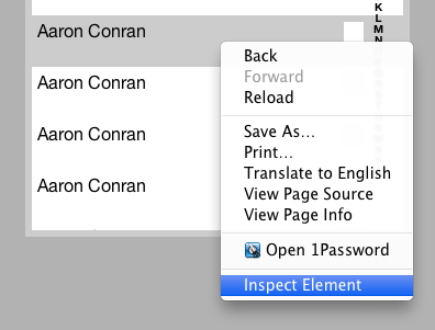
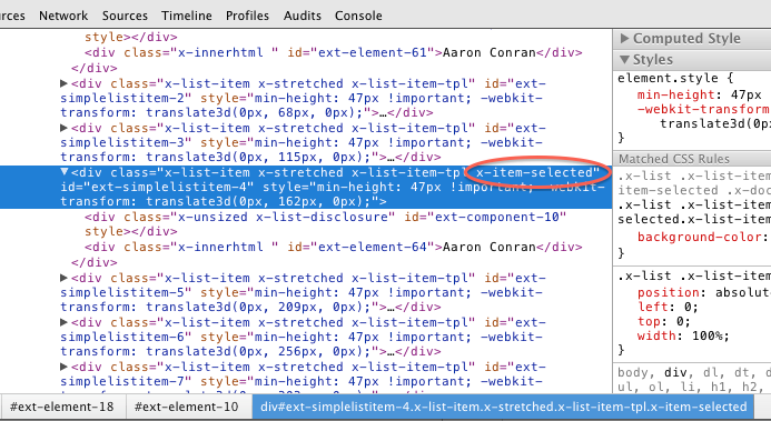
Navigate the DOM until you see the selected class ‘x-item-selected’ (it may even be the select DOM element)
Use the styles panel to see and copy the selector used in the base theme.
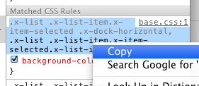
Paste the selector into your
app.scssfile and style as needed:.x-list .x-list-item.x-item-selected .x-dock-horizontal, .x-list .x-list-item.x-item-selected.x-list-item-tpl { color: red; }
List Component
The List component in Sencha Touch has been optimized to ensure performance is best in every scenario.
Lists now have these modes:
- Normal items
- Infinite
- Simple items
- Items with different heights
Unfortunately this means that the DOM structure of list items can change depending on the mode the list is running. Therefore if you have custom styling on lists or list items, change the selectors to match the new selectors.
Icon Fonts
One element of themes in Sencha Touch 2.2 is the new use of icons as fonts. Previously, scaling icons required a great deal of overhead where the application had to draw the picture for the icon and then redraw, rescale, and change it as the app appeared on different browsers and devices.
New in Touch 2.2, icons are now handled as fonts, which enables very fast scaling without the need to redraw the picture. Icons appear on buttons and tabs.
To convert your existing icons to fonts, you can use Pictos Server, Pictonic, icomoon.io, or http://fontstruct.com/ — some of these are free or available with trial subscriptions.
Using the Pictos Font
The Pictos font provides a large collection of free icons. You can find a full list of characters available for the Pictos font at http://www.pictos.cc. Sencha Touch provides free access to the Pictos Font Pack.
When you build your application using Sencha Cmd, the font libraries are copied to your application file.
Just like Sencha Touch 1 and 2, Sencha Touch 2.2 and later maps icon names to actual icons so you can use them within your application:
{
    xtype: 'button',
    iconCls: 'home',
    title: 'Home'
}
For a full list of iconCls functions that are available, refer to the Ext.Button class documentation.
Alternatively, you can use the Compass icon mixin to map a specific character of the icon font to an iconCls which you can use in your app:
@include icon('home', 'H');Using Other Icon Fonts
The Pictos font is not the only font you can use in your application. If you know of another font or you have custom converted your icons to fonts, it is very easy to use that font with the icon mixin.
Just like with the Pictos font, you need to specify the iconCls and character to be used for the icon. Additionally, you need to specify the name of the icon font, which needs to match the font family of the icon font you have, plus you need to make sure the font has been included in your CSS using the icon-font mixin.
This example specifies the Home icon in the custom MyFont:
@include icon('home', 'H', 'MyFont');The following example shows how to include the Pictos font using the icon-font mixin:
@include icon-font('Pictos', inline-font-files('pictos/pictos-web.woff', woff, 'pictos/pictos-web.ttf', truetype,'pictos/pictos-web.svg', svg));The first parameter is the name of the font face, which must match the name you use as the CSS font-family. The second parameter uses the inline-font-files Compass function to base64-encode the font file inline into the CSS file with paths to the WOFF, TTF, and SVG versions of the font files.
A good list of other icon fonts (some paid and some free) is available at http://css-tricks.com/flat-icons-icon-fonts/
Sencha Touch 1 and 2 used -webkit-maask to display and style fonts. Unfortuantely, although webkit-mask functionality works on most WebKit browsers, it does not work on non-WebKit browsers like Internet Explorer. Sencha Touch fully supports IE10, so webkit-mask is no longer an option as of Sencha Touch 2.2+.
Creating a Custom Font
There are many tools available online to create your own icon font. A good example of this is icomoon.
Advantages of creating your own icon font:
- You can pick the icons you want to use in your application.
- Because you are choosing your own icons, you can reduce the file size of the font, which in turn reduces the size of your stylesheet.
Adding Your Own Icons to Your Application
As of Sencha Touch 2.2.x webmasks for icons are no longer supported. Instead Touch now uses the much more flexible and faster webfonts. Configuring your application with new icons using Webfonts is simple.
Create your own webfont file in WOFF, truetype, or SVG format. Sites like fontello let you select,create, and download your custom webfont file.Put your webfont in the default location of the
resources/sass/stylesheets/fonts/directory.Include the webfont file into this Sass file using the
@include icon-font mixinstatement. Once downloaded, incorporate the font file into your Compass files using the@font-face mixin:@include font-face('_fontName_', inline-font-files(['_filename_', _filetype_]*));Where:
- fontName is the name of your webfont.
- filename and filetype are the path and type of the webfont file. Valid filetypes are the
woff,ttf, orsvgvalues.
Define your icon class names found in your font file using the
@include icon mixinstatement. Once added to this Compass file,define a name for each icon within the file using a unique name to access the icon.Using the icon mixin you define the icon:@include icon('_iconName_', '_index_', '_fontName_');Where:
- iconName is the unique name for the icon you are referencing.
- index is the index (letter or hexcode) into the webfont file the icon is to be found.
- fontName is the name you gave your webfont file in step 2.
Compile your Compass files from the directory that this file found using the
compass compilecommand
Example:
If you use an online service to create and download yourown webfont file, this example shows the commands to insertin the app.scss file in your project to addand utilize fonts found in a font file named resources/sass/stylesheets/fonts/myfonts/myFonts.woff under your app directory:
@include font-face('myFonts', inline-font-files('myfonts/myFonts.woff', woff));
@include icon('house', '\002', 'myFonts');