Layouts
Many classes have shortcut names used when creating (instantiating) a class with a
configuration object. The shortcut name is referred to as an alias (or xtype if the
class extends Ext.Component). The alias/xtype is listed next to the class name of
applicable classes for quick reference.
Framework classes or their members may be specified as private or protected. Else,
the class / member is public. Public, protected, and private are access
descriptors used to convey how and when the class or class member should be used.
Public classes and class members are available for use by any other class or application code and may be relied upon as a stable and persistent within major product versions. Public classes and members may safely be extended via a subclass.
Protected class members are stable public members intended to be used by the
owning class or its subclasses. Protected members may safely be extended via a subclass.
Private classes and class members are used internally by the framework and are not intended to be used by application developers. Private classes and members may change or be omitted from the framework at any time without notice and should not be relied upon in application logic.
static label next to the
method name. *See Static below.Below is an example class member that we can disect to show the syntax of a class member (the lookupComponent method as viewed from the Ext.button.Button class in this case).
Let's look at each part of the member row:
lookupComponent in this example)( item ) in this example)Ext.Component in this case). This may be omitted for methods that do not
return anything other than undefined or may display as multiple possible values
separated by a forward slash / signifying that what is returned may depend on the
results of the method call (i.e. a method may return a Component if a get method calls is
successful or false if unsuccessful which would be displayed as
Ext.Component/Boolean).PROTECTED in
this example - see the Flags section below)Ext.container.Container in this example). The source
class will be displayed as a blue link if the member originates from the current class
and gray if it is inherited from an ancestor or mixed-in class.view source in the example)item : Object in the example).undefined a "Returns" section
will note the type of class or object returned and a description (Ext.Component in the
example)Available since 3.4.0 - not pictured in
the example) just after the member descriptionDefaults to: false)The API documentation uses a number of flags to further commnicate the class member's function and intent. The label may be represented by a text label, an abbreviation, or an icon.
classInstance.method1().method2().etc();false is returned from
an event handler- Indicates a framework class
- A singleton framework class. *See the singleton flag for more information
- A component-type framework class (any class within the Ext JS framework that extends Ext.Component)
- Indicates that the class, member, or guide is new in the currently viewed version
- Indicates a class member of type config
- Indicates a class member of type property
- Indicates a class member of type
method
- Indicates a class member of type event
- Indicates a class member of type
theme variable
- Indicates a class member of type
theme mixin
- Indicates that the class, member, or guide is new in the currently viewed version
Just below the class name on an API doc page is a row of buttons corresponding to the types of members owned by the current class. Each button shows a count of members by type (this count is updated as filters are applied). Clicking the button will navigate you to that member section. Hovering over the member-type button will reveal a popup menu of all members of that type for quick navigation.
Getting and setter methods that correlate to a class config option will show up in the methods section as well as in the configs section of both the API doc and the member-type menus just beneath the config they work with. The getter and setter method documentation will be found in the config row for easy reference.
Your page history is kept in localstorage and displayed (using the available real estate) just below the top title bar. By default, the only search results shown are the pages matching the product / version you're currently viewing. You can expand what is displayed by clicking on the button on the right-hand side of the history bar and choosing the "All" radio option. This will show all recent pages in the history bar for all products / versions.
Within the history config menu you will also see a listing of your recent page visits. The results are filtered by the "Current Product / Version" and "All" radio options. Clicking on the button will clear the history bar as well as the history kept in local storage.
If "All" is selected in the history config menu the checkbox option for "Show product details in the history bar" will be enabled. When checked, the product/version for each historic page will show alongside the page name in the history bar. Hovering the cursor over the page names in the history bar will also show the product/version as a tooltip.
Both API docs and guides can be searched for using the search field at the top of the page.
On API doc pages there is also a filter input field that filters the member rows using the filter string. In addition to filtering by string you can filter the class members by access level, inheritance, and read only. This is done using the checkboxes at the top of the page.
The checkbox at the bottom of the API class navigation tree filters the class list to include or exclude private classes.
Clicking on an empty search field will show your last 10 searches for quick navigation.
Each API doc page (with the exception of Javascript primitives pages) has a menu view of metadata relating to that class. This metadata view will have one or more of the following:
Ext.button.Button class has an alternate class name of Ext.Button). Alternate class
names are commonly maintained for backward compatibility.Runnable examples (Fiddles) are expanded on a page by default. You can collapse and expand example code blocks individually using the arrow on the top-left of the code block. You can also toggle the collapse state of all examples using the toggle button on the top-right of the page. The toggle-all state will be remembered between page loads.
Class members are collapsed on a page by default. You can expand and collapse members using the arrow icon on the left of the member row or globally using the expand / collapse all toggle button top-right.
Viewing the docs on narrower screens or browsers will result in a view optimized for a smaller form factor. The primary differences between the desktop and "mobile" view are:
The class source can be viewed by clicking on the class name at the top of an API doc page. The source for class members can be viewed by clicking on the "view source" link on the right-hand side of the member row.
Understanding and Using GXT Layouts.
Browsers and web standards like HTML and CSS are designed to make building web pages easy. Web pages are documents with links between them, are intended to be viewed top to bottom, and have full-page scrollbars along the side. This document oriented approach is great for content consumed more or less in order. This differs from applications, which are viewed in all kinds of non-linear fashions.
To start really thinking about why layouts are necessary, let's take a look at what kinds of features HTML and CSS give us. Some use libraries like GXT to try to avoid these details, but having a basic understanding can come in handy.
HTML elements can be automatically laid out in just a few ways by default. Almost all
elements can be considered to either be block or inline elements. Block elements are laid out like
paragraphs in a textual document, one below the other. The <p>, <div>, and <table> elements are three
examples of block elements. Inline elements are like words in a paragraph - they are laid out one after the
other on the same line until there isn't enough space to show the next word, then they wrap to the next line.
The <a>, <img>, and <span> elements are three examples of inline elements.
Block elements may have padding, borders, and margins while inline elements don't necessarily respond to their desired effects. They may also be positioned, either relatively to where they belong normally, or absolutely based on the parent container. Block elements do not need to always start on a new line - the float property allows them to be positioned one after the other until there is no room, much like inline elements. Applying the float property to block elements is one way to allow the use of positioning and padding/border/margin properties on several elements that all need to appear in the same row.
We can see from these basic features that HTML elements are really designed to build documents that flow horizontally depending on the localization (either inline or using float), from the top to the bottom (full lines, or block elements wrapping to the next line). These features, used on pages with lots of content, inevitably result in long pages needing full-browser scrollbars to view all the content presented to the user.
Compare this to other applications you use - no native application should ever have full-app scrollbars. Even a web browser has user interface elements like the title bar or tab strip or bookmarks bar that remain fixed and don't "scroll off the screen". Even word processors have menus that stay visible. We need a way to build content that can occupy space in a meaningful way to present an application and not a single large scrollable block of content.
Going forward, we'll refer to these concepts in two different ways - applications fit the space available, whereas documents stack content and use scrollbars if the content doesn't fit. We can describe the structure of these layouts by looking at how nested elements affect each other's sizing. Document layouts are bottom-up, where the child elements size their parents. Conversely, application layouts are top-down - starting with the root window, space is allocated for each child according to the developer's instructions. Standard HTML and CSS are great for building document layouts, but to build applications we need either some specialized hand-written CSS or some code that measures, sizes, and positions our content to fit in the available space.
In GXT, Widgets that contain other Widgets are called Containers. The first main kind of Containers are SimpleContainters. SimpleContainers accept one child and can resize that child. Containers that can hold many children are called InsertResizeContainers. Additional Widgets can be inserted into an InsertResizeContainer, and these children will be sized based on the size of the container.
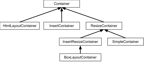
The basic contract for a ResizeContainer is that it can size its children. However, it can only do this resizing if the ResizeContainer itself is given a size. Otherwise, it is just guessing as to the space available. ResizeContainer has no specifics about sizing - it has just enough wiring to make sure that all subclasses are able to get the info they need and size their children correctly.
These are typically built to hold one child and to size that child to the space available. They may use some of the space themselves for other other features they provide. SimpleContainer can be configured not to size its child by setting resize to false. Some examples of SimpleContainers are ContentPanel, FieldSet, FieldLabel, Viewport, and BorderLayoutContainer.
These are the containers that people most often think of when they talk about layouts, positioning, and sizing. These can all hold multiple items and have the capability of sizing and positioning them. Each InsertResizeContainer will resize its children based on their own particular rules. As we discussed in ResizeContainer, these cannot generally do they job correctly if they are not given a size, as they wouldn't know how much space they have available to them to allocate to each of their children.
These are specialized containers, good at holding already sized elements, and spacing and stacking them. These are primarily used for menu/tool/button bars, and won't be discussed further in this article.
These are containers that only allow children to be appended to them, but do not size or position them at all. The only sizing and positioning available to them is what HTML and CSS would normally do.
And finally there is HtmlLayoutContainer, which isn't actually any of these. This is a special container which allows you to start with an HTML template and to add children to it based on CSS selectors. The HTML used for the template is entirely responsible for positioning all of the children.
Each container has its own specific uses, and these uses should be described in that container's documentation. When looking at any container and its layout features, keep in mind how it sizes and positions its children and what layout data it uses to be more specific.
Many components or containers need sizes to do their jobs correctly - Grid, Tree, HorizontalLayoutContainer, and BorderLayoutContainer are a few such examples. It isn't necessary to always invoke component.setPixelSize or component.setSize on these directly, but if they are not explicitly given a size in this way, they must be sized by their parent to function correctly. Some of these components, like Grid, may mostly function correctly if not given an explicit size, but this is not a supported use case.
Not all containers size their children - if a parent is not going to size a child that requires a size, it must be sized explicitly to render correctly.
Some containers need additional information to properly position and size their children. They typically get that direction from a LayoutData instance, passed in along with the child through the add or insert method. If an object is not being rendered or sized correctly, ensure that both it and its parents have been given meaningful and correct layout data when they were added to their parents.
In many cases, these layout data types provide not only features that can be enabled or disabled, but they also provide the ability to specify the size of the child being added. VerticalLayoutData and HorizontalLayoutData, for example accept three ranges of values: -1 indicates that the child will not be given a size, but that it will automatically (i.e. bottom-up) consume the size it needs. Greater than 1 indicates a specific pixel size to use, and 0.0-1.0 indicates that a percentage value of the remaining space should be allocated for this child.
There are times when building an application where it is a good thing to make a document. Consider a web browser or a word processor again - these are applications, but they contain documents, and let you interact with them. In the same way, a web application might use scroll bars and bottom-up sizing when it needs to draw a document of some kind, but that document is almost always sized to fit the space available in the app, so instead of just growing, it should have its own scrollbar after it reaches a certain size.
Forms, Grids, and Trees are three great examples of document-like behavior, with slight differences - while forms and Trees both work well either with or without a size assigned, the scrollbar in the Grid doesn't make sense to be allowed to continually grow. The Grid needs to know how much space it has to build a header, optionally a footer, space for the scroll bar itself, and then the rest of the scrolling content.
Even in these cases, it generally makes sense to size the container to fit into the application, though the children won't be sized. Those children then will consume the space they need, and will either leave blank space, or will require a scroll bar.
Counting only concrete, non-anonymous Container subclasses within GXT itself, there are several dozen, so a single article can't go into any depth on all of them. Instead, consider this as a list of commonly used containers and the basic features they offer.
Automatically sizes itself to the available browser space. Since it is a SimpleContainer, it will size its child to its own available space. Add this directly to the RootPanel, then add the rest of your app to it to keep it all sized to the browser correctly.
Supports a main region with four outside border regions. Allows for user interaction to resize those outside sections. Useful for building the shell of an app, with different side and top/bottom panels. Side regions must be given a size (either width or height, depending on region), and the center region will occupy remaining space. Use BorderLayoutData to make use of other features.
Simple panel that supports a single child. Has a header (capable of containing text and simple tool widgets), borders around the main region, and a button bar at the bottom. As this is a SimpleContainer, the child added will be sized to fit remaining space not used by the header, borders, and toolbar.
Basic InsertContainer that will allow all children to be drawn as normal HTML/CSS rules would dictate. Good for forms and other document-like content.
These containers size their children based on the size they are given. The container must be given a size, and will use that size in conjunction with the given HorizontalLayoutData or VerticalLayoutData to allocate space for each child. Sizes of -1.0 mean to not size the child (use it's natural size), sizes greater than 1.0 are interpreted as pixel values to size a child, and sizes between 0.0 and 1.0 are interpreted as percentages of remaining space. These containers must be sized. When these containers are provided layout data with sizes other than -1, they will also size their children.
This container operates somewhere between VerticalLayoutContainer and FlowLayoutContainer. It makes use of the float:left css ability to position children, but relies on being given a width to decide on widths for its children. CssFloatLayoutContainer does not assign height values, but instead grows (bottom-up structure) to use the space required. Widths will be assigned based on available space, so four items with 0.25 width will share the width, whereas four items with 1.0 width will each take a new line, using all available width. This behavior is good for forms and other document-like content which should scale to the available width.
Each container has its specific uses but it is important to note that when nesting panels builds a layout chain in GXT. If a non GXT widget or elements are added into the chain, like using a <div/> element will possibly break the GXT layout behavior. In other words the children containers should be GXT container descendants or the children behavior like sizing may not render as designed.


 GXT | Terms of Use
