Application Styling
Many classes have shortcut names used when creating (instantiating) a class with a
configuration object. The shortcut name is referred to as an alias (or xtype if the
class extends Ext.Component). The alias/xtype is listed next to the class name of
applicable classes for quick reference.
Framework classes or their members may be specified as private or protected. Else,
the class / member is public. Public, protected, and private are access
descriptors used to convey how and when the class or class member should be used.
Public classes and class members are available for use by any other class or application code and may be relied upon as a stable and persistent within major product versions. Public classes and members may safely be extended via a subclass.
Protected class members are stable public members intended to be used by the
owning class or its subclasses. Protected members may safely be extended via a subclass.
Private classes and class members are used internally by the framework and are not intended to be used by application developers. Private classes and members may change or be omitted from the framework at any time without notice and should not be relied upon in application logic.
static label next to the
method name. *See Static below.Below is an example class member that we can disect to show the syntax of a class member (the lookupComponent method as viewed from the Ext.button.Button class in this case).
Let's look at each part of the member row:
lookupComponent in this example)( item ) in this example)Ext.Component in this case). This may be omitted for methods that do not
return anything other than undefined or may display as multiple possible values
separated by a forward slash / signifying that what is returned may depend on the
results of the method call (i.e. a method may return a Component if a get method calls is
successful or false if unsuccessful which would be displayed as
Ext.Component/Boolean).PROTECTED in
this example - see the Flags section below)Ext.container.Container in this example). The source
class will be displayed as a blue link if the member originates from the current class
and gray if it is inherited from an ancestor or mixed-in class.view source in the example)item : Object in the example).undefined a "Returns" section
will note the type of class or object returned and a description (Ext.Component in the
example)Available since 3.4.0 - not pictured in
the example) just after the member descriptionDefaults to: false)The API documentation uses a number of flags to further commnicate the class member's function and intent. The label may be represented by a text label, an abbreviation, or an icon.
classInstance.method1().method2().etc();false is returned from
an event handler- Indicates a framework class
- A singleton framework class. *See the singleton flag for more information
- A component-type framework class (any class within the Ext JS framework that extends Ext.Component)
- Indicates that the class, member, or guide is new in the currently viewed version
- Indicates a class member of type config
- Indicates a class member of type property
- Indicates a class member of type
method
- Indicates a class member of type event
- Indicates a class member of type
theme variable
- Indicates a class member of type
theme mixin
- Indicates that the class, member, or guide is new in the currently viewed version
Just below the class name on an API doc page is a row of buttons corresponding to the types of members owned by the current class. Each button shows a count of members by type (this count is updated as filters are applied). Clicking the button will navigate you to that member section. Hovering over the member-type button will reveal a popup menu of all members of that type for quick navigation.
Getting and setter methods that correlate to a class config option will show up in the methods section as well as in the configs section of both the API doc and the member-type menus just beneath the config they work with. The getter and setter method documentation will be found in the config row for easy reference.
Your page history is kept in localstorage and displayed (using the available real estate) just below the top title bar. By default, the only search results shown are the pages matching the product / version you're currently viewing. You can expand what is displayed by clicking on the button on the right-hand side of the history bar and choosing the "All" radio option. This will show all recent pages in the history bar for all products / versions.
Within the history config menu you will also see a listing of your recent page visits. The results are filtered by the "Current Product / Version" and "All" radio options. Clicking on the button will clear the history bar as well as the history kept in local storage.
If "All" is selected in the history config menu the checkbox option for "Show product details in the history bar" will be enabled. When checked, the product/version for each historic page will show alongside the page name in the history bar. Hovering the cursor over the page names in the history bar will also show the product/version as a tooltip.
Both API docs and guides can be searched for using the search field at the top of the page.
On API doc pages there is also a filter input field that filters the member rows using the filter string. In addition to filtering by string you can filter the class members by access level, inheritance, and read only. This is done using the checkboxes at the top of the page.
The checkbox at the bottom of the API class navigation tree filters the class list to include or exclude private classes.
Clicking on an empty search field will show your last 10 searches for quick navigation.
Each API doc page (with the exception of Javascript primitives pages) has a menu view of metadata relating to that class. This metadata view will have one or more of the following:
Ext.button.Button class has an alternate class name of Ext.Button). Alternate class
names are commonly maintained for backward compatibility.Runnable examples (Fiddles) are expanded on a page by default. You can collapse and expand example code blocks individually using the arrow on the top-left of the code block. You can also toggle the collapse state of all examples using the toggle button on the top-right of the page. The toggle-all state will be remembered between page loads.
Class members are collapsed on a page by default. You can expand and collapse members using the arrow icon on the left of the member row or globally using the expand / collapse all toggle button top-right.
Viewing the docs on narrower screens or browsers will result in a view optimized for a smaller form factor. The primary differences between the desktop and "mobile" view are:
The class source can be viewed by clicking on the class name at the top of an API doc page. The source for class members can be viewed by clicking on the "view source" link on the right-hand side of the member row.
Application Styling refers to user adjustment of the look and feel of components. These adjustments may include: color, color gradients, font, margins/padding, etc. There are a number of ways this can be accomplished via Architect.
You can:
This guide focuses primarily on the first two bullet points. Before we start, let's define the difference between Styling and Theming.
Styling is a global term that includes theming, but also direct changes to the CSS. These changes are implemented as independent resources in your project.
Theming deals with modifications to Ext JS theme SCSS. Modifying theme SCSS can be performed by modifying variables, creating component UIs, or adding additional overrides. The themes are then compiled into packages that can be applied to your project.
Each of the Sencha frameworks comes with a number of themes that you can use in your application. Architect enables you to apply a theme to your application in any of the following ways:
Develop your theme outside Architect, compile it with Sencha Cmd, and then include the resulting CSS file that defines your theme as a CSS Resource in your Architect project.
Select one of the framework themes in the toolbox, add it to your project, and apply it. Your project can include any number of themes, though only one can be applied at a time.
Customize a toolbox theme by selecting the theme resource in your project. You will then be able to view all variables that define the look of the theme, organized by component. Furthermore, it is possible to create new UIs for the components that support them. You can then extend those UIs by adding custom SCSS resources. The changes are immediately compiled and can be previewed in the Architect canvas.
Save your theme to the toolbox or export it to an external file allowing it to be used by other projects and users.
A CSS Resource is simply a CSS file with custom styles for your view components. To add a CSS resource, locate it in the toolbox and add it to the Resources in your project. After adding a CSS Resource, set its URL config to the location of your CSS file.
It is generally ideal to give the URL config a path relative to the main app.html file. Using
a relative path allows you to edit the contents of the file within Architect's code
editor. Simply select the CSS Resource in the inspector and switch to code view. You can
then edit the CSS code to update the target .css file and re-apply it to the canvas. If no
file exists at the specified local path, Architect creates it when you save or
build the project.
Architect attempts to load after you configure your CSS Resource. If successful, Architect applies your custom CSS to the canvas so you can see your custom styles while designing your app. If your CSS file gets modified by in a manner aside from Architect, you can reload and re-apply it to the canvas by clicking the "Refresh CSS" button above the canvas.
By loading and applying your CSS within the canvas, it is possible that your custom styles can override base framework styles. This could break the display of the components on the canvas. In most cases, CSS styles take precedence since they are applied after theme and framework styles. We recommend using CSS classes that do not occur within the framework. This removes the possibility of conflicts with the base CSS.
Both Sencha frameworks come with a selection of themes that can be applied to applications built with Ext JS 4.2+ and Sencha Touch 2.2+.
The following themes are available for Sencha Touch projects:
Default - The default theme used for Sencha Touch projects. This theme was specifically designed for easy modification and is best as a base for custom themes.
Blackberry - Theme for BlackBerry 10+ devices. This theme provides support for the BlackBerry Action Bar, Action Menus, Context Menus, and Application Menus.
Windows Phone - Theme for Internet Explorer 10 and later devices, such as Windows Phone and Microsoft Surface.
Cupertino - iOS7+ based device theme.
Cupertino Classic - iOS6 based device theme.
MountainView - Android based device theme.
Tizen - Tizen based device theme.
The following themes are available for Sencha Ext JS projects:
Classic - The classic blue Ext JS theme.
Gray - Extends 'ext-theme-classic'. Identical to classic, but with a gray hue.
Access - Accessibility theme. Extends 'ext-theme-classic'. This is a legacy theme that was created for Ext JS 4.2 WAI-ARIA accessibility requirements. It is retained for backwards compatibility, but is superseded by the aria theme.
Neptune - Modern border-less theme. Extends 'ext-theme-neutral'. This theme was specifically designed for easy modification and is best as a base for custom themes.
Classic - The classic blue Ext JS theme.
Gray - Extends 'ext-theme-classic'. Identical to classic, but with a gray hue.
Neptune - Modern border-less theme. Extends 'ext-theme-neutral'. This theme was specifically designed for easy modification and is best as a base for custom themes.
Neptune Touch - Same as Neptune, but contains enlarged components for use with touch screen devices.
Crisp - Modern minimalistic theme. Extends 'ext-theme-neptune'.
Crisp Touch - Same as Crisp, but contains enlarged components for use with touch screen devices.
ARIA - Accessibility theme. Extends 'ext-theme-neptune'.
Classic - The classic blue Ext JS theme.
Gray - Extends 'theme-classic'. Identical to classic, but with a gray hue.
Neptune - Modern border-less theme. Extends 'theme-neutral'. This theme was specifically designed for easy modification and is best as a base for custom themes.
Neptune Touch - Same as Neptune, but contains enlarged components for use with touch screen devices.
Crisp - Modern minimalistic theme. Extends 'theme-neptune'.
Crisp Touch - Same as Crisp, but contains enlarged components for use with touch screen devices.
ARIA - Accessibility theme. Extends 'theme-neptune'.
Triton - Modern border-less theme. Extends 'theme-neptune'. This theme was specifically designed for easy modification and is best as a base used as a base for custom themes.
Windows Phone - Theme for Internet Explorer 10 and later devices, such as Windows Phone and Microsoft Surface.
Cupertino - iOS7+ based device theme.
Neptune Touch - Modern border-less theme. Extends 'theme-neutral'. Contains enlarged components for use with touch screen devices.
MountainView - Android based device theme.
Triton - Modern border-less theme. Extends 'theme-neptune'. This theme was specifically designed for easy modification for mobile devices and is best used as a base for custom themes.
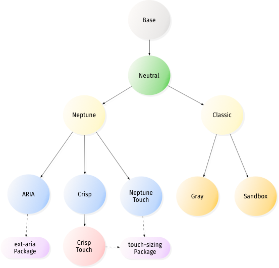
Ext JS themes are organized within packages and are hierarchical in nature. 'theme-base' is the base theme, which contains layout information for framework components. 'theme-neutral' inherits from 'theme-base' and configures global variables and rules for all the components. All other themes extend from 'theme-neutral' in some fashion.
Ext JS, additionally, contains a sub-package for touch-sizing, which assists 'theme-neptune-touch' and 'theme-crisp-touch' in adjusting component sizes for touch screen devices.
The following chart should make it easier to see how theme inheritance works in Ext JS.
For more information about Ext JS themes, see the Ext JS Theming guide
Touch follows the same basic structure with base and neutral themes. However, Default and other platform specific themes are built on top of the neutral theme package. Only the Default theme has configurable variables. Other themes are not highly configurable, as they are intended to replicate the look and feel of a specific platform.
For more information about Touch themes, see the Ext JS Theming guide
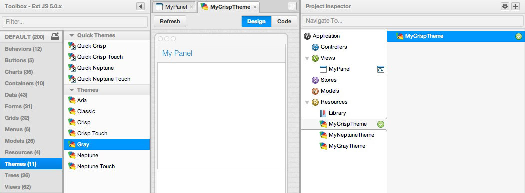
Sencha Ext JS 4.2+ and Touch 2.3+ include several Quick Themes within Architect. Quick Themes allow you to create comprehensive variations to some themes in just a few clicks. This prevents you from having to customize every component, which provides a clearer path towards simple theming.
The following Quick Themes are available for Touch and Ext JS:
Neptune
Neptune Touch
Crisp
Crisp Touch
All framework themes, custom added themes, and Quick Themes can be found under "themes" in Toolbox. You can apply a theme from the Toolbox to your project in any of the following ways:
Drag the theme to a blank area of the Canvas panel
Drag the theme to the Resource node of the Inspector panel.
Select the Resources node in the Inspector panel then double-click the theme.
After adding a theme to the project, Architect will ask whether you want to apply this theme to your project.
You can include any number of themes in your project, but only one is applied at any given
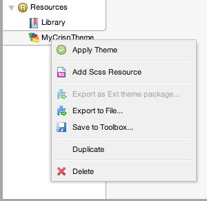
time. To apply a different theme, right-click on it in the Inspector panel and choose
"Apply Theme". You can delete or copy a theme from your project in the same fashion.
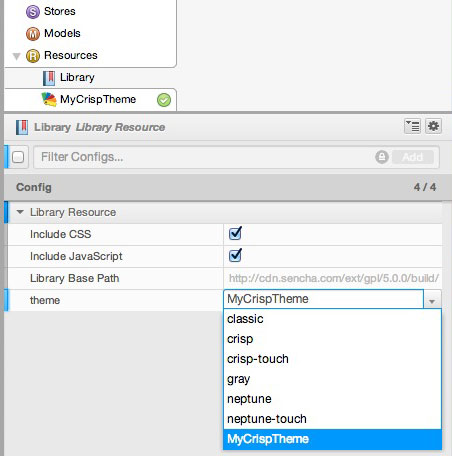
You can easily customize theme resources in your project from the Toolbox. You may also
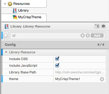
apply non-customizable framework themes by modifying the value of the theme config in
the Library. Simply select one of the framework themes. The built-in themes will be at
the top of the list and any other custom themes will show at the bottom.
Note: If you have applied a theme to your project from the toolbox, changing the theme
config does not delete the it from your project. It just isn't applied any longer. Setting
the theme configuration in the Library has the same effect as applying a custom theme.
Before starting, please recognize that you cannot create custom themes for framework versions prior to Ext JS 4.2 and Sencha Touch 2.2. Additionally, custom themes must be created for Ext JS or Sencha Touch, not both. You cannot create a single theme to be shared by both frameworks.
These are the general steps to customize your theme:
Apply one of the Sencha defined themes to your project as previously discussed.
Select this theme in the Project Inspector. It appears with a name such as
"MyCrispTheme". You can rename your theme by modifying File Name in the config panel.
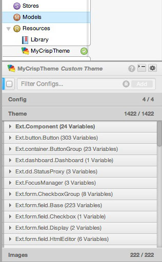
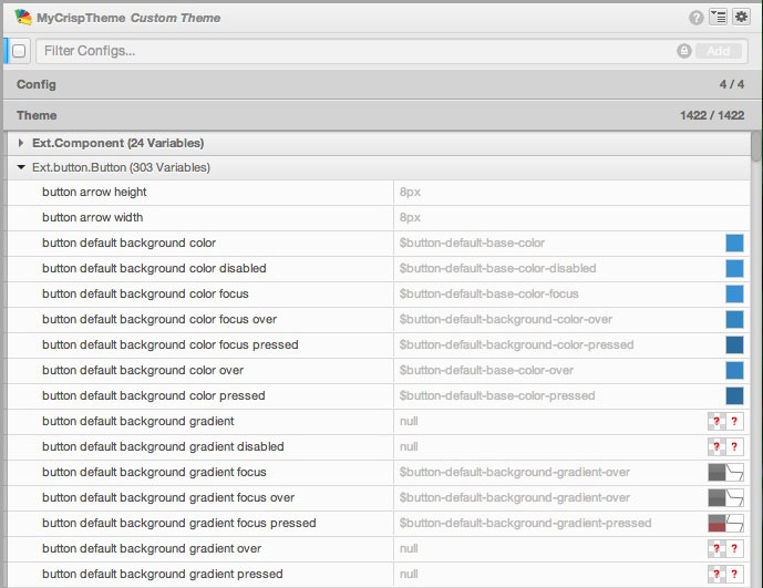
Click the "Theme" accordion header to display a list of global variables grouped by component. These variables can be modified to customize your theme as you see fit. Changing a global variable will affect the look of all instances of the said component. If you'd like to modify a single instance of a component, please see the UI section below.
When you have defined and named your custom theme, right-click on the theme in the Project
Inspector window to get a drop-down menu that allows you to save your theme to the Toolbox
or export it to a file that can be shared with other users.
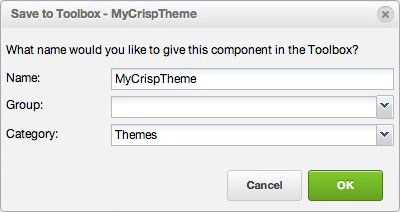
When you save your custom theme to the toolbox, you get a pop-up window where you define the display name for the theme as well as the category and group that will be used:
When you export your custom theme to a file, you will see a pop-up window where you can
define the file name and location to which your .xdc file will be written.
Another user can download this file and then import it using the "Import Component" link on the "Edit" Menu Bar item.
If you do not want to include an Architect theme with your project, follow these simple steps.
You can customize many aspects of your theme by changing the value of global variables.
With the "Theme" accordion selected, click the triangle to the left of any class name listed to reveal the global variables for that component.
Each variable name is fairly self-explanatory, but the majority of them also have tooltips with a more verbose explanation. Variable names are additionally documented under the "CSS Variables" section of the Ext JS and Touch API reference pages.
Each variable has a "real name" or "scss-name" in addition to its human-readable "display name" that is listed in the grid. The syntax of such variable values begins with a $ sign (such as $base-color for the base color variable). This is a variable reference that can be used to link variables together. If the type of two variables is the same, you can use the scss-name of one of them in the value field of the other.
Variables defined for Ext.Class and Ext.Component are root-level. These variables don't modify components directly, but updating them can change the overall look of the theme due to their derived classes.
A component variable should not typically reference variables defined for other components, unless said components inherit from each other.
You can find and modify the variables you want to change by using the filter panel to search for any of the following naming schemes:
Upon selection of your variable, you can add a new value. Acceptable values depend on variable type. If you enter an unacceptable value, the compiler will typically give an error when compiling. We'll discuss a few different variable types below.
Color variables have an integrated colorpicker that also displays a preview of the current color value.
Click on the color to launch the colorpicker to set a different color for the components in your project.
We'll discuss the colorpicker later in this guide.
Gradient variables have an integrated gradient picker that also displays a preview of the current gradient and gradient curve. Gradients are functions that operate on the color that is selected for the same component and are previewed as gray. However, when applied, the gradient will display the correct color.
Color gradients specify a range of colors that are used in progression to fill a region.
Architect supports all gradients defined for each framework:
| bevel | recessed | matte | linear | glossy |
|---|---|---|---|---|
| General | Panel | Tab(bar) | Grid | Button |
|---|---|---|---|---|
| bevel | panel-reverse | tabbar | grid-header | glossy-button |
| glossy | panel-header | tab | grid-header-over | glossy-button-over |
| recessed | tab-active | grid-row-over | glossy-button-pressed | |
| matte | tab-over | grid-cell-special | ||
| matte-reverse | tab-disabled |
Font family variables have a number of preset fonts that can be selected. These are common web-safe font families. However, it is possible to enter any other font or combination of font families manually.
To use web fonts in your application:
Edit your css/scss file in the Code Editor to use the @font-face rule that includes
the webfonts.
Add an SCSS segment under the theme resources in your project by opening the config tab and clicking on the "+" sign at the right of the SCSS line.
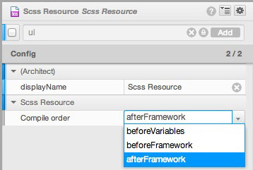
Set the compile/include order so that the SCSS segment runs before the rest of the
theme. To do this, click on the arrow on the "SCSS Resource" line to add the "Compile order"
line. Choose beforeVariables from the drop-down menu.
After following the previous steps, you should be able to utilize the font-name of any installed fonts as the value for any font-family variables in your theme.
By default, the Theme is recompiled each time you modify a variable. You will notice a progress bar for the compilation across the bottom of the config panel. The compiler gives a warning if you have assigned an invalid value to any of the variables.
You can turn off the automatic compile feature by clicking the "A" button to the left of the progress bar. You can then perform a manual compilation by clicking the button between the "A" button and the progress bar.
The compilation bar appears at the bottom of the config panel.

When the compile bar is orange (as seen above), Automatic Compile is off and variable values have been modified since the last compilation ran.
When the compile bar is red, it indicates a compile error.
Each variable listed for Themes and UIs gain a checkbox after modification. Toggling this checkbox allows you to quickly compare the original appearance of the component versus your modified component values.
Each variable in the grid is in one of three possible states, identified by an indicator bar in the left margin:
Default state (indicator bar is grey) – The variable is set to the default value and the checkbox is not visible.
Enabled state (indicator bar is blue) – You have modified the value of this variable. The checkbox appears with a checkmark in it. You can click on the checkmark to go to the disabled state. Toggling the enabled and disabled state allows you to quickly compare two values.
Disabled state (indicator is orange) – You have modified the value of this variable but have toggled it off. This means your value will not be user-defined when compiling the theme, rather compiling as if it were in the default state.
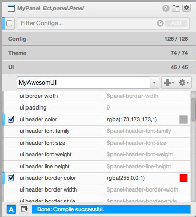
In both the Enabled and Disabled state, the value displayed for the variable is the value the user assigned it.
To revert to the original value for the variable, right-click on the variable name and
choose Reset from the drop-down menu. After doing this, the variable is in Default
state. Visually, the default value is displayed, the indicator bar is grey, and the
checkbox is not visible.
A UI has an additional set of variables that override the basic variables for a component instance, whereas a global variable in a theme is valid for all instances of that component.
When the theme is applied and you may select a UI eligible component. Eligibility will
be visually represented by the presence of a UI accordion header. The config Panel also
displays a UI config with the value Global or Default. This state depends on the
component and framework as some components come with premade framework UIs.
Components that support UIs will have a UI config.
For example, if you are using one of the default, unmodifiable Ext JS themes, the Theming interface is not available. To modify a UI config in this way, you must know the valid UI name to use.
As a simple example, use the Ext JS "Left / Top / Bottom" layout template to open a project.
ui.default to light.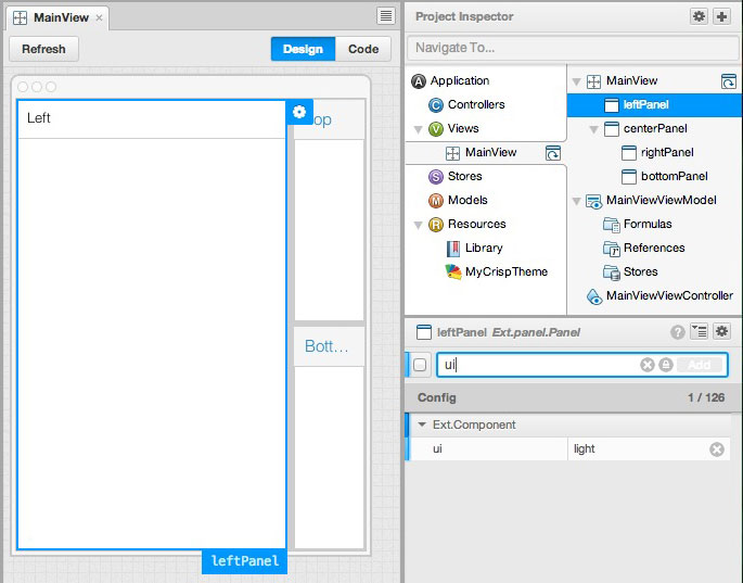
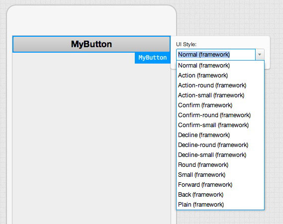
Some UI variables can be set for individual components in Sencha Touch projects. Selecting that component and clicking the cogwheel that appears on the Canvas produces a list of available UIs.
You can instantly modify the appearance of your component by modifying that UI value as seen below.
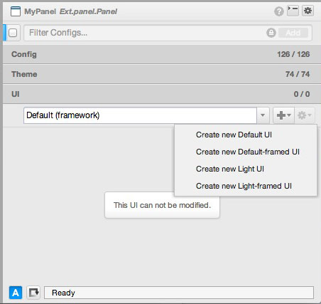
Default UIs cannot be modified or removed. In order to modify a UI, you will need to create your own custom version.
To create your own UI for the component, click on the "+" sign to add a new UI type. These UIs are named "Untitled {x}" by default. You can rename the UI by clicking the cogwheel to the far right of the UI panel and typing your desired name into the pop-up window that is displayed. The UI drop-down selector and "+" button are not displayed if the selected component does not support UIs.
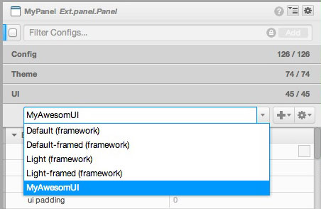
Creating a new UI type causes all relevant variables to be displayed.
After you compile the new UI, you can drag a new component into the Canvas or Inspector. Initially, each new component you select is displayed using a default UI. To change this, simply click on the arrow to the right of the UI box and select the new UI. This will apply your custom UI to said component as seen below.
In some circumstances, you may want to go beyond variable adjustments.
To help with this, there are two types of modifiable SCSS resources available in Architect
Template SCSS - SCSS segments that can be added to any template. These help you style data generated content, such as lists, dataviews, etc. These segments belong with the Template and will exist regardless of what custom theme is applied. These SCSS resources are also wrapped in a custom class so they stay template specific to avoid CSS collisions.
Theme SCSS - SCSS segments that can be added to the root of any theme.
To add a SCSS Resource, select a template or a theme and click the + button next to the
SCSS config in the config pane.
There are helpful actions available when editing SCSS Resources in the code editor's toolbar:
Insert Tpl Structure will insert CSS class names from the Template data in proper SCSS syntax so that you can style your template faster.
Insert Color will use the color picker to insert a color into the editor. If a color is selected, that color will be visible in the colorpicker when opened.
Note: Architect generally shelters you from having to know the intricacies of SASS. That said, you can read the SASS Reference Guide if you need access to this information.
Additionally, Theme SCSS can specify the compile order relative to the other parts of the theme.
The colorpicker provides a customizable palette to assist in selecting the appropriate colors when you are customizing your Theme.
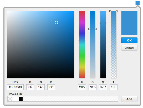
The large square on the upper right shows the color palette that is currently assigned. You can select another base color for the palette in any of the following ways:
Hex field.These values can be adjusted by dragging your cursor up and down the column or by supplying an absolute value in the box at the base of each column. You can also specify a color using the RGB system in the boxes under the color palette square.
As you modify different values in the colorpicker, the hue selector on the main palette display square moves to show the exact color that is currently selected; a larger swatch o f this color is also displayed in the rectangle at the upper right.
When you are satisfied with the results, click the "OK" button. This automatically updates the color of the variable and compiles the theme with the newly defined color. A progress bar is displayed in the lower right portion of the window to indicate that the compiler's progress. When the compilation completes, the project component(s) displayed in the Canvas are changed to use the newly-defined palette.
Here are some additional tips for modifying colors in your custom theme:
To copy the scss-name, right-click the variable name and choose "Copy SCSS reference"
from the drop-down menu.
Variables whose values do some sort of calculation, will be overridden by an absolute color value if you use the colorpicker or manually set a valid CSS color name or hex value.
When you select a new color, you can click "Add" at the lower right of the screen to add a color swatch square to the display, or drag the color from the color preview in the upper right corner to the palette to add it. If you want to set other variables to this same palette, you can simply select the variable then click on the color swatch square that represents that palette color.
You can drag the swatches in the palette menu to rearrange the way they are displayed. To delete a swatch from the palette, drag and drop it outside the palette. The contents of the palette menu persist across projects and between frameworks.
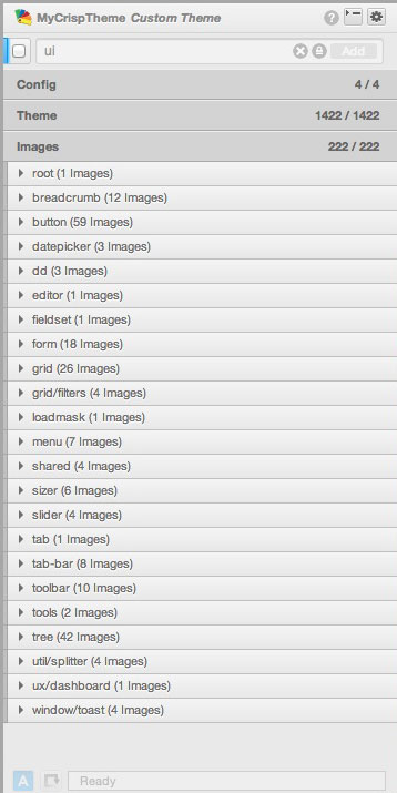
Some icons and images are theme-related. For example, the look of the check box and various triggers. When select a theme and click on the "Images" tab, a list of associated images is displayed. A single image may be used by multiple components.
Sencha Architect enables you to include images in your application styling.
Buttons and other components may have images attached to them.
To add an image to a component:
project/resources/ directory in the
project tree. Images in this directory can be rendered in the Canvas and are accessed by
the preview and build operations for Ext JS and Sencha Touch projects. Note: See Project Files for more information about the file structure of an Architect project.
Select the component to which you want to attach the image.
Go to the config panel and select the Icon config.
Supply the URL to the .png file that contains your image. Using a path relative to the
mainapp.html file gives you the most flexibility, although an absolute path name will work.
When you have a logo or other image that you want to use repeatedly in different Views, create a custom component with that image:
Place your image in a meaningful location under the project/resources/ directory in the
project tree.
Create a container and select it.
Go to the config panel and locate the html config. Set this config to a value
such as <img src="path/to/my/image.png"/>.
Set the width and height of your component to match the width and height of your image.
Save this container as a custom component.
You can now easily drag and drop the component that contains your logo as needed.
Place your image in a meaningful location under the project/resources/ directory in the
project tree.
Refer to the image in the SCSS code as so:
url('project/resources/your-image-folder/your-image.png').


 Architect | Terms of Use
