Ext JS 6.2.0 Upgrade Guide
Many classes have shortcut names used when creating (instantiating) a class with a
configuration object. The shortcut name is referred to as an alias (or xtype if the
class extends Ext.Component). The alias/xtype is listed next to the class name of
applicable classes for quick reference.
Framework classes or their members may be specified as private or protected. Else,
the class / member is public. Public, protected, and private are access
descriptors used to convey how and when the class or class member should be used.
Public classes and class members are available for use by any other class or application code and may be relied upon as a stable and persistent within major product versions. Public classes and members may safely be extended via a subclass.
Protected class members are stable public members intended to be used by the
owning class or its subclasses. Protected members may safely be extended via a subclass.
Private classes and class members are used internally by the framework and are not intended to be used by application developers. Private classes and members may change or be omitted from the framework at any time without notice and should not be relied upon in application logic.
static label next to the
method name. *See Static below.Below is an example class member that we can disect to show the syntax of a class member (the lookupComponent method as viewed from the Ext.button.Button class in this case).
Let's look at each part of the member row:
lookupComponent in this example)( item ) in this example)Ext.Component in this case). This may be omitted for methods that do not
return anything other than undefined or may display as multiple possible values
separated by a forward slash / signifying that what is returned may depend on the
results of the method call (i.e. a method may return a Component if a get method calls is
successful or false if unsuccessful which would be displayed as
Ext.Component/Boolean).PROTECTED in
this example - see the Flags section below)Ext.container.Container in this example). The source
class will be displayed as a blue link if the member originates from the current class
and gray if it is inherited from an ancestor or mixed-in class.view source in the example)item : Object in the example).undefined a "Returns" section
will note the type of class or object returned and a description (Ext.Component in the
example)Available since 3.4.0 - not pictured in
the example) just after the member descriptionDefaults to: false)The API documentation uses a number of flags to further commnicate the class member's function and intent. The label may be represented by a text label, an abbreviation, or an icon.
classInstance.method1().method2().etc();false is returned from
an event handler- Indicates a framework class
- A singleton framework class. *See the singleton flag for more information
- A component-type framework class (any class within the Ext JS framework that extends Ext.Component)
- Indicates that the class, member, or guide is new in the currently viewed version
- Indicates a class member of type config
- Indicates a class member of type property
- Indicates a class member of type
method
- Indicates a class member of type event
- Indicates a class member of type
theme variable
- Indicates a class member of type
theme mixin
- Indicates that the class, member, or guide is new in the currently viewed version
Just below the class name on an API doc page is a row of buttons corresponding to the types of members owned by the current class. Each button shows a count of members by type (this count is updated as filters are applied). Clicking the button will navigate you to that member section. Hovering over the member-type button will reveal a popup menu of all members of that type for quick navigation.
Getting and setter methods that correlate to a class config option will show up in the methods section as well as in the configs section of both the API doc and the member-type menus just beneath the config they work with. The getter and setter method documentation will be found in the config row for easy reference.
Your page history is kept in localstorage and displayed (using the available real estate) just below the top title bar. By default, the only search results shown are the pages matching the product / version you're currently viewing. You can expand what is displayed by clicking on the button on the right-hand side of the history bar and choosing the "All" radio option. This will show all recent pages in the history bar for all products / versions.
Within the history config menu you will also see a listing of your recent page visits. The results are filtered by the "Current Product / Version" and "All" radio options. Clicking on the button will clear the history bar as well as the history kept in local storage.
If "All" is selected in the history config menu the checkbox option for "Show product details in the history bar" will be enabled. When checked, the product/version for each historic page will show alongside the page name in the history bar. Hovering the cursor over the page names in the history bar will also show the product/version as a tooltip.
Both API docs and guides can be searched for using the search field at the top of the page.
On API doc pages there is also a filter input field that filters the member rows using the filter string. In addition to filtering by string you can filter the class members by access level, inheritance, and read only. This is done using the checkboxes at the top of the page.
The checkbox at the bottom of the API class navigation tree filters the class list to include or exclude private classes.
Clicking on an empty search field will show your last 10 searches for quick navigation.
Each API doc page (with the exception of Javascript primitives pages) has a menu view of metadata relating to that class. This metadata view will have one or more of the following:
Ext.button.Button class has an alternate class name of Ext.Button). Alternate class
names are commonly maintained for backward compatibility.Runnable examples (Fiddles) are expanded on a page by default. You can collapse and expand example code blocks individually using the arrow on the top-left of the code block. You can also toggle the collapse state of all examples using the toggle button on the top-right of the page. The toggle-all state will be remembered between page loads.
Class members are collapsed on a page by default. You can expand and collapse members using the arrow icon on the left of the member row or globally using the expand / collapse all toggle button top-right.
Viewing the docs on narrower screens or browsers will result in a view optimized for a smaller form factor. The primary differences between the desktop and "mobile" view are:
The class source can be viewed by clicking on the class name at the top of an API doc page. The source for class members can be viewed by clicking on the "view source" link on the right-hand side of the member row.
With Ext JS 6.2 every effort has been made to ensure a high degree of compatibility with existing code, but there have been some compromises and minor differences introduced. This article will cover the important changes you should be aware of before planning your upgrade.
The move to browser-based, native scrolling and pinch-to-zoom support has perhaps the largest impact on existing code.
On touch-screen-enabled devices, browsers automatically handle certain gestures and perform default "touch actions" in response. These touch actions are:
In previous versions of the framework these browser touch actions were disabled by default, and all scrolling on touch-screen devices was handled by a virtualized scroller. For improved accessibility Ext JS 6.2 now supports all the browser touch actions, including pinch-to-zoom, and has replaced the virtual scroller with native scrolling. Upgraded applications will need to enable pinch-to-zoom, and may need to modify their gesture handling logic to account for the presence of browser touch actions.
In previous versions, the virtual scrollers could be disabled so they would not listen to gesture events and perform scrolling. Now that scrollers are native, the "disabled" config has been removed, in favor of setting the appropriate x/y scrolling configs.
Previous versions required the following meta tag to be added to the head of the html document in order to function
properly. This tag disables user scaling of the viewport via pinch or double-tap:
<meta name="viewport" content="width=device-width, initial-scale=1, maximum-scale=1, user-scalable=no">
While applications using this meta tag should still function properly, they will not be able to take advantage of the new support for pinch and double-tap zoom. As such we recommend replacing the old viewport meta tag with the following:
<meta name="viewport" content="width=device-width, initial-scale=1, maximum-scale=10, user-scalable=yes">
Since the browser default touch actions were previously disabled, application code could handle various gestures without concern for interference from the browser. With browser touch actions enabled one may find that undesired scrolling or zooming occurs while handling a gesture. Application views that implement custom gesture handling should use the the touchAction config or the [ext:Ext.dom.Element#setTouchAction setTouchAction]] method to configure the browser touch actions that are allowed on a particular Component or Element. For example, a Component that handles the drag gesture can disable scrolling while its element is being dragged as follows:
Ext.create('Ext.Component', {
    touchAction: {
        panX: false,
        panY: false
    },
    listeners: {
        drag: function(e) {
            // handle drag
        }
    }
});
For a more in-depth discussion of gesture handling see the Gesture Guide.
In order to allow gesture handlers to be properly nested, the order in which gesture events propagate through the DOM
hierarchy was changed. In previous versions of the framework a gesture event, such as drag, propagated after the native
event which caused it had already completed propagation. Additionally, if multiple gestures such as drag and swipe
were recognized simultaneously, they would also propagate separately. This meant that there was no opportunity for one
gesture handler to prevent another from firing when gestures of different types were nested in the same DOM hierarchy.
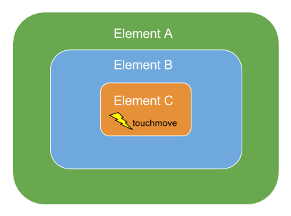
For example, assume the DOM contains three elements, Element "A" contains Element "B", which contains Element "C". Element "C" receives a touchmove event which meets the criteria for both a drag and a swipe gesture:
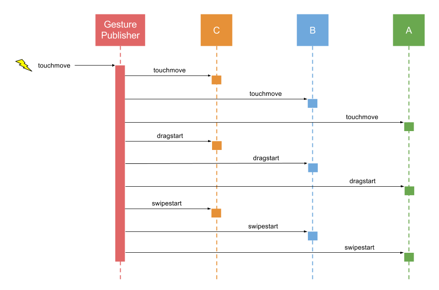
In previous versions the touchmove, dragstart, and swipestart events would proceed to propagate through the DOM as follows:
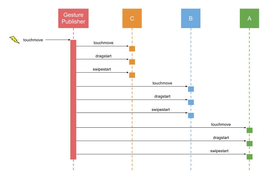
In Ext JS 6.2 this has been improved so that all three events propagate through the DOM in tandem.
The main benefit of the new approach to propagation is that gesture handlers can now "claim" that the current gesture is the gesture they are handling. This prevents events associated with any other gesture from firing for the remaining duration of the gesture.
Applications that are sensitive to the firing order of gesture handlers may experience issues when upgrading to Ext JS 6.2. In some cases these issues can be solved using an appropriately placed call to stopPropagation or claimGesture. In other cases the handlers may need to be rewritten or refactored to take the new propagation order into account.
For more information on gesture propagation and claiming see the Gesture Guide.
The click event is no longer automatically translated to tap gestures on IE and Edge devices. This change resolve limitations from popup blockers and the like that rely on processing the actual click event but does inject a 300ms delay. To avoid this delay, use the tap event instead. The tap event fires immediately and works on all devices.
The Ext.Action class has been enhanced to work declaratively with ViewControllers. The new actions config can be used to manage a group of named, reusable actions that now work seamlessly with the associated controller.
The Ext.Base destroy method will loop over the object's own properties and set all object, array or function references to null. This process greatly reduces the possibility of memory leaks. By default this property clearing is asynchronous to avoid timing problems as object graphs are being destroyed. The new Ext.Base#property-clearPropertiesOnDestroy option can configure (or disable) this behavior.
Several configs previously declared directly on the pivot grid have been consolidated in a single [[Ext.pivot.Grid#cfg-matrix matrix]] config. This new matrix config allows changing the matrix type using setMatrix.
The following code, while still supported, should be migrated to the new form:
{
    xtype: 'pivotgrid',
    matrixConfig: {
        type: 'local',
        store: 'yourStoreId'    // or a store instance
    },
    rowGrandTotalsPosition: 'first',
    leftAxis: [{
        dataIndex: 'country',
        direction: 'DESC',
        header: 'Countries',
        width: 150
    }],
    topAxis: [{
        dataIndex: 'year',
        direction: 'ASC'
    }],
    aggregate: [{
        dataIndex: 'value',
        header: 'Total',
        aggregator: 'sum',
        width: 120
    }]
}
Using the matrix config, the above code should now be as follows:
 {
    xtype: 'pivotgrid',
    matrix: {
        type: 'local',
        store: 'yourStoreId',    // or a store instance
        rowGrandTotalsPosition: 'first',
        leftAxis: [{
            dataIndex: 'country',
            direction: 'DESC',
            header: 'Countries'
            width: 150
        }],
        topAxis: [{
            dataIndex: 'year',
            direction: 'ASC'
        }],
        aggregate: [{
            dataIndex: 'value',
            header: 'Total',
            aggregator: 'sum',
            width: 120
        }]
    }
}
The grid and pivot grid exporter plugins work in both Classic and Modern Toolkits. These plugins adds the following methods to the associated grid or pivot grid:
The default export format has been changed to XLSX. Specifically, the previous default exporter class
"Ext.exporter.Excel" was renamed to Ext.exporter.excel.Xml and its alias is
now exporter.excel03.The new default export class is Ext.exporter.excel.Xlsx and it
now has the alias exporter.excel.
Ext.draw.modifier.Modifier is now marked private due to some internal refactoring. This class was never intended to be public but the documentation was missing the private attribute.
The column align config now means that 'right' aligns to the right and 'left' means align to the left in all locales. align: 'right' on numeric columns will also work in all locales.
The values 'start' and 'end' may now be specified as a locale-independent way of aligning to the text start side or the text end side.
If the grid is configured with no columns which have header text or child columns, then the hideHeaders configuration is set, and the headers container is not shown. If any column acquires text subsequently, the headers container will be shown.
The cell editing plugin now fires the beforeedit and edit events before moving to the next cell while tabbing. With Form Fields components in a CellEditor, if you were using beforeedit to prevent the completion of the edit for a previous cell, you should use the validateedit event instead.
There is a new event, cellactivate which fires when a cell has focusable content activated by Actionable Mode. This includes cell editing starting, but also any focusable content inside a cell being activated by entering Actionable Mode, or navigating using TAB in Actionable Mode.
The glyph property of a tree node will be used, or the glyph property of cell metadata if set by a custom renderer to create a node icon.
The checkPropagation config of Tree now propagates checkbox changes. It may be set to any of these values:
'up': Checking a child node causes parent to become checked.
'down': Checking a parent node causes all children to become checked.
'both': Both the above scenarios take place.
In the process of creating the new Material and iOS themes some theme variables were deprecated. When building an application, Fashion will output a warning such as the following if a deprecated variable is being assigned:
[WRN] Using new variable $new-var for deprecated variable $old-var: /path/to/app/sass/var/controller/Main.scss
The deprecated variables should still work correctly, but we recommend using the new variables instead.
There were some internal uses of the term "floating" in Ext JS 6.0 Modern Toolkit, but unlike the new floated config, this term was applied to components that were absolutely positioned inside their container. For example:
{
    xtype: 'button',
    ui: 'circular',
    text: '+',
    right: 16,
    bottom: 16
}
There is clearly no direct use of the term "floating" in the above code. The term "floating", however, did appear in documentation and in CSS class names applied to these absolutely positioned items. This term has been replaced by the (more appropriate) term "positioned" to indicate that only the items positioning behavior is affected.
This should have minimal impact on existing code because the uses of "floating" in code was marked as private.
To avoid conflict with the old name, the name "floated" was chosen for the new config that allows the item to not only be positioned absolutely, but positioned in viewport space. That is, not constrained to its container's bounding box.
This component has been moved to the "google" package and its official name is Ext.ux.google.Map. The name Ext.Map is maintained as an alternate class name.


 Ext JS | Terms of Use
