Many classes have shortcut names used when creating (instantiating) a class with a
configuration object. The shortcut name is referred to as an alias (or xtype if the
class extends Ext.Component). The alias/xtype is listed next to the class name of
applicable classes for quick reference.
Framework classes or their members may be specified as private or protected. Else,
the class / member is public. Public, protected, and private are access
descriptors used to convey how and when the class or class member should be used.
Public classes and class members are available for use by any other class or application code and may be relied upon as a stable and persistent within major product versions. Public classes and members may safely be extended via a subclass.
Protected class members are stable public members intended to be used by the
owning class or its subclasses. Protected members may safely be extended via a subclass.
Private classes and class members are used internally by the framework and are not intended to be used by application developers. Private classes and members may change or be omitted from the framework at any time without notice and should not be relied upon in application logic.
static label next to the
method name. *See Static below.Below is an example class member that we can disect to show the syntax of a class member (the lookupComponent method as viewed from the Ext.button.Button class in this case).
Let's look at each part of the member row:
lookupComponent in this example)( item ) in this example)Ext.Component in this case). This may be omitted for methods that do not
return anything other than undefined or may display as multiple possible values
separated by a forward slash / signifying that what is returned may depend on the
results of the method call (i.e. a method may return a Component if a get method calls is
successful or false if unsuccessful which would be displayed as
Ext.Component/Boolean).PROTECTED in
this example - see the Flags section below)Ext.container.Container in this example). The source
class will be displayed as a blue link if the member originates from the current class
and gray if it is inherited from an ancestor or mixed-in class.view source in the example)item : Object in the example).undefined a "Returns" section
will note the type of class or object returned and a description (Ext.Component in the
example)Available since 3.4.0 - not pictured in
the example) just after the member descriptionDefaults to: false)The API documentation uses a number of flags to further commnicate the class member's function and intent. The label may be represented by a text label, an abbreviation, or an icon.
classInstance.method1().method2().etc();false is returned from
an event handler- Indicates a framework class
- A singleton framework class. *See the singleton flag for more information
- A component-type framework class (any class within the Ext JS framework that extends Ext.Component)
- Indicates that the class, member, or guide is new in the currently viewed version
- Indicates a class member of type config
- Indicates a class member of type property
- Indicates a class member of type
method
- Indicates a class member of type event
- Indicates a class member of type
theme variable
- Indicates a class member of type
theme mixin
- Indicates that the class, member, or guide is new in the currently viewed version
Just below the class name on an API doc page is a row of buttons corresponding to the types of members owned by the current class. Each button shows a count of members by type (this count is updated as filters are applied). Clicking the button will navigate you to that member section. Hovering over the member-type button will reveal a popup menu of all members of that type for quick navigation.
Getting and setter methods that correlate to a class config option will show up in the methods section as well as in the configs section of both the API doc and the member-type menus just beneath the config they work with. The getter and setter method documentation will be found in the config row for easy reference.
Your page history is kept in localstorage and displayed (using the available real estate) just below the top title bar. By default, the only search results shown are the pages matching the product / version you're currently viewing. You can expand what is displayed by clicking on the button on the right-hand side of the history bar and choosing the "All" radio option. This will show all recent pages in the history bar for all products / versions.
Within the history config menu you will also see a listing of your recent page visits. The results are filtered by the "Current Product / Version" and "All" radio options. Clicking on the button will clear the history bar as well as the history kept in local storage.
If "All" is selected in the history config menu the checkbox option for "Show product details in the history bar" will be enabled. When checked, the product/version for each historic page will show alongside the page name in the history bar. Hovering the cursor over the page names in the history bar will also show the product/version as a tooltip.
Both API docs and guides can be searched for using the search field at the top of the page.
On API doc pages there is also a filter input field that filters the member rows using the filter string. In addition to filtering by string you can filter the class members by access level and inheritance. This is done using the checkboxes at the top of the page.
The checkbox at the bottom of the API class navigation tree filters the class list to include or exclude private classes.
Clicking on an empty search field will show your last 10 searches for quick navigation.
Each API doc page (with the exception of Javascript primitives pages) has a menu view of metadata relating to that class. This metadata view will have one or more of the following:
Ext.button.Button class has an alternate class name of Ext.Button). Alternate class
names are commonly maintained for backward compatibility.Runnable examples (Fiddles) are expanded on a page by default. You can collapse and expand example code blocks individually using the arrow on the top-left of the code block. You can also toggle the collapse state of all examples using the toggle button on the top-right of the page. The toggle-all state will be remembered between page loads.
Class members are collapsed on a page by default. You can expand and collapse members using the arrow icon on the left of the member row or globally using the expand / collapse all toggle button top-right.
Viewing the docs on narrower screens or browsers will result in a view optimized for a smaller form factor. The primary differences between the desktop and "mobile" view are:
The class source can be viewed by clicking on the class name at the top of an API doc page. The source for class members can be viewed by clicking on the "view source" link on the right-hand side of the member row.
In this guide, we will walk through Sencha Themer and explore some of its many theming capabilities at a high level. Themer allows you to simply create, modify, and share themes that can then be added to Ext JS applications. All of this is done through a Graphical User Interface without having to write a single line of code. Sencha Themer gives you access to all Ext JS components for both Modern and Classic Toolkits, along with inspection tools to set fine-grained styles and generate theme packages with dynamic stylesheets.
Let's get started by looking at the theme creation process.
Creating custom themes has always been challenging in Ext JS. But with Sencha Themer, we've removed all of the guess work, and added a simple Graphical Interface to customize any aspect of your application.
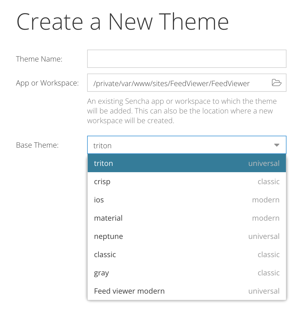
As you can see below, getting started is pretty easy. Just name your theme, point to your app, workspace, or empty directory, and then select which theme you'd like to use as your base. You can even select your own custom themes as a starting point from which to extend.

Once you've made your selections, just hit "Create Theme" and you're ready to go for both Modern and Classic Toolkit applications.
Once your Theme has been created, you can immediately attach it to an application. With "sencha app watch" enabled with the fashion switch, you can even see your application change as you modify your theme via the Themer interface.
You can attach your theme to an application by selecting "Publish" from the top menu. Select "Apply Theme to App(s)" and then select your application from the menu. Apply your theme by clicking "Apply to Selected".
If fashion is running by way of sencha app watch, you can see your application change as you change variables within Themer. To start fashion, issue one of the following commands:
Issue the following command from your CLI:
sencha app watch -fashion classic
You can then visit your application at:
Issue the following command from your CLI:
sencha app watch -fashion modern
You can then visit your desktop application at:
http://localhost:1841?toolkit=modern
Or, if you have device mode enabled in Chrome Developer Tools, you can view a device view at:
Note: If you are running "sencha app watch" elsewhere, your port may vary. Check the terminal output of “sencha app watch” for your correct URL.
Themer's GUI can be broken down into three main areas.
Component Tree
Canvas/Preview
Editor
The component tree contains all of the components available for editing. This tree differs based on which toolkit you have selected.
The canvas visually displays mockups of the components available for editing depending on your component tree selection. It also updates to display those components with the modifications that you make in the editor.
The Canvas tree also contains an Inspector, which will talk about in a later section.
The editor panel contains all of the styles that can be currently changed based on your component and canvas/preview selections. It will always contain the default values dictated by the theme that you extended when you created it unless you have changed them.
There are multiple ways to change values. Sometimes there are text boxes, sliders, select boxes, etc. Once special feature is the color selection tool.
You can always enter a hex code into a color text field, but there are several other ways to select colors as well.
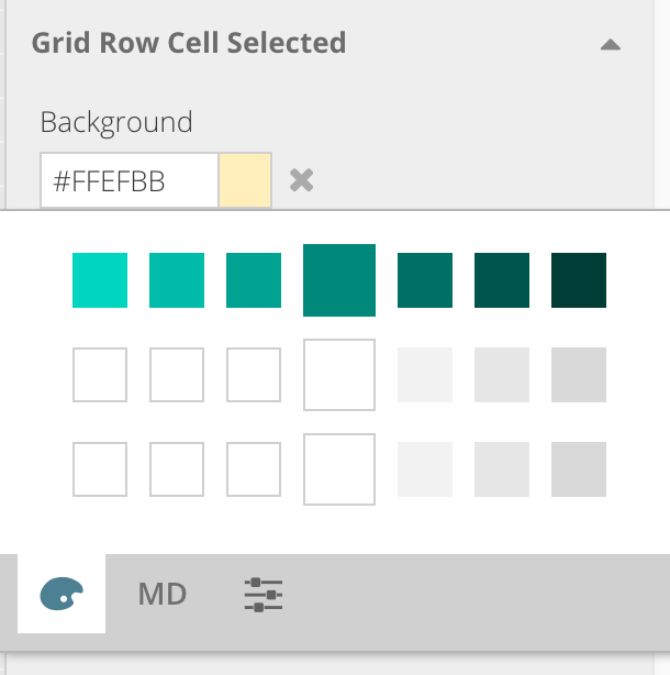
If you click the color box, it will initially display your base color, body background color, and font color. You'll also see lighter and darker options in increments of +/- 5% that should work well as accent colors for your application.

The biggest, emphasized box in the middle contains your current base, background, and text colors.
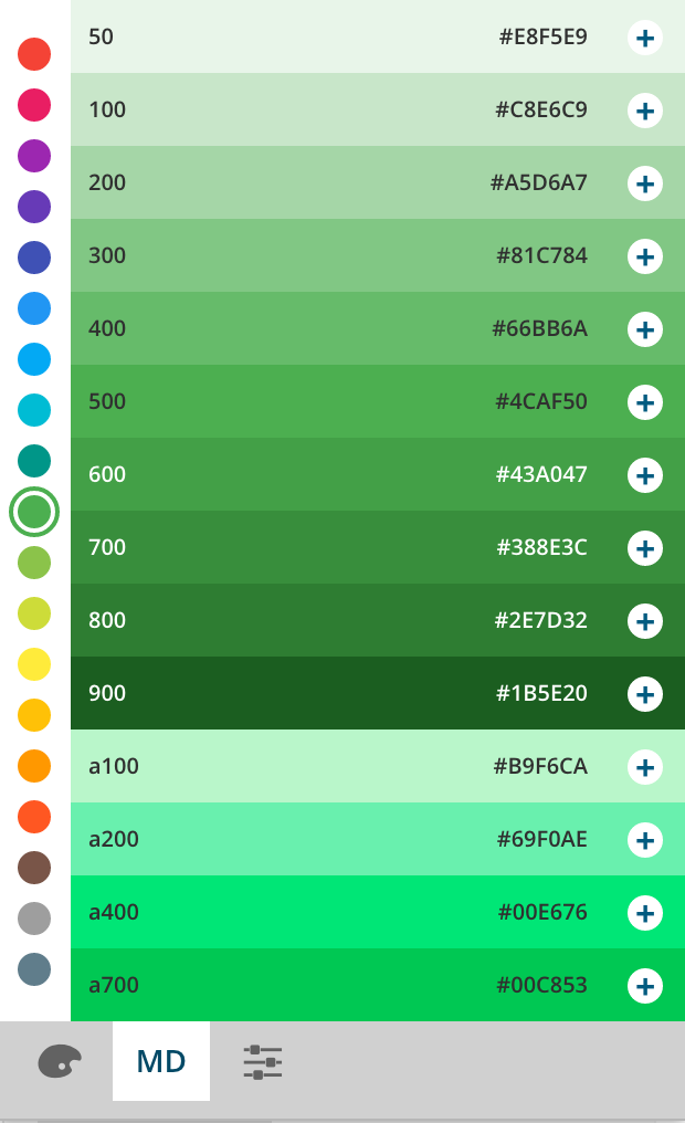
The second tab contains suggestions based on material design. This is a great place to start if you do not have design specs and are trying to find the right color palette based on a curated list of Material-based colors and increments.

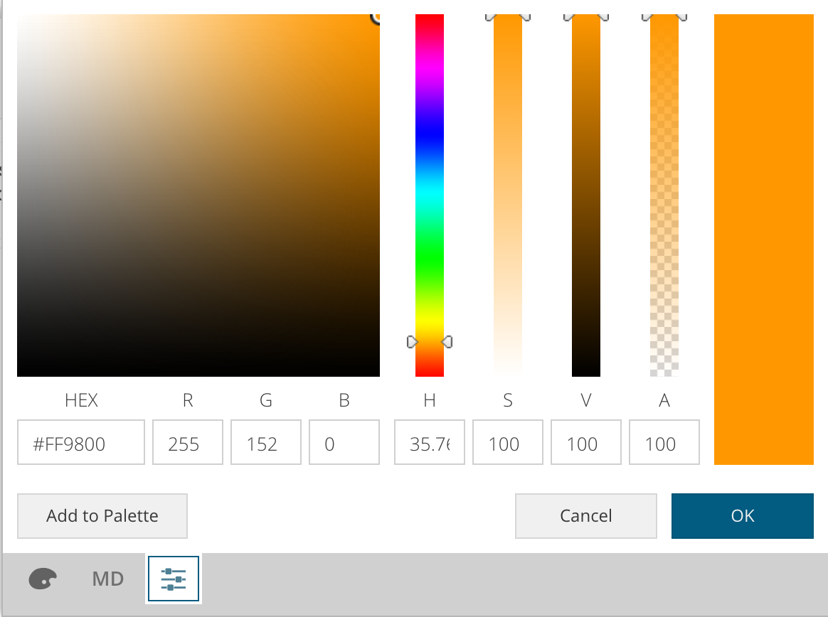
The third tab contains the most commonly known color selection tool. It allows you to directly input colors based on hex, hue, gradient color picker, etc.

Not all changeable aspects of our application are readily apparent. In some cases, we'll need to use the "Inspect" tool to discover certain editable properties of a component.

Tabs are a good example of a component that benefits from Inspect Mode. When you select Inspect and then click on a tab, you are then able to modify different states of the tab that may not have been previously visible. For instance, active tab, over tab, hover tab, etc. are editable after activating Inspect mode and clicking on a tab.
Inspect Mode has another handy feature that allows you to "lock" the state that you wish to edit. For instance, if you wanted to edit a hover state, you won't be able to hover and edit at the same time. In this case, you can hover over a tab to activate its hover state and then hit "Cmd + I" on Mac, or "Ctrl + I" on Windows and Linux.
This engages Inspect Mode and freezes the state of the center pane (canvas). You can now inspect the tab and modify the over state. Simply un-click "Inspect" to exit this locked state.
Themer makes it easy to create a custom theme applying style changes to all components using the theme. However,
you may want a particular style to apply to only select component instances. That’s where the component ui
config comes in handy. The ui config applies theme mixin styles to a given component subclass / instance. In Themer,
you can create custom UI styles for all of your Ext JS 6.2+ applications.
Note: UIs created outside of Themer may not be managed / edited within Themer. Only UIs created within Themer will be displayed for theming.
To create a custom UI:
Click on the "+" on the right-hand side of the “UIs” node in the left-hand component tree to open the “Add UI” window
Choose the component you’d like to create a UI for (the component list will be different depending on whether you’re working on a classic or modern theme). You can filter the component list using the "Search Mixins..." field.
Add a UI name to the "Name" field. Conventionally, the UI name should be representative of what the UI aims to accomplish, but can be any valid CSS name.
Click on "Create UI"
After creating the UI it will appear under "UI’s in the component tree and will be selected. All available config options for the UI will appear in the properties panel at right the same as with components themselves.
Once you’ve edited the component UI to taste, you’ll add the UI to select component subclasses / instances to view the UI in action. For example, if you were to create a "green-btn" UI where the button’s background and border were green you’d then add “green-btn” to any button instances in your app you’d like to appear green.
{
    xtype: ’button’,
    text: ’Go on...’,
    ui: ’green-btn’
}
Themer also allows you to utilize web fonts. We'll walk through Google fonts for this particular display. Before changing the font, you'll need to get the Google Font URL. Go to the corresponding Google Fonts page, and copy the web link. The resulting link should be something like this:
https://fonts.googleapis.com/css?family=Raleway
Then, in Themer, select "Tools" from the top menu and select "Manage Web Fonts". Paste in the URL and click "Done".
Finally, click on "Theme Defaults" from the component tree on the left. From the font section select the newly added "Raleway". Your application should update momentarily.
Themer makes it easy to export your finished custom theme for use with other Ext JS applications.
Once you are happy with the look and feel of your theme, export it! To export your theme, simply select "Publish" from the top Themer menu and then select "Export Theme as Zip Archive".
Your theme is now ready to share with other users and their applications!