Setup & Getting Started
Many classes have shortcut names used when creating (instantiating) a class with a
configuration object. The shortcut name is referred to as an alias (or xtype if the
class extends Ext.Component). The alias/xtype is listed next to the class name of
applicable classes for quick reference.
Framework classes or their members may be specified as private or protected. Else,
the class / member is public. Public, protected, and private are access
descriptors used to convey how and when the class or class member should be used.
Public classes and class members are available for use by any other class or application code and may be relied upon as a stable and persistent within major product versions. Public classes and members may safely be extended via a subclass.
Protected class members are stable public members intended to be used by the
owning class or its subclasses. Protected members may safely be extended via a subclass.
Private classes and class members are used internally by the framework and are not intended to be used by application developers. Private classes and members may change or be omitted from the framework at any time without notice and should not be relied upon in application logic.
static label next to the
method name. *See Static below.Below is an example class member that we can disect to show the syntax of a class member (the lookupComponent method as viewed from the Ext.button.Button class in this case).
Let's look at each part of the member row:
lookupComponent in this example)( item ) in this example)Ext.Component in this case). This may be omitted for methods that do not
return anything other than undefined or may display as multiple possible values
separated by a forward slash / signifying that what is returned may depend on the
results of the method call (i.e. a method may return a Component if a get method calls is
successful or false if unsuccessful which would be displayed as
Ext.Component/Boolean).PROTECTED in
this example - see the Flags section below)Ext.container.Container in this example). The source
class will be displayed as a blue link if the member originates from the current class
and gray if it is inherited from an ancestor or mixed-in class.view source in the example)item : Object in the example).undefined a "Returns" section
will note the type of class or object returned and a description (Ext.Component in the
example)Available since 3.4.0 - not pictured in
the example) just after the member descriptionDefaults to: false)The API documentation uses a number of flags to further commnicate the class member's function and intent. The label may be represented by a text label, an abbreviation, or an icon.
classInstance.method1().method2().etc();false is returned from
an event handler- Indicates a framework class
- A singleton framework class. *See the singleton flag for more information
- A component-type framework class (any class within the Ext JS framework that extends Ext.Component)
- Indicates that the class, member, or guide is new in the currently viewed version
- Indicates a class member of type config
- Indicates a class member of type property
- Indicates a class member of type
method
- Indicates a class member of type event
- Indicates a class member of type
theme variable
- Indicates a class member of type
theme mixin
- Indicates that the class, member, or guide is new in the currently viewed version
Just below the class name on an API doc page is a row of buttons corresponding to the types of members owned by the current class. Each button shows a count of members by type (this count is updated as filters are applied). Clicking the button will navigate you to that member section. Hovering over the member-type button will reveal a popup menu of all members of that type for quick navigation.
Getting and setter methods that correlate to a class config option will show up in the methods section as well as in the configs section of both the API doc and the member-type menus just beneath the config they work with. The getter and setter method documentation will be found in the config row for easy reference.
Your page history is kept in localstorage and displayed (using the available real estate) just below the top title bar. By default, the only search results shown are the pages matching the product / version you're currently viewing. You can expand what is displayed by clicking on the button on the right-hand side of the history bar and choosing the "All" radio option. This will show all recent pages in the history bar for all products / versions.
Within the history config menu you will also see a listing of your recent page visits. The results are filtered by the "Current Product / Version" and "All" radio options. Clicking on the button will clear the history bar as well as the history kept in local storage.
If "All" is selected in the history config menu the checkbox option for "Show product details in the history bar" will be enabled. When checked, the product/version for each historic page will show alongside the page name in the history bar. Hovering the cursor over the page names in the history bar will also show the product/version as a tooltip.
Both API docs and guides can be searched for using the search field at the top of the page.
On API doc pages there is also a filter input field that filters the member rows using the filter string. In addition to filtering by string you can filter the class members by access level, inheritance, and read only. This is done using the checkboxes at the top of the page.
The checkbox at the bottom of the API class navigation tree filters the class list to include or exclude private classes.
Clicking on an empty search field will show your last 10 searches for quick navigation.
Each API doc page (with the exception of Javascript primitives pages) has a menu view of metadata relating to that class. This metadata view will have one or more of the following:
Ext.button.Button class has an alternate class name of Ext.Button). Alternate class
names are commonly maintained for backward compatibility.Runnable examples (Fiddles) are expanded on a page by default. You can collapse and expand example code blocks individually using the arrow on the top-left of the code block. You can also toggle the collapse state of all examples using the toggle button on the top-right of the page. The toggle-all state will be remembered between page loads.
Class members are collapsed on a page by default. You can expand and collapse members using the arrow icon on the left of the member row or globally using the expand / collapse all toggle button top-right.
Viewing the docs on narrower screens or browsers will result in a view optimized for a smaller form factor. The primary differences between the desktop and "mobile" view are:
The class source can be viewed by clicking on the class name at the top of an API doc page. The source for class members can be viewed by clicking on the "view source" link on the right-hand side of the member row.
Getting started with Ext JS and Sencha Cmd couldn't be easier. Completing these two steps will result in a fully functional starter application that can be run on a local web server. Note: It may be helpful to read the Introduction to Sencha Cmd guide for information on what is required to install Sencha Cmd.
Open your terminal or console window and issue these commands from your webserver root directory:
 sencha -sdk /path/to/framework generate app MyApp my-app
 cd my-app
 sencha app watch
That's it. You've created an application and deployed a server. Now navigate to http://localhost:1841 or your native localhost. You can now view your newly generated Ext JS application. It should look something like this:
Sencha Cmd is now monitoring your application for changes. You will see "Waiting for changes..." which is an indication that your application is up to date. As you make changes and save files you will see other messages printing, but these will end shortly with another "Waiting for changes..." message. This cycle usually takes a few seconds, so be sure to allow enough time between file saves and hitting "Reload" in your browser.
It's not much use having an application that consists of two empty containers, so let's make this example a little more interesting.
The generated application scaffolding is built using a border layout which gives us
"regions" based on cardinal directions. The main tab area is the center region and
the empty panel titled "MyApp" is the west region.
Every good application needs appropriate branding, so let's personalize this application by adding a company title.
Using your favorite IDE or text editor, open app/view/main/Main.js. This is the
container that currently holds the border layout that we discussed previously.
Let's go ahead and add another item to the items array. Here is a new component with a
north region. We've added a height of 40px, 10px of padding, and the text 'My
Company - My Company Motto':
{
    region: 'north',
    xtype: 'component',
    padding: 10,
    height: 40,
    html: 'My Company - My Company Motto'
}
Your items array in Main.js should now look like this:
items: [{
region: 'north',
xtype: 'component',
padding: 10,
height: 40,
html: 'My Company - My Company Motto'
}, {
xtype: 'panel',
bind: {
title: '{name}'
},
region: 'west',
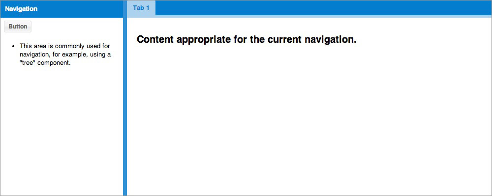
html: '<ul><li>This area is commonly used for navigation, for example, using a "tree" component.</li></ul>',
width: 250,
split: true,
tbar: [{
text: 'Button',
handler: 'onClickButton'
}]
},{
region: 'center',
xtype: 'tabpanel',
items:[{
title: 'Tab 1',
html: '<h2>Content appropriate for the current navigation.</h2>'
}]
}]
Save your "app/view/main/Main.js" file with these changes. This will be the first time you will see "sencha app watch" in action. When the content of this file changes, app watch will detect the change and execute a special set of build steps. Once you see "Waiting for changes..." again, you can refresh your application. You should now see your newly added north region.

That looks a little better, but it's pretty hard to read. Let's try and get that text to pop a bit more.
There's a number of methods in which styles can be modified. The first method is great
for very targeted situations. For instance, let's say you just want to make that
particular text white and be done with it. No other application colors need to change,
and you only care about that bit of black text. In that case, it may make the most
sense to simply add a class config (cls) to your north region like this:
{
    region: 'north',
    xtype: 'component',
    cls: 'appBanner',
    padding: 10,
    height: 40,
    html: 'My Company - My Company Motto'
}
You can then add a CSS rule for appBanner to "sass/etc/all.scss" and give it a color
of white.
.appBanner{
    color:#ffffff;
}
Alternatively, you can include a CSS file by creating it and then adding it to the "my-app/app.json" config file in the "css" array.
"css": [
    {
        "path": "bootstrap.css",
        "bootstrap": true
    },
    {
        "path": "path/to/your/custom/css-file.css"
    }
],
What if you want to have a little more global control over your application's design?
In that case, you will probably want to modify your application's theme (SCSS) files.
SCSS (Sassy CSS) is a syntax of SASS, which allows you to add nested rules, variables and mixins to your design code. These new additions are then processed and converted to traditional CSS files for your application's consumption.
To see a list of global SCSS variables used to modify the overall look of an application, check out this page from our API docs: Global_CSS.
Individual components also have specific SCSS variables for you to change. For instance, you can view specific Panel SCSS variables by visiting the Panel API page: Ext.panel.Panel
The first thing we want to do is create a file called Main.scss in
sass/var/view/main. Some of those folders will not exist yet, but they will be picked
up by sencha app watch when you add them. You may wonder why we're adding a
Main.scss file.
For each class in your application, Sencha Cmd checks for a corresponding SCSS file in
sass/var/ for variables, and sass/src/ for rules. Since the application has a class
named MyApp.view.main.Main, the sass/var/view/main/Main.scss file gets included in the
build if you add it. You could also target any other view by creating a {ViewName}.scss
file under sass/var/view/{namespace}/{ViewName}.scss. It's all up to you and how you
want your SCSS rules to be applied and organized.
In this instance, it would probably make the most sense to extract the north region into its own class definition. Then you could target that toolbar specifically without applying SCSS rules to anything else in the view. However, this illustrates the point without delving too deeply into application structure.
Now, you can add the following variable to the first line of your currently empty
Main.scss file:
$color: #ffffff;
Once the change is picked up, refresh your page and see that your text is now white
(#ffffff). We're doing a simple text color change, but you can change pretty much
anything via SASS variables. For the purpose of this guide, go ahead and comment out
the color change entry you made in Main.scss before proceeding.
For more information on theming applications see the Ext JS Theming guide.

Now that we have some brand identification, let's play around with some other
configurations. That west panel is kind of burdensome now, so let's give the user some
manner of getting it out of the way. The Panel class allows us to set a property called
collapsible. So let's go to the west region panel and add collapsible: true. Your
"app/view/main/Main.js" west region code should now look like this:
{
    xtype: 'panel',
    bind: {
        title: '{name}'
    },
    region: 'west',
    html: '<ul><li>This area is commonly used for navigation, for example, using a "tree" component.</li></ul>',
    width: 250,
    split: true,
    collapsible: true,
    tbar: [{
        text: 'Button',
        handler: 'onClickButton'
    }]
}
Upon refreshing, you should now see that your panel has a small collapsible button.

Then upon collapsing, the application should look like this:

Perhaps you'd like your west region to start off collapsed instead. You guessed it, the
west region item supports a collapsed property. So let's set collapsed: true.
{
    xtype: 'panel',
    bind: {
        title: '{name}'
    },
    region: 'west',
    html: '<ul><li>This area is commonly used for navigation, for example, using a "tree" component.</li></ul>',
    width: 250,
    split: true,
    collapsible: true,
    collapsed: true,
    tbar: [{
        text: 'Button',
        handler: 'onClickButton'
    }]
}
Our application is starting to take shape, but there's only one tab in our center region. That doesn't make much sense. If we're going to have a tabpanel, we should probably have at least two tabs. Let's add another tab with some helpful information. We add tabs by appending another item to the tabpanel items array.
{
    region: 'center',
    xtype: 'tabpanel',
    items: [{
        title: 'Tab 1',
        bodyPadding: 20,
        html: '<h2>Content...</h2>'
    },{
        title: 'The Data'
    }]
}

Great! Now we have two tabs. But the second tab is empty. Ext JS is really great at displaying complex data in a simple to read manner. Let's check out the Grid component and add that to our second tab.
The grid is really composed of four things: the grid itself, the store that houses and organizes the data records, a model that "models" the data for the store, and the data itself. In a real application, you would have all of these split out in the traditional MVC architecture, but for this example, we'll keep everything in-line.
I've modified the 2nd tab to contain a grid with a store, field definitions, and some data. My second tab now looks something like this:
{
    title: 'The Data',
    xtype: 'grid',
    store: {
        fields:['name', 'email', 'phone'],
        data:[
            { name: 'Lisa',  email: "[email protected]",
              phone: "555-111-1224"  },
            { name: 'Bart',  email: "[email protected]",
              phone: "555-222-1234" },
            { name: 'Homer', email: "[email protected]",
              phone: "555-222-1244"  },
            { name: 'Marge', email: "[email protected]",
              phone: "555-222-1254"  }
        ],
        proxy: {
            type: 'memory'
        }
    },
    columns: [
        { text: 'Name',  dataIndex: 'name' },
        { text: 'Email', dataIndex: 'email', flex: 1},
        { text: 'Phone', dataIndex: 'phone' }
    ]
}
It may look like we've added a lot of code here, but we've just created a fully functional grid. By default, each column is sortable and will toggle between ASC and DESC sorting when you click on its header. Each column header is also re-orderable by default, and each gains a drop-down menu with options to hide and show columns. Not only that, but it's incredibly easy to configure each column independently. Upon reloading your application and selecting the "The Data" tab, you should see something like this:

Note: If sencha app watch fails to pick up your changes for any reason,
you can simply stop (CTRL + c) and restart.
The layout system is one of the most powerful parts of Ext JS. It handles the sizing and positioning of every Component in your application. There are many possible layouts in Ext JS including border (which is used as the main layout for our example app), fit to expand the child component to the size of its parent, accordion to show a column of collapsible panels, and many more.
In a real world situation, the above store would commonly have a proxy with a url property. The proxy would most likely be pulling information from a server. We are keeping the data in-line in this example for the sake of visualization. However, most situations would not call for having in-line data.
We've added a lot of neat functionality. Now let's focus on the look and feel of the application. The default theme is generated with every new application unless told otherwise. That said, it's incredibly easy to swap themes once your application has been created.
Let's try out the Ext JS Crisp theme.
All you need to do is open your "my-app/app.json" file in your projects root and change the "theme" value like:
"theme": "ext-theme-crisp"
Once the build has completed, refresh the page and you should see that your application has gotten a facelift.

Now you see how easy it is to get an application up and running using Ext JS and Sencha Cmd. Make sure to check out the API docs for all of the components and classes that we explored throughout this walkthrough.


 Ext JS | Terms of Use
