Components
Many classes have shortcut names used when creating (instantiating) a class with a
configuration object. The shortcut name is referred to as an alias (or xtype if the
class extends Ext.Component). The alias/xtype is listed next to the class name of
applicable classes for quick reference.
Framework classes or their members may be specified as private or protected. Else,
the class / member is public. Public, protected, and private are access
descriptors used to convey how and when the class or class member should be used.
Public classes and class members are available for use by any other class or application code and may be relied upon as a stable and persistent within major product versions. Public classes and members may safely be extended via a subclass.
Protected class members are stable public members intended to be used by the
owning class or its subclasses. Protected members may safely be extended via a subclass.
Private classes and class members are used internally by the framework and are not intended to be used by application developers. Private classes and members may change or be omitted from the framework at any time without notice and should not be relied upon in application logic.
static label next to the
method name. *See Static below.Below is an example class member that we can disect to show the syntax of a class member (the lookupComponent method as viewed from the Ext.button.Button class in this case).
Let's look at each part of the member row:
lookupComponent in this example)( item ) in this example)Ext.Component in this case). This may be omitted for methods that do not
return anything other than undefined or may display as multiple possible values
separated by a forward slash / signifying that what is returned may depend on the
results of the method call (i.e. a method may return a Component if a get method calls is
successful or false if unsuccessful which would be displayed as
Ext.Component/Boolean).PROTECTED in
this example - see the Flags section below)Ext.container.Container in this example). The source
class will be displayed as a blue link if the member originates from the current class
and gray if it is inherited from an ancestor or mixed-in class.view source in the example)item : Object in the example).undefined a "Returns" section
will note the type of class or object returned and a description (Ext.Component in the
example)Available since 3.4.0 - not pictured in
the example) just after the member descriptionDefaults to: false)The API documentation uses a number of flags to further commnicate the class member's function and intent. The label may be represented by a text label, an abbreviation, or an icon.
classInstance.method1().method2().etc();false is returned from
an event handler- Indicates a framework class
- A singleton framework class. *See the singleton flag for more information
- A component-type framework class (any class within the Ext JS framework that extends Ext.Component)
- Indicates that the class, member, or guide is new in the currently viewed version
- Indicates a class member of type config
- Indicates a class member of type property
- Indicates a class member of type
method
- Indicates a class member of type event
- Indicates a class member of type
theme variable
- Indicates a class member of type
theme mixin
- Indicates that the class, member, or guide is new in the currently viewed version
Just below the class name on an API doc page is a row of buttons corresponding to the types of members owned by the current class. Each button shows a count of members by type (this count is updated as filters are applied). Clicking the button will navigate you to that member section. Hovering over the member-type button will reveal a popup menu of all members of that type for quick navigation.
Getting and setter methods that correlate to a class config option will show up in the methods section as well as in the configs section of both the API doc and the member-type menus just beneath the config they work with. The getter and setter method documentation will be found in the config row for easy reference.
Your page history is kept in localstorage and displayed (using the available real estate) just below the top title bar. By default, the only search results shown are the pages matching the product / version you're currently viewing. You can expand what is displayed by clicking on the button on the right-hand side of the history bar and choosing the "All" radio option. This will show all recent pages in the history bar for all products / versions.
Within the history config menu you will also see a listing of your recent page visits. The results are filtered by the "Current Product / Version" and "All" radio options. Clicking on the button will clear the history bar as well as the history kept in local storage.
If "All" is selected in the history config menu the checkbox option for "Show product details in the history bar" will be enabled. When checked, the product/version for each historic page will show alongside the page name in the history bar. Hovering the cursor over the page names in the history bar will also show the product/version as a tooltip.
Both API docs and guides can be searched for using the search field at the top of the page.
On API doc pages there is also a filter input field that filters the member rows using the filter string. In addition to filtering by string you can filter the class members by access level, inheritance, and read only. This is done using the checkboxes at the top of the page.
The checkbox at the bottom of the API class navigation tree filters the class list to include or exclude private classes.
Clicking on an empty search field will show your last 10 searches for quick navigation.
Each API doc page (with the exception of Javascript primitives pages) has a menu view of metadata relating to that class. This metadata view will have one or more of the following:
Ext.button.Button class has an alternate class name of Ext.Button). Alternate class
names are commonly maintained for backward compatibility.Runnable examples (Fiddles) are expanded on a page by default. You can collapse and expand example code blocks individually using the arrow on the top-left of the code block. You can also toggle the collapse state of all examples using the toggle button on the top-right of the page. The toggle-all state will be remembered between page loads.
Class members are collapsed on a page by default. You can expand and collapse members using the arrow icon on the left of the member row or globally using the expand / collapse all toggle button top-right.
Viewing the docs on narrower screens or browsers will result in a view optimized for a smaller form factor. The primary differences between the desktop and "mobile" view are:
The class source can be viewed by clicking on the class name at the top of an API doc page. The source for class members can be viewed by clicking on the "view source" link on the right-hand side of the member row.
An Ext JS application's UI is made up of one or many widgets called Components. All Components are subclasses of the Ext.Component class which allows them to participate in automated lifecycle management including instantiation, rendering, sizing and positioning, and destruction. Ext JS provides a wide range of useful Components out of the box, and any Component can easily be extended to create a customized Component.
A Container is a special type of Component that can contain other Components. A typical application is made up of many nested Components in a tree-like structure that is referred to as the Component hierarchy. Containers are responsible for managing the Component lifecycle of their children, which includes creation, rendering, sizing and positioning, and destruction. A typical application's Component hierarchy starts with a Viewport at the top, which has other Containers and/or Components nested within it:
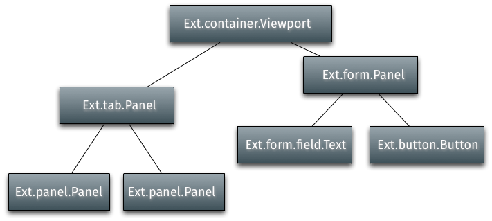
Child Components are added to a Container using the Container's items configuration property. This example uses Ext.create() to instantiate two Panels, then adds those Panels as child Components of a Viewport:
Containers use Layout Managers to size and position their child Components. For more information on Layouts and Containers please refer to the Layouts and Containers Guide.
Every Component has a symbolic name called an xtype. For
example Ext.panel.Panel has an xtype of 'panel'.
The above example showed how to add already instantiated Components
to a Container.
In a large application, however, this is not ideal since not all of the Components need to
be instantiated right away,
and some Components might never be instantiated depending on how the application is used.
For example an application that uses a Tab Panel
will only need the contents of each tab to be rendered if and when each tab is clicked on
by the user. This is where xtypes come in handy
by allowing a Container's children to be configured up front, but not instantiated until
the Container determines it is necessary.
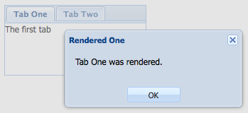
The following example code demonstrates lazy instantiation and rendering of a Container's Child components using a Tab Panel. Each tab has an event listener that displays an alert when the tab is rendered.
Running this code results in an immediate alert for the first tab. This happens because it is the default active tab, and so its Container Tab Panel instantiates and renders it immediately.
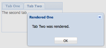
The alert for the second tab does not get displayed until the tab is clicked on. This shows that the tab was not rendered until needed, since the render event did not fire until the tab was activated.
All Components have built in show and hide methods. The default CSS method used to hide the Component is "display: none", but this can be changed using the hideMode configuration:
    var panel = Ext.create('Ext.panel.Panel', {
        renderTo: Ext.getBody(),
        title: 'Test',
        html: 'Test Panel',
        hideMode: 'visibility' // use the CSS visibility property to show and hide this
component
    });

    panel.hide(); // hide the component

    panel.show(); // show the component
Floating Component are positioned outside of the document flow using CSS absolute positioning, and do not participate in their Containers' layout. Some Components such as Windows are floating by default, but any Component can be made floating using the floating configuration.
var panel = Ext.create('Ext.panel.Panel', {
    width: 200,
    height: 100,
    floating: true, // make this panel an absolutely-positioned floating component
    title: 'Test',
    html: 'Test Panel'
});
The above code instantiates a Panel but does not render it. Normally a Component either has a renderTo configuration specified, or is added as a child Component of a Container, but in the case of floating Components neither of these is needed. Floating Components are automatically rendered to the document body the first time their show method is called:
panel.show(); // render and show the floating panel
Here are a few other configurations and methods to make note of related to floating components:
When creating a new UI class, the decision must be made whether that class should own an instance of a Component, or to extend that Component.
It is recommended to extend the nearest base class to the functionality required. This is because of the automated lifecycle management Ext JS provides which includes automated rendering when needed, automatic sizing and positioning of Components when managed by an appropriate layout manager, and automated destruction on removal from a Container.
It is easier to write a new class which is a Component and can take its place in the Component hierarchy rather than a new class which has an Ext JS Component, and then has to render and manage it from outside.
The Class System makes it easy to extend any part of the Ext JS framework.
Ext.Base is the building block of all Ext JS classes, and the prototype and static members of this class are inherited by all other classes.
While you can certainly begin adding functionality at the lowest possible level via Ext.Base, in many cases developers want to start a bit higher in the inheritance chain.
The following example creates a subclass of Ext.Component:
Ext.define('My.custom.Component', {
    extend: 'Ext.Component',

    newMethod : function() {
       //...
    }
});
This example creates a new class, My.custom.Component, which inherits all of the functionality (methods, properties, etc.) of Ext.Component in addition to any new methods or properties defined.
Ext JS uses the Template method pattern to delegate to subclasses, behavior which is specific only to that subclass.
This means each class in the inheritance chain may "contribute" an extra piece of logic to certain phases in the Component's lifecycle. Each class implements its own special behavior while allowing the other classes in the inheritance chain to continue to contribute their own logic.
An example is the render function. render is a method defined in
Component. It is responsible for initiating the
rendering phase of the Component lifecycle.
render must not be overridden, but it calls onRender during processing to allow the
subclass implementor to add an onRender
method to perform class-specific processing. Every onRender method must call its
superclass' onRender method before "contributing" its extra logic.
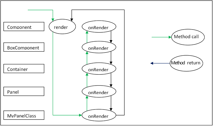
The diagram below illustrates the functioning of the onRender template method.
The render method is called (This is done by a Container's layout manager). This method
may not be overridden and is implemented by the Ext base class.
It calls this.onRender which is the implementation within the current subclass (if
implemented).
This calls the superclass version which calls its superclass version etc. Eventually, each
class has contributed its functionality, and control returns to the render function.
Here is an example of a Component subclass that implements the onRender method:
Ext.define('My.custom.Component', {
    extend: 'Ext.Component',
    onRender: function() {
        this.callParent(arguments); // call the superclass onRender method

        // perform additional rendering tasks here.
    }
});
It is important to note that many of the template methods also have a corresponding event. For example the render event is fired after the Component is rendered. When subclassing, however, it is it is essential to use template methods to perform class logic at important phases in the lifecycle and not events. Events may be programmatically suspended, or may be stopped by a handler.
Below are the template methods that can be implemented by subclasses of Component:
initComponent
This method is invoked by the constructor. It is used to initialize data, set up
configurations, and attach event handlers.beforeShow
This method is invoked before the Component is shown.onShow
Allows addition of behavior to the show operation. After calling the superclass's onShow,
the Component will be visible.afterShow
This method is invoked after the Component is shown.onShowComplete
This method is invoked after the afterShow method is completeonHide
Allows addition of behavior to the hide operation. After calling the superclass's onHide,
the Component will be hidden.afterHide
This method is invoked after the Component has been hiddenonRender
Allows addition of behavior to the rendering phase.afterRender
Allows addition of behavior after rendering is complete. At this stage the Component's
Element will have been styled according to the configuration,
will have had any configured CSS class names added, and will be in the configured
visibility and the configured enable state.onEnable
Allows addition of behavior to the enable operation. After calling the superclass's
onEnable, the Component will be enabled.onDisable
Allows addition of behavior to the disable operation. After calling the superclass's
onDisable, the Component will be disabled.onAdded
Allows addition of behavior when a Component is added to a Container. At this stage, the
Component is in the parent Container's collection of child items.
After calling the superclass's onAdded, the ownerCt reference will be present, and if
configured with a ref, the refOwner will be set.onRemoved
Allows addition of behavior when a Component is removed from its parent Container. At this
stage, the Component has been removed from its parent Container's
collection of child items, but has not been destroyed (It will be destroyed if the parent
Container's autoDestroy is true, or if the remove call was passed a truthy second
parameter).
After calling the superclass's onRemoved, the ownerCt and the refOwner will not be
present.onResize
Allows addition of behavior to the resize operation.onPosition
Allows addition of behavior to the position operation.onDestroy
Allows addition of behavior to the destroy operation. After calling the superclass's
onDestroy, the Component will be destroyed.beforeDestroy
This method is invoked before the Component is destroyed.afterSetPosition
This method is invoked after the Components position has been set.afterComponentLayout
This method is invoked after the Component is laid out.beforeComponentLayout
This method is invoked before the Component is laid out.Choosing the best class to extend is mainly a matter of efficiency, and which capabilities the base class must provide. There has been a tendency to always extend Ext.panel.Panel whenever any set of UI Components needs to be rendered and managed.
The Panel class has many capabilities:
If these are not needed, then using a Panel is a waste of resources.
If the required UI Component does not need to contain any other Components, that is, if it
just to encapsulate some form of HTML which performs the requirements,
then extending Ext.Component is appropriate. For example, the following class is a
Component that wraps an HTML image element, and allows setting
and getting of the image's src attribute. It also fires a load event when the image is
loaded:
Ext.define('Ext.ux.Image', {
    extend: 'Ext.Component', // subclass Ext.Component
    alias: 'widget.managedimage', // this component will have an xtype of 'managedimage'

    autoEl: {
        tag: 'img',
        src: Ext.BLANK_IMAGE_URL,
        cls: 'my-managed-image'
    },

    // Add custom processing to the onRender phase.
    // Add a 'load' listener to the element.
    onRender: function() {
        this.autoEl = Ext.apply({}, this.initialConfig, this.autoEl);
        this.callParent(arguments);
        this.el.on('load', this.onLoad, this);
    },

    onLoad: function() {
        this.fireEvent('load', this);
    },

    setSrc: function(src) {
        if (this.rendered) {
            this.el.dom.src = src;
        } else {
            this.src = src;
        }
    },

    getSrc: function(src) {
        return this.el.dom.src || this.src;
    }
});
Usage:
var image = Ext.create('Ext.ux.Image');

Ext.create('Ext.panel.Panel', {
    title: 'Image Panel',
    height: 200,
    renderTo: Ext.getBody(),
    items: [ image ]
});

image.on('load', function() {
    console.log('image loaded: ', image.getSrc());
});

image.setSrc('http://www.sencha.com/img/sencha-large.png');
This example is for demonstration purposes only - the Ext.Img class should be used for managing images in a real world application.
If the required UI Component is to contain other Components, but does not need any of the previously mentioned additional capabilities of a Panel, then Ext.container.Container is the appropriate class to extend. At the Container level, it is important to remember which Ext.layout.container.Container is to be used to render and manage child Components.
Containers have the following additional template methods:
onBeforeAdd
This method is invoked before adding a new child Component. It is passed the new
Component, and may be used to modify the Component, or prepare the Container in some way.
Returning false aborts the add operation.onAdd
This method is invoked after a new Component has been added. It is passed the Component
which has been added. This method may be used to update any internal structure which may
depend upon the state of the child items.onRemove
This method is invoked after a new Component has been removed. It is passed the Component
which has been removed. This method may be used to update any internal structure which may
depend upon the state of the child items.beforeLayout
This method is invoked before the Container has laid out (and rendered if necessary) its
child Components.afterLayout
This method is invoked after the Container has laid out (and rendered if necessary) its
child Components.If the required UI Component must have a header, footer, or toolbars, then Ext.panel.Panel is the appropriate class to extend.
Important: A Panel is a Container. It is important to remember which Layout is to be used to render and manage child Components.
Classes which extend Ext.panel.Panel are usually highly application-specific and are generally used to aggregate other UI Components (Usually Containers, or form Fields) in a configured layout, and provide means to operate on the contained Components by means of controls in the tbar and the bbar.
Panels have the following additional template methods:
afterCollapse
This method is invoked after the Panel is Collapsed.afterExpand
This method is invoked after the Panel is expandedonDockedAdd
This method is invoked after a docked item is added to the PanelonDockedRemove
This method is invoked after a docked item is removed from the Panel


 Ext JS | Terms of Use
