First Desktop Application
Many classes have shortcut names used when creating (instantiating) a class with a
configuration object. The shortcut name is referred to as an alias (or xtype if the
class extends Ext.Component). The alias/xtype is listed next to the class name of
applicable classes for quick reference.
Framework classes or their members may be specified as private or protected. Else,
the class / member is public. Public, protected, and private are access
descriptors used to convey how and when the class or class member should be used.
Public classes and class members are available for use by any other class or application code and may be relied upon as a stable and persistent within major product versions. Public classes and members may safely be extended via a subclass.
Protected class members are stable public members intended to be used by the
owning class or its subclasses. Protected members may safely be extended via a subclass.
Private classes and class members are used internally by the framework and are not intended to be used by application developers. Private classes and members may change or be omitted from the framework at any time without notice and should not be relied upon in application logic.
static label next to the
method name. *See Static below.Below is an example class member that we can disect to show the syntax of a class member (the lookupComponent method as viewed from the Ext.button.Button class in this case).
Let's look at each part of the member row:
lookupComponent in this example)( item ) in this example)Ext.Component in this case). This may be omitted for methods that do not
return anything other than undefined or may display as multiple possible values
separated by a forward slash / signifying that what is returned may depend on the
results of the method call (i.e. a method may return a Component if a get method calls is
successful or false if unsuccessful which would be displayed as
Ext.Component/Boolean).PROTECTED in
this example - see the Flags section below)Ext.container.Container in this example). The source
class will be displayed as a blue link if the member originates from the current class
and gray if it is inherited from an ancestor or mixed-in class.view source in the example)item : Object in the example).undefined a "Returns" section
will note the type of class or object returned and a description (Ext.Component in the
example)Available since 3.4.0 - not pictured in
the example) just after the member descriptionDefaults to: false)The API documentation uses a number of flags to further commnicate the class member's function and intent. The label may be represented by a text label, an abbreviation, or an icon.
classInstance.method1().method2().etc();false is returned from
an event handler- Indicates a framework class
- A singleton framework class. *See the singleton flag for more information
- A component-type framework class (any class within the Ext JS framework that extends Ext.Component)
- Indicates that the class, member, or guide is new in the currently viewed version
- Indicates a class member of type config
- Indicates a class member of type property
- Indicates a class member of type
method
- Indicates a class member of type event
- Indicates a class member of type
theme variable
- Indicates a class member of type
theme mixin
- Indicates that the class, member, or guide is new in the currently viewed version
Just below the class name on an API doc page is a row of buttons corresponding to the types of members owned by the current class. Each button shows a count of members by type (this count is updated as filters are applied). Clicking the button will navigate you to that member section. Hovering over the member-type button will reveal a popup menu of all members of that type for quick navigation.
Getting and setter methods that correlate to a class config option will show up in the methods section as well as in the configs section of both the API doc and the member-type menus just beneath the config they work with. The getter and setter method documentation will be found in the config row for easy reference.
Your page history is kept in localstorage and displayed (using the available real estate) just below the top title bar. By default, the only search results shown are the pages matching the product / version you're currently viewing. You can expand what is displayed by clicking on the button on the right-hand side of the history bar and choosing the "All" radio option. This will show all recent pages in the history bar for all products / versions.
Within the history config menu you will also see a listing of your recent page visits. The results are filtered by the "Current Product / Version" and "All" radio options. Clicking on the button will clear the history bar as well as the history kept in local storage.
If "All" is selected in the history config menu the checkbox option for "Show product details in the history bar" will be enabled. When checked, the product/version for each historic page will show alongside the page name in the history bar. Hovering the cursor over the page names in the history bar will also show the product/version as a tooltip.
Both API docs and guides can be searched for using the search field at the top of the page.
On API doc pages there is also a filter input field that filters the member rows using the filter string. In addition to filtering by string you can filter the class members by access level, inheritance, and read only. This is done using the checkboxes at the top of the page.
The checkbox at the bottom of the API class navigation tree filters the class list to include or exclude private classes.
Clicking on an empty search field will show your last 10 searches for quick navigation.
Each API doc page (with the exception of Javascript primitives pages) has a menu view of metadata relating to that class. This metadata view will have one or more of the following:
Ext.button.Button class has an alternate class name of Ext.Button). Alternate class
names are commonly maintained for backward compatibility.Runnable examples (Fiddles) are expanded on a page by default. You can collapse and expand example code blocks individually using the arrow on the top-left of the code block. You can also toggle the collapse state of all examples using the toggle button on the top-right of the page. The toggle-all state will be remembered between page loads.
Class members are collapsed on a page by default. You can expand and collapse members using the arrow icon on the left of the member row or globally using the expand / collapse all toggle button top-right.
Viewing the docs on narrower screens or browsers will result in a view optimized for a smaller form factor. The primary differences between the desktop and "mobile" view are:
The class source can be viewed by clicking on the class name at the top of an API doc page. The source for class members can be viewed by clicking on the "view source" link on the right-hand side of the member row.
This guide provides step-by-step instructions for using Sencha Architect to build a web application that runs in a desktop browser or on a tablet. The example application is called Car Listings and uses the Ext JS 6.x framework using the classic toolkit (though you may substitute older versions of Ext JS in its place as you follow along through the guide).
Car Listings is a simple application that illustrates the use of data binding. In the final application, the user selects a car in a grid to see details about the car, including a picture of it. By the end of this tutorial, you should have a better understanding of how to build and configure views, how to model data, and how to bind your data to views.
Before using this guide, do the following:
Download, install, and set up Architect, then set up a web server and create a directory for your projects on the web server, following the instructions in Installation and Set-Up and in Save, Preview, and Build.
Download the data files example to a convenient place in your file system. (The complete project source for the example can be downloaded as an archive or you can view the GitHub repository.)
To begin your project:
After the Architect interface loads, immediately save the project. When prompted, enter the following:
Upon save completion, an "Application Rename" dialog will appear. You can click "No" since this is a fresh application.
The project should then begin initializing Cmd.
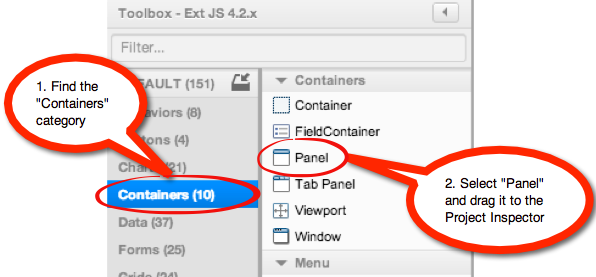
Add a Panel component to the project: Search for the Containers category in the
Toolbox and drag the Panel to the Canvas in the center of the application.
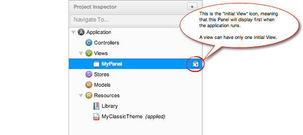
Initial View: After creating the Panel, MyPanel is listed under the Views node in the
Project Inspector. The Initial View indicator appears on the right-hand side. Position
the cursor over it and Architect should display the message This component is your
Initial View. This means that the Panel will display first when the application runs.
Notice that the initialView config is checked in the Config Panel as well. An
application can have only one Initial View.
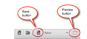
Save your project again
Preview your project by clicking the "Preview" button in the Toolbar.
If you are using the Sencha Cmd web server, set the URL Prefix to the http://localhost:1841/ address.
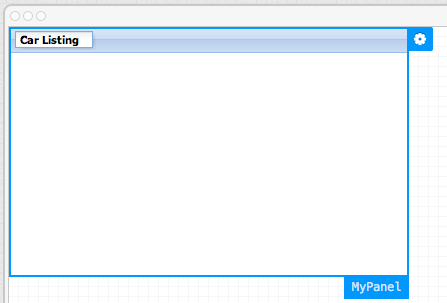
A browser window launches showing the single Panel you added to the project.
As you progress through the tutorial, you can see the code for your project at any time. Select a component in the Canvas or Project Inspector and use the "Design" and "Code" toggles in the upper-right of the Canvas to switch between Design and Code views respectively.
Double-click the title of your Panel and change it to Car Listing.
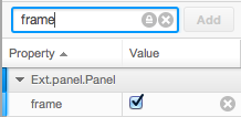
Change the frame config to true by checking the checkbox in the Config panel.
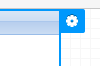
Select the Panel and click the fly-out Config button (the gear at the upper right). Set
the layout config to vbox. This arranges future child components of the Panel
vertically.
Drag a Grid Panel from the "Grids" category of the Toolbox and drop it on the Panel
container in the Canvas. Note that you set the layout for the
top-level View component (in this case, the panel) to control how the sub-components will
be arranged.
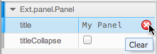
Remove the title bar from the grid by selecting the grid in the Canvas or Inspector and clicking the clear icon ("x") to the right of the title configuration in the Config panel.
Change the userClassName configuration for the top-level Panel from MyPanel to
CarListings. This changes its name in the Project Inspector. It also changes the name
of the generated JavaScript class in the Ext.define of the underlying source code.
Note: We use vbox layout here because we intend
to add more panels in a vertical stack. The above example alone could have been achieved
with a single Grid Panel with the frame configuration set to true.
If you preview the application now, you see an empty grid without data and the default column headers -- String, Number, Date, and Boolean. This is because we have not bound our grid to a data Store. Let's bind our grid to a new Store and load in information about some sports cars.
Move your downloaded and and unzipped data files to
your project directory. The data folder should be at the same level as your CarListings.xds file.
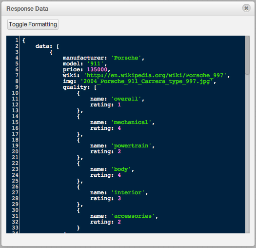
If you open the cars.json file in a plain text editor, you can see the format of the
data and the key value pairs. Let's take a closer look at the entry for the Porsche 911
(wrapped for readability).
{
    data: [{
        manufacturer: 'Porsche',
        model: '911',
        price: 135000,
        wiki: 'http://en.wikipedia.org/wiki/Porsche_997',
        img: '2004_Porsche_911_Carrera_type_997.jpg',
        quality:
          [{name: 'overall', rating:1},
          {name: 'mechanical', rating: 4},
          {name: 'powertrain', rating: 2},
          {name: 'body', rating: 4},
          {name: 'interior', rating: 3},
          {name: 'accessories', rating: 2}]
    },{
        ...
    }]
}
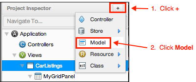
Next, we will create a Model to represent this data in Architect.
Let's create a Model with the proper fields (keys) that we would like to know about the car entity.
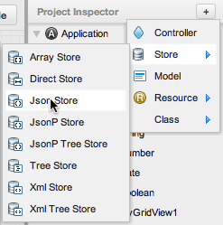
Click the Add button ("+") at the top right of the Project Inspector and click
Model. A new Model named MyModel appears under the Models node of the Project
Inspector.
Select the newly created Model and set its userClassName config to CarData.
Search for fields in the Config panel. Click the Add button ("+"), and when prompted
to Enter one or more field names, type in the field names separated by commas:
manufacturer, model, price, wiki, img, quality
Click Finish or press Enter.
Now that we have a Model representing the data structure, we can create a Store that uses
the CarData Model.
Click the "Add" button ("+") at the top right of the Project Inspector and select Json Store under the Store sub-menu. A new Store is created named "MyJsonStore". It appears under the Stores node of the Inspector.
Note: A JsonStore automatically adds a JsonReader and makes the assumption that we will load our data in JSON format.
A warning icon should appear to the right-hand side of the newly created Store in the Inspector, indicating that there is a problem with the Stores configuration. Clicking on the icon will provide more detailed information as to why the configuration is invalid.
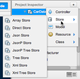
Select the Store in the Inspector and set the model config to CarData. The
warning icon should go away. We'll fix the warning for MyAjaxProxy in Step 5.
Select the Store and set its userClassName configuration to CarDataStore. The
Store's name should update in the Inspector.
Select the Store and set its userAlias configuration to cardatastore.
Select AjaxProxy underneath the CarDataStore and set its url to
data/cars.json. Note that this URL is relative to your project. Your URL prefix must
be set properly to load data within Architect.
Right-click CarDataStore and click Load Data.
Note: The Load Data feature in the context menu becomes enabled when the url
configuration of the proxy or data configuration of the Store has been set.
Positioning the cursor over the eye icon displays the number of records that have been loaded into your Store. Note that only one record was loaded.
Click the eye icon to see the response data. Looking at the response data, you can
see that individual entities are within a data array. This is why only one record was
loaded. Select the JsonReader in the Inspector and set its rootProperty config to
data (or the root config on previous versions of Ext JS). Your Store has now been
properly configured.
Right-click CarDataStore and click Load Data again. Because we made changes to the
store's configuration that would affect data loading, Architect has cleared the data
cache.
Finally, set the autoLoad configuration on the Store to true so that we do not
have to programmatically load it.
Next, we will bind the grid to the Store. Because the grid is bound to the Store, any time records inside of the Store change, the grid automatically updates itself to reflect the changes. Additionally, if any records are added to or removed from the Store, they are also reflected in the grid.
Select the Grid Panel in the Inspector. Set its store configuration to
CarDataStore. Notice that all the data disappears because our mappings are not set up
yet.
Right-click the Grid Panel in the Inspector and select "Grid Builder" You should now see a new modal window that displays a column for each of the fields we entered earlier!
Check the "Remove Existing" box at the bottom of the window to delete the default columns.
Click generate, and you should see all of your fields turn into columns on your grid.
Note: If you're using an older version of Architect, you can use "Auto Columns" instead of "Grid Builder".
Save your application and click on "Preview". You can see your grid and its data in your browser.
If you see a blank screen and/or a blank grid in your browser, ensure the following:
autoLoad config is set on the StoreYou have completed the first major step to building the CarListings application.
Next, we add a detail panel to display additional information about each entry in the grid as a user selects individual records.
Select the top-level CarListings Panel. Resize the Panel by dragging the lower border of the panel downward so that it is big enough to accommodate a detail panel. Make it approximately double the height.
With the CarListing panel still selected, search for "panel" in the Toolbox. Double click "Panel" to add a new Panel to the currently selected item in the Project Inspector. This is an alternate and frequently faster way of adding components rather than dragging and dropping.
Select the newly added Panel. Search for the tpl config and click the "Add" button ("+") to its right. All components have a tpl config, which accept an XTemplate. Refer to the XTemplate reference to learn more about the templating library.
Once the tpl config has been added, click the forward arrow icon to its right to open the code editor in the center stage. Paste the following template into the code editor:
`<img src="data/{img}" style="float: right" />
Manufacturer: {manufacturer}
Model: <a href="{wiki}" target="_blank">{model}</a><br>
Price: {price:usMoney}`
The curly brackets with names in them represent variables that conveniently correspond to
the fields in our CarData model.
Note: These steps are order-dependent. When containers have a vbox or hbox
layout set, their newly added child items automatically get their flex
configurations set to 1. If you add the child items before setting the layout to
vbox, you need to manually set each of the child items flex settings to 1.
Let's add the code that glues together the two panels via an Event Binding. When a user chooses a particular entry in the grid, we want the application to show the detailed information below it in the detail panel using the template that we just set up.
Select the panel you added last (the one with the template) and set its itemId
configuration to "detailPanel". This lets the application easily retrieve a reference to
this specific panel within the CarListings class.
Clear the title configuration.
Select the grid panel in the Project Inspector, search for the View Controller Event Bindings
config, and click the "Add" button ("+") to its right. Choose the select event and
click "Finish" or press Enter.
Click the arrow icon to select the new event binding. Architect has already generated
a sensible method name for the new function but you can change this with the fn config
if you would like.
Double-click the event binding in the Project Inspector to display the Code view for this event handler. Notice that we will only be writing the method body. Function arguments have already been defined for us.
Paste the following code into the event handler.
 // grab a reference to the detailPanel via itemId
 // the # in front of the id indicates that we would like to grab a reference by
 var detailPanel = Ext.ComponentQuery.query('#detailPanel')[0];
 // update the detailPanel with data
 // this will trigger the tpl to become updates
 detailPanel.update(record.data);
Save the project and preview it in the browser. When you select a particular record in the grid, additional information should appear in the bottom panel.
To start the final leg of this project, we will add a Chart to display the quality of a selected car.
Add a second Model to the Inspector. Set its userClassName config to CarChart.
Examine the contents of the quality field as shown below. We are already loading
the quality field into the CarStore from cars.json. We are now creating an
additional Model to hold its contents specifically for charting.
 "quality" : [{
     "name" : "overall",
     "rating" : 1
 },{
     "name" : "mechanical",
     "rating" : 4
 },{
     "name" : "powertrain",
     "rating" : 2
 },{
     "name" : "body",
     "rating" : 4
 },{
     "name" : "interior",
     "rating" : 3
 },{
     "name" : "accessories",
     "rating" : 2
 }]
In the Config panel, add two fields to the CarChart Model that map directly to each
key defined in the quality field. Create two fields in the Model named name and
rating. These fields will map directly to cars.json.
Create a Store and set its userClassName to CarChartStore. Directly clicking
the submenu Store creates a plain Store without a proxy or reader.
Link the CarChart Model to CarChartStore by setting the model config on the
Store to the CarChart Model.
Resize the CarListings panel if you need additional room for the chart to fit below.
Drag an additional Panel onto the CarListings Panel. Drop it on the title of the
Panel or the Views node in the Inspector. Because the grid is stretched to the size of
the top-level Panel, you cannot drop it in the center. Alternately, you can select the
top-level Panel and then double-click Panel in the Toolbox.
Set its itemId configuration to chartPanel.
Drag a Column Chart onto the third Panel (the last Panel you added, which should be the bottom-most Panel in the Canvas).
Select the newly created Panel in the Inspector, then click its fly-out config button
(gear on top-right) in the Canvas, and set its layout to fit. This stretches the chart
in both directions to fit its parent Panel.
Clear the title configuration of both the middle and bottom panel.
Add margins around the middle and bottom panels. Select the middle Panel
(detailPanel) in the Inspector, type "margins" into the filter field.
Set margin to 5 0 0 0. (Be careful to set the margins configuration for
Ext.layout.container.VBox and not the margin
configuration for Ext.Component.) Add the same
margins to the bottom Panel (chartPanel).
Click the fly-out config button on the Chart panel and select CarChartStore
to bind the Chart component to the JSON Store.
Note: This makes the chart disappear and that's OK for now. We only care that it shows up when a user selects a record.
Select Category Axis under the chart in the Inspector to edit the chart's x axis.
This Category Axis displays the categories for the quality of the cars in the CarListing
app. Make the following changes:
title configuration to Quality.Change its fields configuration from x to name.
The name field provides values for the x-axis of the chart -- the quality categories.
Select Numeric Axis under the chart in the Inspector to edit the chart's y axis.
The Numeric axis will display the values for each car quality category. Make the
following changes:
Score.Change the fields configuration from y to rating.
This configuration determines what is rendered on the axis but does not actually influence the columns rendered on the chart.
Change the value of the maximum configuration to 5, which will be the maximum
value for the y-axis.
Change the value of the minimum configuration to 0, which will be the minimum
value for the y-axis. This is important because it causes numbering on the y axis to
begin at 0 rather than at the lowest-reported value.
Change the value of the majorTickSteps configuration to 4. This determines how
many markers are in between the minimum and maximum.
Select MyBarSeries under the chart in the Inspector. In the Config panel, find
the label config and change it to the following:
   {
     display: 'insideEnd',
     field: 'rating',
     color: '#333',
     'text-anchor': 'middle'
 }
Note: We had to quote the key text-anchor because it has - in the key name.
Make the following additional changes to the MyBarSeries. These configurations
determine the actual columns that are rendered as a series on the chart.\
Change the xField configuration to name.
Change the yField configuration to rating.
Set the itemId configuration of the chart to qualityChart so that we can access
it via code.
Add the following code in onGridpanelSelect (the event handler added to the grid
earlier in the tutorial) to update the charts Store when the user selects a record.
 // grab a reference to the qualityChart, notice we use down here instead of child
 // because down will go down the container hierarchy at any depth and child
 // only retrieves direct children
 var chart = Ext.ComponentQuery.query('#qualityChart')[0];
 // get the quality field out of this record
 var qualityData = record.get('quality');
 chart.store.loadData(qualityData);
For more information about the Ext JS Charting API, see the Ext.chart.CartesianChart API doc page.
Let's have a look at the application running in a browser.
When you first save a project, Architect puts all the files needed to run it -- including
.html and .js files as well as .js files for Controllers, Models, Stores, and Views
-- in the directory indicated when you first saved the project. Every time you build
again, Architect updates all the files automatically.
To see the final application, launch a browser or simply click Preview and the
application UI should display. Click on a grid row, and the car detail should display
along with the car image and the chart showing the car quality data for various
categories.


 Architect | Terms of Use
