Using the Inspector
Many classes have shortcut names used when creating (instantiating) a class with a
configuration object. The shortcut name is referred to as an alias (or xtype if the
class extends Ext.Component). The alias/xtype is listed next to the class name of
applicable classes for quick reference.
Framework classes or their members may be specified as private or protected. Else,
the class / member is public. Public, protected, and private are access
descriptors used to convey how and when the class or class member should be used.
Public classes and class members are available for use by any other class or application code and may be relied upon as a stable and persistent within major product versions. Public classes and members may safely be extended via a subclass.
Protected class members are stable public members intended to be used by the
owning class or its subclasses. Protected members may safely be extended via a subclass.
Private classes and class members are used internally by the framework and are not intended to be used by application developers. Private classes and members may change or be omitted from the framework at any time without notice and should not be relied upon in application logic.
static label next to the
method name. *See Static below.Below is an example class member that we can disect to show the syntax of a class member (the lookupComponent method as viewed from the Ext.button.Button class in this case).
Let's look at each part of the member row:
lookupComponent in this example)( item ) in this example)Ext.Component in this case). This may be omitted for methods that do not
return anything other than undefined or may display as multiple possible values
separated by a forward slash / signifying that what is returned may depend on the
results of the method call (i.e. a method may return a Component if a get method calls is
successful or false if unsuccessful which would be displayed as
Ext.Component/Boolean).PROTECTED in
this example - see the Flags section below)Ext.container.Container in this example). The source
class will be displayed as a blue link if the member originates from the current class
and gray if it is inherited from an ancestor or mixed-in class.view source in the example)item : Object in the example).undefined a "Returns" section
will note the type of class or object returned and a description (Ext.Component in the
example)Available since 3.4.0 - not pictured in
the example) just after the member descriptionDefaults to: false)The API documentation uses a number of flags to further commnicate the class member's function and intent. The label may be represented by a text label, an abbreviation, or an icon.
classInstance.method1().method2().etc();false is returned from
an event handler- Indicates a framework class
- A singleton framework class. *See the singleton flag for more information
- A component-type framework class (any class within the Ext JS framework that extends Ext.Component)
- Indicates that the class, member, or guide is new in the currently viewed version
- Indicates a class member of type config
- Indicates a class member of type property
- Indicates a class member of type
method
- Indicates a class member of type event
- Indicates a class member of type
theme variable
- Indicates a class member of type
theme mixin
- Indicates that the class, member, or guide is new in the currently viewed version
Just below the class name on an API doc page is a row of buttons corresponding to the types of members owned by the current class. Each button shows a count of members by type (this count is updated as filters are applied). Clicking the button will navigate you to that member section. Hovering over the member-type button will reveal a popup menu of all members of that type for quick navigation.
Getting and setter methods that correlate to a class config option will show up in the methods section as well as in the configs section of both the API doc and the member-type menus just beneath the config they work with. The getter and setter method documentation will be found in the config row for easy reference.
Your page history is kept in localstorage and displayed (using the available real estate) just below the top title bar. By default, the only search results shown are the pages matching the product / version you're currently viewing. You can expand what is displayed by clicking on the button on the right-hand side of the history bar and choosing the "All" radio option. This will show all recent pages in the history bar for all products / versions.
Within the history config menu you will also see a listing of your recent page visits. The results are filtered by the "Current Product / Version" and "All" radio options. Clicking on the button will clear the history bar as well as the history kept in local storage.
If "All" is selected in the history config menu the checkbox option for "Show product details in the history bar" will be enabled. When checked, the product/version for each historic page will show alongside the page name in the history bar. Hovering the cursor over the page names in the history bar will also show the product/version as a tooltip.
Both API docs and guides can be searched for using the search field at the top of the page.
On API doc pages there is also a filter input field that filters the member rows using the filter string. In addition to filtering by string you can filter the class members by access level, inheritance, and read only. This is done using the checkboxes at the top of the page.
The checkbox at the bottom of the API class navigation tree filters the class list to include or exclude private classes.
Clicking on an empty search field will show your last 10 searches for quick navigation.
Each API doc page (with the exception of Javascript primitives pages) has a menu view of metadata relating to that class. This metadata view will have one or more of the following:
Ext.button.Button class has an alternate class name of Ext.Button). Alternate class
names are commonly maintained for backward compatibility.Runnable examples (Fiddles) are expanded on a page by default. You can collapse and expand example code blocks individually using the arrow on the top-left of the code block. You can also toggle the collapse state of all examples using the toggle button on the top-right of the page. The toggle-all state will be remembered between page loads.
Class members are collapsed on a page by default. You can expand and collapse members using the arrow icon on the left of the member row or globally using the expand / collapse all toggle button top-right.
Viewing the docs on narrower screens or browsers will result in a view optimized for a smaller form factor. The primary differences between the desktop and "mobile" view are:
The class source can be viewed by clicking on the class name at the top of an API doc page. The source for class members can be viewed by clicking on the "view source" link on the right-hand side of the member row.
The Inspector enables users of Sencha Test to easily locate components in a running Ext JS Application and create both locator strings as well as Page Objects for accessing those components in tests.
View hierarchy of all components on an Ext JS application page.
Add components from that hierarchy to a list of selected locators.
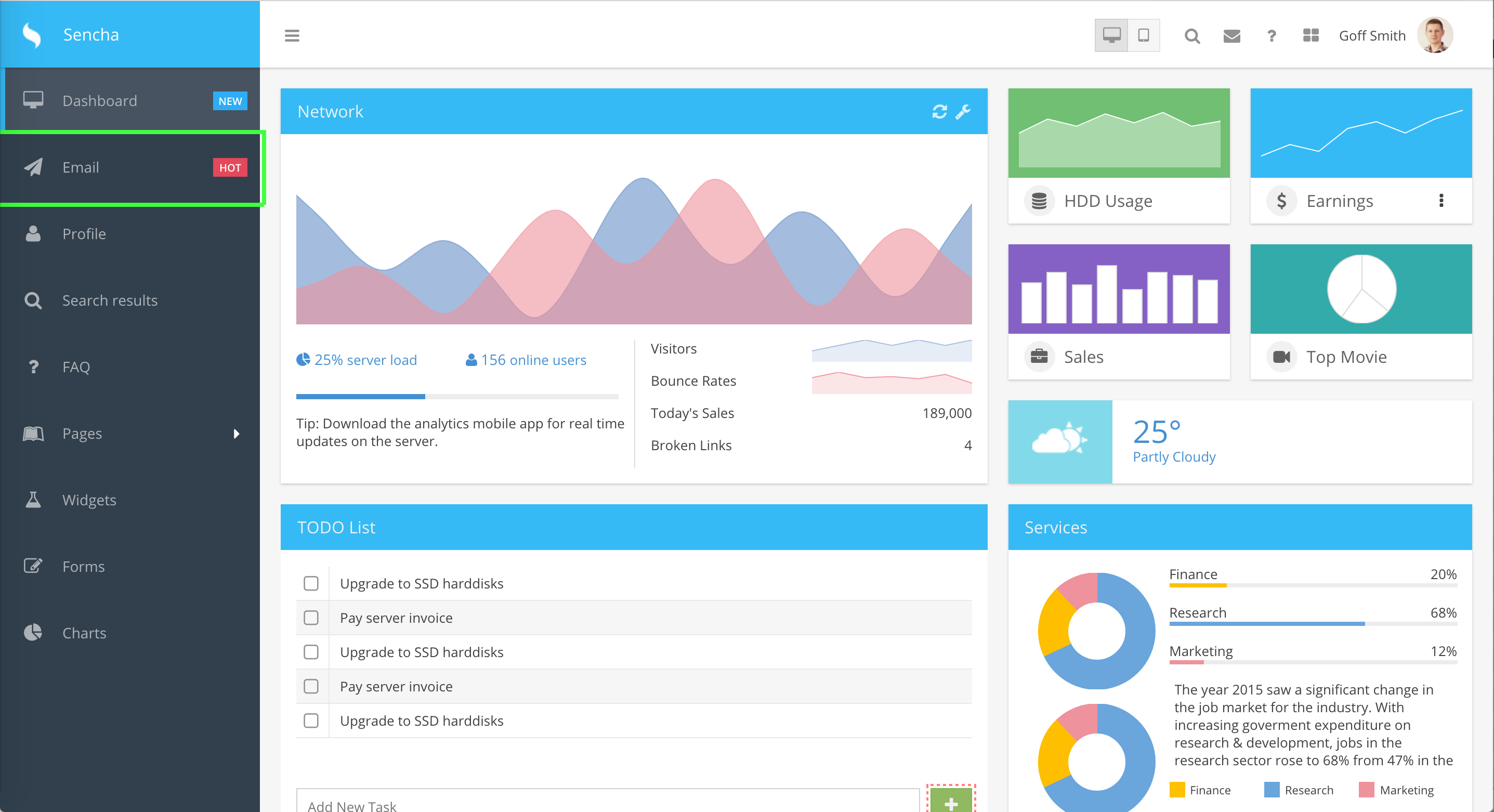
Hover over the Ext JS application page in a browser and click to select components. These components are then added to the list of selected locators.
When clicking on hierarchy components or selected locators Inspector will attempt to highlight the component in the browser with a green rectangle.
Selected locators may be given a page name and individual names and saved as Page
Objects to be used in tests as stpo.
A wizard is available to add hierarchical parents to the locator as well as advanced properties as well.
Selected locators can simply be inserted into the current test as ST Futures API expressions. Using the Page Objects feature is not required to make use of Inspector to generate locators.
Javascript expressions to access Page Objects can be inserted into the current test if Page Objects and named locators are present.
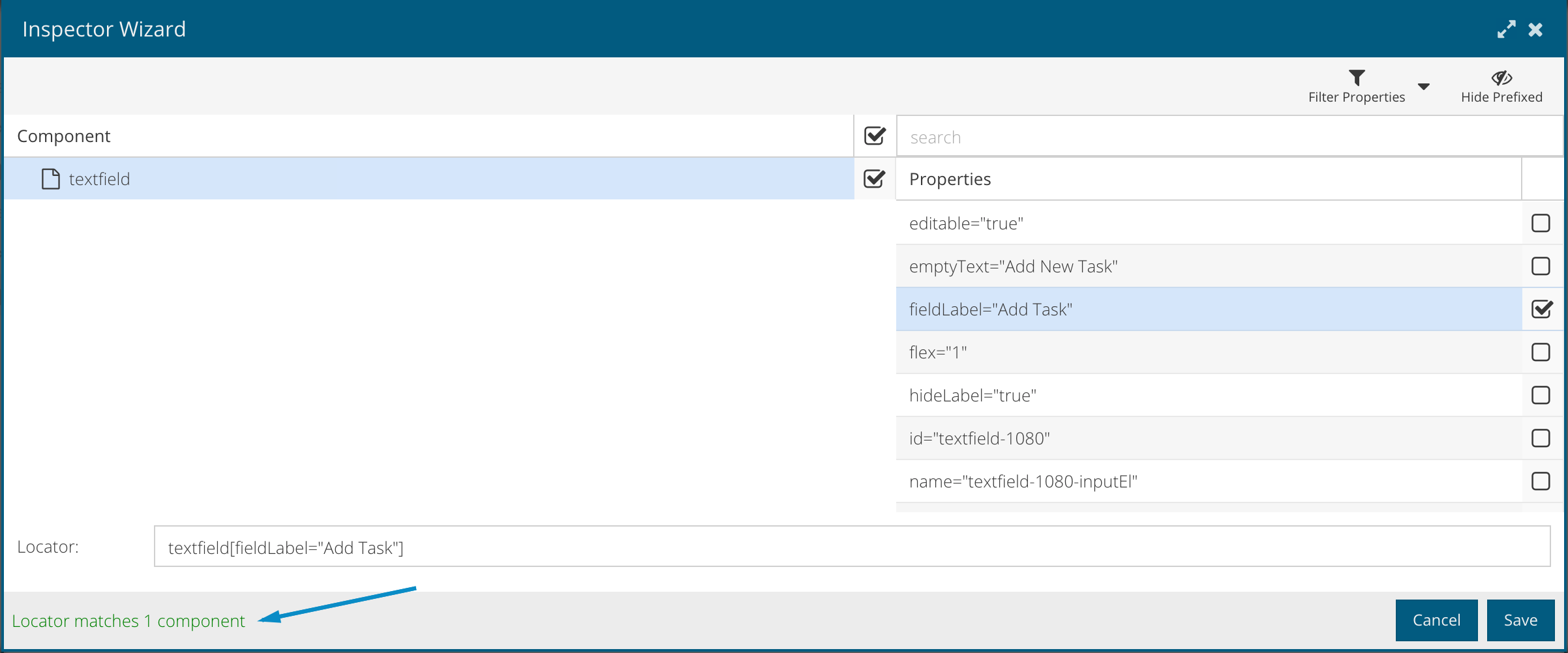
Inspector helps you derive meaningful locators from elements on the web page. If you consider a simple scenario where you have to enter a value in a text field, you’ll see the significance of a good locator. For the text field on this page, we assign a default id of "@textfield-1143". Now, Ext JS is a highly componentized framework, so we can use the component query instead of the id. The component query for the subject text field is "textfield[fieldLabel="Subject"]".

Source Seleniumhq: The Page Object Design Pattern provides the following advantages
There is a clean separation between test code and page specific code such as locators (or their use if you’re using a UI Map) and layout.
There is a single repository for the services or operations offered by the page rather than having these services scattered throughout the tests.
The idea is very simple. You create functions or objects of all the components on a page in the application under test. You reuse them in multiple tests by instantiating the objects when needed. This means you can avoid having to copy and paste a locator on multiple test cases, which minimizes the need to modify the locator value when the developer changes the label from Subject to something fancy.
Follow these steps to use the Inspector either with an in-browser(single page application) or WebDriver Scenario (multi page application) test.
Note: It is required to use WebDriver scenario even if there is just a login page that redirects to a single page Ext JS app.
Are you starting from scratch? No tests at all? Just an application URL?
Create a new Jasmine Test Suite
Open the newly created Jasmine spec file
Use the pre-made test case "should pass".
Place the cursor inside of the "it" block and launch the Inspector by clicking the inspector button (search icon).
Select a browser
Wait for the browser to open, application to be loaded and started and for the Inspector grid of component hierarchy to be presented and filled out.
If the application/URL you configured in the Scenario points to a non-Ext page you will need to navigate to an Ext page before Inspector will show any components. You can achieve this in two ways:
Add code to your test which navigates to the Ext app. A common situation is a login page.
  describe("test", function() {
      it("login then inspect", function() {
          ST.element('@email').type('a-username');
          ST.element('@password').type('a-password');
          ST.element('@submit').click();
          // inspect after this comment
      });
  });
Press Ctrl/Cmd-I to disabled inspecting in the browser and proceed to navigate to the Ext app.
At this point you should see a component hierarchy in the Inspector window. You can navigate around in this hierarchy.
When you click on a component in the hierarchy you may see the component highlighted in the browser with a bright green rectangle. A message will inform you if a component was highlighted or not. If a component is hidden you will not see it highlighted.
Using the selected value, you can take two different paths here. Create ST API code using the locators or Create Page Object code.
ST APIs allows you to create tests targeting Ext JS components and generic elements on a web applications. Inspector generate ST API code directly into the editor that can be extended with appropriate API methods based on the test case.
Launch the Inspector as previously described in Using the Inspector
On arriving at the Inspector Grid and Selected Locators, select the page objects checkbox, enter a page name for this page.
You may confirm that the URL is correct but may not change the URL.
In order to change the URL you must change the URL in the Scenario or add some code to your test which navigates to the desired URL.
Add components by clicking in the browser or by adding from the component hierarchy.
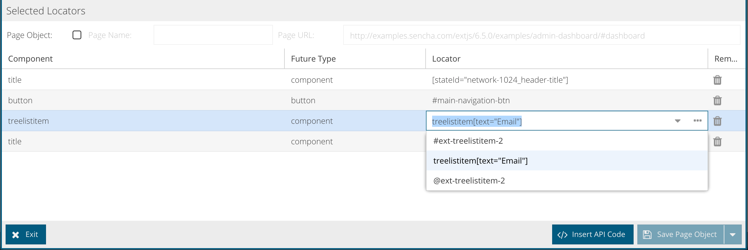
Refine the locator string by selecting one of the pre-populated strings from the drop-down, by opening the Wizard or by typing in one manually (not recommended).
Give the component/locator a name.
Save the page object.
Inspector Wizard allows users to select more properties to get a one-to-one match with a component. When multiple component matches a locator additional properties may be needed to narrow down to a specific component and this can be done by launching the wizard. Every time a new property is added, the wizard will indicate the number of matching components. The user can save the locator and use it within a test when there is just one component match.
The below approach will let you use inspector to create meaningful locators. We will be enhancing this feature in the future so the page navigation and the URL updates will be captured more effectively.
A page in a single page application can be accessed by just changing the anchor. For e.g. in the sample application on Sencha’s website http://examples.sencha.com/extjs/6.2.0/examples/admin-dashboard/#dashboard - #dashboard is the anchor.
To inspect email page a new spec should be created. In Email.js, insert a code that will navigate the test to the email page.
Launch inspector and follow the steps under "using inspector" section to get locators for the new page
Multi page applications that involves page navigation should have code that will login user and navigate them to the specific page as mentioned above
Once you are on a specific page, launch inspector and follow the steps under "using inspector" section to get locators for the new page


 Sencha Test | Terms of Use
