Managing page objects
Many classes have shortcut names used when creating (instantiating) a class with a
configuration object. The shortcut name is referred to as an alias (or xtype if the
class extends Ext.Component). The alias/xtype is listed next to the class name of
applicable classes for quick reference.
Framework classes or their members may be specified as private or protected. Else,
the class / member is public. Public, protected, and private are access
descriptors used to convey how and when the class or class member should be used.
Public classes and class members are available for use by any other class or application code and may be relied upon as a stable and persistent within major product versions. Public classes and members may safely be extended via a subclass.
Protected class members are stable public members intended to be used by the
owning class or its subclasses. Protected members may safely be extended via a subclass.
Private classes and class members are used internally by the framework and are not intended to be used by application developers. Private classes and members may change or be omitted from the framework at any time without notice and should not be relied upon in application logic.
static label next to the
method name. *See Static below.Below is an example class member that we can disect to show the syntax of a class member (the lookupComponent method as viewed from the Ext.button.Button class in this case).
Let's look at each part of the member row:
lookupComponent in this example)( item ) in this example)Ext.Component in this case). This may be omitted for methods that do not
return anything other than undefined or may display as multiple possible values
separated by a forward slash / signifying that what is returned may depend on the
results of the method call (i.e. a method may return a Component if a get method calls is
successful or false if unsuccessful which would be displayed as
Ext.Component/Boolean).PROTECTED in
this example - see the Flags section below)Ext.container.Container in this example). The source
class will be displayed as a blue link if the member originates from the current class
and gray if it is inherited from an ancestor or mixed-in class.view source in the example)item : Object in the example).undefined a "Returns" section
will note the type of class or object returned and a description (Ext.Component in the
example)Available since 3.4.0 - not pictured in
the example) just after the member descriptionDefaults to: false)The API documentation uses a number of flags to further commnicate the class member's function and intent. The label may be represented by a text label, an abbreviation, or an icon.
classInstance.method1().method2().etc();false is returned from
an event handler- Indicates a framework class
- A singleton framework class. *See the singleton flag for more information
- A component-type framework class (any class within the Ext JS framework that extends Ext.Component)
- Indicates that the class, member, or guide is new in the currently viewed version
- Indicates a class member of type config
- Indicates a class member of type property
- Indicates a class member of type
method
- Indicates a class member of type event
- Indicates a class member of type
theme variable
- Indicates a class member of type
theme mixin
- Indicates that the class, member, or guide is new in the currently viewed version
Just below the class name on an API doc page is a row of buttons corresponding to the types of members owned by the current class. Each button shows a count of members by type (this count is updated as filters are applied). Clicking the button will navigate you to that member section. Hovering over the member-type button will reveal a popup menu of all members of that type for quick navigation.
Getting and setter methods that correlate to a class config option will show up in the methods section as well as in the configs section of both the API doc and the member-type menus just beneath the config they work with. The getter and setter method documentation will be found in the config row for easy reference.
Your page history is kept in localstorage and displayed (using the available real estate) just below the top title bar. By default, the only search results shown are the pages matching the product / version you're currently viewing. You can expand what is displayed by clicking on the button on the right-hand side of the history bar and choosing the "All" radio option. This will show all recent pages in the history bar for all products / versions.
Within the history config menu you will also see a listing of your recent page visits. The results are filtered by the "Current Product / Version" and "All" radio options. Clicking on the button will clear the history bar as well as the history kept in local storage.
If "All" is selected in the history config menu the checkbox option for "Show product details in the history bar" will be enabled. When checked, the product/version for each historic page will show alongside the page name in the history bar. Hovering the cursor over the page names in the history bar will also show the product/version as a tooltip.
Both API docs and guides can be searched for using the search field at the top of the page.
On API doc pages there is also a filter input field that filters the member rows using the filter string. In addition to filtering by string you can filter the class members by access level, inheritance, and read only. This is done using the checkboxes at the top of the page.
The checkbox at the bottom of the API class navigation tree filters the class list to include or exclude private classes.
Clicking on an empty search field will show your last 10 searches for quick navigation.
Each API doc page (with the exception of Javascript primitives pages) has a menu view of metadata relating to that class. This metadata view will have one or more of the following:
Ext.button.Button class has an alternate class name of Ext.Button). Alternate class
names are commonly maintained for backward compatibility.Runnable examples (Fiddles) are expanded on a page by default. You can collapse and expand example code blocks individually using the arrow on the top-left of the code block. You can also toggle the collapse state of all examples using the toggle button on the top-right of the page. The toggle-all state will be remembered between page loads.
Class members are collapsed on a page by default. You can expand and collapse members using the arrow icon on the left of the member row or globally using the expand / collapse all toggle button top-right.
Viewing the docs on narrower screens or browsers will result in a view optimized for a smaller form factor. The primary differences between the desktop and "mobile" view are:
The class source can be viewed by clicking on the class name at the top of an API doc page. The source for class members can be viewed by clicking on the "view source" link on the right-hand side of the member row.
Sencha WebTestIt provides you with powerful tools for Page Object creation and management. You can use elements to generate Page Object Actions directly in Sencha WebTestIt. Using Page Object pattern, you can model the behavior of your web application into simple objects and perform your Page Object actions, like “click”, “sendKeys”, etc. to construct logical user interactions.
Hint
Despite the name, the Page Object pattern does not necessarily correspond to an entire “page” on your website or in your app, but to the significant components on a page, such as headers, menus, or content areas. When creating Page Objects, create a separate one for each of these components, not one for the whole page or multiple pages.
A Page Object is a class within your project that contains elements and a set of actions utilizing those elements. To create a new Page Object, right-click the test/pageobjects folder in the Project tab and select New > Page Object from the context menu.
Note
While we recommend keeping the default project structure, you can create a Page Object in any folder you like, as long as you keep the Special Headers.
Alternatively, you can use the keyboard chord Ctrl+N > Ctrl+P. Sencha WebTestIt will create a new Page Object file and wait for you to name it. Click ENTER to create a new class.
It is a good practice to create Page Object classes which have
Poas a suffix, e.g.DetailPagePoin Java and Typescript ordetail_page_poin Python.
Each Page Object is generated with default functions open and getTitle, which is derived from the template system.
The Page Object you select in the Project tab becomes the Active Page Object. Sencha WebTestIt adapts the user interface and display information in various tabs according to the currently active Page Object class.
When you select a Page Object from the Project tab, Sencha WebTestIt will open the Page Object tab. You use the Page Object tab to navigate the actions within the active Page Object.
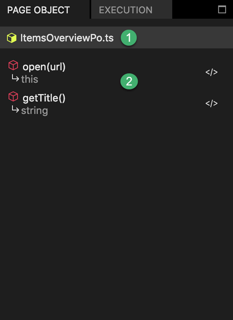
1 Page Object Name: Display the name of the current active Page Object.
2 Actions List: GDisplays the Page Object's public methods and their return values. Right-click the name of an action and select Jump to code position to directly scroll to the definition in the code editor
To quickly create a Page Object action, you can utilize the Sencha WebTestIt templates.
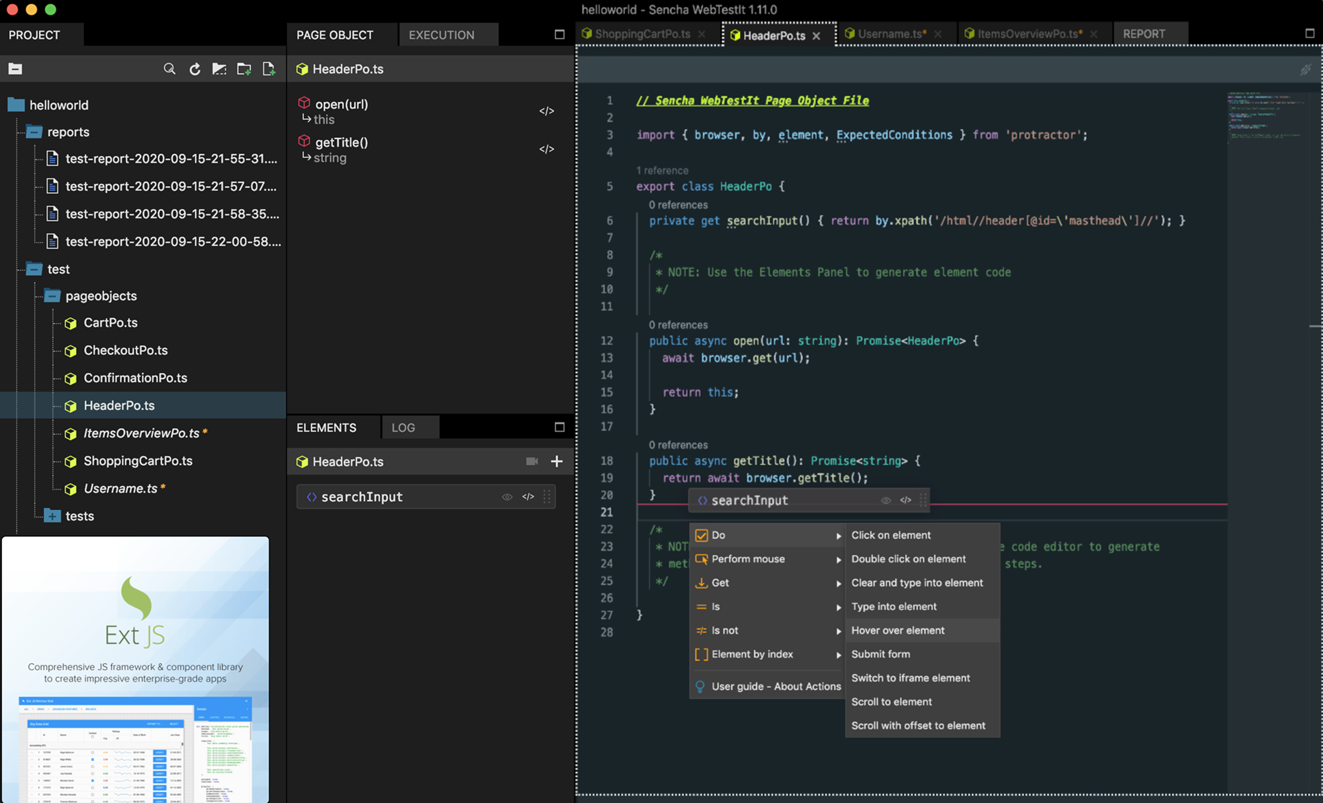
With an active Page Object, locate the Elements tab.
Drag the element you want to base your action on, into the Code tab.
Release the mouse at the spot you want to insert the new method.
From the pop-up menu, select the action you want the method to be based on.
Sencha WebTestIt will create a method reflecting the action.
You can continue to edit the action freely, or drag more elements into the newly generated method.
Thanks to this feature you save on the amount of code you will have to write when defining your Page Objects. Sencha WebTestIt offers you a set of actions out of the box, which is a subset of Selenese commands used in Selenium IDE to help test various elements, actions, and many other functionalities related to a web application.
Actions are simple starting points for interactions with elements in your website or app. The following actions are available from the pop-up menu in Sencha WebTestIt:
| Name | Description |
|---|---|
| Click on element | A standard Selenium click() element method that performs a click on the given element. |
| Double click on element | Invokes the mouse doubleclick() method from the Selenium Actions()class on the given element. |
| Type into element | Invokes the sendKeys(text) method, allowing you to send the input string to simulate typing into an element. |
| Clear and type into element | First invokes the clear() method, that clears out the input field. Followed by sendKeys(text) method that sends the input string to the and simulates typing into an element. |
| Hover over element | Moves the mouse cursor at the center of the given element, simulating the hover over element action. |
| Submit form | Performs the submit to remote server action if the given element is a form or an element that is within in a form. |
| Switch to the iframe element | Allows users to switch to the located iframe and perform actions on the elements located inside that iframe. |
| Scroll to element | Allows users to scroll the specified element into the visible area of the browser window. |
| Scroll to element with offset | Scrolls to the target element and additionally by the number of pixels given as offset coordinates (x, y). Note that a negative value means either left (-x) or up (-y). |
| Name | Description |
|---|---|
| Down | Simulates the mouse click and hold action. Moves the mouse cursor to the center of the given element and performs the click and hold (without releasing) the left mouse button. |
| Up | Simulates the release of the clicked mouse button, in the middle of the given element. |
| Move | Moves the mouse cursor to the center of the given element. |
| Over | Simulates the mouseover event by moving the mouse cursor over the given element. |
| Out | Moves the mouse cursor away from the current (X, Y) position to the desired location by the given offset. |
If you hover over the Element by index pop-up menu entry, you’ll find a set of enumerator-based actions. These generate methods which are specifically targeting lists and other collections of similar elements.
An example of enumerator-based elements is a list of products in a Demo Webshop you can download for Java or TypeScript. Every product is displayed as its own component and the number of items is variable. In cases like these, the ID-based selector is often not feasible.
| Name | Description |
|---|---|
| Click nth element | Clicks the nth item from the list. Stores all the located elements, and clicks the selected element from the list using the element’s index. |
| Get nth element | Returns the nth item from a WebElement list. Creates a list of Web Elements and selects and returns the element from the list using the element’s index. |
| Get nth element’s text | Returns the nth item’s text from the list. Creates a list of Web Elements and returns the selected element’s text from the list using the element’s index. |
Instead of Assert and Verify commands common to Selenese, we introduced Get/Is/Is not commands in Sencha WebTestIt to obtain the data to be checked, such as the element’s value, text, attribute, etc. With these new commands, the acquired data will be split from the test, which is a recommended practice when working with Page Objects. This means that the Page Object contains the Get/It/Is not commands to get the data, while the test validates it.
| Name | Description |
|---|---|
| Element as variable | Returns the selected element as a WebElement so that you can add your custom actions and methods to it. |
| Element’s text | Returns a String containing visible element’s inner text using the .getText() method. |
| Element’s value | Returns the “elements” value attribute using the getAttribute("value") method. |
| Element’s attribute | Gives you the possibility to retrieve a specific element attribute like value, type, etc. using the getAttribute() method. |
| Element’s selected value | Returns the first selected option from the given (“select” type) element, e.g. the select list. If the WebElement is not of a “select” type, an Exception gets thrown. |
| Element’s selected label | Returns a String containing the label (text) of the first selected option from the given “select” type element, e.g. the select list, using the Selenium Select() class. If the WebElement is not of a “select” type, an Exception gets thrown. |
| Name | Description |
|---|---|
| Element checked | Determines if the given element is checked or not. Returns a Boolean. Only applies for input elements e.g. checkboxes, radio buttons, options in select tags. |
| Element editable | Determines if the given element is editable. Returns a Boolean after checking if the element is enabled within the webpage and has a “readonly” attribute that equals null. |
| Element present | Determines if the given element is present on the Web page. Returns a Boolean after checking if the number of elements with provided selector found is greater than 0. |
| Element visible | Determines if the given element is visible on the Web page. Returns a Boolean after using the isDisplayed() method on the element. |
| Name | Description |
|---|---|
| Element checked | Determines if the given element is not checked. Returns a Boolean. Only applies for input elements e.g. checkboxes, radio buttons, options in select tags. |
| Element editable | Determines if the given element is not editable. Returns a Boolean after checking whether the element is disabled within the webpage and has a “readonly” attribute not equal to null. |
| Element present | Determines if the given element is not present on the Web page. Returns a Boolean after checking if the number of elements with provided selector found is equal to 0. |
| Element visible | Determines if the given element is not visible (is hidden) on the Web page. Returns a Boolean after using the isDisplayed() method on the element. |
It is strongly advisable to keep in mind Test maintenance when designing your tests and Page Objects. We recommend you to implement the Page Object pattern to keep everything in order.
Page Objects offer you a great possibility to encapsulate the elements and actions specific to your website or app. If an element breaks (e.g. the selector is not returning an element), you can edit the selector in the appropriate Page Object. Your test cases are responsible for orchestrating those actions and evaluating the results.
That is why a good practice is to keep elements private in their dedicated Page Object. You as the tester are interested in the actions only, which should be publicly accessible.
What about redirects and site changes? Let’s say you are entering data on a form and sending it off, which causes your client to get redirected to another page. In this case, the appropriate action should return the new Page Object.
The number of Page Objects required for the test depends heavily on your website’s or app’s structure. We recommend to analyze the overall structure and break down your website or app into components. Create a Page Object then for each of the components you identified. Don not worry though if something is not perfect from the beginning. There is always the possibility of refactoring your Page Objects.
For further information on the Page Object pattern, click here.


 WebTestIt | Terms of Use
