Events
Many classes have shortcut names used when creating (instantiating) a class with a
configuration object. The shortcut name is referred to as an alias (or xtype if the
class extends Ext.Component). The alias/xtype is listed next to the class name of
applicable classes for quick reference.
Framework classes or their members may be specified as private or protected. Else,
the class / member is public. Public, protected, and private are access
descriptors used to convey how and when the class or class member should be used.
Public classes and class members are available for use by any other class or application code and may be relied upon as a stable and persistent within major product versions. Public classes and members may safely be extended via a subclass.
Protected class members are stable public members intended to be used by the
owning class or its subclasses. Protected members may safely be extended via a subclass.
Private classes and class members are used internally by the framework and are not intended to be used by application developers. Private classes and members may change or be omitted from the framework at any time without notice and should not be relied upon in application logic.
static label next to the
method name. *See Static below.Below is an example class member that we can disect to show the syntax of a class member (the lookupComponent method as viewed from the Ext.button.Button class in this case).
Let's look at each part of the member row:
lookupComponent in this example)( item ) in this example)Ext.Component in this case). This may be omitted for methods that do not
return anything other than undefined or may display as multiple possible values
separated by a forward slash / signifying that what is returned may depend on the
results of the method call (i.e. a method may return a Component if a get method calls is
successful or false if unsuccessful which would be displayed as
Ext.Component/Boolean).PROTECTED in
this example - see the Flags section below)Ext.container.Container in this example). The source
class will be displayed as a blue link if the member originates from the current class
and gray if it is inherited from an ancestor or mixed-in class.view source in the example)item : Object in the example).undefined a "Returns" section
will note the type of class or object returned and a description (Ext.Component in the
example)Available since 3.4.0 - not pictured in
the example) just after the member descriptionDefaults to: false)The API documentation uses a number of flags to further commnicate the class member's function and intent. The label may be represented by a text label, an abbreviation, or an icon.
classInstance.method1().method2().etc();false is returned from
an event handler- Indicates a framework class
- A singleton framework class. *See the singleton flag for more information
- A component-type framework class (any class within the Ext JS framework that extends Ext.Component)
- Indicates that the class, member, or guide is new in the currently viewed version
- Indicates a class member of type config
- Indicates a class member of type property
- Indicates a class member of type
method
- Indicates a class member of type event
- Indicates a class member of type
theme variable
- Indicates a class member of type
theme mixin
- Indicates that the class, member, or guide is new in the currently viewed version
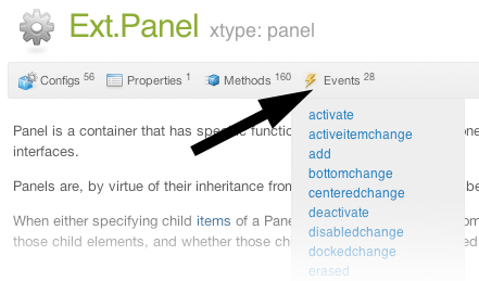
Just below the class name on an API doc page is a row of buttons corresponding to the types of members owned by the current class. Each button shows a count of members by type (this count is updated as filters are applied). Clicking the button will navigate you to that member section. Hovering over the member-type button will reveal a popup menu of all members of that type for quick navigation.
Getting and setter methods that correlate to a class config option will show up in the methods section as well as in the configs section of both the API doc and the member-type menus just beneath the config they work with. The getter and setter method documentation will be found in the config row for easy reference.
Your page history is kept in localstorage and displayed (using the available real estate) just below the top title bar. By default, the only search results shown are the pages matching the product / version you're currently viewing. You can expand what is displayed by clicking on the button on the right-hand side of the history bar and choosing the "All" radio option. This will show all recent pages in the history bar for all products / versions.
Within the history config menu you will also see a listing of your recent page visits. The results are filtered by the "Current Product / Version" and "All" radio options. Clicking on the button will clear the history bar as well as the history kept in local storage.
If "All" is selected in the history config menu the checkbox option for "Show product details in the history bar" will be enabled. When checked, the product/version for each historic page will show alongside the page name in the history bar. Hovering the cursor over the page names in the history bar will also show the product/version as a tooltip.
Both API docs and guides can be searched for using the search field at the top of the page.
On API doc pages there is also a filter input field that filters the member rows using the filter string. In addition to filtering by string you can filter the class members by access level and inheritance. This is done using the checkboxes at the top of the page.
The checkbox at the bottom of the API class navigation tree filters the class list to include or exclude private classes.
Clicking on an empty search field will show your last 10 searches for quick navigation.
Each API doc page (with the exception of Javascript primitives pages) has a menu view of metadata relating to that class. This metadata view will have one or more of the following:
Ext.button.Button class has an alternate class name of Ext.Button). Alternate class
names are commonly maintained for backward compatibility.Runnable examples (Fiddles) are expanded on a page by default. You can collapse and expand example code blocks individually using the arrow on the top-left of the code block. You can also toggle the collapse state of all examples using the toggle button on the top-right of the page. The toggle-all state will be remembered between page loads.
Class members are collapsed on a page by default. You can expand and collapse members using the arrow icon on the left of the member row or globally using the expand / collapse all toggle button top-right.
Viewing the docs on narrower screens or browsers will result in a view optimized for a smaller form factor. The primary differences between the desktop and "mobile" view are:
The class source can be viewed by clicking on the class name at the top of an API doc page. The source for class members can be viewed by clicking on the "view source" link on the right-hand side of the member row.
The Components and classes of Sencha Touch fire a broad range of events at various points in their lifecycle. Events allow your code to react to changes around it and are a key concept within Sencha Touch.
Events are fired whenever something interesting happens to one of your classes. For example, when any Component is rendered to the screen, its painted event is fired. We can listen for that event by configuring a simple listeners config:
When you click the "Live Preview" button above, you will see a Panel rendered to the screen, followed by the defined alert message. All events fired by a class are listed in its API page - for example at the time of writing Ext.Panel has 28 events:
Although the painted event itself is useful in some cases, there are other events that you are much more likely to use. For example, Buttons fire tap events whenever they are tapped on:
You can add as many event listeners as you like. In the following example we are going to confound users by calling this.hide() inside our tap listener to hide the Button, only to show it again a second later. When this.hide() is called, the Button is hidden and the hide event fired. The hide event in turn triggers our hide listener, which waits for a second before it shows the Button again:
Event listeners are called every time an event is fired, so you can continue hiding and showing the button for all eternity.
Most classes are reconfigurable at run time, meaning that you can change their configurations such as height, width, or content at any time and the Component will correctly update itself on screen. Many of these configuration changes trigger the firing of an event - for example 14 of the Button's component 24 events have names such as widthchange, hiddenchange and centeredchange.
In the following example the tap handler calls this.setWidth() to set a random width on our button. The widthchange listener is informed immediately of the change, along with the new and old width values:
Every event that ends in 'change' is fired as a result of a config option that has changed. Note that although listening to these events is like listening to any other events, it is useful to know the convention.
Previous examples involved passing listeners in when the class is instantiated. If we already have an instance though, we can still add listeners later on using the on function:
In this way you can add new listeners at any time. You can also combine these approaches, and you can even listen to the same event more than once, if you need to, as shown in the following example:
In this case, both defined event listener functions are called, preserving the order they were added in.
Finally, you can specify multiple listeners by using the .on method, similar to using a listener configuration. The following code revisits the previous example that was setting the button's random width:
Just as we can add listeners at any time, we can remove them too, this time using un. In order to remove a listener, we need a reference to its function. In the previous examples we have just passed a function into the listeners object or the .on call, this time we create the function earlier and link it into a variable called doSomething.
Since initially we pass the new doSomething function into our listeners object, at first the code works like before. Since we eventually add an Ext.defer function that removes the listener after 3 seconds, clicking on the button in the first 3 seconds yields an alert message, after 3 seconds however the listener is removed so nothing happens:
In the following example we use a button like in previous code samples, but this time we also add a toggle button that adds and removes the tap listener as you toggle it. The listener starts by being disabled, using the toggle button enables and then disables it:
There are a number of additional options that you can pass into listeners.
Scope sets the value of this inside your handler function. By default this is set to the instance of the class firing the event, which is often (but not always) the functionality that you want. This functionality allowed us to call this.hide() to hide the button in the second example at the start of this guide.
In the following example we create a Button and a Panel, then listen to the Button's 'tap' event with the handler running in Panel's scope. In order to do this we need to pass in an object instead of a handler function - this object contains the function plus the scope:
When you run this example, the value of this in the tap handler is the Panel. To see this we have set the Panel's html configuration to 'Panel HTML' and then alerted this.getHtml() in our handler. When the button is tapped we do indeed see the Panel's html being alerted.
Sometimes we only want to listen to an event one time. The event itself might fire any number of times, but we only want to listen to it once. The following codes illustrates this situation:
For events that are fired many times in short succession, we can reduce the number of times our listener is called by using the buffer configuration. In this case our button's tap listener is only invoked once every 2 seconds, regardless of how many times you click it:
Firing your own events is done by calling fireEvent with any event name. In the following example we fire an event called myEvent that passes two arguments - the button itself and a random number between 1 and 100:
Once again we used Ext.defer to delay the function that fires our custom event, this time by 2 seconds. When the event is fired, the myEvent listener picks up on it and displays the arguments we passed in.
Events are a key part of Sencha Touch and keep your app informed of changes in the system. If you are new to Sencha Touch we suggest reading the following guides to get a better understanding of how everything works:


 Sencha Touch 2.4 | Terms of Use
