Layouts
Many classes have shortcut names used when creating (instantiating) a class with a
configuration object. The shortcut name is referred to as an alias (or xtype if the
class extends Ext.Component). The alias/xtype is listed next to the class name of
applicable classes for quick reference.
Framework classes or their members may be specified as private or protected. Else,
the class / member is public. Public, protected, and private are access
descriptors used to convey how and when the class or class member should be used.
Public classes and class members are available for use by any other class or application code and may be relied upon as a stable and persistent within major product versions. Public classes and members may safely be extended via a subclass.
Protected class members are stable public members intended to be used by the
owning class or its subclasses. Protected members may safely be extended via a subclass.
Private classes and class members are used internally by the framework and are not intended to be used by application developers. Private classes and members may change or be omitted from the framework at any time without notice and should not be relied upon in application logic.
static label next to the
method name. *See Static below.Below is an example class member that we can disect to show the syntax of a class member (the lookupComponent method as viewed from the Ext.button.Button class in this case).
Let's look at each part of the member row:
lookupComponent in this example)( item ) in this example)Ext.Component in this case). This may be omitted for methods that do not
return anything other than undefined or may display as multiple possible values
separated by a forward slash / signifying that what is returned may depend on the
results of the method call (i.e. a method may return a Component if a get method calls is
successful or false if unsuccessful which would be displayed as
Ext.Component/Boolean).PROTECTED in
this example - see the Flags section below)Ext.container.Container in this example). The source
class will be displayed as a blue link if the member originates from the current class
and gray if it is inherited from an ancestor or mixed-in class.view source in the example)item : Object in the example).undefined a "Returns" section
will note the type of class or object returned and a description (Ext.Component in the
example)Available since 3.4.0 - not pictured in
the example) just after the member descriptionDefaults to: false)The API documentation uses a number of flags to further commnicate the class member's function and intent. The label may be represented by a text label, an abbreviation, or an icon.
classInstance.method1().method2().etc();false is returned from
an event handler- Indicates a framework class
- A singleton framework class. *See the singleton flag for more information
- A component-type framework class (any class within the Ext JS framework that extends Ext.Component)
- Indicates that the class, member, or guide is new in the currently viewed version
- Indicates a class member of type config
- Indicates a class member of type property
- Indicates a class member of type
method
- Indicates a class member of type event
- Indicates a class member of type
theme variable
- Indicates a class member of type
theme mixin
- Indicates that the class, member, or guide is new in the currently viewed version
Just below the class name on an API doc page is a row of buttons corresponding to the types of members owned by the current class. Each button shows a count of members by type (this count is updated as filters are applied). Clicking the button will navigate you to that member section. Hovering over the member-type button will reveal a popup menu of all members of that type for quick navigation.
Getting and setter methods that correlate to a class config option will show up in the methods section as well as in the configs section of both the API doc and the member-type menus just beneath the config they work with. The getter and setter method documentation will be found in the config row for easy reference.
Your page history is kept in localstorage and displayed (using the available real estate) just below the top title bar. By default, the only search results shown are the pages matching the product / version you're currently viewing. You can expand what is displayed by clicking on the button on the right-hand side of the history bar and choosing the "All" radio option. This will show all recent pages in the history bar for all products / versions.
Within the history config menu you will also see a listing of your recent page visits. The results are filtered by the "Current Product / Version" and "All" radio options. Clicking on the button will clear the history bar as well as the history kept in local storage.
If "All" is selected in the history config menu the checkbox option for "Show product details in the history bar" will be enabled. When checked, the product/version for each historic page will show alongside the page name in the history bar. Hovering the cursor over the page names in the history bar will also show the product/version as a tooltip.
Both API docs and guides can be searched for using the search field at the top of the page.
On API doc pages there is also a filter input field that filters the member rows using the filter string. In addition to filtering by string you can filter the class members by access level, inheritance, and read only. This is done using the checkboxes at the top of the page.
The checkbox at the bottom of the API class navigation tree filters the class list to include or exclude private classes.
Clicking on an empty search field will show your last 10 searches for quick navigation.
Each API doc page (with the exception of Javascript primitives pages) has a menu view of metadata relating to that class. This metadata view will have one or more of the following:
Ext.button.Button class has an alternate class name of Ext.Button). Alternate class
names are commonly maintained for backward compatibility.Runnable examples (Fiddles) are expanded on a page by default. You can collapse and expand example code blocks individually using the arrow on the top-left of the code block. You can also toggle the collapse state of all examples using the toggle button on the top-right of the page. The toggle-all state will be remembered between page loads.
Class members are collapsed on a page by default. You can expand and collapse members using the arrow icon on the left of the member row or globally using the expand / collapse all toggle button top-right.
Viewing the docs on narrower screens or browsers will result in a view optimized for a smaller form factor. The primary differences between the desktop and "mobile" view are:
The class source can be viewed by clicking on the class name at the top of an API doc page. The source for class members can be viewed by clicking on the "view source" link on the right-hand side of the member row.
Intro to Layouts in Sencha Touch 2 from Sencha on Vimeo.
Layouts describe the sizing and positioning on Components in your app. For example, an email client might have a list of messages pinned to the left, taking up one third of the available width, and a message viewing panel in the rest of the screen.
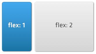
We can achieve this using an hbox layout and its ability to 'flex' items within it. Flexing means that we divide the available area based on the flex of each child component, so to achieve our example above we can set up flexes like shown in the following image:
In the code for this layout we need to specify the 'hbox' layout on any Container, then supply a flex parameter for each of the child components (Panels in this case) as follows:
Ext.create('Ext.Container', {
    fullscreen: true,
    layout: 'hbox',
    items: [
        {
            xtype: 'panel',
            html: 'message list',
            flex: 1
        },
        {
            xtype: 'panel',
            html: 'message preview',
            flex: 2
        }
    ]
});
This creates a container that fills the screen, and inside of it creates a message list panel and a preview panel. Their relative flex configs of 1 and 2 respectively means that the message list takes up one third of the available width, with the preview taking the remaining two thirds. If our Container was 300px wide, the first item (flex: 1) will be 100px wide and the second (flex: 2) will be 200px wide.
The hbox layout is one of the most useful layouts, as it can arrange components in a wide variety of horizontal combinations. See the Ext.layout.HBox for more examples.
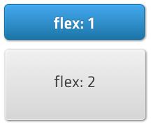
VBox is similar to HBox, just vertical instead of horizontal. Again, we can visualize this easily as a set of stacked boxes:
The code to create this is almost identical to the previous example, we only traded layout: 'hbox' for layout: 'vbox':
Ext.create('Ext.Container', {
    fullscreen: true,
    layout: 'vbox',
    items: [
        {
            xtype: 'panel',
            html: 'message list',
            flex: 1
        },
        {
            xtype: 'panel',
            html: 'message preview',
            flex: 2
        }
    ]
});
If our Container was 300px tall, the first panel (flex: 1) would be 100px tall, and the second (flex: 2) would be 200px tall. See the Ext.layout.VBox for more examples.
Sometimes you want to show several information screens information on a small device screen. TabPanels and Carousels both enable you to see one screen of many at a time, and underneath they both use a Card Layout.
Card Layout takes the size of the Container it is applied to and sizes the currently active item so as to completely fill the Container. It then hides the rest of the items, allowing you to change which one is currently visible, but only showing one at once:
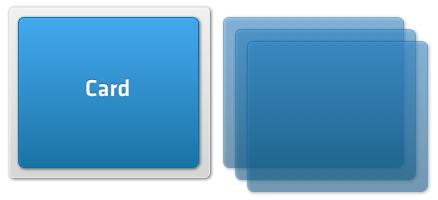
In the previous image, the gray box is the Container, and the blue box inside it is the currently active card. The three other cards are hidden from view, but can be swapped in later. While it is not very common to create Card layouts directly, you can do this as follows:
var panel = Ext.create('Ext.Panel', {
    layout: 'card',
    items: [
        {
            html: "First Item"
        },
        {
            html: "Second Item"
        },
        {
            html: "Third Item"
        },
        {
            html: "Fourth Item"
        }
    ]
});

panel.setActiveItem(1);
In this example we created a Panel with a Card Layout and later set the second item as active (the active item index is zero-based, so 1 corresponds to the second item). In most cases you should however use a Tab Panel or a Carousel.
The Fit Layout is probably the simplest layout available. All it does is make a child component fit the full size of its parent Container.
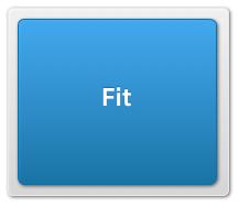
For example, if you have a parent Container that is 200px by 200px and give it a single child component and a 'fit' layout, the child component will also be 200px by 200px:
var panel = Ext.create('Ext.Panel', {
    width: 200,
    height: 200,
    layout: 'fit',

    items: {
        xtype: 'panel',
        html: 'Also 200px by 200px'
    }
});

Ext.Viewport.add(panel);
Please note that if you add more than one item into a container that has a fit layout, only the first item will be visible. If you want to switch between multiple items, use the Card layout instead.
Every layout is capable of docking items inside it. Docking enables you to place additional Components at the top, right, bottom, or left edges of the parent Container, resizing the other items as necessary.
For example, coming back to our first hbox layout from this guide, let us imagine we want to dock another component at the top, like shown in the following image:
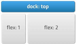
This feature is often used for items such as toolbars and banners, and it is easy to achieve using the docked: 'top' configuration:
Ext.create('Ext.Container', {
    fullscreen: true,
    layout: 'hbox',
    items: [
        {
            docked: 'top',
            xtype: 'panel',
            height: 20,
            html: 'This is docked to the top'
        },
        {
            xtype: 'panel',
            html: 'message list',
            flex: 1
        },
        {
            xtype: 'panel',
            html: 'message preview',
            flex: 2
        }
    ]
});
You can add any number of docked items by simply providing the dock configuration on the child components that you want docked. Items can also be docked on any side, for example if we wanted to do this with our previous vbox example:
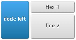
we could achieve this by specifying docked: 'left':
Ext.create('Ext.Container', {
    fullscreen: true,
    layout: 'vbox',
    items: [
        {
            docked: 'left',
            xtype: 'panel',
            width: 100,
            html: 'This is docked to the left'
        },
        {
            xtype: 'panel',
            html: 'message list',
            flex: 1
        },
        {
            xtype: 'panel',
            html: 'message preview',
            flex: 2
        }
    ]
});
You can add multiple docked items on each side (for example docking several items in the 'bottom' position).
The Pack and Align feature controls how child elements are aligned in a layout. 'Pack' refers to the axis of your current layout, while 'Align' is the opposite. For example, in an HBox layout, Pack refers to the horizontal axis, and Align to the vertical axis. The following example illustrates the difference:
Layouts are only a part of the Sencha Touch ecosystem. In order to better understand the framework and how it works, we recommend reading the following guides:


 Sencha Touch | Terms of Use
