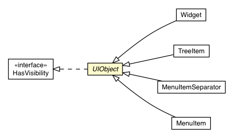
Class UIObject


public static class UIObject
extends Object
Widget.
All UIObject objects can be styled using CSS. Style names that
are specified programmatically in Java source are implicitly associated with
CSS style rules. In terms of HTML and CSS, a GWT style name is the element's
CSS "class". By convention, GWT style names are of the form
[project]-[widget].
For example, the Button widget has the style name
gwt-Button, meaning that within the Button
constructor, the following call occurs:
setStyleName("gwt-Button");
A corresponding CSS style rule can then be written as follows:
 // Example of how you might choose to style a Button widget
 .gwt-Button {
   background-color: yellow;
   color: black;
   font-size: 24pt;
 }
Note the dot prefix in the CSS style rule. This syntax is called a CSS class
selector.
Every UIObject has a primary style name that identifies
the key CSS style rule that should always be applied to it. Use
#setStylePrimaryName(String) to specify an object's primary style
name. In most cases, the primary style name is set in a widget's constructor
and never changes again during execution. In the case that no primary style
name is specified, it defaults to the first style name that is added.
More complex styling behavior can be achieved by manipulating an object's
secondary style names. Secondary style names can be added and removed
using #addStyleName(String), #removeStyleName(String), or
#setStyleName(String, boolean). The purpose of secondary style names
is to associate a variety of CSS style rules over time as an object
progresses through different visual states.
There is an important special formulation of secondary style names called
dependent style names. A dependent style name is a secondary style
name prefixed with the primary style name of the widget itself. See
#addStyleName(String) for details.
Setter methods that follow JavaBean property conventions are exposed as
attributes in UiBinder
templates. For example, because UiObject implements #setWidth(String)
you can set the width of any widget like so:
<g:Label width='15em'>Hello there</g:Label>Generally speaking, values are parsed as if they were Java literals, so methods like
#setVisible(boolean) are also available:
<g:Label width='15em' visible='false'>Hello there</g:Label>Enum properties work this way too. Imagine a Bagel widget with a handy Type enum and a setType(Type) method:
 enum Type { poppy, sesame, raisin, jalapeno }

 <my:Bagel type='poppy' />
There is also special case handling for two common method signatures,
(int, int) and (double, Unit)
<g:Label pixelSize='100, 100'>Hello there</g:Label>Finally, a few UiObject methods get special handling. The debug id (see
#ensureDebugId) of any UiObject can be set via the
debugId attribute, and addtional style names and dependent style
names can be set with the addStyleNames and
addStyleDependentNames attributes.
 <g:Label debugId='helloLabel'
     addStyleNames='pretty rounded big'>Hello there</g:Label>
Style names can be space or comma separated.Copyright © 2018. All rights reserved.