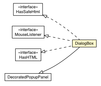
A form of popup that has a caption area at the top and can be dragged by the
user. Unlike a PopupPanel, calls to
#setWidth(String) and
#setHeight(String) will set the width and height of the dialog box
itself, even if a widget has not been added as yet.

CSS Style Rules
- .gwt-DialogBox { the outside of the dialog }
- .gwt-DialogBox .Caption { the caption }
- .gwt-DialogBox .dialogContent { the wrapper around the content }
- .gwt-DialogBox .dialogTopLeft { the top left cell }
- .gwt-DialogBox .dialogTopLeftInner { the inner element of the cell }
- .gwt-DialogBox .dialogTopCenter { the top center cell, where the caption
is located }
- .gwt-DialogBox .dialogTopCenterInner { the inner element of the cell }
- .gwt-DialogBox .dialogTopRight { the top right cell }
- .gwt-DialogBox .dialogTopRightInner { the inner element of the cell }
- .gwt-DialogBox .dialogMiddleLeft { the middle left cell }
- .gwt-DialogBox .dialogMiddleLeftInner { the inner element of the cell }
- .gwt-DialogBox .dialogMiddleCenter { the middle center cell, where the
content is located }
- .gwt-DialogBox .dialogMiddleCenterInner { the inner element of the cell }
- .gwt-DialogBox .dialogMiddleRight { the middle right cell }
- .gwt-DialogBox .dialogMiddleRightInner { the inner element of the cell }
- .gwt-DialogBox .dialogBottomLeft { the bottom left cell }
- .gwt-DialogBox .dialogBottomLeftInner { the inner element of the cell }
- .gwt-DialogBox .dialogBottomCenter { the bottom center cell }
- .gwt-DialogBox .dialogBottomCenterInner { the inner element of the cell }
- .gwt-DialogBox .dialogBottomRight { the bottom right cell }
- .gwt-DialogBox .dialogBottomRightInner { the inner element of the cell }
Example
Use in UiBinder Templates
DialogBox elements in UiBinder templates can have one widget child and one <g:caption> child.
(Note the lower case "c", meant to signal that the caption is not a runtime
object, and so cannot have a ui:field attribute.) The body of
the caption can be html.
For example:
 <g:DialogBox autoHide="true" modal="true">
   <g:caption><b>Caption text</b></g:caption>
   <g:HTMLPanel>
     Body text
     <g:Button ui:field='cancelButton'>Cancel</g:Button>
     <g:Button ui:field='okButton'>Okay</g:Button>
   </g:HTMLPanel>
 </g:DialogBox>
You may also create your own header caption. The caption must implement
Caption.
For example:
 <g:DialogBox autoHide="true" modal="true">
   <-- foo is your prefix and Bar is a class that implements Caption-->
   <g:customCaption><foo:Bar/></g:customCaption>
   <g:HTMLPanel>
     Body text
     <g:Button ui:field='cancelButton'>Cancel</g:Button>
     <g:Button ui:field='okButton'>Okay</g:Button>
   </g:HTMLPanel>
 </g:DialogBox>


