com.google.gwt.user.client.ui
Class CellPanel
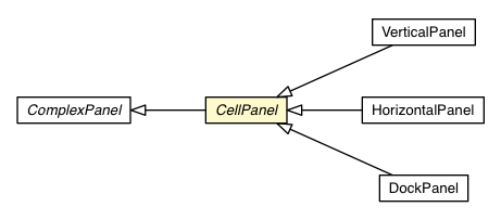
public static class CellPanel
extends Object
Note: This class is not related to the
Cell based data presentation widgets such
as CellList and
CellTable.
When working with CellPanel subclasses in
UiBinder templates, wrap
child widgets in <g:cell> elements. (Note the lower case
"c", meant to signal that the cell is not a runtime object, and so cannot
have a ui:field attribute.) Cell elements can have
attributes setting their height, width and alignment.
HorizontalAlignmentConstant
and used as the align argument to #setCellHorizontalAlignment
VerticalAlignmentConstant
and used as the align argument to #setCellVerticalAlignment
width argument to #setCellWidth
height argument to #setCellHeight
For example:
 <g:HorizontalPanel>
   <g:cell width='5em' horizontalAlignment='ALIGN_RIGHT'>
     <g:Label ui:field='leftSide' />
   </g:cell>
   <g:cell width='15em' horizontalAlignment='ALIGN_LEFT'>
     <g:Label ui:field='rightSide' />
   </g:cell>
 </g:HorizontalPanel>
Copyright © 2018. All rights reserved.