What's New
Many classes have shortcut names used when creating (instantiating) a class with a
configuration object. The shortcut name is referred to as an alias (or xtype if the
class extends Ext.Component). The alias/xtype is listed next to the class name of
applicable classes for quick reference.
Framework classes or their members may be specified as private or protected. Else,
the class / member is public. Public, protected, and private are access
descriptors used to convey how and when the class or class member should be used.
Public classes and class members are available for use by any other class or application code and may be relied upon as a stable and persistent within major product versions. Public classes and members may safely be extended via a subclass.
Protected class members are stable public members intended to be used by the
owning class or its subclasses. Protected members may safely be extended via a subclass.
Private classes and class members are used internally by the framework and are not intended to be used by application developers. Private classes and members may change or be omitted from the framework at any time without notice and should not be relied upon in application logic.
static label next to the
method name. *See Static below.Below is an example class member that we can disect to show the syntax of a class member (the lookupComponent method as viewed from the Ext.button.Button class in this case).
Let's look at each part of the member row:
lookupComponent in this example)( item ) in this example)Ext.Component in this case). This may be omitted for methods that do not
return anything other than undefined or may display as multiple possible values
separated by a forward slash / signifying that what is returned may depend on the
results of the method call (i.e. a method may return a Component if a get method calls is
successful or false if unsuccessful which would be displayed as
Ext.Component/Boolean).PROTECTED in
this example - see the Flags section below)Ext.container.Container in this example). The source
class will be displayed as a blue link if the member originates from the current class
and gray if it is inherited from an ancestor or mixed-in class.view source in the example)item : Object in the example).undefined a "Returns" section
will note the type of class or object returned and a description (Ext.Component in the
example)Available since 3.4.0 - not pictured in
the example) just after the member descriptionDefaults to: false)The API documentation uses a number of flags to further commnicate the class member's function and intent. The label may be represented by a text label, an abbreviation, or an icon.
classInstance.method1().method2().etc();false is returned from
an event handler- Indicates a framework class
- A singleton framework class. *See the singleton flag for more information
- A component-type framework class (any class within the Ext JS framework that extends Ext.Component)
- Indicates that the class, member, or guide is new in the currently viewed version
- Indicates a class member of type config
- Indicates a class member of type property
- Indicates a class member of type
method
- Indicates a class member of type event
- Indicates a class member of type
theme variable
- Indicates a class member of type
theme mixin
- Indicates that the class, member, or guide is new in the currently viewed version
Just below the class name on an API doc page is a row of buttons corresponding to the types of members owned by the current class. Each button shows a count of members by type (this count is updated as filters are applied). Clicking the button will navigate you to that member section. Hovering over the member-type button will reveal a popup menu of all members of that type for quick navigation.
Getting and setter methods that correlate to a class config option will show up in the methods section as well as in the configs section of both the API doc and the member-type menus just beneath the config they work with. The getter and setter method documentation will be found in the config row for easy reference.
Your page history is kept in localstorage and displayed (using the available real estate) just below the top title bar. By default, the only search results shown are the pages matching the product / version you're currently viewing. You can expand what is displayed by clicking on the button on the right-hand side of the history bar and choosing the "All" radio option. This will show all recent pages in the history bar for all products / versions.
Within the history config menu you will also see a listing of your recent page visits. The results are filtered by the "Current Product / Version" and "All" radio options. Clicking on the button will clear the history bar as well as the history kept in local storage.
If "All" is selected in the history config menu the checkbox option for "Show product details in the history bar" will be enabled. When checked, the product/version for each historic page will show alongside the page name in the history bar. Hovering the cursor over the page names in the history bar will also show the product/version as a tooltip.
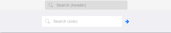
Both API docs and guides can be searched for using the search field at the top of the page.
On API doc pages there is also a filter input field that filters the member rows using the filter string. In addition to filtering by string you can filter the class members by access level, inheritance, and read only. This is done using the checkboxes at the top of the page.
The checkbox at the bottom of the API class navigation tree filters the class list to include or exclude private classes.
Clicking on an empty search field will show your last 10 searches for quick navigation.
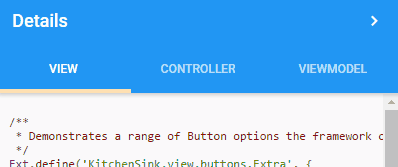
Each API doc page (with the exception of Javascript primitives pages) has a menu view of metadata relating to that class. This metadata view will have one or more of the following:
Ext.button.Button class has an alternate class name of Ext.Button). Alternate class
names are commonly maintained for backward compatibility.Runnable examples (Fiddles) are expanded on a page by default. You can collapse and expand example code blocks individually using the arrow on the top-left of the code block. You can also toggle the collapse state of all examples using the toggle button on the top-right of the page. The toggle-all state will be remembered between page loads.
Class members are collapsed on a page by default. You can expand and collapse members using the arrow icon on the left of the member row or globally using the expand / collapse all toggle button top-right.
Viewing the docs on narrower screens or browsers will result in a view optimized for a smaller form factor. The primary differences between the desktop and "mobile" view are:
The class source can be viewed by clicking on the class name at the top of an API doc page. The source for class members can be viewed by clicking on the "view source" link on the right-hand side of the member row.
Ext JS 6.5.3 has a number of improvements and bug fixes to Grid, TreeGrid, Charts, and more. Below are the key changes to Ext JS framework.
You can read more about these updates here.
Ext JS 6.5.3 adds SplitButton, a widely requested component, to the modern toolkit. A SplitButton is similar to a menu button, but its arrow can fire an event separately from the default click event of the button. This can be used to display a dropdown menu that provides additional options to the primary button action and you can provide a custom handler that can provide the arrow click implementation.
The Ext JS Grid is one of the most popular components and buffered store (or virtual store) helps you manage and seamlessly scroll through massive datasets. The various bug fixes and enhanced scrolling capabilities in Ext JS 6.5.3 provides a smooth scrolling experience with grouped grids, grid view options, grid with locked columns and more. The grid row expander is improved as well.
The NestedList in modern toolkit provides an intuitive interface to navigate between nested sets and provides a clean interface for applications with limited screen real-estate. The NestedList has undergone major changes in Ext JS 6.5.3 with improvements in events such as activate, selectionchange, in multiple configs showBy, allowDeselect and more.
Android 8 is the latest release from Android. Ext JS 6.5.3 provides compatibility with Android 8 so that your Ext JS applications work seamlessly with Android 8 based smartphones and tablets. Ext JS 6.5.3 has support for the latest released Chrome browser versions (Chrome 60-63) as well.
Ext JS 6.5.3 includes multiple enhancements and bug fixes to Charts, Data View, Events, Widgets, List, Calendar, Panel, Pivot Grid, Grid Tree, Forms and more. Many of these were based on customer reported issues as well as issues found during extensive testing phases.
Ext JS 6.5.1 includes multiple enhancements to Grid, Tree Grid, Pivot Grid, tabs, toolbars, forms, date panel, and more. Below are the key changes to Ext JS components.
These enhancements are accompanied by hundreds of additional bug fixes and overall improvements.
You can read more about these updates here.
Ext JS Grid, along with the selectable config in Grid, now also support the Clipboard plugin. The Clipboard plugin supports multiple formats including html for rendered html tags, text, and raw for underlying field values based on dataindex and cell.
Grids often need to show extra details that may not fit in a column's cell or header. Now, you can configure an overflow tip. When a cell in a grid has more text than fits, it will show an ellipsis. When a user hovers over that cell, it will show a tooltip with the entire text.
Number field validations and modified cell renditions have been improved in the grid as well.
The Tree component is closely related to Grid and shares many of its features such as Grid plugins for editing content. With Ext JS 6.5.1, you can use the “Exporter” plugin to export selected rows in the tree grid along with the header and summary row.
Tab panels now support overflow scrolling, so your application can have multiple tabs that can be easily scrolled along with support for ripple and indicator animation. With overflow handler controls, you have complete control to enable or disable scrollbar visibility.
The Pivot Grid aggregator functions now provide options that behave more like Excel. Your data sets can include null values, and you have the option to ignore null values, just like in Excel, using the property calculateAsExcel. The count numbers function of Excel is supported in both the Configurator as well as Exporter plugins.
With Ext JS 6.5.1, we’ve made multiple styling improvements to the datepanel component including a rounded style for Selected date and Today’s date. There is also a UI mixin for datepanel that allows you to easily create custom themes.
Ext JS 6.5 delivers numerous exciting new features for the modern toolkit as well as many improvements and enhancements for everyone. With its focus on the modern toolkit, this release represents a major version release for the modern toolkit combined with a normal feature release for the classic toolkit. While there are a few, small, breaking changes (detailed in the Upgrade Guide), overall there is just lots of new stuff to make your Ext JS applications even more awesome.
Advancements in the modern toolkit are the main focus for this release. While the modern toolkit has always been "mobile first", with Ext JS 6.5, the modern toolkit is clearly not "mobile only".
The improvements cover all aspects of the toolkit from forms, to lists and grids, to dialogs and menus and more. Let's get started by diving into grids!
The Grid and its base class List (coming up next), are among the most heavily relied upon components in Ext JS applications and consequently they have gained the most in this release.
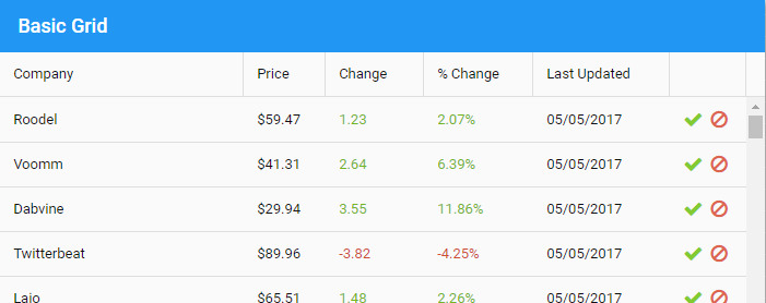
One immediate benefit to all grids is that you can now allow users to select rows,
cells or columns in a manner very similar to Microsoft Excel. Each of these selection
modes is now configurable using the simple new selectable config. This config provides
all the capabilities found in the classic toolkit's spreadsheet selection model.
A couple examples should illustrate:
items: [{
    xtype: 'grid',

    selectable: {
        cells: true,
        columns: true,
        drag: true,
        rows: true
    }
}]
These settings allow the user to make all kinds of selections in the grid. For example:
To just use a checkbox to select rows, change selectable to only include those properties:
items: [{
    xtype: 'grid',

    selectable: {
        checkbox: true,
        rows: true
    }

}]
As the user selects cells, rows or columns, various events are fired to allow your application to monitor these changes and take the appropriate actions.
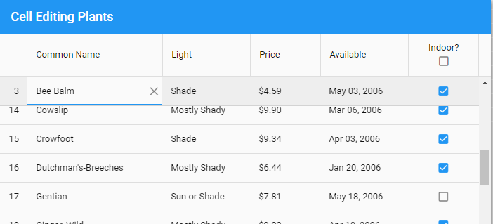
The grideditable plugin is now joined by the gridcellediting plugin. The grideditable
plugin is a good choice for a mobile user since it provides a modal form to edit the
fields of a row that slides in from the side. For desktop users, however, inline cell
editing is often a better choice and this is now available in the gridcellediting
plugin. As with grideditable, the form field to use is configured with the column's
editor config:
items: [{
    xtype: 'grid',

    plugins: {
        gridcellediting: true
    },

    columns: [{
        text: 'Name',
        dataIndex: 'name',
        editor: 'textfield'
    },
    ...]
}]
To provide an editing experience adapted to the current platform, you can
select which of these plugins to use with platformConfig:
items: [{
    xtype: 'grid',

    platformConfig: {

        desktop: {
            plugins: {
                gridcellediting: true
            }
        },

        '!desktop': {
            plugins: {
                grideditable: true
            }
        }
    },
    ...]
}]
To configure plugin options just replace the true value with a config object. The
plugin type will be known by the property key and does not need to be specified. Since
both plugins use the column's editor config, there will likely be no additional,
platform-specific configuration needed.
By default, while editing a cell on a row, the cell editor plugin will prevent that row from scrolling out of view. The row will automatically be pinned to the top or bottom of the grid when the row would normally be above or below the visible area.
While editing you can navigate to the next and previous cells using TAB and Shift+TAB. In fact, as part of cell editing, most of the actionable mode spec for keyboard interaction is supported in this release.
Panels were the first place tool components (a minimal, icon-only button) made their
initial debut:
With Ext JS 6.5, tools can go many more places... in particular, grids and lists!
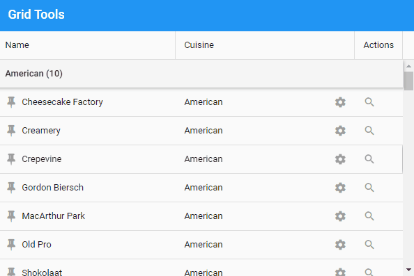
Probably the most commonly desired place for tools to appear is grid cells:
columns: [{
    ...
}, {
    width: 70,

    cell: {
        tools: {
            approve: {
                iconCls: 'x-fa fa-check green',
                handler: 'onApprove'
            },
            decline: {
                iconCls: 'x-fa fa-ban red',
                handler: 'onDecline',
                weight: 1
            }
        }
    }
}]
So far this looks like the classic toolkit's action column. All cells can have tools,
however, even if they have other content such as a simple dataIndex value. To control
the presentation in this case, the tool can be assigned a zone. By default, tools use
the "head" zone which is attached to the front of the cell content.
columns: [{
    text: 'Name',
    cell: {
        tools: {
            pin: 'onPin'
        }
    }
}, {
    text: 'Cuisine',
    cell: {
        tools: {
            gear: {
                handler: 'onSettings',
                zone: 'end'
            }
        }
    }
}, {
    ...
}]
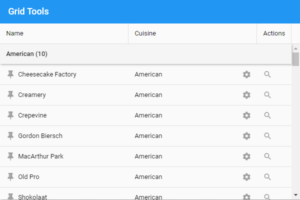
In total, there are four zones for cell tools: "head", "tail", "start" and "end". The "head" and "tail" zones attach the tool to the cell content and are affected by content length as well as alignment. Conversely, "start" and "end" are always at the left or right edge of the cell, respectively.
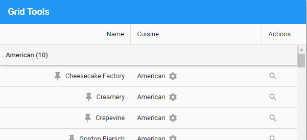
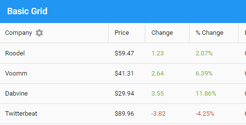
Column headers can also contain tools. For example you can make configurable columns by adding a gear to the column header like so:
columns: [{
    text: 'Company',
    tools: {
        gear: 'onCompanySettings'
    }
}, {
    ...
}]
Column headers support the same four zones for tools, but default to the "tail" zone as shown above.
When you apply a grouper to the store, the group header and its pinned variety can be used to contain tools as well. These tools would be useful for providing actions that operate on entire groups of records. The tools are specified on the groupHeader config like so.
groupHeader: {
    tools: {
        print: {
            handler: 'onGroupPrint',
            tooltip: 'Print group',
            zone: 'tail'
        },

        save: {
            handler: 'onGroupSave',
            weight: -1
        },

        refresh: 'onGroupRefresh'
    }
}
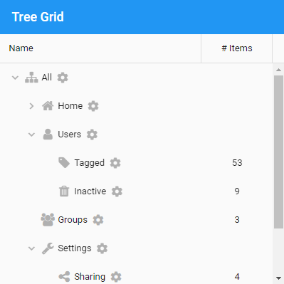
Placing tools on the tree cell works as you would expect with only one difference. In a tree cell, the default zone is "tail". For example:
columns: [{
    xtype: 'treecolumn',
    text: 'Name',
    dataIndex: 'text',
    flex: 1,
    cell: {
        tools: {
            gear: 'onChangeSettings'
        }
    }
}, {
    ...
}]
The above will add a gear tool following the text of each tree node:
Grid columns now provide popup menus that can be used to change sort direction and control grouping (as in the classic toolkit).
The column menu can also be easily customized in the column definition:
columns: [{
    text: 'Company',
    dataIndex: 'name',

    menu: {
        custom: {
            text: 'Custom Item',
            separator: true,
            handler: 'onCustom'
        }
    }
}, ...
The above snippet illustrates a couple other exciting features in this release. These are popup menus (obviously) and "weighted" containers. We've already seen weighted containers for tools, but more on each of these later.
To deal with massive (or just potentially massive) data sets, grids and infinite lists
can use the new virtual store (Ext.data.virtual.Store). Unlike a normal data store, a
virtual store only fetches the pages needed by the view(s) using it. Those familiar with
the classic toolkit grid will recognize that this is the same functionality provided by a
buffered store (Ext.data.BufferedStore). The inner workings and the public API of the
buffered store are, however, quite specific to the inner workings of the classic
toolkit grid. The modern toolkit grid (and list) have very different requirements. So
rather then break these public API's, the virtual store was born.
From a high-level perspective, there is little difference between a virtual store and a buffered store. Both hold only the portion of the data set needed for display (plus some nearby pages as a cache). Both request pages of records using the standard means of the data package, meaning that server-side handling is the same. It is only when you look at the details of the virtual store API that the differences come out.
Some of these differences are:
To manage the needs of its client views, a virtual store tracks a set of
active ranges. These are just objects (Ext.data.virtual.Range) created like so:
var range = store.createActiveRange({
    prefetch: true,
    callback: 'onRangeUpdate',
    scope: this
});

range.goto(1000, 1050);

var rec = range.records[1000];
if (rec) { ...
The above code creates and configures a range and then directs it to the desired records
using their index in the data set. The prefetch option tells the virtual store to load
pages adjacent to the range specified in the goto() call.
The records collection is indexable (at all times) using the absolute record index, even
if that number is very large. This is because, for a virtual store, records is not an
array but an object and so it is not fully populated.
The important thing to remember with a virtual store is that not all records are present
at any given point in time. That is to say, the if (rec) test is essential. To complete
the circuit, as new records become available in range.records, the callback is called
with the details.
The difference between virtual and non-virtual stores is minimized since all stores
(except buffered) implement createActiveRange. These stores simply provide read-only
access to their array of records as range.records and ignore the prefetch option.
These techniques add up to greatly streamlined code paths in critical areas such as responding to scrolling by populating and adjust rows just in time.
A very common mobile idiom for manipulating rows of information is to hide the
selection tool until it is needed. The rowoperations plugin provides this capability.
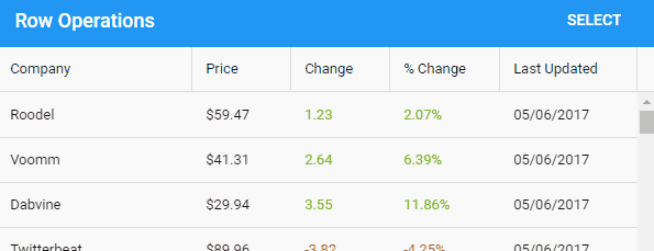
rowoperations is the renamed and revamped update to the MultiSelect plugin in previous
versions. rowoperations allows you to customize the operation(s) you want to perform on
the selected records. It can also disable selection visibility when not in selection
mode. That is, clicking on rows does not change their background to selected.
There are a collection of enhancements to the grouping abilities of lists and grids. For
starters, much more information is presented to the tpl config of the groupHeader. This
template now has access to numerous useful bits of information about the group,
including access to the group itself.
In addition, there are now column-level configs that can be applied when the grid is
grouped by that column. Columns can now provide a custom grouper that will be passed to
the store when the user asks to group by that column. Columns can also supply a
groupHeaderTpl config to be used instead of the normal tpl for the groupHeader.
There are also many improvements and new features in the realm of summaries. For
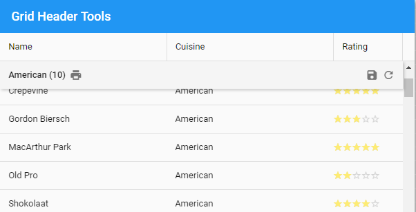
starters, the grid's summaryrow component can be added as the groupFooter:
groupFooter: {
    xtype: 'gridsummaryrow'
},
The above (plus some pieces we'll see in a moment) produce the summary row with an average Rating between the last row of the "American" group and the header of the "Asian" group:
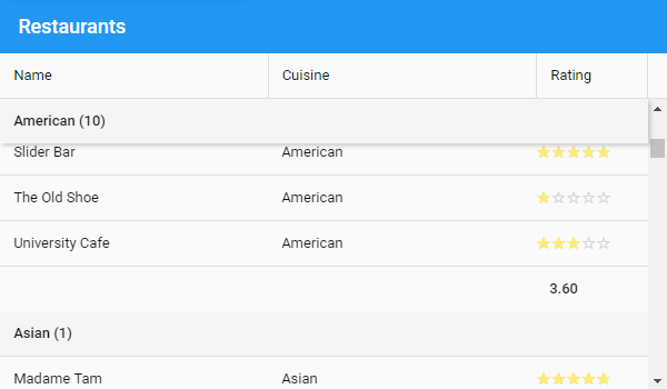
Columns have numerous configs that can be used to configure their cells in summary rows and the content of those cells.
summary
summaryCell
summaryDataIndex
summaryFormatter
summaryRenderer
The summaryCell, summaryDataIndex, summaryFormatter and summaryRenderer are the
counterparts to cell, dataIndex, formatter and renderer configs for normal rows.
In most cases these configs are applied to both summary and normal rows, but there are
many cases where these need to be adjusted for presenting summary
The summary config allows a column to specify how data should be aggregated or
summarized. This config holds the name of a summarizer (such as "average", "min",
"max", "sum"). This config is equivalent to the summary config on the data model layer.
Calculating and managing summaries for groups and whole stores can now be automated
in your data models. These can now be requested using the getSummaryRecord method on
stores and groups.
Consider a model for an Employee that has a salary field. By adding a summary config to the salary field we can indicate how that field should be processed when calculating summaries.
Ext.define('App.model.Employee', {
    extend: 'Ext.data.Model',
    fields: [{
        name: 'salary',
        summary: 'average'
    }]
});
We can also define additional summary fields:
Ext.define('App.model.Employee', {
    extend: 'Ext.data.Model',
    summary: {
        maxSalary: {
            field: 'salary',
            summary: 'max'
        }
    }
});
These definitions are used to populate the fields of a derived class called the
"summary model". An instance of this class is created to hold summary values when
loading from a remote source or just being calculated locally. In grid summary rows,
these summary records (instances of the summary model) are consulted using the dataIndex
(or summaryDataIndex). The column's summary and summaryRenderer configs can be used to
determine a value outside the data layer but defining summaries at this lower-level can
save a lot of repetition.
While these data level features are available to the classic toolkit, the classic grid's grouping plugin has not been updated to use summary models. It still performs grouping calculations as it was in previous versions.
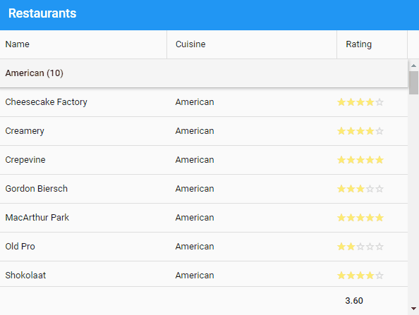
By default, infinite grids and lists will automatically pin group headers as seen above. That way the user can always see the group heading at the top of the grid as they scroll. The same can now be applied to group footers:
pinFooters: true,
pinnedFooter: {
    xtype: 'gridsummaryrow'
},
In most cases the pinnedFooter config will be the same as the groupFooter. For grids
the gridsummaryrow component (Ext.grid.SummaryRow) is the normal choice.
With the pinned footer in place the user can now always see the summary of the last visible group at the bottom of the grid.
The Rating column in the above examples demonstrates the rating component
(Ext.ux.rating.Picker) that was previously available only in the classic toolkit. The
rating component is an easy way to display a series of glyphs (typically stars) to
represent a value similar to the slider.
The new rowNumbers config automates the declaration of a rownumberer column in your
columns config. This makes it much simpler to retain this column if the others in your
grid change dynamically since you will no longer have to juggle the additional column.
Next to grids, lists are probably the most heavily used component in most applications. On mobile, lists are even more prominent, and so we've given lists a lot of attention and improvement. Many of the features mentioned for grids are in fact list features that grid simply inherits. Things like virtual stores, group footers and pinned footers are actually properly features of list. While virtual stores and pinned headers/footers are only available when the infinite config is enabled, normal group headers and footers are available in all lists.
A common list interaction in mobile applications is the ability to drag an item from side-to-side to perform some action upon it like "archive" or "delete". There are two ways this interaction typically takes place as you drag: all options are presented or only one option (at a time) is presented.
The new listswiper plugin supports both approaches.
To present all available options at the same time is called the "accordion". Adding the plugin to a list is much like declaring a toolbar:
plugins: {
    listswiper: {
        defaults: {
            width: 48
        },

        right: [{
            iconCls: 'x-fa fa-envelope',
            ui: 'alt confirm',
            commit: 'onMessage'
        }, {
            iconCls: 'x-fa fa-phone',
            ui: 'alt action',
            commit: 'onCall'
        }, {
            iconCls: 'x-fa fa-trash',
            ui: 'alt decline',
            commit: 'onDeleteItem'
            undoable: true
        }]
    }
},
With the above plugin defined, the user can now drag list items like so:
Actions can be placed on both sides or only one as shown above. If the item is swiped
sufficiently far and released, the item will park itself such that all of the
buttons will be fully displayed. The user can then decide to tap one or they can
resume dragging the item. In this open state, the dismissOnScroll and dismissOnTap
config can be used to decide what actions should return the item to normal.
When an action button is tapped or if the drag was large enough to trigger the default
button, the commit method is called (typically implemented by the view's controller).
Actions can also be undoable, but more on that later.
To present one action at a time, the listswiper plugin can be directed to a different
component for presenting the actions:
plugins: [{
    type: 'listswiper',
    widget: {
        xtype: 'listswiperstepper'
    },
The left and right configs are essentially the same as before, but not the user interaction looks like this:
It is often desirable to give the user the option to undo these gestures and the
listswiper provides all the hooks necessary to manage these more complex
operations. Normally when an action is selected its commit method is called. When an
undoable action is selected, it instead calls the optional precommit method and then
displays the Undo prompt.
While the Undo prompt can be customized, this is its normal appearance:
There are now two basic paths for the user to take. The first is the Undo button. If the
user taps Undo, the revert method will be called. All other ways to dismiss the Undo
interface will result in the commit method being called. In other words, precommit is
called when the user selects the action and then either commit or revert is called
depending on how the Undo prompt was dismissed.
In the same way that the dismissOnScroll and dismissOnTap configs control closing a swiped
item, they also determine whether these gestures will dismiss the Undo prompt. Since the
Undo button was not used to dismiss the item, the commit method will be called.
Another way for the prompt to be controlled is the commitDelay config. This config will
dismiss the Undo prompt after is has been displayed for a certain amount of time. When
this time elapses, again the commit method is called.
While the method names precommit, commit and revert imply their intended purpose, they
can of course be used to perform any actions necessary. For example, the simplest way
to implement an undoable Delete action is to simply put the logic in the commit method
as you would for a normal action. From the user's perspective, the item looks deleted once
they select that action, but if they select Undo then nothing actually happens.
Alternatively, you could perform the delete in the precommit method and then
also implement the revert method. Obviously this approach is more complex but may be
necessary if the effects of the delete need to be immediate.
Because Grid extends List, this plugin works on grid rows as well as list items.
While combining the listswiper with a grid that has horizontal scrolling is not a
recommended user experience, there are many simple grids where this plugin can be
quite useful.
As with grids, list items can now contain tools. In prior releases, there was only the option for a disclosure tool but now you can add any tool to your list items.
In previous releases, infinite lists (and grids) had to be given a height by some external means. Perhaps by a box or fit layout. In Ext JS 6.5, these can now operate on the maxHeight instead if one is specified. In this case, the infinite list will only acquire the height necessary to fully contain its items if that is less than the configured maxHeight. This is particularly useful when using popup lists that may contain a very large number of items… or perhaps just two.
The pullrefresh plugin has been updated so that all presentation modes are available to any theme. In the previous release, the floating spinner style was built into the material theme and so was unavailable in any other theme, and conversely the info bar was not available in material theme.
To stick with the default choices for your theme, simply add the plugin:
plugins: {
    pullrefresh: true
}
The default settings will produce the same result for each theme, but now you can configure the widget to use for the presentation.
To use the material spinner:
plugins: {
    pullrefresh: {
        widget: 'pullrefreshspinner',
        overlay: true
    }
}
To use an overlay info bar:
plugins: {
    pullrefresh: {
        widget: 'pullrefreshbar',
        overlay: true
    }
}
To use the inline info bar:
plugins: {
    pullrefresh: {
        widget: 'pullrefreshbar',
        overlay: false
    }
}
There are other settings for the pullrefresh plugin, like mergeData that determines if the refresh replaces the current records or only adds new ones.
It is easy to forget that some important functionality of list and grid actually comes to them from their dataview base class. The new associatedData config could easily go unnoticed for this reason, but that would be unfortunate because it is particularly useful for grids.
The associatedData config is used to limit the amount of data gathered from associations. The default value is true, which means to gather all available associated data and present it, along with the data fields, to the itemTpl, or the tpl for grid cells.
To see how associatedData works, consider a grid that displays a store of Order records. The Order has an association for orderItems that describes the items in the order as well as several other associations (such as multiple Address associations for shipping, billing, etc.). Each cell's tpl will be presented with an object containing the Order's fields, and child objects for all associated items such as an array of objects for the orderItems. If no cell tpl needs this information, we can save time and disable associations:
associatedData: false
If we only need the shippingAddress association, we can say something like this:
associatedData: {
    shippingAddress: true
}
Now the data gathering will be limited to the record's data fields and the data for the associated shippingAddress. This same underlying feature will appear again later for nested writing!
The forms package has gained a number of major improvements and some brand new components as well.
Perhaps the most important enhancement to the field component family is the validation
system. This support starts at the "bottom" with the new error and errorTarget configs on
Ext.field.Field. The validators config then allows you to succinctly express the
rules that determine the field's validity. The validator results are used to set the
field's error config.
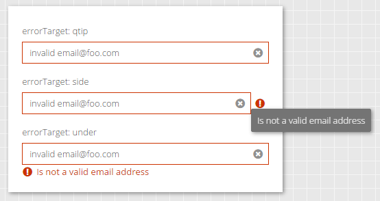
By default, the errorTarget is set to "qtip" which means you have to hover the field to see the tooltip:
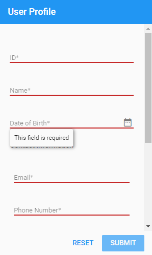
You can also specify "bottom" or "side" as the errorTarget. The "side" target will display an icon on the right side of the field when the field is invalid. Hovering or tapping that icon will display the error message.
There are other options for displaying the error message that you can learn more about in the API documentation.
The validators config allows you to add one or more rules to a field that will be automatically checked when the value changes.
For example:
{
    xtype: 'urlfield',
    label: 'Homepage',
    validators: 'url'
}
You can have multiple validators as well as provide config options:
{
    xtype: 'urlfield',
    label: 'Homepage',
    validators: [
        'url',
        { type: 'length', max: 140 }
    ]
}
When there is no value, the field's required config or a presence validator will be used to determine validity. Only when there is a value will other validators be tested. This means the above Homepage field is not required and will therefore accept an empty value.
Providing a visual assist for editing textfields has been a popular feature request for some time, and now with Ext JS 6.5 the inputMask has arrived. This is currently only available in the Modern toolkit for now but Classic will catch up soon.
To use this config, you need to require Ext.field.InputMask. This approach is similar to the new panel features and helps keep build size down for unused features. Once this class is required, you can add inputMask to any textfield like so:
{
    xtype: 'textfield',
    label: 'Phone Number',
    placeholder: '(xxx) xxx-xxxx',
    inputMask: '(999) 999-9999'
}
The above yield the format mask "() -__" which is inserted when the user focuses the field. Only valid characters for the cursor position are accepted while the mask is preserved.
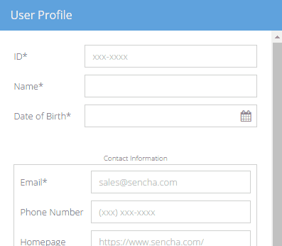
The numbers '0' and '9' serve as wildcards that will accept any digit. Similarly 'a' or 'A' will match any letter and '*' will match any alphanumeric character. All other characters are considered part of the format mask.
When developing for multiple devices it can be difficult to get the user experience right for all situations. One of the most glaring differences between mobile and desktop UX are what Ext JS calls picker fields like datefield. On mobile, the expected interface when editing such fields is typically a modal attached to the bottom of the screen. The desired experience for a desktop user is completely different.
The solution provided by Ext.field.Picker comes down to three configs: picker, edgePicker and floatedPicker. The picker config is generally set by the framework, based on the device type, to either 'edge' or 'floated'. This value then determines whether the edgePicker or floatedPicker config will be used to create the necessary components.
Normally then you would use the edgePicker and floatedPicker configs to determine how each experience should work and then the right one will be used automatically. Of course, you can also set the picker config directly and bypass the normal device-detection.
The datefield component uses the above picker controls to create a datepanel as the floated picker and a datepicker as the edge picker. The datepicker will be familiar from previous releases, but the datepanel is new in Ext JS 6.5.
The datepanel presents one or more calendar months from which the user can select the desired date. The datepanel can be configured to display multiple months in a carousel arrangement as well:

And of course, the datepanel can be created and used outside of a datefield.
The combobox is a selectfield with many additional features. The biggest difference is that, unlike a selectfield, the user can type into a combobox. As the user types the contents of the associated store is filtered.
The forceSelection config is the second major difference. This config determine how the value of the combobox is handled. The default value of false causes the combobox to act more like a textfield and allows the user to type whatever they want as the value. Setting this config to true requires that the user pick an item found in the store.
The formpanel (Ext.form.Panel) class that manages an HTML form has gained extra functionality to help manage errors for the fields it contains. It has also been refactored into some reusable since as the new fieldpanel (Ext.field.Panel) base class and the Ext.field.Manager mixin.
The fieldpanel can be used in most places where a formpanel is used currently. The major difference is that because a fieldpanel is not an HTML form element, it does not have a submit method. This is also one of its key advantages. While Ext JS allows you to nest formpanel's (and therefore their form elements), this is actually disallowed by the HTML5 Content Model. Now with fieldpanel, there is no reason to do so any longer.
All of the field management features and some new ones have been gathered in the
Ext.field.Manager mixin. These methods arrive on formpanel by being mixed into
fieldpanel, but are also available on containerfield (Ext.field.Container).
In the world of forms, fields often need to provide a name config to set their HTML
name attribute. To simplify managing fields in a controller there is the new lookupName()
method that works like the reference config and lookup() method. Unlike reference,
however, a name can be marked as shared using shareableName. In this case the lookupName()
call will return an array of components with the given name.
In many desktop forms it can be difficult to assign proper label widths. This is especially true if those labels can be localized. The form layout allows you to sidestep this issue and let the fields automatically adjust to their labels:
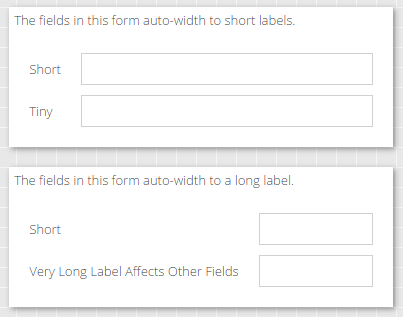
The first form simply declares its layout and labels its fields:
xtype: 'formpanel',
layout: 'form',
items: [{
    xtype: 'textfield',
    label: 'Short'
}, {
    xtype: 'textfield',
    label: 'Tiny'
}]
The major limitation with the form layout is that is uses CSS display table and table-cell to drive the label width. This makes it suitable for simple forms like these but not for more complex forms.
Popup menus come in handy at times on mobile but are essential for desktop
applications. The Ext.Menu class from previous releases was really just an
Ext.ActionSheet and so it has been removed to avoid confusion with the new
menu component family (Ext.menu.*). The menu family has components like menuitem,
menucheckitem and menuseparator. Of course, menuitem has a menu config for sub-menus
as does the button component.
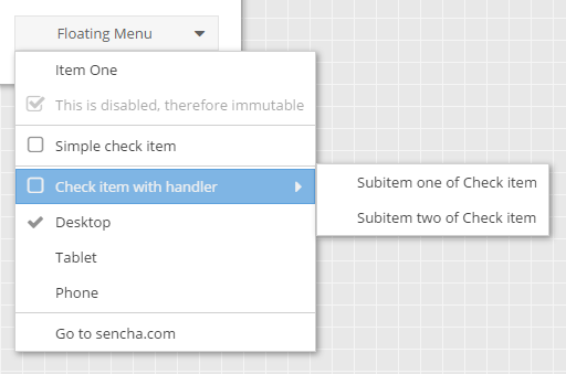
Another useful config on menuitem is separator. This boolean config allows you to associate a separator above the menuitem in such a way that it will never be orphaned. Orphaned separators are the bane of dynamic menus and the separator config can be really helpful in avoiding them. An orphaned separator is a separator that appears at the very top of the menu (say if the previous item was hidden or removed) or stay behind when the item they were separating was hidden or removed.
Compare the menu config using an explicit menuseparator component:
items: [{
    // ...
}, {
    xtype: 'menuseparator'
}, {
    text: 'Simple check item',
    checked: false
}, {
    // ...
}]
To the menu config using the separator config:
items: [{
    // ...
}, {
    text: 'Simple check item',
    checked: false,
    separator: true
}, {
    // ...
}]
Not much different, but now if that menu item is hidden or removed, the separator above it will be removed as well. Since the item below it also has a separator, this is the kind of thing that would lead to two adjacent separators.
Menus also set the new weighted config to true to enable more declarative menu creation. This is especially helpful for grid column menus that are produced by merging the grid's columnMenu config with the column's menu config.
In most containers the items config is defined as an array. This is ideal for lots of
simple cases, but at times it presents a challenge to declaratively intervene and remove
or adjust the properties of some member of that array. Declaratively adding to items is
also problematic. The first place the solution to this problem was applied was
Ext.panel.Header specifically because of its need to compose the items of that
container from the panel's header, title and tools configs. The same approach was used
for the triggers of a textfield, but those are not managed in an Ext.Container.
With Ext JS 6.5, this ability has been refactored and made available to any
Ext.Container via the weighted config. When this config is set to true, the items
can now be supplied as an object instead of an array. This can be seen in action in
Grid's columnMenu config:
columnMenu: {
    xtype: 'menu',
    items: {
        sortAsc: {
            xtype: 'gridsortascmenuitem',
            weight: -100 // Wants to be the first
        },
        sortDesc: {
            xtype: 'gridsortdescmenuitem',
            weight: -90 // Wants to be the second
        },
        //---------------------------------
        // Columns menu is inserted here
        //---------------------------------
        groupByThis: {
            xtype: 'gridgroupbythismenuitem',
            separator: true,
            weight: -70
        },
        showInGroups: {
            xtype: 'gridshowingroupsmenuitem',
            weight: -60
        }
    }
}
The keys of the items object become the itemId of the component and the items are sorted by their weight property. The advantage here is that if the column's menu config is also an object, these will be automatically merged by the config system. Should any of the keys be set to null, that item will simply be removed.
After the merging and the sorting is done, the items array will looking something like this:
items: [{
    xtype: 'gridsortascmenuitem',
    itemId: 'sortAsc',
}, {
    // ...
}, {
    xtype: 'gridshowingroupsmenuitem',
    itemId: 'showInGroups'
}]
Weighted containers were created for triggers and panel tools, but now are open to all as a powerful and flexible way to declare containers. They open new architectural options for writing base classes for views that can declare items and still allow derived classes and finally the instantiator to contribute details at almost any depth.
The weighted container enables the items config to be much more declarative so to go along with that approach the plugins config can now also be an object of named plugins. In fact, in many examples above we've been using this new syntax. Perhaps the most interesting is for cell editing:
platformConfig: {
    desktop: {
        plugins: {
            gridcellediting: true
        }
    },

    '!desktop': {
        plugins: {
            grideditable: true
        }
    }
},
By using named plugins like this, the plugins config on the class body will be merged with whatever matches the platform criteria. In the end, you can easily overlay all kinds of configs (even items and plugins) using platformConfig, inheritance and the final instance config to get exactly the right combination for the situation... without any array splicing logic!
The panel component is a widely used container because of its decorative capabilities. In Ext JS 6.5 these capabilities have grown considerably. From simply things like panel header rotation to some simple convenience configs like tbar (from the Classic toolkit), panels have grown even more useful.
Providing a way to directly manipulate the size of a component is essential in desktop
applications where space is often shared between multiple "regions". The new
Ext.panel.Resizer class (once required by the application) adds a resizable
config to Ext.Panel. This config is used to create and configure a resizer instance.
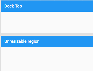
The "Dock Top" component is simply configured to be resizable:
resizable: {
    split: true,
    edges: 'north'
}
The resizer's split config can be removed and the resizer handle will simply overlap the bottom edge.
To really make room we need another technique. In the Classic toolkit, panels have a collapsible config which is now provided in the Modern toolkit by the Ext.panel.Collapser class. As with the Ext.panel.Resizer class, simply requiring Ext.panel.Collapser will add configs to panel. In this case, collapsible and collapsed. The collapsible config can simply be true or it can be a config object for the Ext.panel.Collapser instance.
There are lots of configs on the collapser, so definitely check it out in the docs, but perhaps the most interesting is the drawer config. The drawer is the component that "floats" out when you tap the collapsed header but not the expand tool.
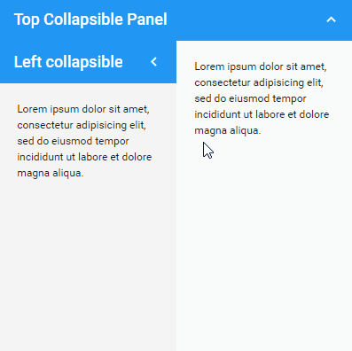
The collapser can also be configured to fully animate the collapse rather than to take the panel out of the flow as above. This would be appropriate for accordion arrangements for example.
While panels can do a tremendous amount, there is a cluster of functionality that is better served as a derived class: popups and modals. The Classic toolkit provided a window component but that name can be ambiguous with the browser's global window object and so the name Ext.Dialog was chosen for the Modern toolkit counterpart.
A dialog is a panel that is centered, draggable, floated and modal (by default). In addition, dialog adds the maximizable config and some refinements to processing the buttons config it inherited from panel.
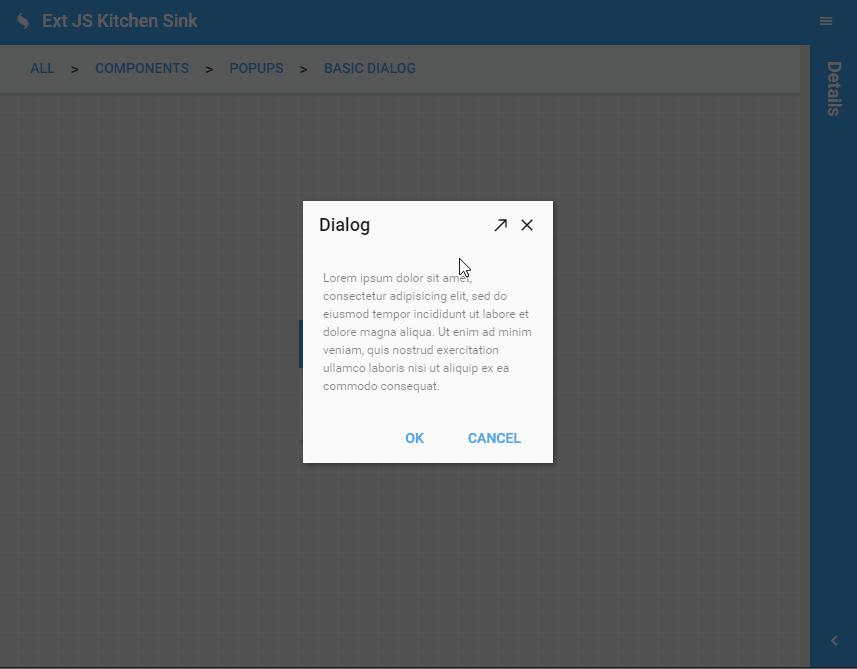
The buttons config (defined by panel) populates a weighted toolbar called the buttonToolbar. Being a weighted container, buttons can be merged with the standardButtons config that defines the text and weight for the most common buttons used by applications. This enables application code to be as simple as this:
buttons: {
    ok: 'onOK',
    cancel: 'onCancel'
}
Since the text and weight come from the standardButtons, these can now be more readily localized and also corrected for a key platform difference: the order of OK and Cancel. This (long) debate can be boiled down to this: Apple platforms want Cancel first and pretty much every other platform wants OK first. Since the goal is to provide the optimal user experience for the end-user, standardButtons assigns weights based on the current platform's standards.
A common pitfall when implementing most popups is to forget that the Cancel button and all its workflow of confirmations and acknowledgements will only happen when the user clicks the Cancel button. The ESC key and the close tool (X) often go down different routes. These are easily corrected once identified, but it would be best if this multipath shutdown weren't the default in the first place.
To make this the case, dialog has an array (dismissAction) of common button names (e.g., "cancel") that should be considered equivalent to ESC/X. When ESC or X arrives, the buttons config is checked for a matching button in the dismissAction array. If there is a match, that button is triggered as if the user had pressed it.
At the core of it all for the Modern toolkit is Ext.Component and Ext.Container. There are a few enhancements at this low-level that are important.
The first thing to note is that there is now an onRendered() template method for components. This method is called when a component is first added to the DOM. This is a bit different than the same named method in the Classic toolkit, but largely similar. In Modern, components have their elements created immediately so they can be used at any time (prior to being destroyed). The element tree of a component is not, however, immediately present in the DOM and hence cannot be measured or queried for styles. While these actions are not needed in most cases, and should be avoided unless necessary, the onRender method is the optimal answer when they are needed.
The final act of wiring ViewModels to their parent is now handled in onRender. This was previously performed at construction time. This prevented view model inheritance if components were created and then added to their container since a view model's parent cannot be changed after creation.
The draggable config now configures an instance of the Ext.drag.Source class in the new drag-drop system. In previous releases this config was implemented in a private way and basically only the value true had a defined meaning. Now you can do all kinds of tricks with draggable based on the drag system.
It is now easier than ever to get panels and other containers to size to their content. In fact, the new autoHeight config is on by default. There is an important qualification, however. The CSS necessary to make height "just work" can run into a long-standing and only very recently fixed performance issue in Safari.
Because the problem only affects some nesting situations and the fix will roll out over the next few months, the decision was made to favor correctness instead of the (short-lived) potential for a performance issue.
If you are seeing a performance gap on those platforms, we recommend the following override to change the default autoSize to false:
Ext.define(null, {
    override: 'Ext.Container',
    autoSize: false
});
Once the setting is changed, make sure to find and add autoSize:true to any containers that actually need it. If Safari and iOS are a critical target for your app, you could just start with this override of course.
There are number of improvements to the themes and theming API's to be excited about. The biggest change you'll notice if you have an Ext JS 6.2 app is that focus styling is now dynamically conditioned by whether the user is tapping or typing. This is how browsers natively decide to show focus on things like buttons, so users will find it quite natural. Mouse and touch users will not be bothered by focus indicators while keyboard users that need them will see them. If you switch back-and-forth, the indicators will come and go based on the most recent device used.
All themes now have focus, hover and pressed styles and variables to control them. Buttons and text fields have new ui's to help them better fit in places such as panel headers.
Buttons use the new ui ("alt") for placement on a panel header or title bar. The alt ui can also be combined with other button ui's like action or confirm.
The treelist component's new "nav" ui makes it a snap to get a good looking navigation tree, so you won't have to copy that code from the Admin Dashboard to start your next app!
Of all the core themes, the material theme is where most of the gains are found. There are improvements to ripples, tab transitions and field focus indicators to name a few.
There are two new components and several smaller features in the realm of charts.
In previous versions you had to create custom text sprites and position them to create titles and such inside the chart. This is now a much simpler process with the new captions config. This config is a weighted container of sprite configs with three special sprites: title, subtitle and credits.
The three predefined caption types pull their styles from the chart theme, so using them requires minimal configuration to get attractive results.
captions: {
    title: 'The Title'
}
All captions are positioned by the chart layout and require minimal configuration but are commonly adjusted for things like weight and docking.
The navigatorcontainer is a container for a chart that shows a "minimap" of the chart’s entire data set and allows the user to interactively adjust the rendered range.
The navigator is fully compatible and automatically syncs bidirectionally with the ‘panzoom’ interaction.
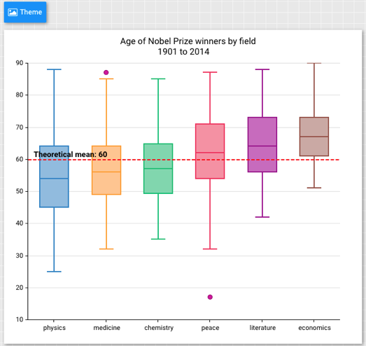
A common chart type used to show the distribution of data in multiple datasets, the boxplot can be used with the scatter series that render outliers (pink dots on the screenshot below).
The new curve config allows you to much more easily customize the appearance of line series. It is typically specified as an object like this:
curve: {
    type: 'cardinal',
    tension: 0.5
}
The tension config allows you to bring the smoothed curve extremums closer to the control points. The optimal value for tension will often depend on the data.
The big news in D3 is the upgrade to version 4. This upgrade contains breaking changes from version 3, so if your application is using D3 directly then you may need to make some changes in those areas affected by the changes in version 4.
We've added new support for zooming and labels to the d3-sunburst component. It will
also animate the labels during zoom.
The new transitions config powers many improvements in tree and other hierarchy components (such as d3-heatmap). This config also allows you to customize stock transitions and even manage your own.
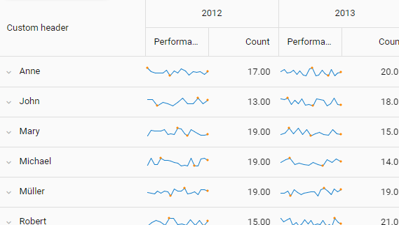
The powerhouse for crunching data, Pivot Grid now gives you even more analytical tools by allowing you to render widgets in cells. For example, you can use a sparkline to represent a whole series of numbers at a glance.
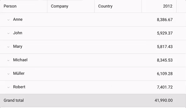
The new tabular layout (as found in Microsoft Excel) is a great way to see more while taking up less space.
The Exporter package enables you to export data to various file formats. With Ext JS 6.5, exporter now supports exporting pivot table definitions, which means your users can now export the raw data and the Pivot Table natively into Microsoft Excel.
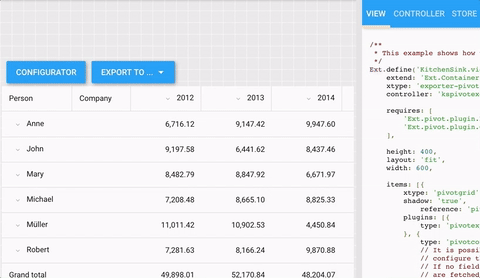
As you can see above, the exported xlsx file contains the pivot table on the first sheet and the raw data on the second sheet.
The Ext JS data package has supported nested loading for some time. With Ext JS 6.5, you now have much greater control of nested data when saving to the server. Previously, you could configure the writer to send all associated data like so:
Ext.define('Order', {
    extend: 'Ext.data.Model',
    proxy: {
        writer: {
            allDataOptions: {
                associated: true
            },
            partialDataOptions: {
                associated: true
            }
        }
    }
});
The problem this presented was that it would gather all available associated data. Including data you may not want to write. With Ext JS 6.5, you can now supply a "shape" object for the associated data:
Ext.define('Order', {
    extend: 'Ext.data.Model',
    proxy: {
        writer: {
            allDataOptions: {
                associated: {
                    orderItems: true
                }
            },
When the associated config is an object, its keys are the associations you want to include. This can be nested multiple levels deep as needed:
Ext.define('Order', {
    extend: 'Ext.data.Model',
    proxy: {
        writer: {
            allDataOptions: {
                associated: {
                    orderItems: {
                        item: true
                    }
                }
            },
In some cases a ViewController may need to be bound to the ViewModel and react to
changes in its data. In previous releases this would be handled in the initViewModel()
method where the necessary calls to bind() could be made. This can now be cleanly
automated with the new bindings config:
Ext.define('App.view.MainController', {
    extend: 'Ext.app.ViewController',

    bindings: {
        onChangeFoo: {
            foo: '{foo}',
            bar: '{bar}'
        }
    },

    onChangeFoo: function (data) {
        // data.foo and data.bar will be populated from VM
    }
});
Since a binding will only deliver once all of its pieces are available, it is not a good idea to have just one large bind that accepts everything. When binding to multiple values at once, it is recommended to only bind to meaningfully related items.
It can be tedious at times to always be sure to include the '!' part of the '#!' in your routes, but the new router config on Ext.app.Application makes it a one-time decision:
Ext.define('App.Application', {
    extend: 'Ext.app.Application',

    router: {
        hashbang: true
The map component (Ext.ux.google.Map) now supports a markers config that makes it easy
to manage a store of markers (Ext.ux.google.map.Marker records). Manipulating the store
or its records will have the appropriate effect on the map.
Well, that just about covers all the big and new things you'll find in Ext JS 6.5! There are plenty more details in the API docs. We hope you are as excited as we are with all the new capabilities Ext JS 6.5 will bring to your applications!


 Ext JS | Terms of Use
