Resource Management
Many classes have shortcut names used when creating (instantiating) a class with a
configuration object. The shortcut name is referred to as an alias (or xtype if the
class extends Ext.Component). The alias/xtype is listed next to the class name of
applicable classes for quick reference.
Framework classes or their members may be specified as private or protected. Else,
the class / member is public. Public, protected, and private are access
descriptors used to convey how and when the class or class member should be used.
Public classes and class members are available for use by any other class or application code and may be relied upon as a stable and persistent within major product versions. Public classes and members may safely be extended via a subclass.
Protected class members are stable public members intended to be used by the
owning class or its subclasses. Protected members may safely be extended via a subclass.
Private classes and class members are used internally by the framework and are not intended to be used by application developers. Private classes and members may change or be omitted from the framework at any time without notice and should not be relied upon in application logic.
static label next to the
method name. *See Static below.Below is an example class member that we can disect to show the syntax of a class member (the lookupComponent method as viewed from the Ext.button.Button class in this case).
Let's look at each part of the member row:
lookupComponent in this example)( item ) in this example)Ext.Component in this case). This may be omitted for methods that do not
return anything other than undefined or may display as multiple possible values
separated by a forward slash / signifying that what is returned may depend on the
results of the method call (i.e. a method may return a Component if a get method calls is
successful or false if unsuccessful which would be displayed as
Ext.Component/Boolean).PROTECTED in
this example - see the Flags section below)Ext.container.Container in this example). The source
class will be displayed as a blue link if the member originates from the current class
and gray if it is inherited from an ancestor or mixed-in class.view source in the example)item : Object in the example).undefined a "Returns" section
will note the type of class or object returned and a description (Ext.Component in the
example)Available since 3.4.0 - not pictured in
the example) just after the member descriptionDefaults to: false)The API documentation uses a number of flags to further commnicate the class member's function and intent. The label may be represented by a text label, an abbreviation, or an icon.
classInstance.method1().method2().etc();false is returned from
an event handler- Indicates a framework class
- A singleton framework class. *See the singleton flag for more information
- A component-type framework class (any class within the Ext JS framework that extends Ext.Component)
- Indicates that the class, member, or guide is new in the currently viewed version
- Indicates a class member of type config
- Indicates a class member of type property
- Indicates a class member of type
method
- Indicates a class member of type event
- Indicates a class member of type
theme variable
- Indicates a class member of type
theme mixin
- Indicates that the class, member, or guide is new in the currently viewed version
Just below the class name on an API doc page is a row of buttons corresponding to the types of members owned by the current class. Each button shows a count of members by type (this count is updated as filters are applied). Clicking the button will navigate you to that member section. Hovering over the member-type button will reveal a popup menu of all members of that type for quick navigation.
Getting and setter methods that correlate to a class config option will show up in the methods section as well as in the configs section of both the API doc and the member-type menus just beneath the config they work with. The getter and setter method documentation will be found in the config row for easy reference.
Your page history is kept in localstorage and displayed (using the available real estate) just below the top title bar. By default, the only search results shown are the pages matching the product / version you're currently viewing. You can expand what is displayed by clicking on the button on the right-hand side of the history bar and choosing the "All" radio option. This will show all recent pages in the history bar for all products / versions.
Within the history config menu you will also see a listing of your recent page visits. The results are filtered by the "Current Product / Version" and "All" radio options. Clicking on the button will clear the history bar as well as the history kept in local storage.
If "All" is selected in the history config menu the checkbox option for "Show product details in the history bar" will be enabled. When checked, the product/version for each historic page will show alongside the page name in the history bar. Hovering the cursor over the page names in the history bar will also show the product/version as a tooltip.
Both API docs and guides can be searched for using the search field at the top of the page.
On API doc pages there is also a filter input field that filters the member rows using the filter string. In addition to filtering by string you can filter the class members by access level, inheritance, and read only. This is done using the checkboxes at the top of the page.
The checkbox at the bottom of the API class navigation tree filters the class list to include or exclude private classes.
Clicking on an empty search field will show your last 10 searches for quick navigation.
Each API doc page (with the exception of Javascript primitives pages) has a menu view of metadata relating to that class. This metadata view will have one or more of the following:
Ext.button.Button class has an alternate class name of Ext.Button). Alternate class
names are commonly maintained for backward compatibility.Runnable examples (Fiddles) are expanded on a page by default. You can collapse and expand example code blocks individually using the arrow on the top-left of the code block. You can also toggle the collapse state of all examples using the toggle button on the top-right of the page. The toggle-all state will be remembered between page loads.
Class members are collapsed on a page by default. You can expand and collapse members using the arrow icon on the left of the member row or globally using the expand / collapse all toggle button top-right.
Viewing the docs on narrower screens or browsers will result in a view optimized for a smaller form factor. The primary differences between the desktop and "mobile" view are:
The class source can be viewed by clicking on the class name at the top of an API doc page. The source for class members can be viewed by clicking on the "view source" link on the right-hand side of the member row.
Web applications commonly include images and other non-code assets (such as video clips, data files, etc.) in addition to their JavaScript, HTML and CSS content. Sencha Cmd categorizes these additional assets as "resources" and provides several options for their management. The best way to understand these options is to start simple and grow the scenario one layer at a time.
To begin, let's generate a workspace that will contain all of the applications and packages that we're going to discuss below. You can do so by issuing the following commands via your CLI:
sencha -sdk /path/to/extjs6 generate workspace ./workspace

cd workspace

sencha generate app --ext --classic MyApp ./myapp

sencha generate app --ext UniversalApp ./myuniversalapp

sencha generate package arrow-button
Here's the resulting file structure for our workspace:
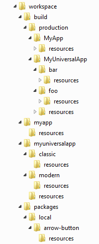
Workspaces are not required to utilize the basic concepts of this guide. However, when dealing with multiple applications and/or packages, a workspace is recommended for coordinating frameworks and builds. For more information about workspaces, please check out our workspace guide.
Note: Generating a package while in an application directory will automatically add the package as an application
dependency by default. If you need to manually add the package to your application, simply add the package name to
your app.json's requires block like so:
 "requires": [
      "font-awesome",
      "arrow-button"
  ],
Let's begin by evaluating our classic toolkit application under the "myapp" folder. The standard structure for a single-toolkit application looks like this:
app/
    view/
    ...
resources/   # home for app resources
sass/
app.json
"app.json", the application descriptor, contains many configuration options. However, the "resources" array describes the
location of the application's resources:
"resources" [{
    "path": "resources",
    "output": "shared"
...
}]
In single-toolkit applications such as this one, only the first entry (shown above) corresponds to an actual resource folder. The remaining entries (and the "output" property of this first entry) are simply ignored in this case, but will come into play for universal applications (more below).
The top-level "output" object in "app.json" completes the picture by specifying the output locations for the
application's build. The starting point of this is the output base:
"output": {
    "base": "${workspace.build.dir}/${build.environment}/${app.name}",
    ...
},
The output base directory is the root location where all build products are placed. In the above, the output base is a
formula that uses several configuration variables, which are expanded by Sencha Cmd when it loads the "app.json"
file. In this case, the expansion would produce the following path:
./workspace/build/production/MyApp
By default, resources are copied to a "resources" subfolder in this directory. This arrangement means that the relative paths in development mode will match the relative paths in the build folder.
Many of the resources needed by an application are provided by its theme. You can specify a theme via "app.json" like so:
"theme": "theme-triton",
Themes often extend other themes, which allows resources to be inherited and overridden as needed. The base theme for Triton is Neptune, so the resources for both of these themes will be inherited by the application and copied into the "resources" folder.
To illustrate this process, let's consider the propagation of a particular image resource:
theme-neptune/
    resources/
        images/
            loadmask/
               loading.gif
Now, build your application like so:
sencha app build --production
The "loading.gif" is copied from Neptune's "resources" folder into the application's build output. The resulting
output looks something like this:
build/
    production/
        MyApp/
            index.html    # the output page
            resources/
                images/
                    loadmask/
                       loading.gif  # from theme-neptune
As you can see, the build output now contains an image resource that it inherited from its base theme.
In the above example, the "images/loadmask/loading.gif" resource was inherited from its base theme, Triton. If the
application were to create its own GIF file in its own "resources" folder at the same relative path, that GIF would
override the image from the theme.
You can use the following loading gif to see the application resource override in action if you're following along:

To override a resource provided by the theme, place your replacement image in the resources folder corresponding to the theme's resources folder. In this case, we're overriding the theme's loadmask "loading.gif" file. So you'd put your image here:
app/
    view/
    ...
resources/
    images/
        loadmask/
           loading.gif   # override theme image
sass/
app.json
Now, you can just build the production version of your application and you should see your application's "loading.gif" in the resulting build resource folder.
Similarly, the Triton theme could have overridden the image from Neptune but this would have been transparent to the application. The application's only concern is that the configured theme uses this image; whether this image comes from the application itself or from the theme (or an inherited theme) is completely flexible.
Similar to themes, code packages can also contain resources. These resources are also copied into the "resources" build output folder. To protect multiple, independently developed packages from colliding, however, these resources are placed in a folder named by the package name.
For example, let's visit the "arrow-button" package we generated above. This package should contain an image in its resources, which will assist in illustrating the package's resource management.
Note: You can use the following arrows for your convenience if you're following along with this guide:

The package will contain a structure that looks like this:
resources/
    images/
        arrow.png   # the arrow image used by this package
    ...
sass/
package.json
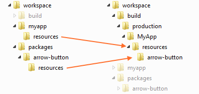
Upon building your application's production build, the package's resources are copied into the application build like so:
build/
    production/
        MyApp/
            index.html    # the output page
            resources/
                arrow-button/   # the package's resource "sandbox"
                    images/
                       arrow.png
As with themes, the application can override these resources as well:
app/
    view/
    ...
resources/
    arrow-button/
        images/
           arrow.png   # override package's image
sass/
app.json
Visually this process looks something like this:
As shown above, applications consume package resources and integrate them into their builds. This process is guided by
the package descriptor ("package.json") as is the process of building an individual package.
The package descriptor is similar to the application descriptor ("app.json"). This file is where the package author
can configure resource locations and build output locations. For example:
"output": "${package.dir}/build",
Similar to the "output" configuration from "app.json", the above determines where package resources are copied during
a package build. The "resources" object is not present by default in "package.json", but behaves as if this were present:
"resources": [{
    "path": "resources"
}]
This is the same object used by "app.json".
For a package to be easily consumed by non-Cmd applications, it must be built by running the following in the package directory:
sencha package build
Unlike application builds, package builds do not have the concept of an environment like "production" or "testing". Instead a package build produces both compressed, optimized code and uncompressed, debuggable code.
build/
    arrow-button-debug.js
    arrow-button.js
    resources/
        images/
            arrow.png   # the arrow image used by this package
...
package.json
The contents of the "build" folder are then directly usable as script and link elements in applications that do not
use Sencha Cmd.
The difference between the package build and application build, as it relates to resources, is that application builds create a resource sandbox for the package's resources. This means that the relative path from the CSS file to the package's resources will be different between package builds and application builds.
In both .scss and .js code, there are API's that determine the proper path to a given resource. For example, the
arrow button might have a CSS rule like this:
.arrow-button {
    background-image: url(get-resource-path('images/arrow.png'));
}
In the package build, get-resource-path will not sandbox the resources. When used in an application build, however,
get-resource-path will properly sandbox the package's resources.
In JavaScript, the Ext.getResourcePath API does the same job.
image.setSrc(
    Ext.getResourcePath('images/arrow.png', null, 'arrow-button')
);
Unlike get-resource-path, the JavaScript equivalent method Ext.getResourcePath, cannot determine the package name
by default and so it must be provided. This argument is only needed for code packages, however. Theme packages do not
need this argument since their resources are not sandboxed.
Note: The null second argument is the resource pool name, which is not used in this case. It is more commonly
used by universal applications.
The application and package discussed so far have been pretty standard examples of Sencha applications up through version 5. The introduction of universal applications in Ext JS 6 and their use of build profiles adds another variable to the resource equation.
While build profiles are discussed in more details in the Microloader Guide, they can be summarized as a way to instruct Sencha Cmd to build multiple, independently optimized flavors of an application. The application decides at page load time which build profile to load based on whatever policy is appropriate for the application.
For example, build profiles can be used to support multiple themes or locales. In an Ext JS 6 universal application, build profiles are used to target the modern and classic toolkits (typically to create optimized builds that target mobile and desktop, respectively).
Let's go ahead and open up the universal application that we generated above so we can walk through some of the differences.
To start, let's open the app.json file from the root of "myuniversalapp".
Build profiles are the properties of the "builds" object in "app.json". The Ext JS 6 starter application has the
following "builds" object:
"builds": {

    "classic": {
        "toolkit": "classic",
        "theme": "theme-triton"
    },

    "modern": {
        "toolkit": "modern",
        "theme": "theme-triton"
    }

},
The "classic" and "modern" property names were chosen to match their respective "toolkit" option, but could have been called anything. To avoid confusing toolkit names with build profile names, the names for this example will be "foo" and "bar":
"builds": {

    "bar": {
        "toolkit": "classic",
        "theme": "theme-triton"
    },

    "foo": {
        "toolkit": "modern",
        "theme": "theme-triton"
    }

},
Because build profiles adjust fundamental things like "toolkit" and "theme" (and therefore produce different CSS files), their resources must be isolated from each other. In other words, the "foo" build profile will have its own CSS file and therefore must keep its resources separate from those of the "bar" build profile.
This isolation is necessary for some resources, but there are also resources that both build profiles may want to share (such as a video clip).
The "app.json" file's "output" object can be adjusted to handle both of these scenarios. This is done by default for a
universal starter application:
"output": {

    "base": "${workspace.build.dir}/${build.environment}/${app.name}",
    ...
    "resources": {
        "path": "${build.id}/resources",
        "shared": "resources"
    }

},
The "resources" object properties ("path" and "shared") are called "resource pools". Prior to Sencha Cmd 6.0.1, there was only one resource output location ("output.resources.path"). In Sencha Cmd 6.0.1 this is now the default resource pool. There is also a new "shared" resource pool as well, but there can be any number of additional output locations added to the object.
In the above configuration, resources will be placed in the same subdirectory as the CSS file. This is based on the "build.id" property expansion to be the name of the build profile ("foo" or "bar"). It is important to note that all relative paths in the "output" object are relative to the "output.base".
Let's go ahead and build UniversalApp so we can have a look at the resulting build folder. Simply "cd" into "myuniversalapp" and issue the following command from your CLI:
sencha app build --production
Note: This will create a build for both build targets: foo and bar.
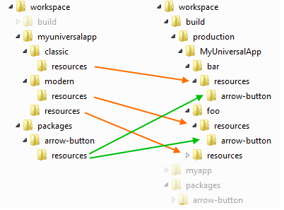
Looking at the resulting build folder:
build/
    production/
        UniversalApp/
            index.html    # the output page
            bar/          # the build profile using "classic"
                resources/
                    UniversalApp-all.css
                    images/
                        loadmask/
                            loading.gif  # from theme-neptune
            foo/          # the build profile using "modern"
                resources/
                    UniversalApp-all.css
                    ...
Corresponding to the resource pools above is the optional "output" property on each entry in the top-level "resources" array.
"resources": [{
    "path": "resources",
    "output": "shared"   # targets the "shared" resource pool
}, {
    "path": "${toolkit.name}/resources"   # uses the default pool
}],
Given these resource locations, a universal application can still override the "loading.gif" but to do so it would
move the image into the "classic/resources" folder.
app/
    view/
    ...
resources/
    ...
classic/       # from the ${toolkit.name} in the resources array
    resources/
        images/
            loadmask/
               loading.gif   # override theme image
sass/
app.json
When a resource can be shared, it should be put in the top-level "resources" folder as opposed to "classic/resources"
or "modern/resources". For example:
app/
    view/
    ...
resources/
    video.mp4
classic/
    resources/
sass/
app.json
This folder is associated with the "shared" resource pool, which is directed to the "resources" folder at the root of
the build output directory:
build/
    production/
        UniversalApp/
            index.html    # the output page
            resources/    # shared resource pool
                video.mp4
            foo/          # build profile
                ...
            bar/          # build profile
                ...
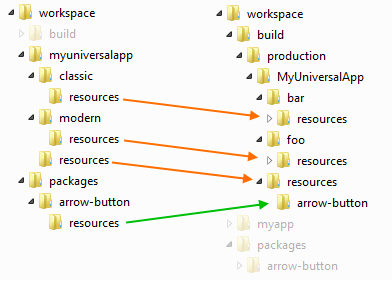
By default, packages resources are not shared which results in a build output that looks like this:
In the case of a theme package this isolation is necessary and this same logic is applied to all packages by default. In Sencha Cmd 6.0.1, however, package resources can also be shared.
Packages, like applications, can describe resources that target specific resource pools by specifying a resource pool
name using the "output" property on a resource entry. For example, the "font-awesome" package contains almost 800 KB of
font assets which need not be duplicated for each build profile. To support this optimization, the "package.json" file
for "font-awesome" looks contains this:
"resources": [{

    "path": "${package.dir}/resources",

    "output": "shared"

}]
For applications that do not define resource pools, these resources will be placed in the default resource pool. While this may be inefficient in some cases, this ensures that the assets will be mutually available. It is therefore always recommended to declare a "shared" resource pool in applications that use build profiles.
Modifying the "arrow-button" resources to follow the pattern used by "font-awesome" produces the following build output:
To locate a shared resource in .scss, you can provide the resource pool name to the get-resource-path API:
background: url(get-resource-path('images/foo.png', $pool: 'shared'));
And in JavaScript:
image.setSrc(Ext.getResourcePath('images/foo.png', 'shared'));
Some component configs will accept URL's resource pool tags (such as Ext.Img#src):
items: [{
    xtype: 'img',
    src: '<shared>images/foo.png'
}]
Package builds also provide support for build profiles. These are very similar to applications but package build profiles are used to create package build artifacts for use by non-Cmd applications. Packages, therefore, use build profiles to create multiple flavors of builds perhaps by toolkit or by theme depending on how these variables affect the usability of their code or styling.
The resource management options in Sencha Cmd allow you to describe your input resources and flexibly control the shape of the build output. Combined with the API's necessary to determine final resource locations, all this flexibility does not have to translate into code complexity.


 Cmd | Terms of Use
