Responsive Dashboard
Many classes have shortcut names used when creating (instantiating) a class with a
configuration object. The shortcut name is referred to as an alias (or xtype if the
class extends Ext.Component). The alias/xtype is listed next to the class name of
applicable classes for quick reference.
Framework classes or their members may be specified as private or protected. Else,
the class / member is public. Public, protected, and private are access
descriptors used to convey how and when the class or class member should be used.
Public classes and class members are available for use by any other class or application code and may be relied upon as a stable and persistent within major product versions. Public classes and members may safely be extended via a subclass.
Protected class members are stable public members intended to be used by the
owning class or its subclasses. Protected members may safely be extended via a subclass.
Private classes and class members are used internally by the framework and are not intended to be used by application developers. Private classes and members may change or be omitted from the framework at any time without notice and should not be relied upon in application logic.
static label next to the
method name. *See Static below.Below is an example class member that we can disect to show the syntax of a class member (the lookupComponent method as viewed from the Ext.button.Button class in this case).
Let's look at each part of the member row:
lookupComponent in this example)( item ) in this example)Ext.Component in this case). This may be omitted for methods that do not
return anything other than undefined or may display as multiple possible values
separated by a forward slash / signifying that what is returned may depend on the
results of the method call (i.e. a method may return a Component if a get method calls is
successful or false if unsuccessful which would be displayed as
Ext.Component/Boolean).PROTECTED in
this example - see the Flags section below)Ext.container.Container in this example). The source
class will be displayed as a blue link if the member originates from the current class
and gray if it is inherited from an ancestor or mixed-in class.view source in the example)item : Object in the example).undefined a "Returns" section
will note the type of class or object returned and a description (Ext.Component in the
example)Available since 3.4.0 - not pictured in
the example) just after the member descriptionDefaults to: false)The API documentation uses a number of flags to further commnicate the class member's function and intent. The label may be represented by a text label, an abbreviation, or an icon.
classInstance.method1().method2().etc();false is returned from
an event handler- Indicates a framework class
- A singleton framework class. *See the singleton flag for more information
- A component-type framework class (any class within the Ext JS framework that extends Ext.Component)
- Indicates that the class, member, or guide is new in the currently viewed version
- Indicates a class member of type config
- Indicates a class member of type property
- Indicates a class member of type
method
- Indicates a class member of type event
- Indicates a class member of type
theme variable
- Indicates a class member of type
theme mixin
- Indicates that the class, member, or guide is new in the currently viewed version
Just below the class name on an API doc page is a row of buttons corresponding to the types of members owned by the current class. Each button shows a count of members by type (this count is updated as filters are applied). Clicking the button will navigate you to that member section. Hovering over the member-type button will reveal a popup menu of all members of that type for quick navigation.
Getting and setter methods that correlate to a class config option will show up in the methods section as well as in the configs section of both the API doc and the member-type menus just beneath the config they work with. The getter and setter method documentation will be found in the config row for easy reference.
Your page history is kept in localstorage and displayed (using the available real estate) just below the top title bar. By default, the only search results shown are the pages matching the product / version you're currently viewing. You can expand what is displayed by clicking on the button on the right-hand side of the history bar and choosing the "All" radio option. This will show all recent pages in the history bar for all products / versions.
Within the history config menu you will also see a listing of your recent page visits. The results are filtered by the "Current Product / Version" and "All" radio options. Clicking on the button will clear the history bar as well as the history kept in local storage.
If "All" is selected in the history config menu the checkbox option for "Show product details in the history bar" will be enabled. When checked, the product/version for each historic page will show alongside the page name in the history bar. Hovering the cursor over the page names in the history bar will also show the product/version as a tooltip.
Both API docs and guides can be searched for using the search field at the top of the page.
On API doc pages there is also a filter input field that filters the member rows using the filter string. In addition to filtering by string you can filter the class members by access level, inheritance, and read only. This is done using the checkboxes at the top of the page.
The checkbox at the bottom of the API class navigation tree filters the class list to include or exclude private classes.
Clicking on an empty search field will show your last 10 searches for quick navigation.
Each API doc page (with the exception of Javascript primitives pages) has a menu view of metadata relating to that class. This metadata view will have one or more of the following:
Ext.button.Button class has an alternate class name of Ext.Button). Alternate class
names are commonly maintained for backward compatibility.Runnable examples (Fiddles) are expanded on a page by default. You can collapse and expand example code blocks individually using the arrow on the top-left of the code block. You can also toggle the collapse state of all examples using the toggle button on the top-right of the page. The toggle-all state will be remembered between page loads.
Class members are collapsed on a page by default. You can expand and collapse members using the arrow icon on the left of the member row or globally using the expand / collapse all toggle button top-right.
Viewing the docs on narrower screens or browsers will result in a view optimized for a smaller form factor. The primary differences between the desktop and "mobile" view are:
The class source can be viewed by clicking on the class name at the top of an API doc page. The source for class members can be viewed by clicking on the "view source" link on the right-hand side of the member row.
In the most recent release of Sencha Architect we added support for Ext JS 6, introducing a whole new way to build apps using MVVM.
In this guide, we'll be introducing 3 new concepts: responsive configs, view controllers, and view models. In doing so we will build a dashboard app that involves navigation and a grid displaying profit and loss numbers -- the same kind of app Sencha customers build every day.
To follow along in this tutorial, you'll need the following:
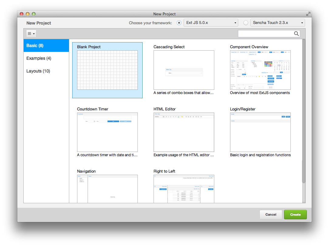
First, open Architect and create a new Ext JS application by selecting "Blank Project".
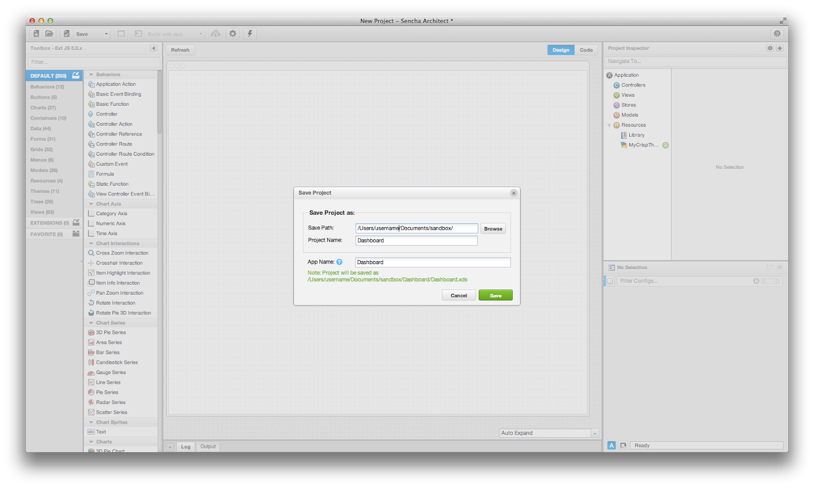
After the Architect interface loads, immediately save the project. When prompted, enter the following:
Upon save completion, an "Application Rename" dialog will appear. You can click "No" since this is a fresh application.
The project should then begin initializing Cmd.
The resources we downloaded earlier are specific to the app we are building, containing data (in the form of JSON files), images, and icons. Open your file explorer to your project and remove the existing resources directory.
Then unzip the new resources into place (e.g. c:\projects\dashboard\resources\).
The main view will serve as the primary container for our app. Let's create a tab panel with some responsiveness by doing the following:
MainNext, set the following configs on our tab panel.
Note: You can isolate them using the config filter if they are not immediately visible.
10 (Click the edit button, type 0 into the resulting object, and click the checkbox to complete)0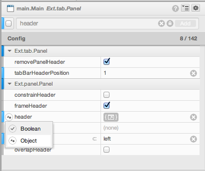
Let's edit the header object by clicking on the icon 
Copy and paste the following code into the resulting object:
{
    layout : {
        align : 'stretchmax'
    },
    iconCls : 'exec-header-icon',
    title : {
        text      : 'MyBiz',
        textAlign : 'center',
        flex      : 0,
        minWidth  : 160
    }
}
Next, let's search for "Tab Bar Config" in the config search and add a customized tab bar by clicking the "+" icon
next to the resulting config. Select the new tab bar in the inspector and set flex to 1.
Select the main view again and remove the 3 tabs that get created by default under Main.
Finally, set headerPosition to left and we're done!
By adding responsiveConfig to our tab configuration, our application can react accordingly when viewed on different screens (e.g. desktop browser vs phone screen). This is surprisingly easy to do!
First, select the Main view in the Project Inspector. In the config filter, set defaults to the following:
{
    tabConfig: {
        responsiveConfig: {
            wide: {
                iconAlign: 'left',
                textAlign: 'left',
                flex: 0
            },
            tall: {
                iconAlign: 'top',
                textAlign: 'center',
                flex: 1
            }
        },
        plugins: 'responsive'
    }
}
This configuration will tell the tabs to display differently depending on whether the screen is taller (portrait) or wider (landscape) - something really useful on tablets.
Next, select the ViewModel MainViewModel. Then set its data config to:
{
    name: 'Dashboard'
}
At this point we have a navigation pane!
Our view will be a Grid like you see in this example. Remember that we're building a dashboard app, so the grid will show the the "Profit and Loss" data across all the regions our company operates in. Data is the star here. The grid will bring it to the forefront and allow users to sort and explore it. We'll also be adding the capability to filter regions in just a bit.
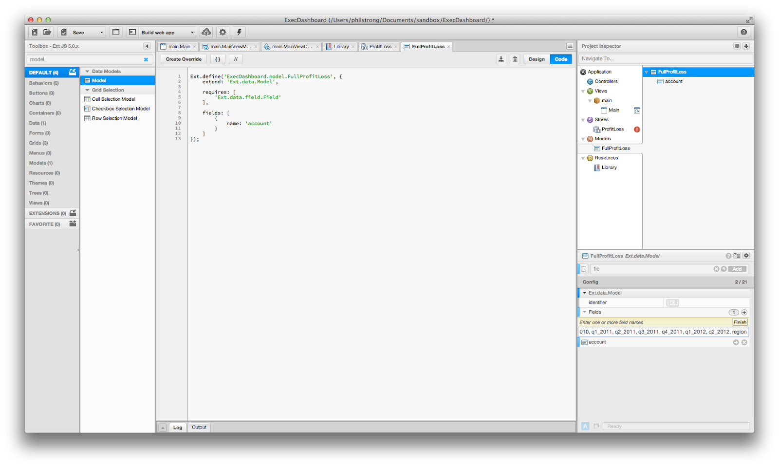
First let's add a Model. Filter for "Model" in the toolbox (upper left).
Drag "Model" onto the model inspector node. This is the node under "Application" that is at the same level as "Views", "Controllers", "Stores", etc.
Set its userClassName to ProfitLoss and set its userAlias to profitloss.
Next, we're going to take advantage of a really helpful piece of Architect. Architect can turn a comma delimited list into fields. This saves you a lot of manual entry. To use this functionality, click the (+) next your model's Fields in the config panel. Paste the following comma delimited data in Fields:
account, q1_2010, q2_2010, q3_2010, q4_2010, q1_2011, q2_2011, q3_2011, q4_2011, q1_2012, q2_2012, region
After you have pasted the data, click "Finish" and your fields will be generated.
Now let's create a JSON store. Filter for "JSON Store" in the toolbox and drag the resulting JSON Store onto the store inspector node.
ProfitLossesprofitlossesProfitLosstrueNote: If the proxy URL creates a red error icon next to your JSON Store, you may need to change the proxy url to
"Dashboard/resources/data/full_data.json". This has to do with how your localhost is set up.
Now our application is ready to load our data!
Drag a "Grid Panel" onto the Main view - this should create the grid as a child component.
Then set the following configs on the grid:
Profit and LossProfitLossesIn our application, we might want to re-use this grid in other places... so let's right-click on the grid and choose
"Promote To Class". This moves the grid's definition to the root level of "Views" in our project inspector,
but leaves an instance of "Profit and Loss" as a child of our Main view.
Select the new view under Views (MyGridPanel) and do the following:
ProfitLossNext, select the ViewController ProfitLossViewController and ensure its alias is profitloss.
Do the same with ViewModel ProfitLossViewModel
Next, ensure the grid's viewModel configs are set to profitloss on the ProfitLoss grid.
Go ahead and right-click the grid ProfitLoss and select "Grid Builder". You should now see a new modal window that
displays a column for each of the fields we entered earlier!
Check the "Remove Existing" box at the bottom of the window to delete the default columns.
Note: You'll need to confirm this selection via a modal box.
Click generate, and you should see all of your fields turn into columns on your grid.
Note: If you're using an older version of Architect, you can use "Auto Columns" instead of "Grid Builder".
If you've made it this far, well done!
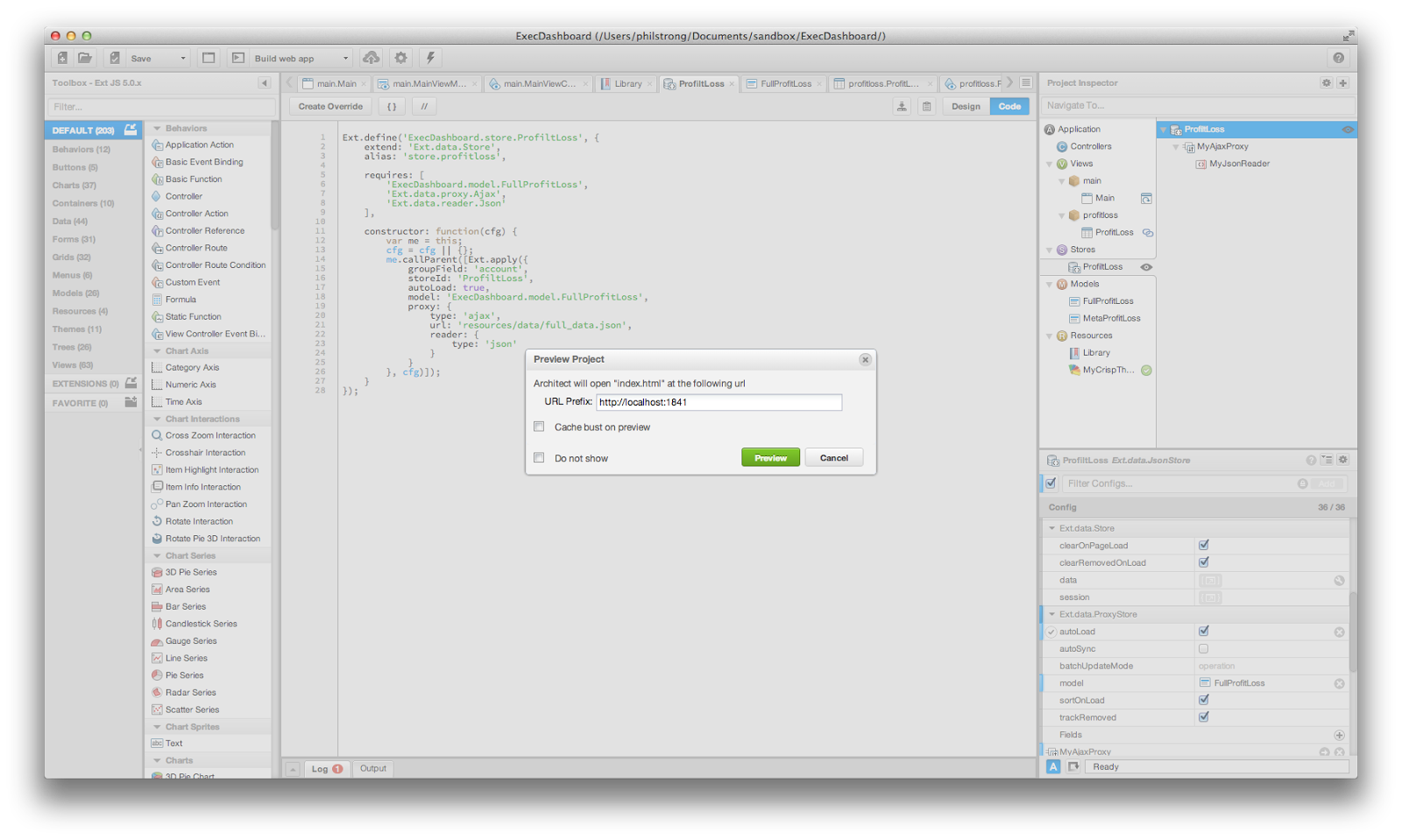
Next, save the project and then click "Preview App", which should launch the application in your browser.
If you're not seeing grid content, and/or are receiving an error in your console, ensure that the store on your grid panel has been properly set.
Let's start by adding a drop-down to filter out regions on our grid. We want to add a new data source with a list of our regions so the user can toggle different regions in the grid. To do this, we will add a new model, store, and then some ViewController behavior to respond when the user filters by region.
First we should add the drop-down filter menu. Select our ProfitLoss grid and drag a toolbar onto the
grid panel. Then:
Region150leftregionsButtonregion-menufloating config and set it to true200Next, let's add the new model. Drag a Model from the Toolbox onto the Project Inspector. Set its
userClassname to metaprofitloss, and then add the fields
display, quarter, region
We can now add a new store. Select the grid's ProfitLossViewModel.
In the Config panel, add a store to it (not a chained store). Then:
metaProfitLossmetaprofitlosstrueresources/data/meta_data.jsonmetaProfitLoss store, add a "View Controller Event Binding"onMetaDataLoadNow that we have our UI configured, we can now add the necessary logic to our ViewController
ProfitLossViewController. Select it in your Project Inspector.
The following code helps to populate the menu with the regions we have available. Copy and paste it into the
onMetaDataLoad function (click the edit button when hovering over the onMetaDataLoad section of the ViewController's
code:
var me = this,
    references = me.getReferences(),
    view = me.getView(),
    items = [],
    columns = [ view.regionColumn ];

    // iterate each record in the store
store.each(function (metaRecord) {
    var type = metaRecord.data.type,
        value = metaRecord.data.value,

        menuItem = {
            checked     : true,
            hideOnClick : false
        };

    // we only care about region data
    if (type === 'region') {
        items.push(Ext.apply({
            text  : metaRecord.data.display,
            value : value,
            type  : type,

            listeners : {
                click : me.onRegionItemClick,
                scope : me
            }
        },menuItem));
    }
});

items.sort(function (lhs, rhs) {
    return (lhs.text < rhs.text) ? -1 : ((rhs.text < lhs.text) ? 1 : 0);
});

// We want to tinker with the UI in batch so we don't trigger multiple layouts
Ext.batchLayouts(function () {
    references.regionsButton.menu.add(items);

    view.store.load(); // displays loadMask so include in layout batch
});
Next, we want to add the click handler for when a user selects a region. In the above code we added a listener to
our menu items called onRegionItemClick. Let's go ahead and add that function handler - select the View Controller,
then add a function named onRegionItemClick. Click "Finish" since we don't need to pass in any params.
Finally, paste the following code inside the function by clicking on the arrow next to the function name:
var view = this.getView(),
    filter = {
        // The id ensures that this filter will be replaced by subsequent calls
        // to this method (while leaving others in place).
        id       : 'regionFilter',
        property : 'region_filter',
        operator : 'in',
        value    : []
    },
    regionMenu = this.lookupReference('regionsButton').menu;
// note before we had set the reference on our button to regionsButton.  This is how we'll gain access to that component

regionMenu.items.each(function (item) {
    if (item.checked) {
        filter.value.push(item.value);
    }
});

if (filter.value.length === regionMenu.items.length) {
    // No need for a filter that includes everything, so remove it (in case it
    // was there - harmless if it wasn't)
    view.store.getFilters().removeByKey(filter.id);
} else {
    view.store.getFilters().add(filter);
}
Now we can test out our drop down filter! Save the project, then preview the app again and try using the filter menu.
The whole reason we used a tab panel at the start is because most dashboards have more than one screen.
Add a second panel to your tab panel called Main; set its title to Customer Feedback.
You're on your way to building a full fledged dashboard application!


 Architect | Terms of Use
