Many classes have shortcut names used when creating (instantiating) a class with a
configuration object. The shortcut name is referred to as an alias (or xtype if the
class extends Ext.Component). The alias/xtype is listed next to the class name of
applicable classes for quick reference.
Framework classes or their members may be specified as private or protected. Else,
the class / member is public. Public, protected, and private are access
descriptors used to convey how and when the class or class member should be used.
Public classes and class members are available for use by any other class or application code and may be relied upon as a stable and persistent within major product versions. Public classes and members may safely be extended via a subclass.
Protected class members are stable public members intended to be used by the
owning class or its subclasses. Protected members may safely be extended via a subclass.
Private classes and class members are used internally by the framework and are not intended to be used by application developers. Private classes and members may change or be omitted from the framework at any time without notice and should not be relied upon in application logic.
static label next to the
method name. *See Static below.Below is an example class member that we can disect to show the syntax of a class member (the lookupComponent method as viewed from the Ext.button.Button class in this case).
Let's look at each part of the member row:
lookupComponent in this example)( item ) in this example)Ext.Component in this case). This may be omitted for methods that do not
return anything other than undefined or may display as multiple possible values
separated by a forward slash / signifying that what is returned may depend on the
results of the method call (i.e. a method may return a Component if a get method calls is
successful or false if unsuccessful which would be displayed as
Ext.Component/Boolean).PROTECTED in
this example - see the Flags section below)Ext.container.Container in this example). The source
class will be displayed as a blue link if the member originates from the current class
and gray if it is inherited from an ancestor or mixed-in class.view source in the example)item : Object in the example).undefined a "Returns" section
will note the type of class or object returned and a description (Ext.Component in the
example)Available since 3.4.0 - not pictured in
the example) just after the member descriptionDefaults to: false)The API documentation uses a number of flags to further commnicate the class member's function and intent. The label may be represented by a text label, an abbreviation, or an icon.
classInstance.method1().method2().etc();false is returned from
an event handler- Indicates a framework class
- A singleton framework class. *See the singleton flag for more information
- A component-type framework class (any class within the Ext JS framework that extends Ext.Component)
- Indicates that the class, member, or guide is new in the currently viewed version
- Indicates a class member of type config
- Indicates a class member of type property
- Indicates a class member of type
method
- Indicates a class member of type event
- Indicates a class member of type
theme variable
- Indicates a class member of type
theme mixin
- Indicates that the class, member, or guide is new in the currently viewed version
Just below the class name on an API doc page is a row of buttons corresponding to the types of members owned by the current class. Each button shows a count of members by type (this count is updated as filters are applied). Clicking the button will navigate you to that member section. Hovering over the member-type button will reveal a popup menu of all members of that type for quick navigation.
Getting and setter methods that correlate to a class config option will show up in the methods section as well as in the configs section of both the API doc and the member-type menus just beneath the config they work with. The getter and setter method documentation will be found in the config row for easy reference.
Your page history is kept in localstorage and displayed (using the available real estate) just below the top title bar. By default, the only search results shown are the pages matching the product / version you're currently viewing. You can expand what is displayed by clicking on the button on the right-hand side of the history bar and choosing the "All" radio option. This will show all recent pages in the history bar for all products / versions.
Within the history config menu you will also see a listing of your recent page visits. The results are filtered by the "Current Product / Version" and "All" radio options. Clicking on the button will clear the history bar as well as the history kept in local storage.
If "All" is selected in the history config menu the checkbox option for "Show product details in the history bar" will be enabled. When checked, the product/version for each historic page will show alongside the page name in the history bar. Hovering the cursor over the page names in the history bar will also show the product/version as a tooltip.
Both API docs and guides can be searched for using the search field at the top of the page.
On API doc pages there is also a filter input field that filters the member rows using the filter string. In addition to filtering by string you can filter the class members by access level, inheritance, and read only. This is done using the checkboxes at the top of the page.
The checkbox at the bottom of the API class navigation tree filters the class list to include or exclude private classes.
Clicking on an empty search field will show your last 10 searches for quick navigation.
Each API doc page (with the exception of Javascript primitives pages) has a menu view of metadata relating to that class. This metadata view will have one or more of the following:
Ext.button.Button class has an alternate class name of Ext.Button). Alternate class
names are commonly maintained for backward compatibility.Runnable examples (Fiddles) are expanded on a page by default. You can collapse and expand example code blocks individually using the arrow on the top-left of the code block. You can also toggle the collapse state of all examples using the toggle button on the top-right of the page. The toggle-all state will be remembered between page loads.
Class members are collapsed on a page by default. You can expand and collapse members using the arrow icon on the left of the member row or globally using the expand / collapse all toggle button top-right.
Viewing the docs on narrower screens or browsers will result in a view optimized for a smaller form factor. The primary differences between the desktop and "mobile" view are:
The class source can be viewed by clicking on the class name at the top of an API doc page. The source for class members can be viewed by clicking on the "view source" link on the right-hand side of the member row.
Sencha WebTestIt has a highly modular report, which is made up from Handlebars templates and is rendered directly within the app once you navigate to one of your generated report files, located by default in the reports folder.
This guide introduces you to customizing the report template to suit your needs. Follow these steps:
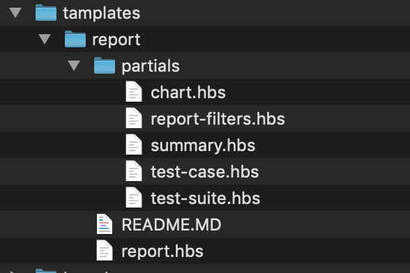
Reports are generated from templates. You can find the default set installed in your global .webtestit folder located inside your user’s folder. To quickly navigate to it, open the templates folder via the apps menu:

You will find a folder named report with a few handlebars files.

As you can see these are divided upon a base template called report.hbs and few partials, which are meant to divide sub-sections into distinct files.
Hint
Adjusting these templates will take effect for every Webtestit project you are working with. If you prefer to customize the reports on a per project basis you need to have project local overrides.
In your project create a top-level folder templates and copy the report folder from the global templates in there.
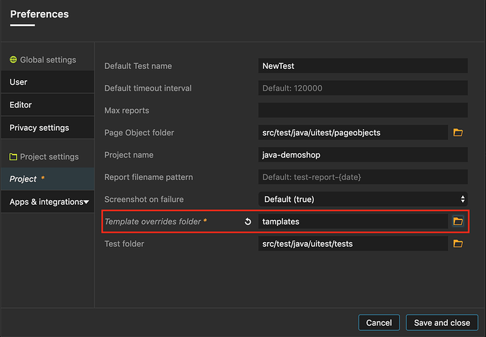
Next, make that the previously created templates folder is actually used inside the project. To accomplish that, open the project settings from the Preferences menu, locate, and set the templates override folder:

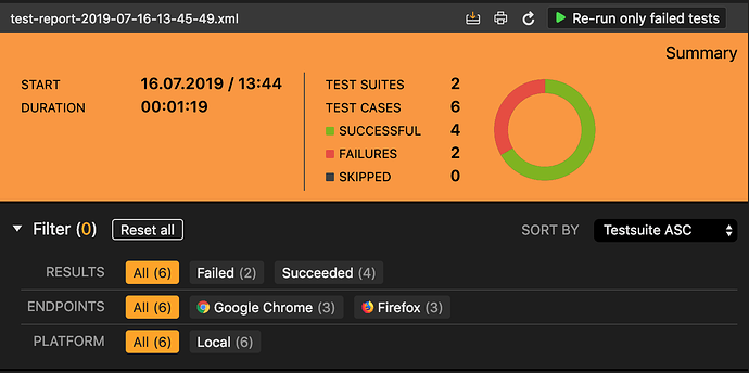
Let’s examine what template files we got here. The report.hbs is the main report rendering entry. The file starts with some inline CSS rules which apply to the @media print query-selector, thus only rendering when printed to PDF. If you need to customize the appearance of your report, this is a good place to do so. As an example let’s say we want to adjust the test-summary header to show a different background color and more padding we could add the following code in the style block of the file report.hbs:
<style>
  .test-summary {
    background-color: #FB9836; padding: 10px;
  }
 ...
Upon saving, navigating to a report. In the report panel header, you will find a refresh button which will re-render the report with the new adjustments.

The new report would look like the following:

Imagine we want to add our company logo to every report header. First, let’s create a folder images inside the templates/report folder. In there we are gonna place our companies logo named as logo.jpg
In the summary.hbs add the following:
{{> summary.hbs}} {{> report-filter.hbs}}
This directive tells the report to include the partial named summary.hbs at this specific location in the report. When we open that file we’ll find a div containing the test-summary div which is rendering the top section of our report. In order to show our logo we can tweak it like this:
<style>
   .test-summary__company-logo {
      width: 200px;
      float: left;
  }

  .test-summary__title {
    text-align: right;
  }

 .donut__hole {
    fill: #FB9836;
  }
</style>

<div class="test-summary">
  <div>
    <img class="test-summary__company-logo" src="{{projectRoot}}/reports/images/logo.jpg" />
    <div class="test-summary__title">Summary</div>
  </div>
  ...
We are moving the test-summary__title together with an img.test-summary__title tag into a new div.
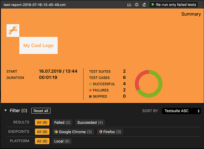
To reflect the mapping to the previously created images folder containing our logo, we can make use of the {{projectRoot}} template variable, which points exactly to the root of your project. From there on we concatenate the final destination templates/report/images/logo.jpg. And with a bit of extra CSS in the above style tag we will get something like this as a result:

Note
Wonder why we are naming our classes that specific way? Sencha WebTestIt leverages the Block-Element-Modifier (BEM) methodology for sane and consistent CSS rules.
As long as we are talking about project-specific templates, you can simply overwrite them with new ones, or delete them altogether. Sencha WebTestIt will prefer project local templates and if it cannot find any of them - even single partials - it will take the global version instead.
So far, we have used the {{projectRoot}} variable to gain access to the project’s root during rendering. But there are more, check the list below:
It contains an interface with the following properties for each executed endpoint:
export interface EndpointData {
  name: string;
  time: number;
  timestamp: Date;
  readableTimestamp: string;
  testSuites: TestSuite[];
  failures: number;
  readableDuration: string;
  testCaseCount: number;
  testSuiteCount: number;
  isVisible: boolean;
  skipped: number;
  iconPath: string;
  id: string;
  headless?: boolean;
}
From within the endpoints you have access to the TestSuite that were run on the specific endpoint:
export interface TestSuite {
  errors: string;
  expanded: boolean;
  failures: string;
  id: string;
  endpoint: Endpoint;
  name: string;
  skipped: string;
  testCases: TestCase[];
  tests: string;
  time: string;
  readableDuration: string;
  timestamp: Date;
  readableTimeStamp: string;
  extraElements?: ExtraElements[];
  isVisible: boolean;
}
From within the testSuites you have access to the TestCase that run on the specific test suite.
export interface TestCase {
  className: string;
  expanded?: boolean;
  fileName: string;
  filePath?: string;
  lineNumber?: number;
  failure: boolean | TestFailure;
  loading?: boolean;
  skipped: boolean;
  endpointName?: string;
  endpointBrowserName?: string;
  name: string;
  time: string;
  id: string;
  jiraIssue?: JiraData;
  testrailData?: { case_id?: number, suite_id?: number };
  testCaseNotFound?: boolean;
  screenshotFound?: boolean;
  extraElements?: ExtraElements[];
  formattedTimestamp?: string;
  screenshot?: string;
  isVisible: boolean;
}
Use extraElementValue helper to access extra element value from report, it accepts two arguments: extraElements array and name of element
export interface ExtraElements{
  name: string;
  value: string | null;
  attributes?: ExtraAttributes;
}
export interface ExtraAttributes { [name: string]: string | null; }
The Jira issue gives you the details of the linked Jira issue for the given test case.
export interface JiraData {
  id: string;
  key: string;
  isCompleted: boolean;
  testCaseNotFound?: boolean;
}
export interface TestFailure {
  message: string;
  trace: string;
  attributes?: ExtraAttributes;
}
It indicates whether your tests are connected to Jira and you have set up the credentials.
It is calculated based on selected filters.
To access any of root variables from any template you can use @root (etc: @root.jiraAvailable, @root.projectRoot…)