Many classes have shortcut names used when creating (instantiating) a class with a
configuration object. The shortcut name is referred to as an alias (or xtype if the
class extends Ext.Component). The alias/xtype is listed next to the class name of
applicable classes for quick reference.
Framework classes or their members may be specified as private or protected. Else,
the class / member is public. Public, protected, and private are access
descriptors used to convey how and when the class or class member should be used.
Public classes and class members are available for use by any other class or application code and may be relied upon as a stable and persistent within major product versions. Public classes and members may safely be extended via a subclass.
Protected class members are stable public members intended to be used by the
owning class or its subclasses. Protected members may safely be extended via a subclass.
Private classes and class members are used internally by the framework and are not intended to be used by application developers. Private classes and members may change or be omitted from the framework at any time without notice and should not be relied upon in application logic.
static label next to the
method name. *See Static below.Below is an example class member that we can disect to show the syntax of a class member (the lookupComponent method as viewed from the Ext.button.Button class in this case).
Let's look at each part of the member row:
lookupComponent in this example)( item ) in this example)Ext.Component in this case). This may be omitted for methods that do not
return anything other than undefined or may display as multiple possible values
separated by a forward slash / signifying that what is returned may depend on the
results of the method call (i.e. a method may return a Component if a get method calls is
successful or false if unsuccessful which would be displayed as
Ext.Component/Boolean).PROTECTED in
this example - see the Flags section below)Ext.container.Container in this example). The source
class will be displayed as a blue link if the member originates from the current class
and gray if it is inherited from an ancestor or mixed-in class.view source in the example)item : Object in the example).undefined a "Returns" section
will note the type of class or object returned and a description (Ext.Component in the
example)Available since 3.4.0 - not pictured in
the example) just after the member descriptionDefaults to: false)The API documentation uses a number of flags to further commnicate the class member's function and intent. The label may be represented by a text label, an abbreviation, or an icon.
classInstance.method1().method2().etc();false is returned from
an event handler- Indicates a framework class
- A singleton framework class. *See the singleton flag for more information
- A component-type framework class (any class within the Ext JS framework that extends Ext.Component)
- Indicates that the class, member, or guide is new in the currently viewed version
- Indicates a class member of type config
- Indicates a class member of type property
- Indicates a class member of type
method
- Indicates a class member of type event
- Indicates a class member of type
theme variable
- Indicates a class member of type
theme mixin
- Indicates that the class, member, or guide is new in the currently viewed version
Just below the class name on an API doc page is a row of buttons corresponding to the types of members owned by the current class. Each button shows a count of members by type (this count is updated as filters are applied). Clicking the button will navigate you to that member section. Hovering over the member-type button will reveal a popup menu of all members of that type for quick navigation.
Getting and setter methods that correlate to a class config option will show up in the methods section as well as in the configs section of both the API doc and the member-type menus just beneath the config they work with. The getter and setter method documentation will be found in the config row for easy reference.
Your page history is kept in localstorage and displayed (using the available real estate) just below the top title bar. By default, the only search results shown are the pages matching the product / version you're currently viewing. You can expand what is displayed by clicking on the button on the right-hand side of the history bar and choosing the "All" radio option. This will show all recent pages in the history bar for all products / versions.
Within the history config menu you will also see a listing of your recent page visits. The results are filtered by the "Current Product / Version" and "All" radio options. Clicking on the button will clear the history bar as well as the history kept in local storage.
If "All" is selected in the history config menu the checkbox option for "Show product details in the history bar" will be enabled. When checked, the product/version for each historic page will show alongside the page name in the history bar. Hovering the cursor over the page names in the history bar will also show the product/version as a tooltip.
Both API docs and guides can be searched for using the search field at the top of the page.
On API doc pages there is also a filter input field that filters the member rows using the filter string. In addition to filtering by string you can filter the class members by access level, inheritance, and read only. This is done using the checkboxes at the top of the page.
The checkbox at the bottom of the API class navigation tree filters the class list to include or exclude private classes.
Clicking on an empty search field will show your last 10 searches for quick navigation.
Each API doc page (with the exception of Javascript primitives pages) has a menu view of metadata relating to that class. This metadata view will have one or more of the following:
Ext.button.Button class has an alternate class name of Ext.Button). Alternate class
names are commonly maintained for backward compatibility.Runnable examples (Fiddles) are expanded on a page by default. You can collapse and expand example code blocks individually using the arrow on the top-left of the code block. You can also toggle the collapse state of all examples using the toggle button on the top-right of the page. The toggle-all state will be remembered between page loads.
Class members are collapsed on a page by default. You can expand and collapse members using the arrow icon on the left of the member row or globally using the expand / collapse all toggle button top-right.
Viewing the docs on narrower screens or browsers will result in a view optimized for a smaller form factor. The primary differences between the desktop and "mobile" view are:
The class source can be viewed by clicking on the class name at the top of an API doc page. The source for class members can be viewed by clicking on the "view source" link on the right-hand side of the member row.
In this guide, we will use Sencha Themer to create a custom theme and apply it to our Themer Contest application.
Note: While Themer does work with both Modern and Classic toolkits, we'll be focusing on Modern for this application and walkthrough.
By going through the steps of this guide, you’ll see the application updated live in the browser thanks to the superpowers of Fashion.
Let's get started by ensuring that your environment is set up to run Themer.
Before getting started, make sure that you have downloaded and installed the following assets.
Themer requires Ext JS 6.0.1+ for the Classic Toolkit and Ext JS 6.2+ for the Modern Toolkit. You can download Ext JS from the Support portal, or you can also find it within your professional package download. If you do not have access to Ext JS, you can download a 30 day free trial.
Note: UI theming is only supported for Ext JS 6.2+.
Themer requires Sencha Cmd 6.5+. Sencha Cmd is a free tool that can be acquired via the download page. If you already have Sencha Cmd, you can also update it via the command line by issuing the following command:
sencha upgrade
You can find Themer within your professional package download. If you do not have the pro package, you can download a 30 day free trial of Sencha Themer.
Next, download our Themer Contest application.
Note: You can download from Github by clicking the green "Clone or Download" button. Then just click "Download Zip" and save the file to your machine.
Once downloaded, unzip "themer-contest-app-master.zip" and move the resulting directory to wherever you'd like your application to live.
Once you have your application where you want it, "cd" into the application directory.
Finally, issue the following command to copy Ext JS to the application.
sencha app install --framework=/path/to/extjs/
Next we'll create a theme using the Modern Toolkit.
From the application directory run:
sencha app build

sencha app watch -fashion
Note: You may need to run "sencha app upgrade" depending on your cmd version. If so, Cmd will prompt you to do so when running "app watch".
Once "app watch" is running, you can open the application in your browser. You'll find your application
running in full desktop at the address supplied by running app watch. This will typically be:
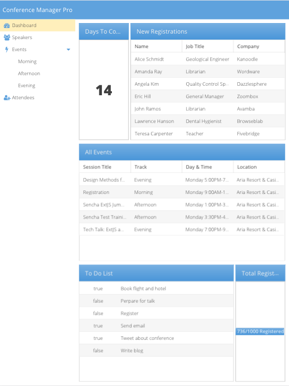
Your application will initially look like:
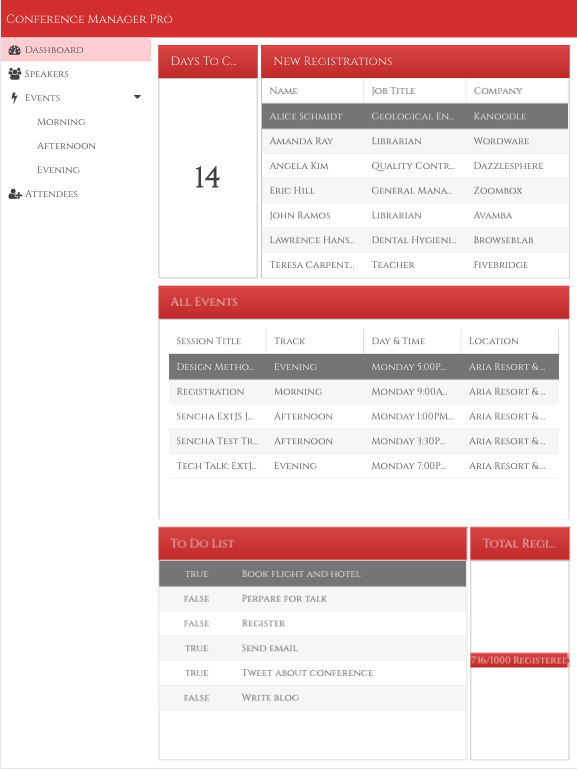
At the conclusion of the walkthrough the application will look like:
Note: You can enter device mode by clicking on the following icon in Chrome's dev tools:

Note: If you are running "sencha app watch" elsewhere, your port may vary. Check the terminal output of “sencha app watch” for the correct URL.
First, we’ll create a custom theme that is effectively a copy of an existing framework theme that we’ll modify with Themer.
Once Themer launches click the "Create Theme" button. Name your custom theme "ContestApp".
In the App or Workspace field, select the "themer-contest-app-master" directory that you recently unzipped.
Select "Triton" as the base theme and then click "Create Theme".
Once the canvas loads, make sure you have "Modern" button selected which you can find at the bottom of the components list.

You should now see a canvas that represents a modern viewport.
Let's start making changes with something very noticeable.
We'll change the application's base color. This is the color that dictates the base
color of your entire application.
Let's change "Base Color" to "#D32F2F" in your Theme Defaults.
You can apply this hex in a couple of different ways. If you haven't used it yet, you likely won't see it in first color palette. However, switching to the 2nd tab provides a list of Material approved color schemes.
Select the Red dot, and then you'll see that 700 correlates with "#D32F2F".
You can also click the third tab, where you'll be able to interact with the color picker input that most of us are familiar with. In this case, you can just paste in the hex value.
If you're watching your application, you should see the entire application apply the new base color via Fashion.
Let's make some more changes!
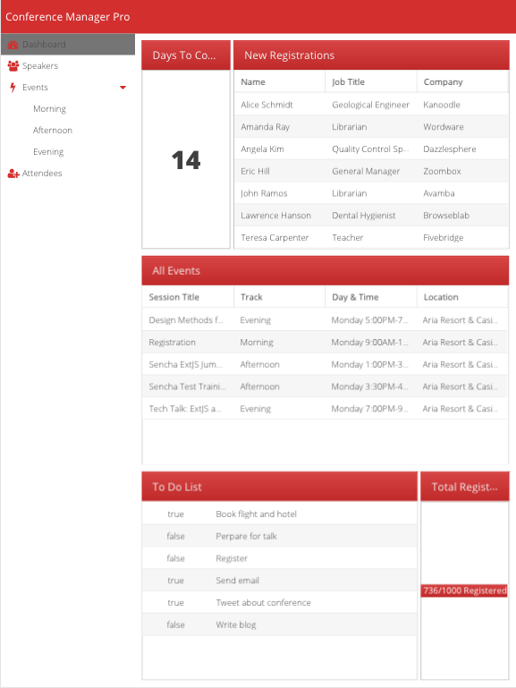
Currently, if we click on a list item, we'll get a light yellow selection state. Let's make it more appealing by adjusting our list items!
Click on List in your Components list on the left.
Scroll down the list of attributes on the right until you reach "Selected Background Color".
Change that to "#757575".
Hint: 600 on the gray Material dot.
This has made our text a bit tricky to read, so change the "Selected Color" to "#FFFFFF".
Finally, we'll adjust the hover color. Change your list item's Hover state to have a background color of "#EEEEEE".
Hint: 100 on the gray Material dot.
Looking good!
Themer also allows you to utilize Google fonts in your applications. Before changing the font, you'll need to get the Google Font URL. For this example, we'll use "Cinzel". Go to the corresponding Google Fonts page, click "Select this Font", and then copy the web link from the resulting selection window (bottom right).
The link should be:
https://fonts.googleapis.com/css?family=Cinzel
Now, in Themer, select "Theme Defaults" from the component tree on the left. Next,
highlight the font field and click "Manage Web Fonts" at the bottom of the fonts menu.
Paste in the Cinzel URL and click "Done".
Your application should update momentarily.
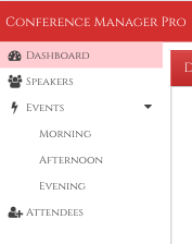
The navigation on the left (in desktop view) is a little strange now. Click on "Tree" in the component tree on the left. Let's change the selected colors.
Scroll down to "Tree Item Selected" and change the Background Color to "#FFCDD2"
Hint: 100 on the red Material dot.
Next, let's change some of the red to be more subtle.
Scroll up to Tree Item and change the Icon Color and Expander Color to "#424242"
Hint: 800 on the gray Material dot.
Since we changed from the blue to the red, the progress bar is a bit difficult to evaluate. The background color is too close to the white background. Let's fix that by clicking "Progress Bar" from the component tree on the left.
The very first value you'll see is "Background Color".
Let's change it to a lighter tone of red so the progress stands out more clearly.
I'm going to use "#EF9A9A".
Hint: 200 on the red Material dot.
I just noticed that our "To Do List" checkboxes have become difficult to read. Click "Form Fields" from the component tree on the left. Then select "Checkbox".
Let's change the "Checked Color" to "#EF9A9A".
We'll also change the "Text Color" to "#EF9A9A".
Hint: 200 on the red Material dot.
Now our checkboxes are much easier to see!
This is looking pretty good for Desktop! Let's see how it looks in a mobile view. Open your Chrome inspector, and click the following icon:

Now refresh your browser to see the mobile view.
Dashboard looks good, so let's click on Speakers. Not too bad! Now let's click on a speaker's name.
Looks like the text is awfully tight on this page. Let's add some top padding to the panel.
Click "Panel" from the component tree on the left. Then select the "Panel" subsection.
Scroll down to "Panel Body" and change the top padding to "1em" for all sides.
Now the text has some room to breath!

Once you are happy with the look and feel of your Themer Contest app, export your new theme. To export your theme, simply select "Publish" from the top Themer menu and then select "Export Theme as Zip Archive".
Your theme is now ready to share with other applications!