Introduction to Event Recorder
Many classes have shortcut names used when creating (instantiating) a class with a
configuration object. The shortcut name is referred to as an alias (or xtype if the
class extends Ext.Component). The alias/xtype is listed next to the class name of
applicable classes for quick reference.
Framework classes or their members may be specified as private or protected. Else,
the class / member is public. Public, protected, and private are access
descriptors used to convey how and when the class or class member should be used.
Public classes and class members are available for use by any other class or application code and may be relied upon as a stable and persistent within major product versions. Public classes and members may safely be extended via a subclass.
Protected class members are stable public members intended to be used by the
owning class or its subclasses. Protected members may safely be extended via a subclass.
Private classes and class members are used internally by the framework and are not intended to be used by application developers. Private classes and members may change or be omitted from the framework at any time without notice and should not be relied upon in application logic.
static label next to the
method name. *See Static below.Below is an example class member that we can disect to show the syntax of a class member (the lookupComponent method as viewed from the Ext.button.Button class in this case).
Let's look at each part of the member row:
lookupComponent in this example)( item ) in this example)Ext.Component in this case). This may be omitted for methods that do not
return anything other than undefined or may display as multiple possible values
separated by a forward slash / signifying that what is returned may depend on the
results of the method call (i.e. a method may return a Component if a get method calls is
successful or false if unsuccessful which would be displayed as
Ext.Component/Boolean).PROTECTED in
this example - see the Flags section below)Ext.container.Container in this example). The source
class will be displayed as a blue link if the member originates from the current class
and gray if it is inherited from an ancestor or mixed-in class.view source in the example)item : Object in the example).undefined a "Returns" section
will note the type of class or object returned and a description (Ext.Component in the
example)Available since 3.4.0 - not pictured in
the example) just after the member descriptionDefaults to: false)The API documentation uses a number of flags to further commnicate the class member's function and intent. The label may be represented by a text label, an abbreviation, or an icon.
classInstance.method1().method2().etc();false is returned from
an event handler- Indicates a framework class
- A singleton framework class. *See the singleton flag for more information
- A component-type framework class (any class within the Ext JS framework that extends Ext.Component)
- Indicates that the class, member, or guide is new in the currently viewed version
- Indicates a class member of type config
- Indicates a class member of type property
- Indicates a class member of type
method
- Indicates a class member of type event
- Indicates a class member of type
theme variable
- Indicates a class member of type
theme mixin
- Indicates that the class, member, or guide is new in the currently viewed version
Just below the class name on an API doc page is a row of buttons corresponding to the types of members owned by the current class. Each button shows a count of members by type (this count is updated as filters are applied). Clicking the button will navigate you to that member section. Hovering over the member-type button will reveal a popup menu of all members of that type for quick navigation.
Getting and setter methods that correlate to a class config option will show up in the methods section as well as in the configs section of both the API doc and the member-type menus just beneath the config they work with. The getter and setter method documentation will be found in the config row for easy reference.
Your page history is kept in localstorage and displayed (using the available real estate) just below the top title bar. By default, the only search results shown are the pages matching the product / version you're currently viewing. You can expand what is displayed by clicking on the button on the right-hand side of the history bar and choosing the "All" radio option. This will show all recent pages in the history bar for all products / versions.
Within the history config menu you will also see a listing of your recent page visits. The results are filtered by the "Current Product / Version" and "All" radio options. Clicking on the button will clear the history bar as well as the history kept in local storage.
If "All" is selected in the history config menu the checkbox option for "Show product details in the history bar" will be enabled. When checked, the product/version for each historic page will show alongside the page name in the history bar. Hovering the cursor over the page names in the history bar will also show the product/version as a tooltip.
Both API docs and guides can be searched for using the search field at the top of the page.
On API doc pages there is also a filter input field that filters the member rows using the filter string. In addition to filtering by string you can filter the class members by access level, inheritance, and read only. This is done using the checkboxes at the top of the page.
The checkbox at the bottom of the API class navigation tree filters the class list to include or exclude private classes.
Clicking on an empty search field will show your last 10 searches for quick navigation.
Each API doc page (with the exception of Javascript primitives pages) has a menu view of metadata relating to that class. This metadata view will have one or more of the following:
Ext.button.Button class has an alternate class name of Ext.Button). Alternate class
names are commonly maintained for backward compatibility.Runnable examples (Fiddles) are expanded on a page by default. You can collapse and expand example code blocks individually using the arrow on the top-left of the code block. You can also toggle the collapse state of all examples using the toggle button on the top-right of the page. The toggle-all state will be remembered between page loads.
Class members are collapsed on a page by default. You can expand and collapse members using the arrow icon on the left of the member row or globally using the expand / collapse all toggle button top-right.
Viewing the docs on narrower screens or browsers will result in a view optimized for a smaller form factor. The primary differences between the desktop and "mobile" view are:
The class source can be viewed by clicking on the class name at the top of an API doc page. The source for class members can be viewed by clicking on the "view source" link on the right-hand side of the member row.
The event recorder is a key element of Sencha Test. It tracks user actions and creates meaningful code that indicates the following:
For a list supported browsers on each platform, please see Event Recorder Browser Support.
When a user performs an action like tapping a button or typing into a form field, the user's action is captured. Where the user has performed the actual operation is identified using the locator.
The Sencha Test event recorder offers three distinct strategies for getting component references; ID, Component Query, and XPath.
The ID of the element under test is captured. This could be a value dynamically generated by the Ext JS framework. This means that it may not be stable for long term test automation.
Ext JS / ExtReact component query lets you identify exactly where a component resides in the hierarchy. The query can be helpful to identify the exact element using one of its properties such as title, class, etc.
Follow these steps to use the event recorder.
Open a Jasmine test suite file
Create a new test case. Jasmine test cases should be written inside of an it function, which resides within
a describe function.
 describe('login form', function () {
     it('should deny access with wrong creds', function () {
         // Your test code goes here
     });
 });
Before recording, ensure you have set the target application’s URL in the project settings screen. Without setting a valid URL, you won't be able to launch your application under test via the event recorder.
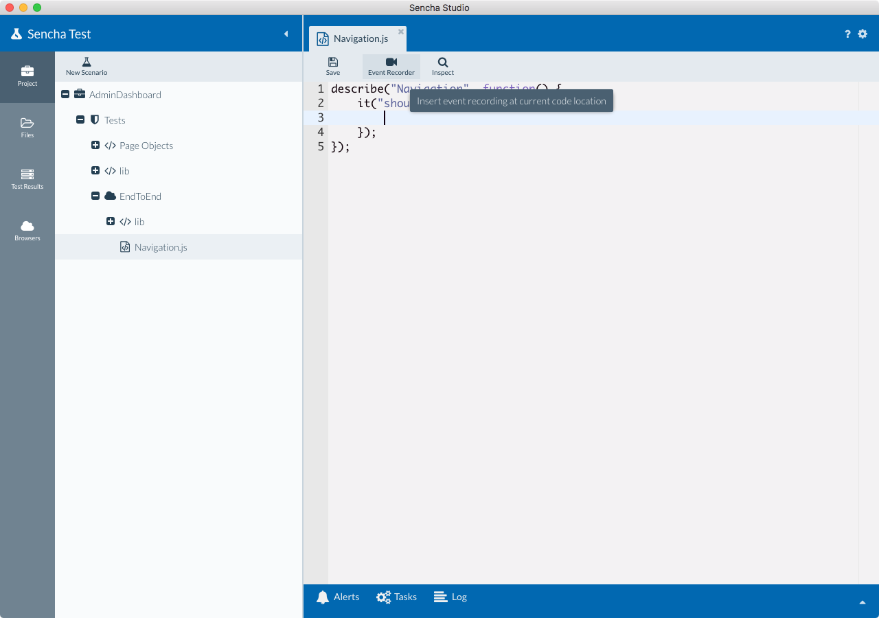
Place the cursor inside of the it block and launch the event recorder by clicking the Event Recorder
button.
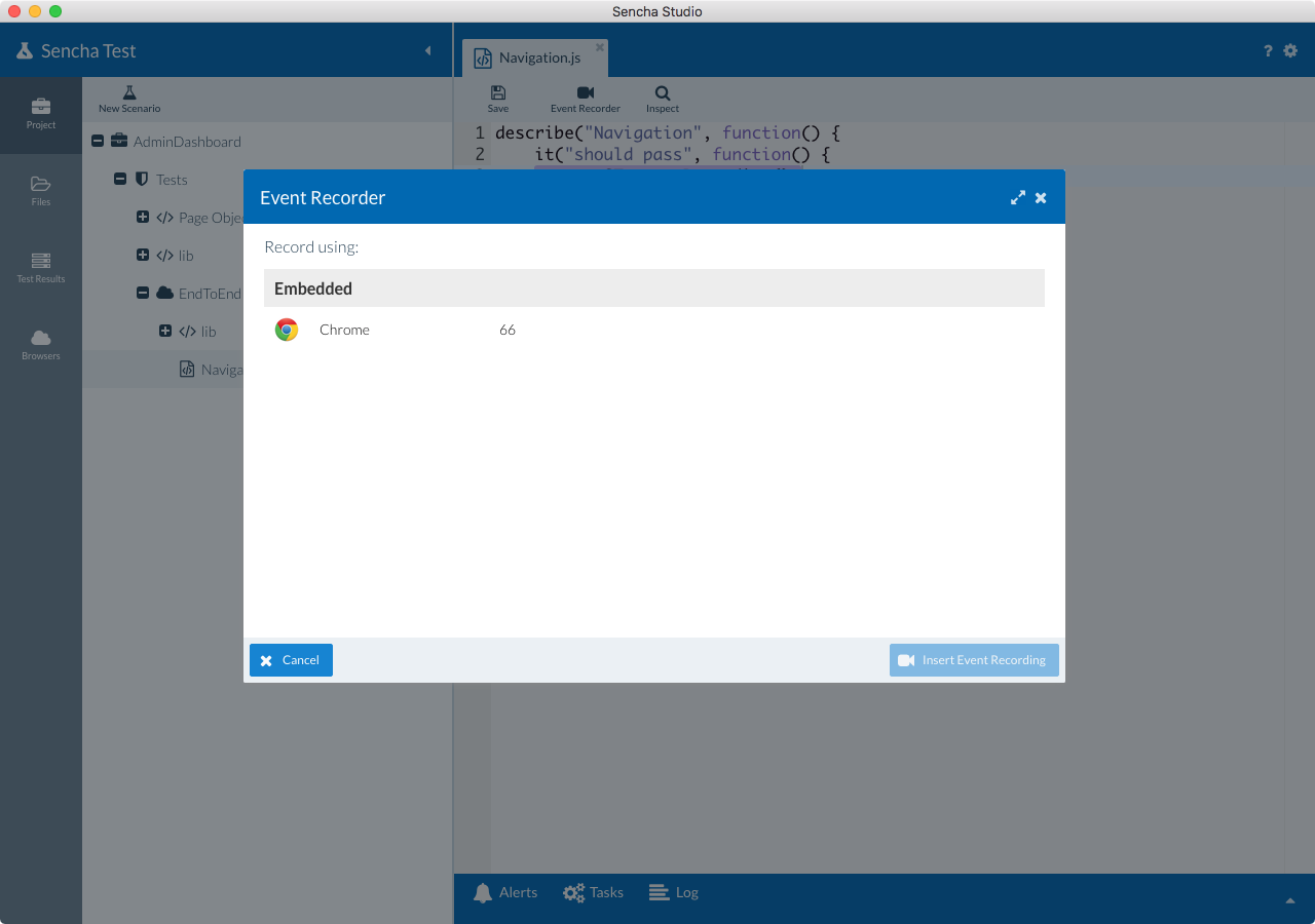
A window will be shown with browser options. If you're using the Sencha Test 2 WebDriver scenario option, you will be able to record using the embedded Google Chrome browser option out of the box. For this, you will need to have Google Chrome installed on the target machine.
If you are running an In-Browser scenario option, you will be able to use any of the local browsers on your machine for recording.
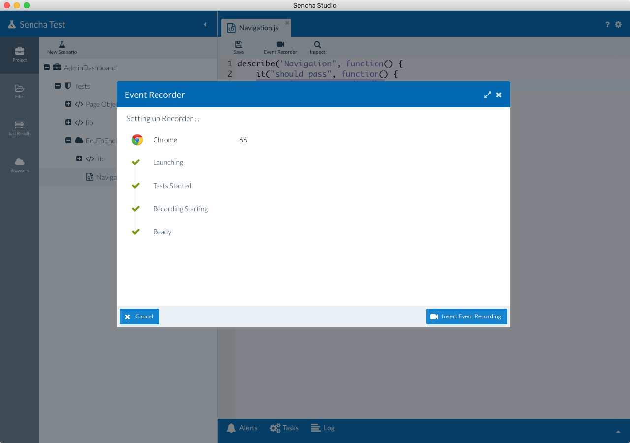
Once the browser is selected, the application is rendered in the browser. Wait for the recorder to be ready before you perform actions on the application. Look for the following screen before you start working on the application.
Perform various operations on the application based on the purpose of your test case.
The events are captured as the operations are performed. In Sencha Studio, a grid is displayed in the
Event Recorder window. Check the value in the Target column. This could be an auto-generated id by the Ext
JS or ExtReact frameworks.
Click on one of the locators in the Target column, and you will be able to edit or select one of the other locators generated by the Event Recorder. Based on where the actions are performed, a component query may be generated. Select this option for more stable test execution.
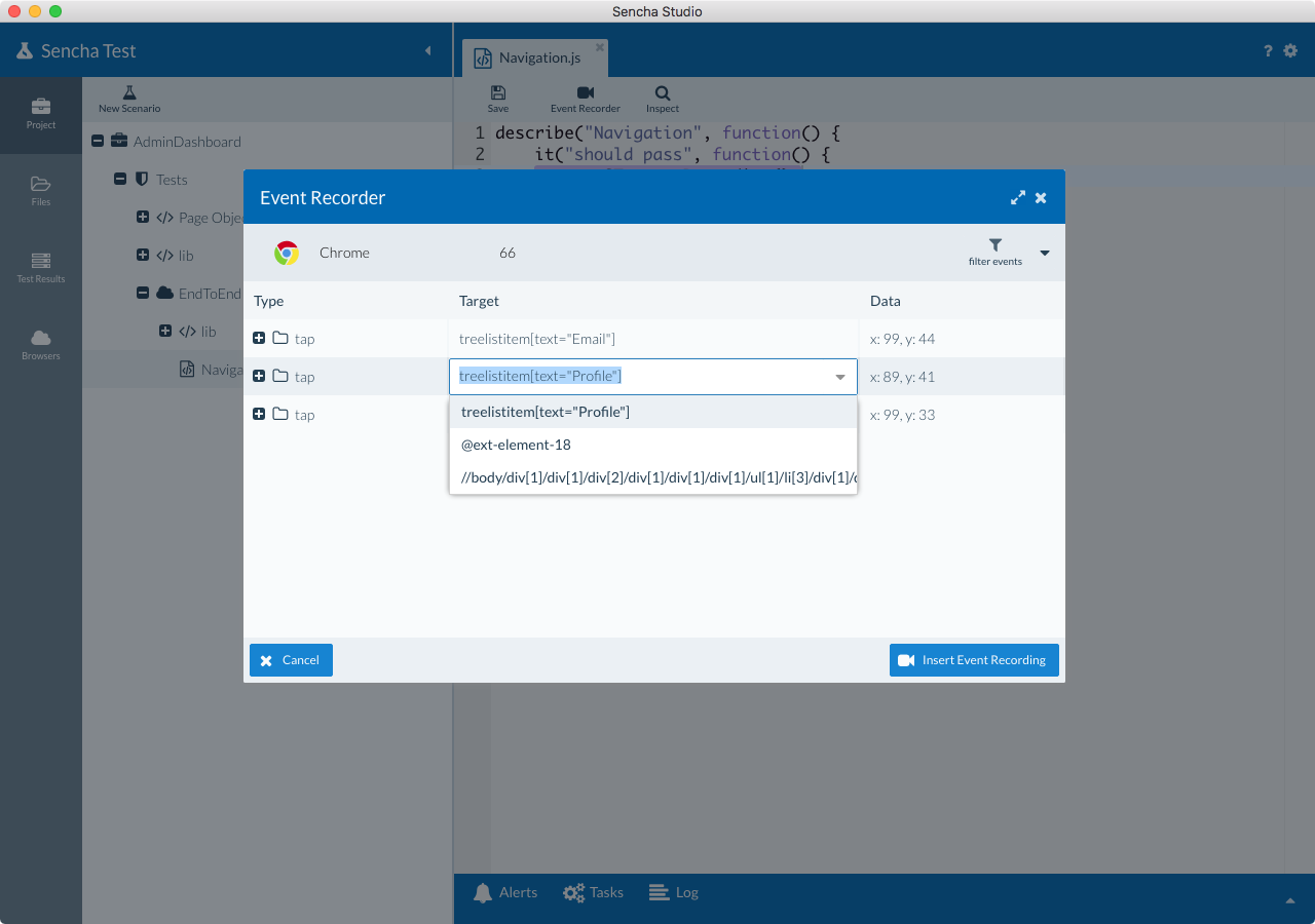
In the above screen, there is a grid with a Target column. This represents the target locators for identifying elements within the application. In an Ext JS and ExtReact application you will see multiple locator strategies such as ID, component query, etc. For any other web application, the ID or XPath will be captured by the Sencha Test event recorder.
Once you have finished recording all of the steps from the test case, click on the "insert recording" button.
The recorded scripts are stored under a ST API called ST.play. It looks something similar to this:
ST.play([
    { type: "tap", target: "treelistitem[text=\"Email\"]", x: 99, y: 44 },
    { type: "tap", target: "treelistitem[text=\"Profile\"]", x: 89, y: 41 },
    { type: "tap", target: "button[text=\"Follow\"]", x: 99, y: 33 }
]);
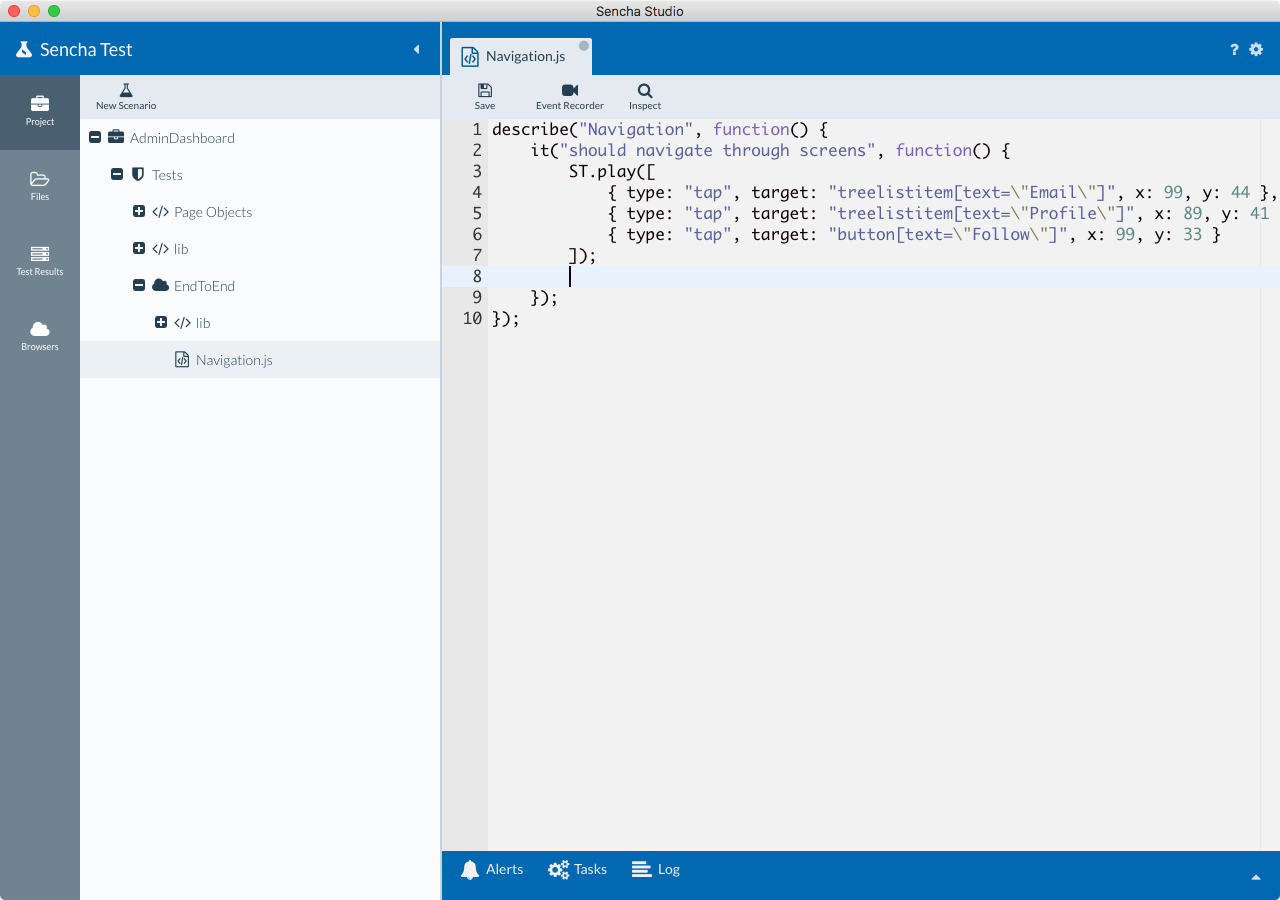
Finally, add any expect statements after the ST.play block.


 Sencha Test | Terms of Use
