What's New
Many classes have shortcut names used when creating (instantiating) a class with a
configuration object. The shortcut name is referred to as an alias (or xtype if the
class extends Ext.Component). The alias/xtype is listed next to the class name of
applicable classes for quick reference.
Framework classes or their members may be specified as private or protected. Else,
the class / member is public. Public, protected, and private are access
descriptors used to convey how and when the class or class member should be used.
Public classes and class members are available for use by any other class or application code and may be relied upon as a stable and persistent within major product versions. Public classes and members may safely be extended via a subclass.
Protected class members are stable public members intended to be used by the
owning class or its subclasses. Protected members may safely be extended via a subclass.
Private classes and class members are used internally by the framework and are not intended to be used by application developers. Private classes and members may change or be omitted from the framework at any time without notice and should not be relied upon in application logic.
static label next to the
method name. *See Static below.Below is an example class member that we can disect to show the syntax of a class member (the lookupComponent method as viewed from the Ext.button.Button class in this case).
Let's look at each part of the member row:
lookupComponent in this example)( item ) in this example)Ext.Component in this case). This may be omitted for methods that do not
return anything other than undefined or may display as multiple possible values
separated by a forward slash / signifying that what is returned may depend on the
results of the method call (i.e. a method may return a Component if a get method calls is
successful or false if unsuccessful which would be displayed as
Ext.Component/Boolean).PROTECTED in
this example - see the Flags section below)Ext.container.Container in this example). The source
class will be displayed as a blue link if the member originates from the current class
and gray if it is inherited from an ancestor or mixed-in class.view source in the example)item : Object in the example).undefined a "Returns" section
will note the type of class or object returned and a description (Ext.Component in the
example)Available since 3.4.0 - not pictured in
the example) just after the member descriptionDefaults to: false)The API documentation uses a number of flags to further commnicate the class member's function and intent. The label may be represented by a text label, an abbreviation, or an icon.
classInstance.method1().method2().etc();false is returned from
an event handler- Indicates a framework class
- A singleton framework class. *See the singleton flag for more information
- A component-type framework class (any class within the Ext JS framework that extends Ext.Component)
- Indicates that the class, member, or guide is new in the currently viewed version
- Indicates a class member of type config
- Indicates a class member of type property
- Indicates a class member of type
method
- Indicates a class member of type event
- Indicates a class member of type
theme variable
- Indicates a class member of type
theme mixin
- Indicates that the class, member, or guide is new in the currently viewed version
Just below the class name on an API doc page is a row of buttons corresponding to the types of members owned by the current class. Each button shows a count of members by type (this count is updated as filters are applied). Clicking the button will navigate you to that member section. Hovering over the member-type button will reveal a popup menu of all members of that type for quick navigation.
Getting and setter methods that correlate to a class config option will show up in the methods section as well as in the configs section of both the API doc and the member-type menus just beneath the config they work with. The getter and setter method documentation will be found in the config row for easy reference.
Your page history is kept in localstorage and displayed (using the available real estate) just below the top title bar. By default, the only search results shown are the pages matching the product / version you're currently viewing. You can expand what is displayed by clicking on the button on the right-hand side of the history bar and choosing the "All" radio option. This will show all recent pages in the history bar for all products / versions.
Within the history config menu you will also see a listing of your recent page visits. The results are filtered by the "Current Product / Version" and "All" radio options. Clicking on the button will clear the history bar as well as the history kept in local storage.
If "All" is selected in the history config menu the checkbox option for "Show product details in the history bar" will be enabled. When checked, the product/version for each historic page will show alongside the page name in the history bar. Hovering the cursor over the page names in the history bar will also show the product/version as a tooltip.
Both API docs and guides can be searched for using the search field at the top of the page.
On API doc pages there is also a filter input field that filters the member rows using the filter string. In addition to filtering by string you can filter the class members by access level, inheritance, and read only. This is done using the checkboxes at the top of the page.
The checkbox at the bottom of the API class navigation tree filters the class list to include or exclude private classes.
Clicking on an empty search field will show your last 10 searches for quick navigation.
Each API doc page (with the exception of Javascript primitives pages) has a menu view of metadata relating to that class. This metadata view will have one or more of the following:
Ext.button.Button class has an alternate class name of Ext.Button). Alternate class
names are commonly maintained for backward compatibility.Runnable examples (Fiddles) are expanded on a page by default. You can collapse and expand example code blocks individually using the arrow on the top-left of the code block. You can also toggle the collapse state of all examples using the toggle button on the top-right of the page. The toggle-all state will be remembered between page loads.
Class members are collapsed on a page by default. You can expand and collapse members using the arrow icon on the left of the member row or globally using the expand / collapse all toggle button top-right.
Viewing the docs on narrower screens or browsers will result in a view optimized for a smaller form factor. The primary differences between the desktop and "mobile" view are:
The class source can be viewed by clicking on the class name at the top of an API doc page. The source for class members can be viewed by clicking on the "view source" link on the right-hand side of the member row.
Sencha Test 2.2.1 brings some new APIs, along with a number of enhancements and bug fixes. These are detailed in the Release Notes.
New features in this release include:
Addition of a doubleClick API for elements and components, to easily execute a double-click
action.
Addition of a rightClick API for elements and components, to easily execute a right-click /
context action.
Addition of a getRecord API for DataView Items, enabling the retrieval of the underlying record
data for a DataView Item. The same API is already available for Grid Rows.
For Sencha Test CLI (STC), there is a new command line switch, --proxyPort, to enable a custom proxy port to be
set for In-Browser tests. This can be useful if the application under test needs to be run on a
specific port, for example: to enable CORS requests to complete successfully.
Sencha Test 2.2.0 has new features which make it easier to create tests, manage defects and store results. New features in this release include:
Support for ExtReact: write application (end-to-end) tests for ExtReact apps
Support for writing application (end-to-end) tests for non-Sencha web applications
Create and utilize Page Objects within the Inspect tool to build robust tests for web applications
Select and use unique locators using a DOM Tree directly from Sencha Studio using the Inspect tool
Visualize tests using a tree view and focus on the test under construction
New Futures APIs for interacting with HTML Tables
New Futures API for interacting with the Ext JS Slider component
Some of these new features are covered in more detail below.
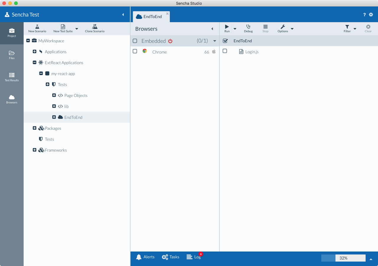
In this release, you can write application (end-to-end) tests for ExtReact apps. You can either create your tests in a new Sencha Test project, or open the ExtReact app in Sencha Studio and add the tests to the project folder structure itself.
In order to open your ExtReact app in Sencha Studio and add your tests to the app folder, the ExtReact app needs to reside within a Sencha Cmd workspace, so that it can be opened in Sencha Studio. This can either be a blank workspace just for the ExtReact app, or one with other Ext JS apps/packages.
Modify the workspace.json file to define the presence of any ExtReact apps, by adding a new extreact config, and defining the folder names of the ExtReact applications that reside within the workspace folder:
{
    /**
    * Array of Ext JS apps
    */
    "apps": [
        "Dashboard"
    ],

    /**
    * Array of ExtReact apps
    */
    "extreact": {
        "apps": [
            "my-react-app"
        ]
    }

    ...
When you open the workspace in Sencha Studio, you will see your ExtReact apps show up in the project structure under the "ExtReact Applications" node, and you will be able to add your scenarios and tests. These will be created within a test folder inside of the ExtReact app folder.
When locating ExtReact components, you can use the capitalized class names of the components in the locators. For example, a panel component in Ext JS would typically use the xtype of panel in its locator:
ST.component('panel[title="My Panel"]');
But in a ExtReact app, the capitalized class name of Panel can also be utilized, as demonstrated in this example:
ST.component('Panel[title="My Panel"]');
This new locator strategy works in apps using ExtReact 6.5.1+.
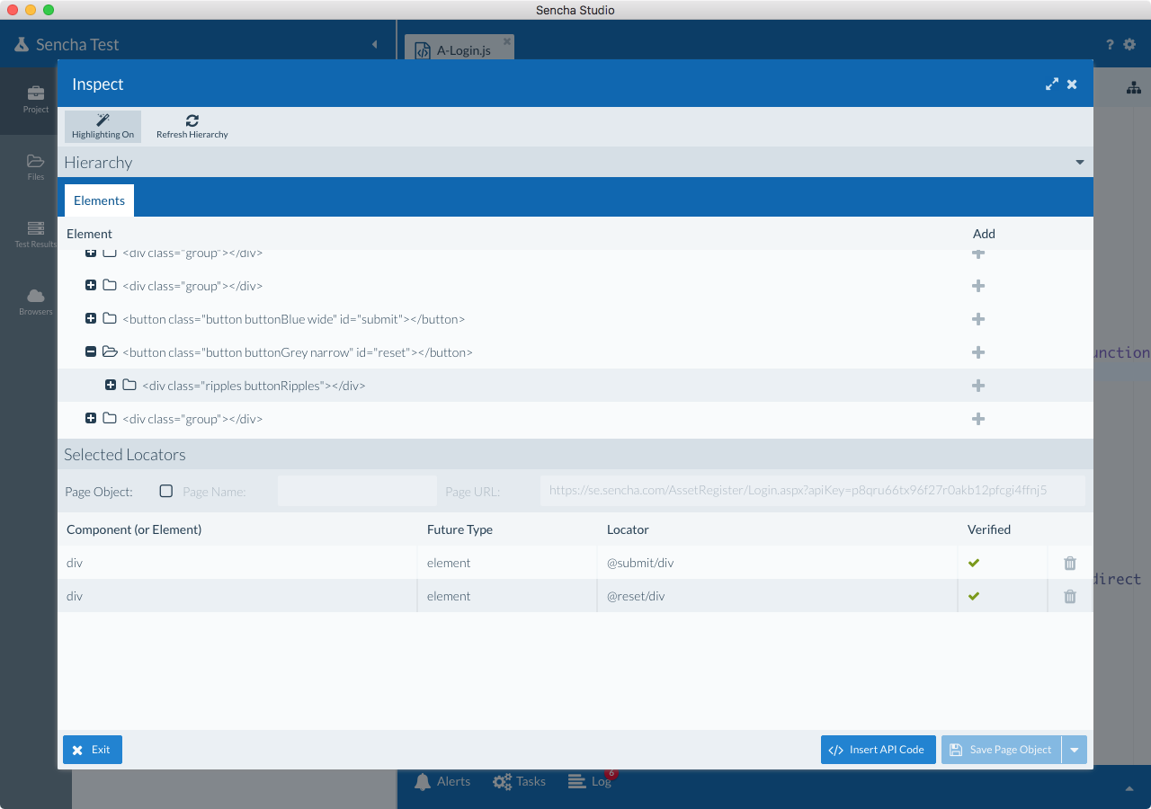
The Inspect tool in this release supports the inspection of elements in standard HTML pages; not just Ext JS / ExtReact apps. This enables Sencha Test to be used for testing web applications that aren't using Sencha frameworks.
In combination with the ST.element Future API, and newly added ST.table API, it's possible to more easily author tests that target various HTML elements in the page, including other third-party grid components that render on screen as an HTML table.
For example, using the ST.table API, a test can be written that finds a particular row by string value within a HTML table, and asserts that one of the cells matches a certain value:
it('should find the grid row by string value', function() {
    ST.table('@mytable')
        .rowWith('Sencha')
        .cellAt(3)
        .textLike(/United States/i);
});
Or, in this example, reference a table row by index and click on the row:
it('should click the third row in the grid', function() {
    ST.table('@mytable')
        .rowAt(2)
        .click();
});
Page Objects allow you to create a central lookup list of all the components/elements on a page in the application under test.
You can reuse them in multiple tests by instantiating the page object when needed. This means you can avoid having to copy and paste a locator across multiple test cases, which minimizes the need to modify the locator value when the developer changes the label from "Subject" to something else (for example), or one of the other underlying attributes is changed.
After creating a Page Object, you can leverage it throughout your test suites using the stpo namespace. For example, with a Page Object named AdminDashboard, and a locator named emailView, you can reference that component/element using this code:
stpo.AdminDashboard
    .emailView()
    .visible();
For more information, see the guide on Creating and Using Page Objects.
When inspecting a page, the Inspect tool now shows a Element hierarchy for easier inspection of the DOM Tree. If your web app is not utilizing Sencha frameworks, this means you are now able to leverage the Inspect tool to help you create meaningful and stable locators for elements, and add them to a Page Object, if desired.
We’ve designed a new way to visualize your test code and focus on one test case at a time. This feature helps teams organize tests more effectively and easily take advantage of many other capabilities, including reordering tests via drag and drop, searching and jumping to a specific test in a file, and more importantly, creating an empty test case, launching the Inspect tool, identifying components from the application, and building a test case.
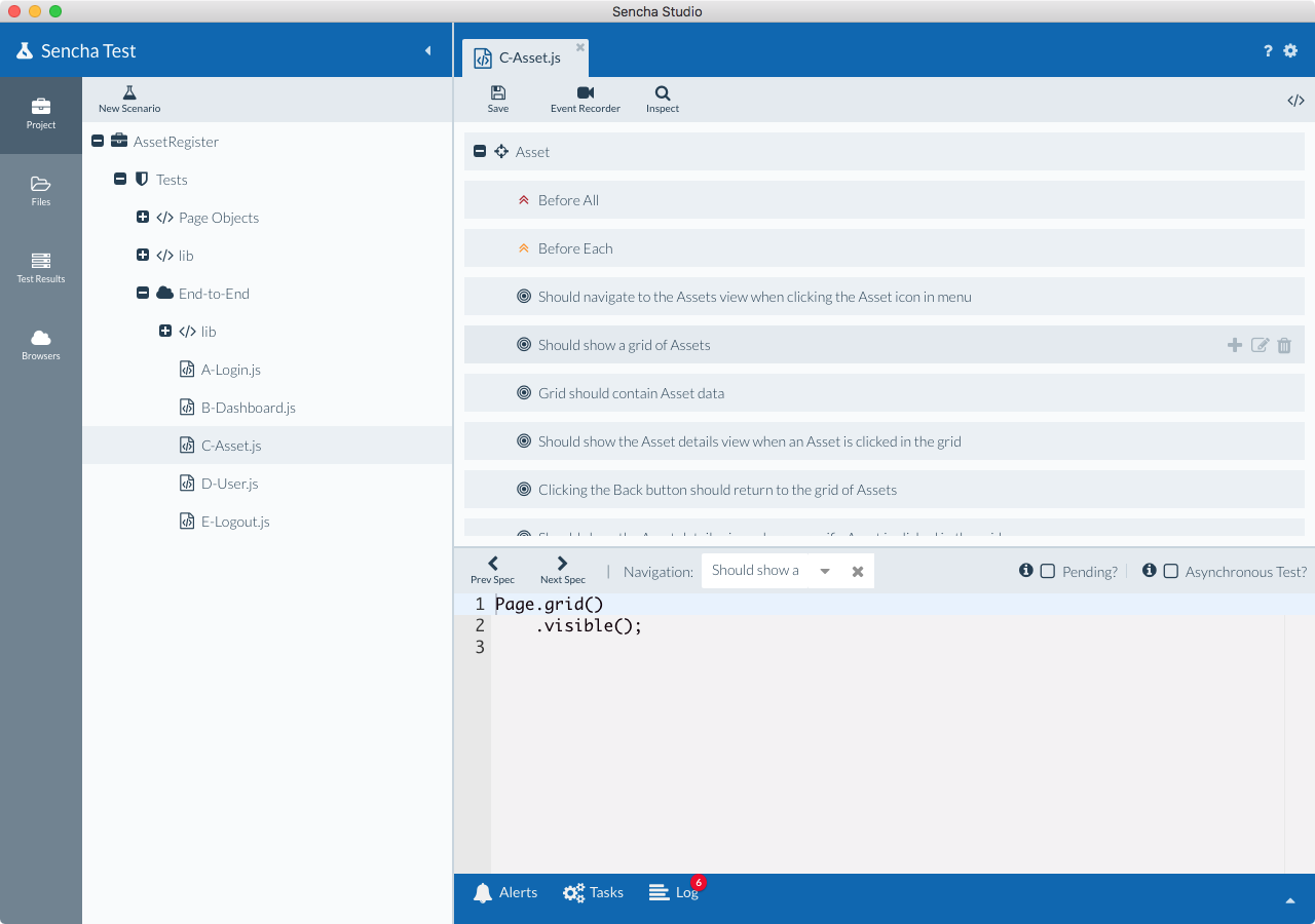
The new Tree View for test suites is the default view if you have the Test Engineer persona selected, but this default view can be changed to the Code view if needed, by going to Preferences -> Editor -> checking the "Default to source view for tests" checkbox.
Alternatively, you can switch between the Source view and the Tree view at anytime by using the toggle button in the top-right corner of the editor window.


 Sencha Test | Terms of Use
