Many classes have shortcut names used when creating (instantiating) a class with a
configuration object. The shortcut name is referred to as an alias (or xtype if the
class extends Ext.Component). The alias/xtype is listed next to the class name of
applicable classes for quick reference.
Framework classes or their members may be specified as private or protected. Else,
the class / member is public. Public, protected, and private are access
descriptors used to convey how and when the class or class member should be used.
Public classes and class members are available for use by any other class or application code and may be relied upon as a stable and persistent within major product versions. Public classes and members may safely be extended via a subclass.
Protected class members are stable public members intended to be used by the
owning class or its subclasses. Protected members may safely be extended via a subclass.
Private classes and class members are used internally by the framework and are not intended to be used by application developers. Private classes and members may change or be omitted from the framework at any time without notice and should not be relied upon in application logic.
static label next to the
method name. *See Static below.Below is an example class member that we can disect to show the syntax of a class member (the lookupComponent method as viewed from the Ext.button.Button class in this case).
Let's look at each part of the member row:
lookupComponent in this example)( item ) in this example)Ext.Component in this case). This may be omitted for methods that do not
return anything other than undefined or may display as multiple possible values
separated by a forward slash / signifying that what is returned may depend on the
results of the method call (i.e. a method may return a Component if a get method calls is
successful or false if unsuccessful which would be displayed as
Ext.Component/Boolean).PROTECTED in
this example - see the Flags section below)Ext.container.Container in this example). The source
class will be displayed as a blue link if the member originates from the current class
and gray if it is inherited from an ancestor or mixed-in class.view source in the example)item : Object in the example).undefined a "Returns" section
will note the type of class or object returned and a description (Ext.Component in the
example)Available since 3.4.0 - not pictured in
the example) just after the member descriptionDefaults to: false)The API documentation uses a number of flags to further commnicate the class member's function and intent. The label may be represented by a text label, an abbreviation, or an icon.
classInstance.method1().method2().etc();false is returned from
an event handler- Indicates a framework class
- A singleton framework class. *See the singleton flag for more information
- A component-type framework class (any class within the Ext JS framework that extends Ext.Component)
- Indicates that the class, member, or guide is new in the currently viewed version
- Indicates a class member of type config
- Indicates a class member of type property
- Indicates a class member of type
method
- Indicates a class member of type event
- Indicates a class member of type
theme variable
- Indicates a class member of type
theme mixin
- Indicates that the class, member, or guide is new in the currently viewed version
Just below the class name on an API doc page is a row of buttons corresponding to the types of members owned by the current class. Each button shows a count of members by type (this count is updated as filters are applied). Clicking the button will navigate you to that member section. Hovering over the member-type button will reveal a popup menu of all members of that type for quick navigation.
Getting and setter methods that correlate to a class config option will show up in the methods section as well as in the configs section of both the API doc and the member-type menus just beneath the config they work with. The getter and setter method documentation will be found in the config row for easy reference.
Your page history is kept in localstorage and displayed (using the available real estate) just below the top title bar. By default, the only search results shown are the pages matching the product / version you're currently viewing. You can expand what is displayed by clicking on the button on the right-hand side of the history bar and choosing the "All" radio option. This will show all recent pages in the history bar for all products / versions.
Within the history config menu you will also see a listing of your recent page visits. The results are filtered by the "Current Product / Version" and "All" radio options. Clicking on the button will clear the history bar as well as the history kept in local storage.
If "All" is selected in the history config menu the checkbox option for "Show product details in the history bar" will be enabled. When checked, the product/version for each historic page will show alongside the page name in the history bar. Hovering the cursor over the page names in the history bar will also show the product/version as a tooltip.
Both API docs and guides can be searched for using the search field at the top of the page.
On API doc pages there is also a filter input field that filters the member rows using the filter string. In addition to filtering by string you can filter the class members by access level, inheritance, and read only. This is done using the checkboxes at the top of the page.
The checkbox at the bottom of the API class navigation tree filters the class list to include or exclude private classes.
Clicking on an empty search field will show your last 10 searches for quick navigation.
Each API doc page (with the exception of Javascript primitives pages) has a menu view of metadata relating to that class. This metadata view will have one or more of the following:
Ext.button.Button class has an alternate class name of Ext.Button). Alternate class
names are commonly maintained for backward compatibility.Runnable examples (Fiddles) are expanded on a page by default. You can collapse and expand example code blocks individually using the arrow on the top-left of the code block. You can also toggle the collapse state of all examples using the toggle button on the top-right of the page. The toggle-all state will be remembered between page loads.
Class members are collapsed on a page by default. You can expand and collapse members using the arrow icon on the left of the member row or globally using the expand / collapse all toggle button top-right.
Viewing the docs on narrower screens or browsers will result in a view optimized for a smaller form factor. The primary differences between the desktop and "mobile" view are:
The class source can be viewed by clicking on the class name at the top of an API doc page. The source for class members can be viewed by clicking on the "view source" link on the right-hand side of the member row.
Sencha Studio allows developers to quickly and automatically test granular aspects of an application or web page. Unit testing ensures that all of the pieces of your application behave as anticipated as your codebase grows and changes.
In this guide, we're going to walk through generating a new application and setting up a test environment, creating a testable application class, and testing said class with a custom unit test. All of these things can be done directly in Sencha Studio.
If you have an existing application, check out Testing Existing Applications.
This guide assumes some familiarity with the Jasmine test framework. If you are unfamiliar with Jasmine or test concepts, check out their excellent documentation for more information on authoring and editing Jasmine tests. This guide also makes use of Sencha Cmd to generate an Ext JS application and assume you have downloaded / installed them.
Let's get started!
We'll begin by opening Sencha Studio.
You can generate your required workspace with Sencha Studio by choosing the following from the application toolbar:
Sencha Studio -> New -> Workspace...
Select the appropriate file system path and click "OK". Your test project should now find itself within your newly generated workspace.
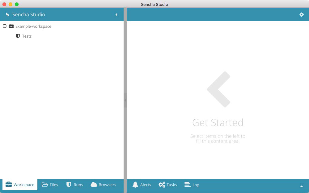
Next, we'll add an application to this fresh workspace.
The starter application has very little functionality, so let's add something that we can test. For our purposes, let's
create a WindowEditor class at MyApp/app/view/main/WindowEditor.js using the IDE of your choice. You can use this code to
follow along:
Ext.define('MyApp.view.main.WindowEditor', {
   extend: 'Ext.Window',

   alias: 'widget.windoweditor',

   width:400,
   height:200,
   padding:20,

   autoShow: true,

   title: 'Update Email',

   items: [{
       xtype: 'form',
       items: [{
           xtype: 'textfield',
           allowBlank: false,
           vtype: 'email'
       },{
           xtype: 'button',
           text: 'Submit Change',
           formBind: true
       }]
   }]
});
This class extends a window that contains a form, which in turn, contains a textfield and a button. We've instructed the textfield that we will not allow a blank value, and that any input must pass email validation.
Additionally, we've set formBind true on the button. This instructs the button to
remain in a disabled state until the form considers itself valid. Once valid, the button
will change to a clickable state.
You can then replace MyApp/app/view/main/MainController.js's onItemSelected method
with the following:
onItemSelected: function (sender, record) {
    Ext.create('MyApp.view.main.WindowEditor');
}
This will open a faux email-editor for our grid. You really don't need to modify this controller code to create the upcoming test in Sencha Studio. That said, you'll find that your application's creation logic often runs parallel to the code you'll end up writing in your test spec.
We'll eventually use this class to test whether or not the button is successfully enabled/disabled as the text input satisfies our prescribed validation.
Note: This "editor" doesn't really do anything at this point, but it should serve our purposes for testing demonstration.
Let's get our project settings added by clicking on "Applications" child "Tests" node. Then click "Initialize Test Project" in the right-hand details panel. Upon clicking, you should see a few Project Settings. We shouldn't need to change anything at this time. However, if you do modify any of the settings, be sure to click "Save" before proceeding.
Next, let's add an application scenario.
A test project must contain a “Scenario” in order to add a suite of test specs.
Scenario - Scenarios house the test suites that you will soon create.
To create a scenario, click the "+ Add" button under the Scenarios heading. You can then change the name and file system location of the Scenario. Typically, you'll want to name your Scenario based on the content you'll be testing. In this case, let's call it "WindowEditor". Once added, make sure to click "Save". We can now begin adding a suite of test specs to our scenario.
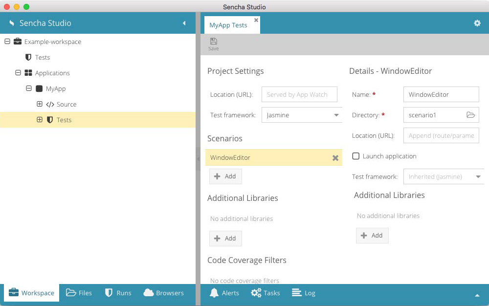
You should now see “WindowEditor” as a child of the "Tests" node. Go ahead and click on that node, and you should see your local browsers and a panel that says "No tests found". Let's change that!
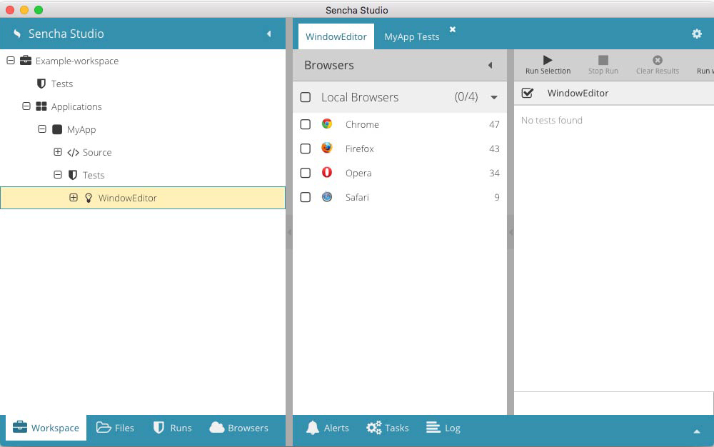
Let's add a Jasmine Test Suite.
Suite - A suite is a file containing a collection of tests that represent some aspect of your application. This could be a class, a component, or a grouping of functions. It really depends on how you choose to organize your test suites.
"Right+Click" the “Window Editor” node and then, click "New->Jasmine Test Suite". A modal window will then pop up that allows you to give your Suite a name. Let's call it "WindowValidation".
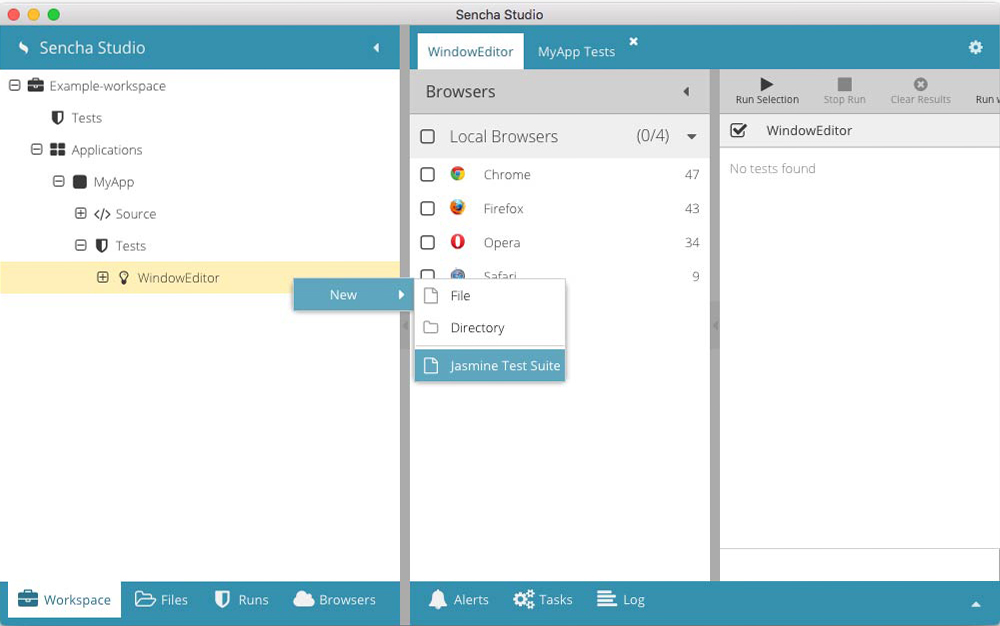
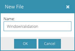
Once added, you should then see a "WindowValidation.js" file under "WindowEditor". Click the new file and you'll see some stubbed in suite code to get your started.
describe("my test suite", function() {
    it("should pass", function() {
        expect(1).toBe(1);
    });
});
For ease of use, "Right+Click" on the WindowValidation.js tab and then click "Move Right". This should split your
screen between the WindowEditor and your Scenario's Test Runner. This makes it much easier to make changes and test
them quickly.
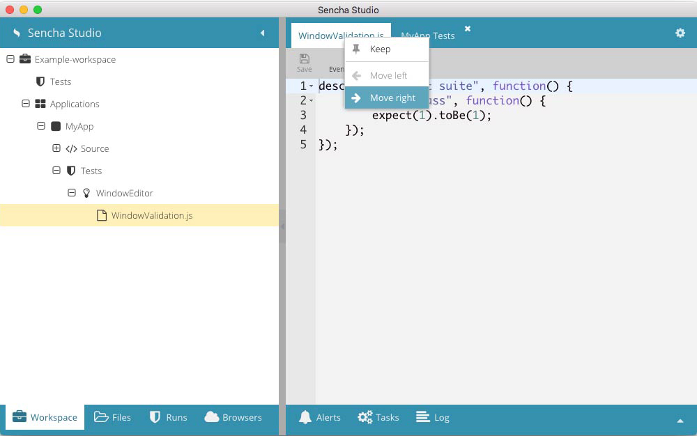
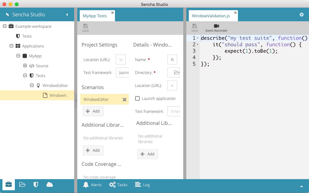
Our stubbed in suite code isn't very helpful in its current form, so let's go ahead and add a spec to our suite.
Spec - A spec is an individual test in the form of a JavaScript function that explains what a portion of your program should accomplish. We should explain in plain language what the test is expecting. It should then provide JavaScript that performs the tests for said expectation.
It's important to note that many times your test may parallel many aspects of your application code in terms of creating classes and obtaining references to components.
For the time being, go ahead and paste the following suite into your WindowEditor.js
file and press "Save":
describe("formBind true", function() {
    it("should disable button if email is not valid", function(done) {

        // Create and reference the WindowEditor and then
        // get reference to the button and textfield
        var win = Ext.create('MyApp.view.main.WindowEditor'),
            button = win.down('button'),
            field  = win.down('textfield');

        // Set the field's value to a valid email address
        // in order to have the button fire an enable event
        field.setValue('[email protected]');

        button.on('enable', function() {

            // Set the field's value to an invalid email address (nothing)
            // in order to have the button fire a disable event
            field.setValue('');

            button.on('disable', function() {

                //  Once the disable event has been called after setting a
                //  bad value, we can safely say that the button is properly
                //  hooked into the form's validity.  Thusly, we can
                //  alert the spec to return by calling the done function.
                done();
            });
        });
    });
});
As you can see, we're testing that the button's state correctly follows the form's validity. If the textfield contains
a valid value, the form is valid, and the button should be enabled. Conversely, if the textfield contains an invalid
value, the form is invalid, and the button should be disabled. This behavior all takes place due to the button's
formBind config being set to true.
We are able to test that these conditions are properly met by listening to the button's enable/disable events. If button
fires "enable", we know that the form has become valid. If the button fires the "disable" event, we know that the form
has become invalid. At that point, we can be satisfied that the test was successful and then call Jasmine's done() function.
In many cases, you would use an expectation to ensure the results meet your postulation. An expectation is built with the expect function, which takes a value, called the actual. It is then chained to a Matcher function which takes the expected value. This determines true/false, or, in other words, pass/fail.
That said, we don't necessarily have to use an expectation in this case. The done() function is passed to the it() method
as an argument. We can use done() by simply calling it when we determine the processing to be complete. Generally,
done() will be called as a "success" callback when dealing with asynchronous testing. However, we can use it here
instead of setting an expectation. By virtue of reaching the final event, we know that we've satisfied our test, so there
is no need for an expectation. If the final event is never fired, done() will not be called, and the test will timeout
after 5 seconds, indicating a failure.
Now that we have a test case, let's run it and ensure that our application's editor is successfully measuring our form's validity.
Now that we have our test connected, let's walk through running it via a local browser.
First, select the "WindowEditor" scenario node from the Workspace navigation view to
display the scenario's test runner tab. Next, select your browser(s) of choice from the
left hand Browsers pane in the test runner tab. For our purposes, we'll select Chrome.
Once selected, you'll see your selected browser(s) open your connected application.
Note: If "sencha app watch" is initializing, you'll see a yellow eye icon next to the application node. Your browser will not open until the eye turns black, signifying that "app watch" has initialized.
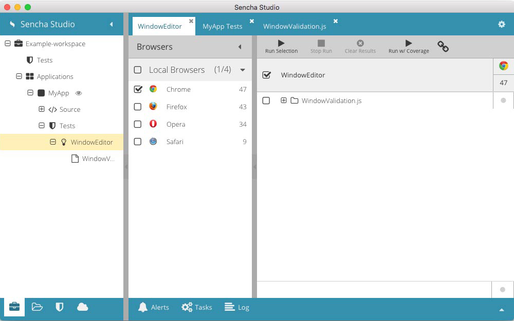
Select "WindowValidation.js" from the WindowEditor Test Runner and click "Run Selection" from the top toolbar. If all goes well, you should receive a green checkbox indicating that the test has successfully passed.

It may be useful to see what happens if the test fails as well, so let's force that to occur by changing our test case.
Replace the following line:
    // Set the field's value to a valid email address
    // in order to have the button fire an enable event
    field.setValue('[email protected]');
with this code:
field.setValue('');
As you can imagine, this change will cause the textfield value to remain invalid, meaning the button's enable event will
never fire and we'll never call done(). After 5 seconds, the test will determine itself failed and timeout.
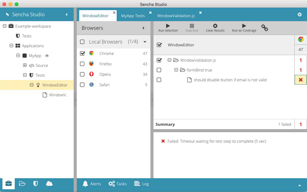
Save your spec and re-run the selection. This time you should see a red "1". This indicates that one spec failed. If
you expand WindowValidation.js, and then expand formBind true, you'll see our spec with a red "x" next to it. If you
click on the red "x", you can then review a summary of the error in the lower summary panel.
As you may imagine, this guide only scratches the surface of what can be done with Sencha Test by way of Sencha Studio. Hopefully, this introduction provides you with the knowledge you'll need to navigate through and discover the many powerful tools contained within Sencha Studio.
If you have further questions, concerns, or bug reports, please visit the Sencha Test forums.