Many classes have shortcut names used when creating (instantiating) a class with a
configuration object. The shortcut name is referred to as an alias (or xtype if the
class extends Ext.Component). The alias/xtype is listed next to the class name of
applicable classes for quick reference.
Framework classes or their members may be specified as private or protected. Else,
the class / member is public. Public, protected, and private are access
descriptors used to convey how and when the class or class member should be used.
Public classes and class members are available for use by any other class or application code and may be relied upon as a stable and persistent within major product versions. Public classes and members may safely be extended via a subclass.
Protected class members are stable public members intended to be used by the
owning class or its subclasses. Protected members may safely be extended via a subclass.
Private classes and class members are used internally by the framework and are not intended to be used by application developers. Private classes and members may change or be omitted from the framework at any time without notice and should not be relied upon in application logic.
static label next to the
method name. *See Static below.Below is an example class member that we can disect to show the syntax of a class member (the lookupComponent method as viewed from the Ext.button.Button class in this case).
Let's look at each part of the member row:
lookupComponent in this example)( item ) in this example)Ext.Component in this case). This may be omitted for methods that do not
return anything other than undefined or may display as multiple possible values
separated by a forward slash / signifying that what is returned may depend on the
results of the method call (i.e. a method may return a Component if a get method calls is
successful or false if unsuccessful which would be displayed as
Ext.Component/Boolean).PROTECTED in
this example - see the Flags section below)Ext.container.Container in this example). The source
class will be displayed as a blue link if the member originates from the current class
and gray if it is inherited from an ancestor or mixed-in class.view source in the example)item : Object in the example).undefined a "Returns" section
will note the type of class or object returned and a description (Ext.Component in the
example)Available since 3.4.0 - not pictured in
the example) just after the member descriptionDefaults to: false)The API documentation uses a number of flags to further commnicate the class member's function and intent. The label may be represented by a text label, an abbreviation, or an icon.
classInstance.method1().method2().etc();false is returned from
an event handler- Indicates a framework class
- A singleton framework class. *See the singleton flag for more information
- A component-type framework class (any class within the Ext JS framework that extends Ext.Component)
- Indicates that the class, member, or guide is new in the currently viewed version
- Indicates a class member of type config
- Indicates a class member of type property
- Indicates a class member of type
method
- Indicates a class member of type event
- Indicates a class member of type
theme variable
- Indicates a class member of type
theme mixin
- Indicates that the class, member, or guide is new in the currently viewed version
Just below the class name on an API doc page is a row of buttons corresponding to the types of members owned by the current class. Each button shows a count of members by type (this count is updated as filters are applied). Clicking the button will navigate you to that member section. Hovering over the member-type button will reveal a popup menu of all members of that type for quick navigation.
Getting and setter methods that correlate to a class config option will show up in the methods section as well as in the configs section of both the API doc and the member-type menus just beneath the config they work with. The getter and setter method documentation will be found in the config row for easy reference.
Your page history is kept in localstorage and displayed (using the available real estate) just below the top title bar. By default, the only search results shown are the pages matching the product / version you're currently viewing. You can expand what is displayed by clicking on the button on the right-hand side of the history bar and choosing the "All" radio option. This will show all recent pages in the history bar for all products / versions.
Within the history config menu you will also see a listing of your recent page visits. The results are filtered by the "Current Product / Version" and "All" radio options. Clicking on the button will clear the history bar as well as the history kept in local storage.
If "All" is selected in the history config menu the checkbox option for "Show product details in the history bar" will be enabled. When checked, the product/version for each historic page will show alongside the page name in the history bar. Hovering the cursor over the page names in the history bar will also show the product/version as a tooltip.
Both API docs and guides can be searched for using the search field at the top of the page.
On API doc pages there is also a filter input field that filters the member rows using the filter string. In addition to filtering by string you can filter the class members by access level, inheritance, and read only. This is done using the checkboxes at the top of the page.
The checkbox at the bottom of the API class navigation tree filters the class list to include or exclude private classes.
Clicking on an empty search field will show your last 10 searches for quick navigation.
Each API doc page (with the exception of Javascript primitives pages) has a menu view of metadata relating to that class. This metadata view will have one or more of the following:
Ext.button.Button class has an alternate class name of Ext.Button). Alternate class
names are commonly maintained for backward compatibility.Runnable examples (Fiddles) are expanded on a page by default. You can collapse and expand example code blocks individually using the arrow on the top-left of the code block. You can also toggle the collapse state of all examples using the toggle button on the top-right of the page. The toggle-all state will be remembered between page loads.
Class members are collapsed on a page by default. You can expand and collapse members using the arrow icon on the left of the member row or globally using the expand / collapse all toggle button top-right.
Viewing the docs on narrower screens or browsers will result in a view optimized for a smaller form factor. The primary differences between the desktop and "mobile" view are:
The class source can be viewed by clicking on the class name at the top of an API doc page. The source for class members can be viewed by clicking on the "view source" link on the right-hand side of the member row.
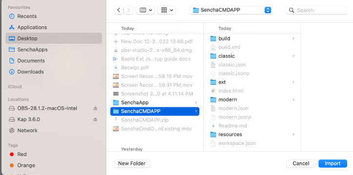
This feature is used to migrate the CMD-based and Ext-gen applications into Rapid Ext JS.
If you are a licensed Sencha customer, login with your Sencha credentials to access premium components. Non-licensed users can also use Rapid Ext JS to generate applications with limited component access as trial users.
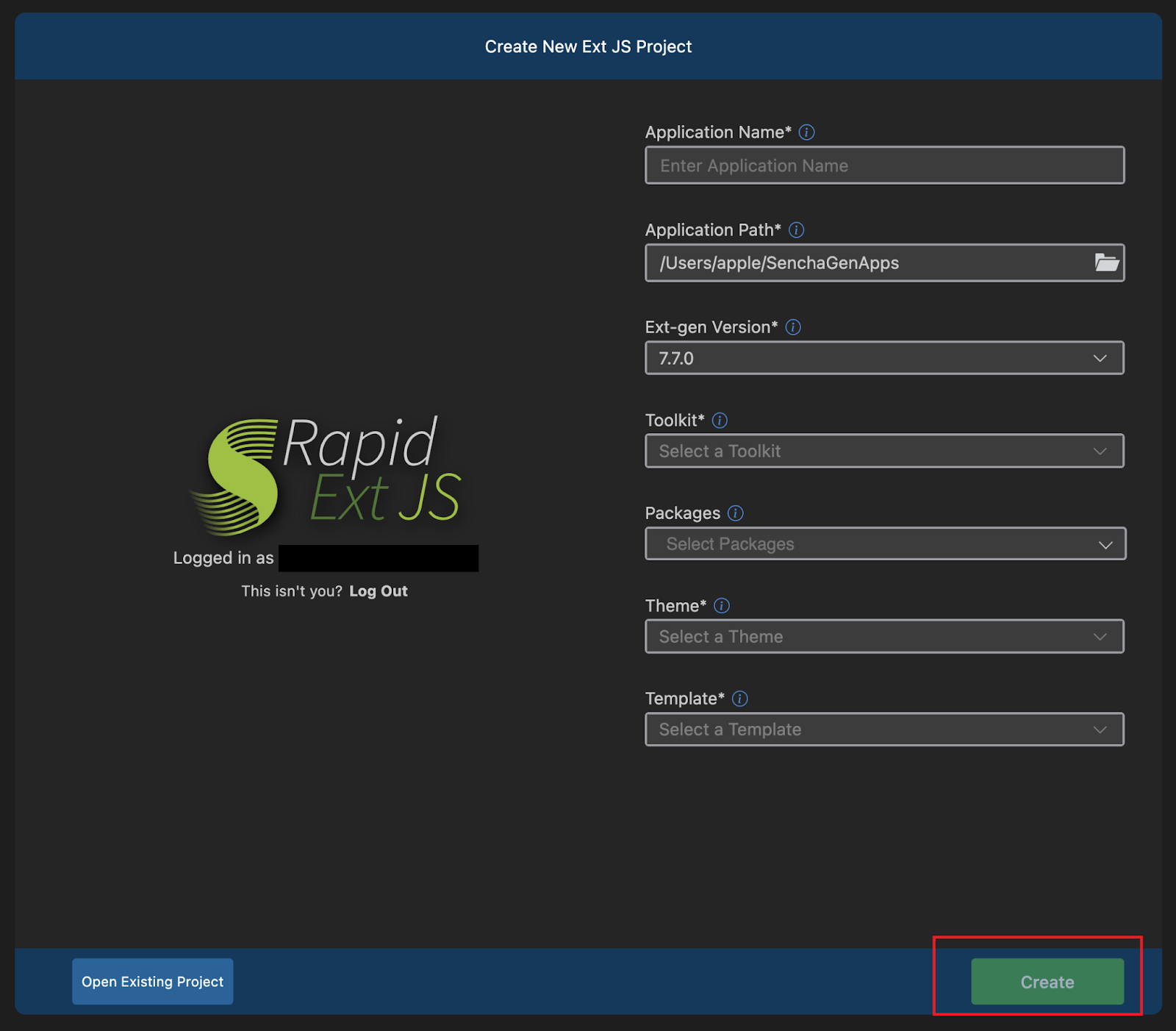
Create an Application by filling the application name, the path to generate the app, the theme, template, toolkit, Ext-gen version, and packages. A sample application will be generated based on user selections. Note: Application generation time will be varied on the packages that the user selects.
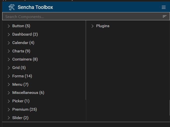
The Sencha Toolbox provides a list of components, plugins, and configurations. The user can look for components by name, xtype, alias or alternate class name. Users can drop any components into the canvas and the respected code will be updated in the file. The dropped component can be customized using configurations.
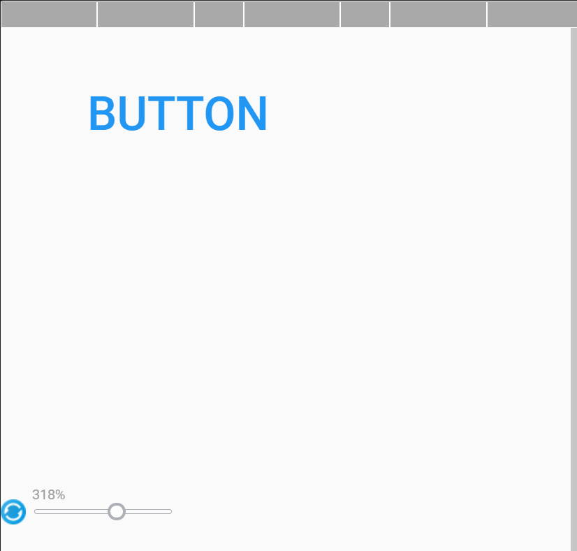
The canvas can be adjusted by zooming in between 25% to 500%. A quick reset button is available to reset to the original size of the canvas.
The Screen resolution selector provides 15 different device resolutions along with the option to change width and height. This helps visual notation of components for different resolutions on the canvas.

Component Hierarchy hold the structure of the components in canvas as a tree view. Hierarchy focuses the component on canvas and highlights the code of that component, when clicking on any component. If any component contains functions, they will be added to the component hierarchy.

Package Explorer has a standard and premium package which can be downloaded and installed by the user. It also lets users to manually add packages, if they have packages locally downloaded or one-click installation handled by Rapid Ext JS extension.

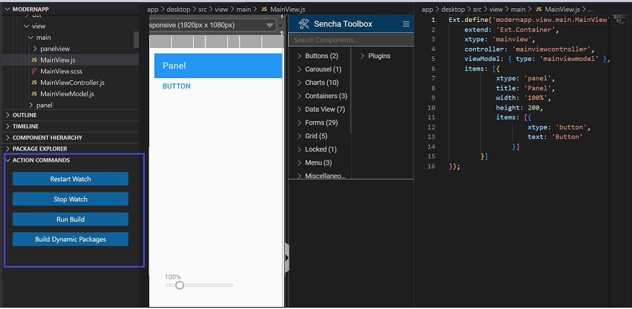
Action Command provides four options:
Restart watch – The Sencha app watch command will stop and restart.
Stop watch – It will stop all the running Ports.
Run build – The Sencha app build command will trigger.
Build Dynamic Packages – It will Dynamically load the packages. This helps when adding packages post-generating applications using the Package Explorer option on the Rapid Ext JS extension.
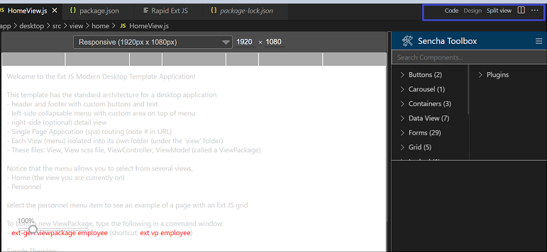
There are three switch buttons to toggle between Code, Design and Split view:
Code - Shows only the ‘Code’ editor or switch the user to the already opened ‘Code’ editor for that file. It also allows users to switch to the ‘Design’ view from the ‘Code’ view.
Design - Shows only the ‘Design’ canvas and closes any other views that are open. Users can drag any component from the Sencha toolbox and drop it inside the design canvas. There are also options to Copy, Paste, Duplicate and Delete the component when right-clicking the selected component.
Split View - Shows the ‘Design’ and ‘Code’ view side by side. This allows users to make changes to the design as well as the code editor. Visually shows the changes and code updates simultaneously.
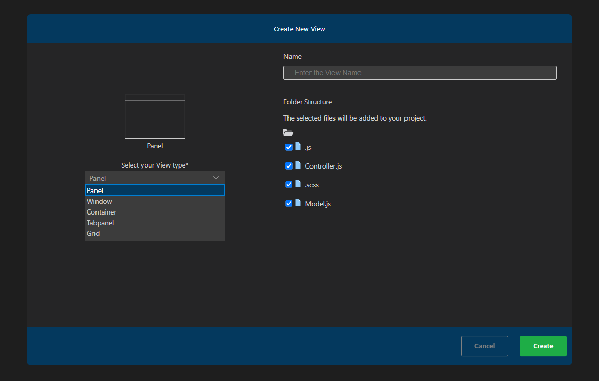
Rapid Ext JS provides an option to generate the custom view folder as per the user selections. Users can select the new view he wishes to generate. Users can also select the file he needs to add into the view folder. These are the view types available in Rapid Ext JS:
Panel – The panel view type is created along with Model, Controller and SCSS file.
Container – Container view type is created along with Model, Controller and SCSS file.
Tab panel - Tab Panel view type is created along with Model, Controller and SCSS file.
Grid – Grid view type is created along with Model, Controller and SCSS file.
Window – Window view type is created along with Model, Controller and SCSS file. It is only available in Classic and Universal Toolkit.
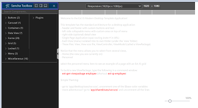
Rapid Ext JS has a cool feature of repositioning the Sencha toolbox to the left, right and bottom. By default, the Sencha toolbox position will be right. Users can reposition it through the VS code settings.
VS code can change the color theme of the editor background. Rapid Ext JS has given support with every theme color in VS code. The default VS code color will be ‘Dark’. Users can change themes by navigating to view > Command palette > search for 'color themes'
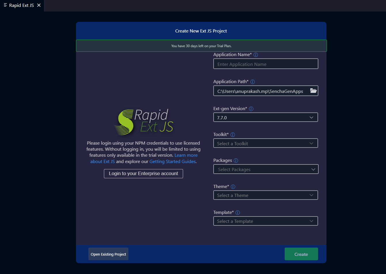
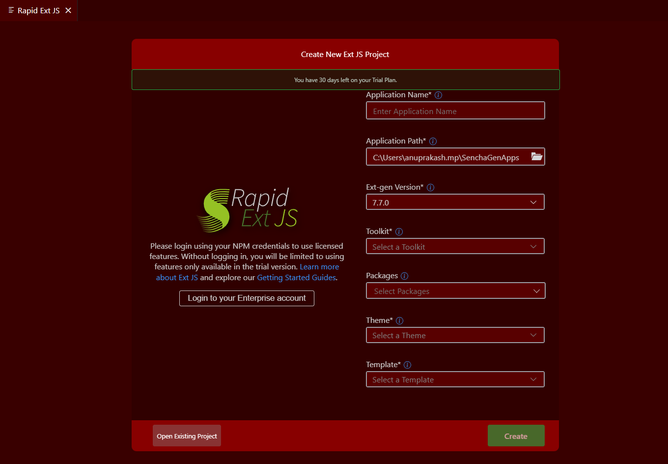
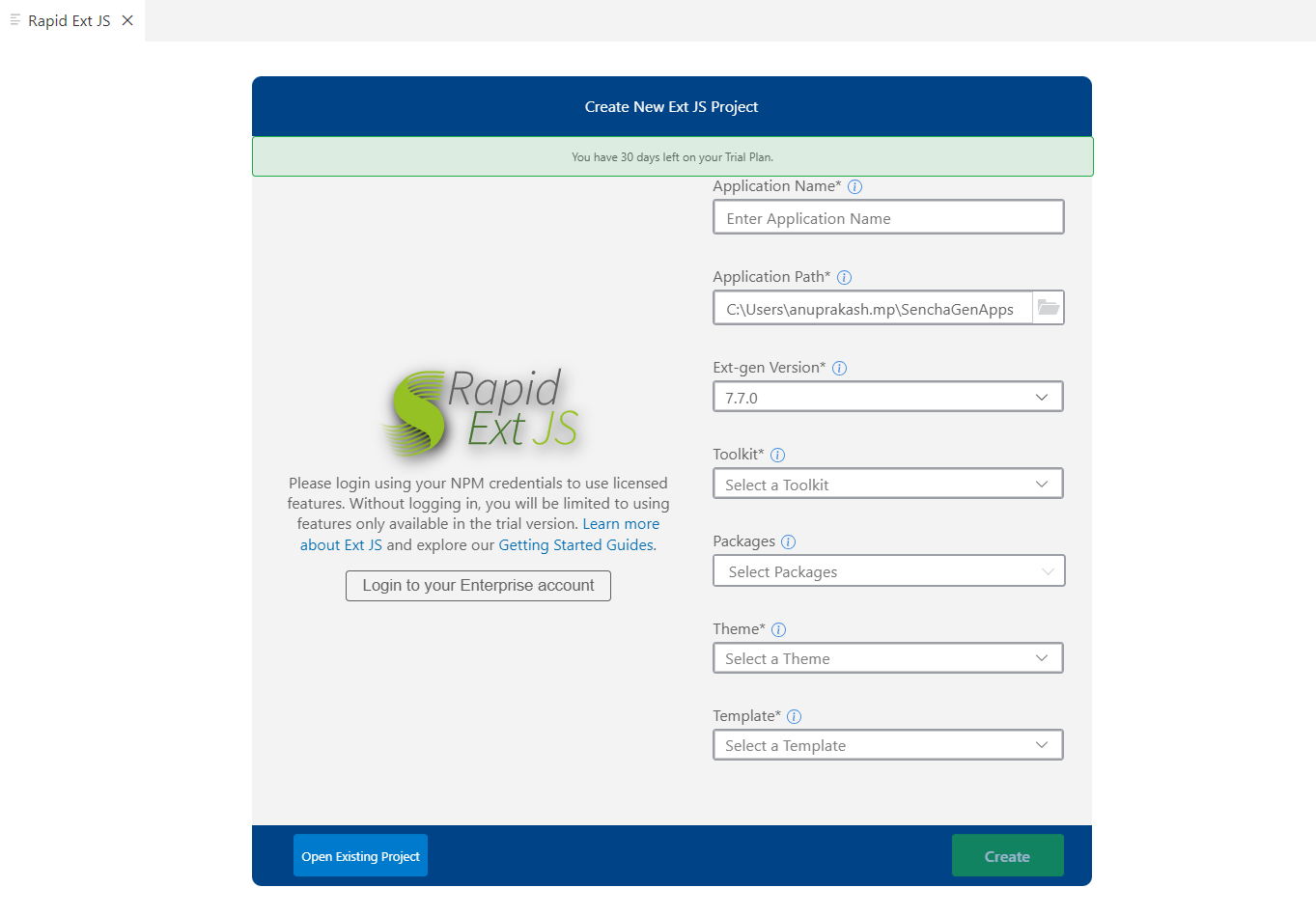
Rapid Ext JS Extension supports more than 120 components in Classic and 135+ components in Modern according to the user license tier. All these components can be draggable into the canvas. After dropping the components, the code will be updated automatically in the code file. Users can experience the design of that component in canvas. They can also filter the component by name, class name, xtype, alternate class name, and alias.
The configuration list will be refreshed when selecting any component. Users can use any configuration associated with the component and search the configuration by Key or Value. If the user adds any wrong value to the config, that code will be removed and updated by the default value if it is available. At the bottom, the user can add or delete an event listener associated with the component. Users can also add or delete custom functions and arguments.
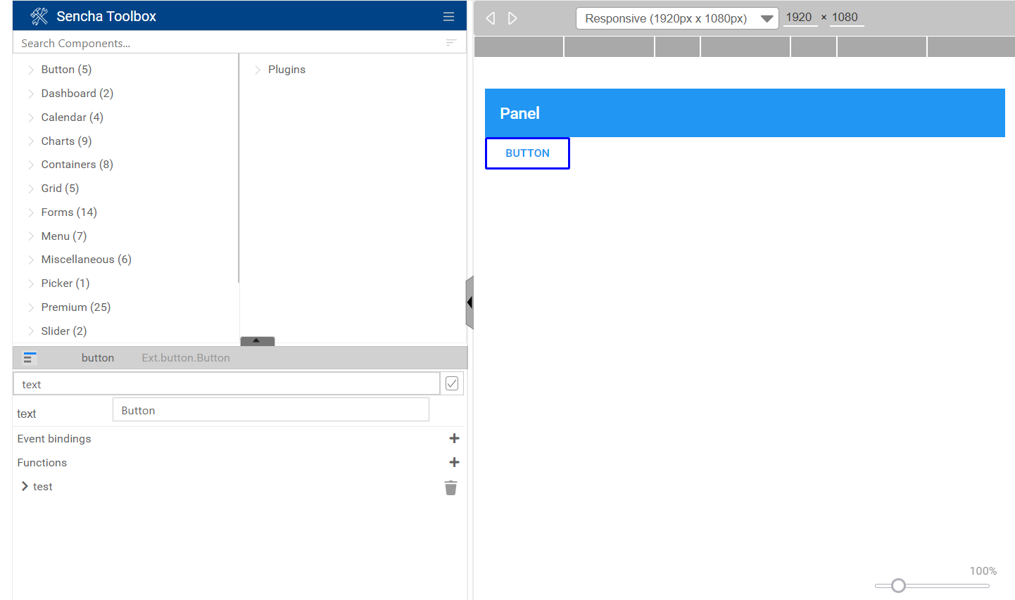
Below is the Configuration search bar, a checkbox is added to filter the modified configs. If the user checks or unchecks the checkbox, all the modified configs of the respected component can be filtered for quick access.

Introduced Undo-Redo feature of components across the design views. A user can easily undo/redo design changes, and the changes are updated in the codeview.

Introduced Copy-Paste feature of components across the views. Users are able to interact between the components across the views by allowing Copy components from view1 and Paste them into view2 on the design view.

Lists missing files on the user machine and provides information on required dependencies. Missing Dependencies view to highlight prerequisites (Java, Node/NPM) before using Rapid Ext JS features is developed.
The capability to run an application directly on an emulator is a crucial feature, offering a simulated environment that mirrors the target device. Rapid Ext JS application comes equipped with a documentation emulator, providing users with a real-time preview and interactive editing environment to streamline the documentation creation process.
Emulators enable a more efficient development workflow by providing a quick and cost-effective way to assess the application's performance across various devices and screen sizes. This capability enhances the overall development experience, fostering rapid iteration and ensuring a smoother deployment process of applications.

In Rapid Ext JS, the addition of default templates from Sencha Examples greatly enhances the application development process. These templates serve as valuable starting points, allowing users to generate new applications swiftly and efficiently. Leveraging the Sencha Examples as templates provides developers with a standardized and proven foundation, ensuring best practices and consistency in their projects.
The following samples are used in Rapid Ext JS as templates from which users can generate a starting app:
By incorporating these samples into the Rapid Ext JS framework, users can expedite the creation of robust applications while benefiting from the expertise encapsulated in Sencha's exemplary code snippets. This integration facilitates a seamless and productive development experience for Ext JS applications.
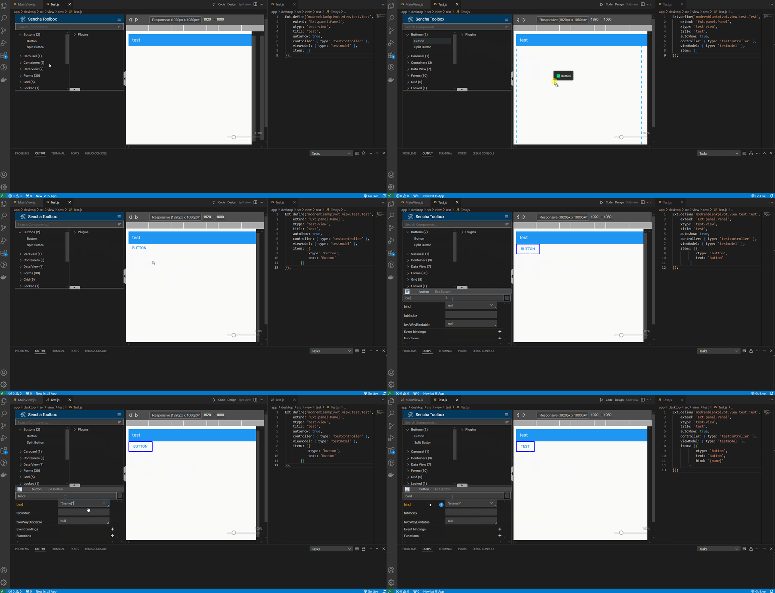
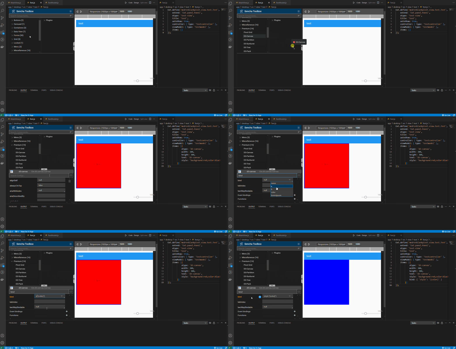
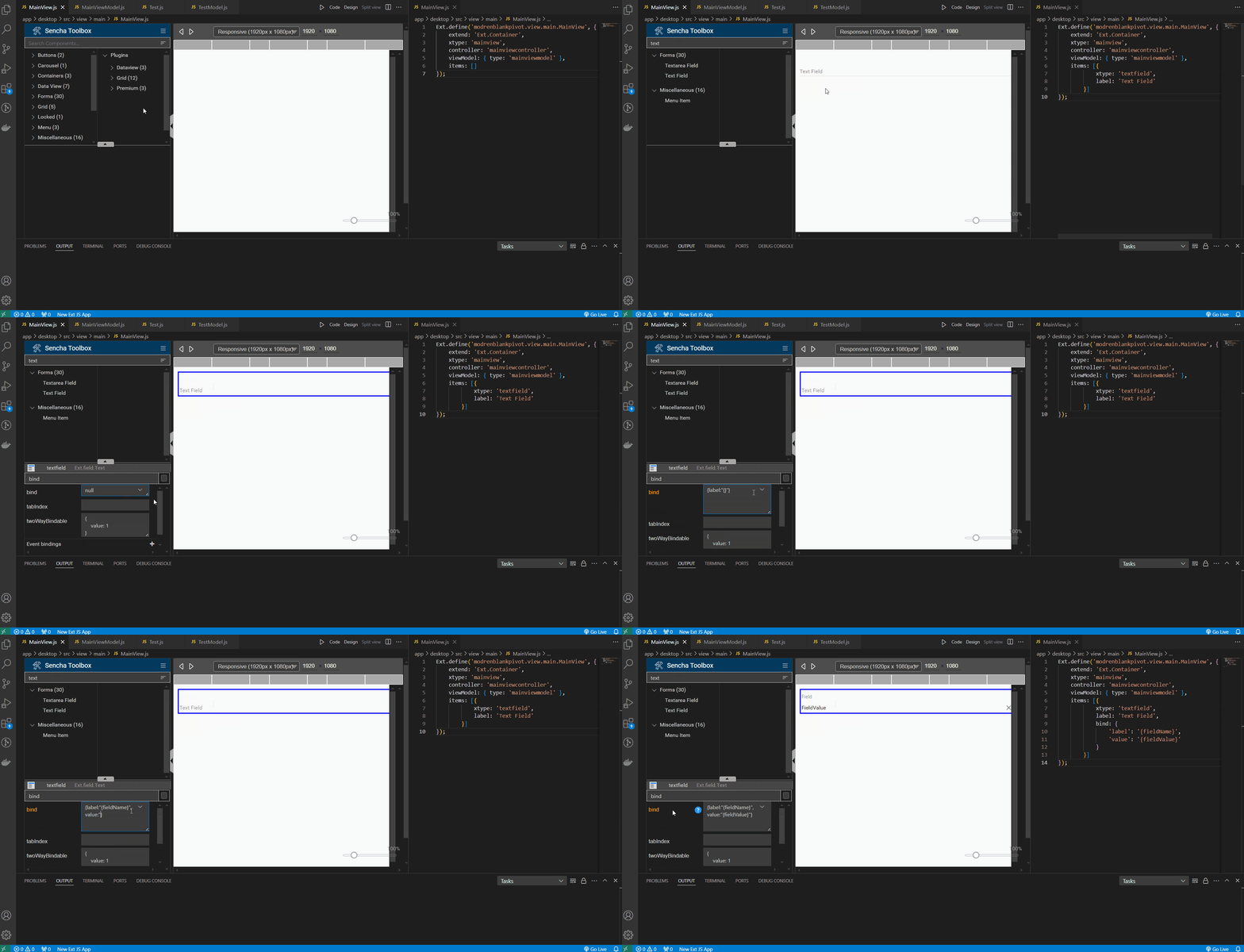
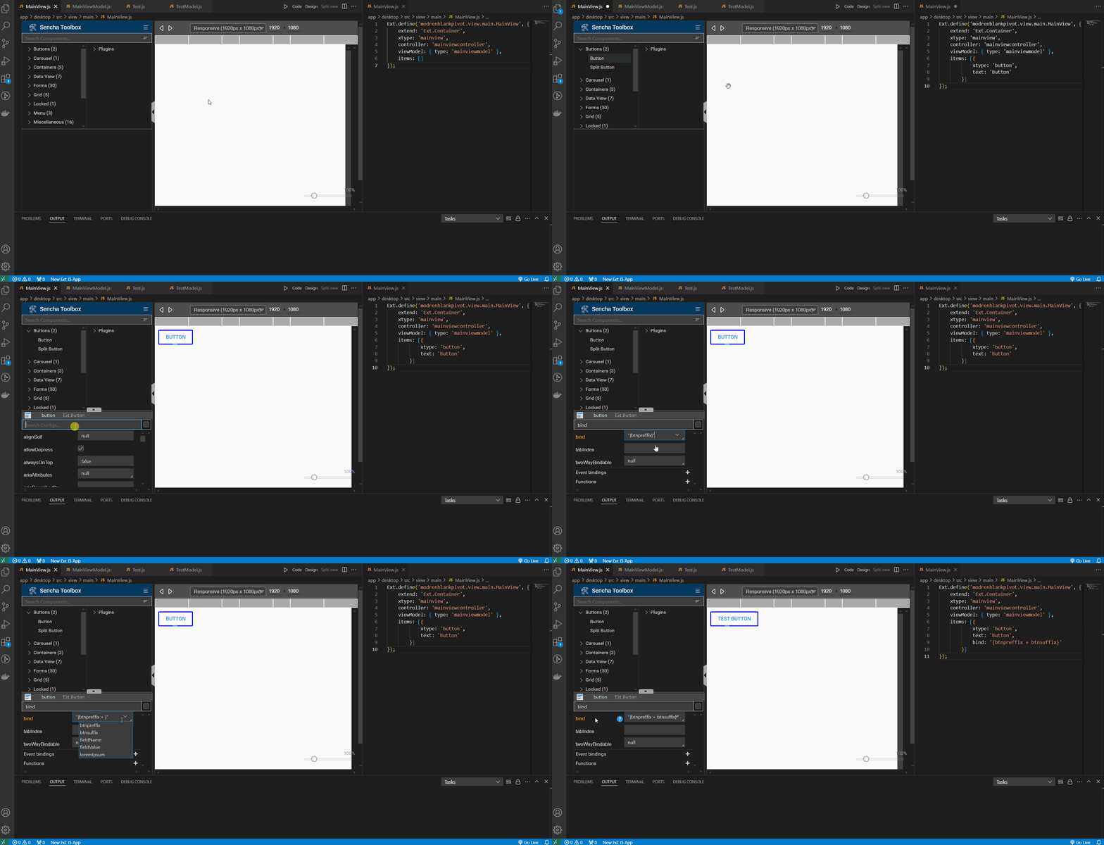
| Path | xtype |
|---|---|
| Ext.grid.Tree | tree |
| Ext.Editor | editor |
| Ext.LoadMask | loadmask |
| Ext.Mask | mask |
| Ext.MessageBox | messagebox |
| Ext.field.trigger.Time | timetrigger |
| Ext.Dialog | window |
| Ext.d3.hierarchy.tree.HorizontalTree | d3-horizontal |
| Ext.slider.Thumb | thumb |
| Ext.tip.ToolTip | tooltip |
| Ext.menu.ColorPicker | colormenu |
| Ext.exporter.Base | exporter.base |
| Ext.pivot.plugin.configurator.Container | pivotconfigcontainer |
| Ext.pivot.plugin.configurator.Panel | pivotconfigpanel |