What's New
Many classes have shortcut names used when creating (instantiating) a class with a
configuration object. The shortcut name is referred to as an alias (or xtype if the
class extends Ext.Component). The alias/xtype is listed next to the class name of
applicable classes for quick reference.
Framework classes or their members may be specified as private or protected. Else,
the class / member is public. Public, protected, and private are access
descriptors used to convey how and when the class or class member should be used.
Public classes and class members are available for use by any other class or application code and may be relied upon as a stable and persistent within major product versions. Public classes and members may safely be extended via a subclass.
Protected class members are stable public members intended to be used by the
owning class or its subclasses. Protected members may safely be extended via a subclass.
Private classes and class members are used internally by the framework and are not intended to be used by application developers. Private classes and members may change or be omitted from the framework at any time without notice and should not be relied upon in application logic.
static label next to the
method name. *See Static below.Below is an example class member that we can disect to show the syntax of a class member (the lookupComponent method as viewed from the Ext.button.Button class in this case).
Let's look at each part of the member row:
lookupComponent in this example)( item ) in this example)Ext.Component in this case). This may be omitted for methods that do not
return anything other than undefined or may display as multiple possible values
separated by a forward slash / signifying that what is returned may depend on the
results of the method call (i.e. a method may return a Component if a get method calls is
successful or false if unsuccessful which would be displayed as
Ext.Component/Boolean).PROTECTED in
this example - see the Flags section below)Ext.container.Container in this example). The source
class will be displayed as a blue link if the member originates from the current class
and gray if it is inherited from an ancestor or mixed-in class.view source in the example)item : Object in the example).undefined a "Returns" section
will note the type of class or object returned and a description (Ext.Component in the
example)Available since 3.4.0 - not pictured in
the example) just after the member descriptionDefaults to: false)The API documentation uses a number of flags to further commnicate the class member's function and intent. The label may be represented by a text label, an abbreviation, or an icon.
classInstance.method1().method2().etc();false is returned from
an event handler- Indicates a framework class
- A singleton framework class. *See the singleton flag for more information
- A component-type framework class (any class within the Ext JS framework that extends Ext.Component)
- Indicates that the class, member, or guide is new in the currently viewed version
- Indicates a class member of type config
- Indicates a class member of type property
- Indicates a class member of type
method
- Indicates a class member of type event
- Indicates a class member of type
theme variable
- Indicates a class member of type
theme mixin
- Indicates that the class, member, or guide is new in the currently viewed version
Just below the class name on an API doc page is a row of buttons corresponding to the types of members owned by the current class. Each button shows a count of members by type (this count is updated as filters are applied). Clicking the button will navigate you to that member section. Hovering over the member-type button will reveal a popup menu of all members of that type for quick navigation.
Getting and setter methods that correlate to a class config option will show up in the methods section as well as in the configs section of both the API doc and the member-type menus just beneath the config they work with. The getter and setter method documentation will be found in the config row for easy reference.
Your page history is kept in localstorage and displayed (using the available real estate) just below the top title bar. By default, the only search results shown are the pages matching the product / version you're currently viewing. You can expand what is displayed by clicking on the button on the right-hand side of the history bar and choosing the "All" radio option. This will show all recent pages in the history bar for all products / versions.
Within the history config menu you will also see a listing of your recent page visits. The results are filtered by the "Current Product / Version" and "All" radio options. Clicking on the button will clear the history bar as well as the history kept in local storage.
If "All" is selected in the history config menu the checkbox option for "Show product details in the history bar" will be enabled. When checked, the product/version for each historic page will show alongside the page name in the history bar. Hovering the cursor over the page names in the history bar will also show the product/version as a tooltip.
Both API docs and guides can be searched for using the search field at the top of the page.
On API doc pages there is also a filter input field that filters the member rows using the filter string. In addition to filtering by string you can filter the class members by access level, inheritance, and read only. This is done using the checkboxes at the top of the page.
The checkbox at the bottom of the API class navigation tree filters the class list to include or exclude private classes.
Clicking on an empty search field will show your last 10 searches for quick navigation.
Each API doc page (with the exception of Javascript primitives pages) has a menu view of metadata relating to that class. This metadata view will have one or more of the following:
Ext.button.Button class has an alternate class name of Ext.Button). Alternate class
names are commonly maintained for backward compatibility.Runnable examples (Fiddles) are expanded on a page by default. You can collapse and expand example code blocks individually using the arrow on the top-left of the code block. You can also toggle the collapse state of all examples using the toggle button on the top-right of the page. The toggle-all state will be remembered between page loads.
Class members are collapsed on a page by default. You can expand and collapse members using the arrow icon on the left of the member row or globally using the expand / collapse all toggle button top-right.
Viewing the docs on narrower screens or browsers will result in a view optimized for a smaller form factor. The primary differences between the desktop and "mobile" view are:
The class source can be viewed by clicking on the class name at the top of an API doc page. The source for class members can be viewed by clicking on the "view source" link on the right-hand side of the member row.
We’re excited to announce the release of Sencha Ext JS 8.0 with new features and enhancements across both the Modern and Classic toolkits.
This release focuses on improving accessibility, adding powerful UI components, and expanding support for modern web standards such as Font Awesome 7.
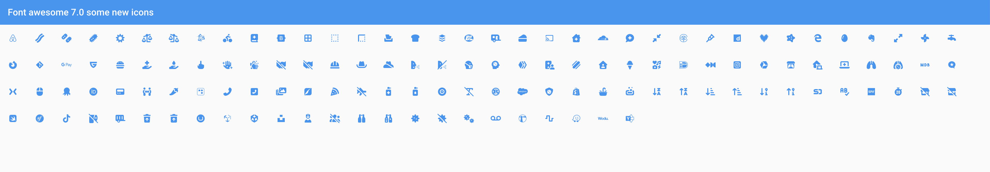
Ext JS now ships with Font Awesome 7.x as the default icon set for both Modern and Classic toolkits.
Key Aspects:
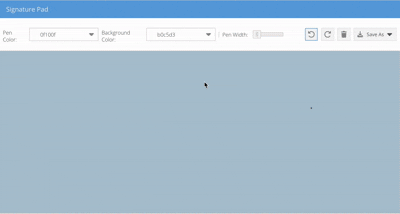
New addon component for smooth, responsive signature capture with support for both toolkits.
Key Aspects:
Works seamlessly with Ext JS Modern and Classic, built by extending Ext JS components, and uses Font Awesome icons.
Can be rendered inside Grid, Form, or Panels, supporting Ext JS configs, events, methods, properties, and themes (variables & mixins).
- Includes Undo / Redo, Clear, Pen Width/Size, Background Color, Color Picker, Save As (JPG, PNG, SVG), plus Preview, Title, and Signature placeholders.
Outlined steps for self-upgrading the Signature Pad library to access the latest features and ensure smoother future upgrades.
{
    xtype: 'signature',
    penColor: '#000',
    penStrokeWidth: 2,
    minStrokeRatio: 0.7,
    listeners: {
        beginStroke: function(cmp) {
            console.log('Signature beginStroke:', cmp);
        },
        endStroke: function(cmp) {
            console.log('Signature endStroke:', cmp);
        }
    }
}
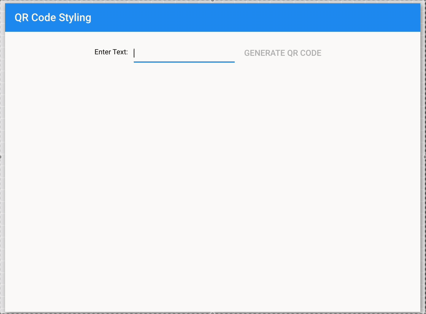
Ext JS introduces a QR Code Reader/Generator component available for both Modern and Classic toolkits. This component enables developers to easily generate and read QR codes directly within their Ext JS applications, supporting a variety of use cases such as payments, and data sharing.
Key Aspects
Works with Ext JS Modern and Classic, exposing a API to generate and read QR codes, with support for configs, events, methods, and themes.
Generate QR codes for **URLs, text, VCARD/MeCard, calendar events, geolocation, phone & SMS, email, Wi-Fi configs and payments with customizable options as per requirement.
Supports SVG, Canvas, and PNG rendering, with options to download as image (PNG/SVG), copy data to clipboard, and preview before saving.
Allows custom foreground/background colors, size control (e.g., 128px, 256px, etc.), responsive UI for desktop & mobile, and input sanitization for security.
Outlined steps for self-upgrading the QR Code library to access the latest features and ensure smoother future upgrades.
{
        xtype: 'qrcode',
        padding: 20,
        type: 'email',
        data: {
            email: '[email protected]',
            subject: 'QR code generation example',
            body: 'QR code generated through sencha'
        },
        listeners:{
            qrgenerated: function(QRCodeClassInstance, dataPassed) {
                console.log("QR Code Generated");
            }
        }

  }
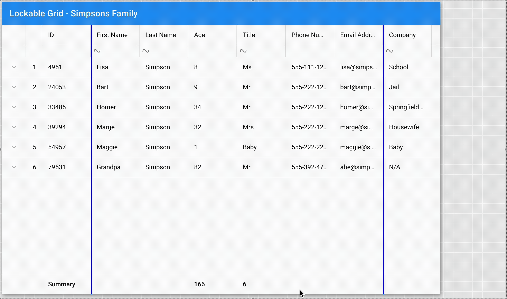
Introducing a new Lockable Grid plugin for the Modern toolkit to provide full lockable grid functionality. This plugin is designed to be simple to use, easy to configure, and supports flexible customizations.
Key Aspects:
  {
    xtype: 'grid',
    plugins: [{
        type: 'lockable'
    }],
    store: myStore,
    columns: [{
        text: 'ID',
        dataIndex: 'id',
        locked: true
    },{
        text: 'Name',
        dataIndex: 'name'
    },{
        text: 'Email',
        dataIndex: 'email'
    }]
}
Improved grid rendering with column virtualization for large datasets.
Key Aspects:
Ext.create('Ext.grid.Grid', {
    title: 'Simpsons',

    store: store,
    bufferedColumns: true, // Enable virtual column rendering

    columns: [
        { text: 'Name',  dataIndex: 'name', width: 200 },
        { text: 'Email', dataIndex: 'email', width: 250 },
        { text: 'Phone', dataIndex: 'phone', width: 120 }
    ],

    height: 200,
    layout: 'fit',
    fullscreen: true
});
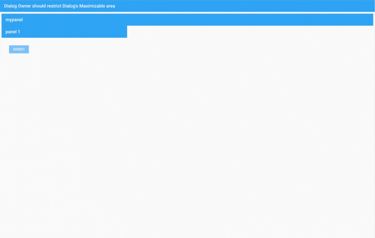
Ext.Dialog now supports boundary-aware maximize, minimize, and drag.
Key Aspects:
Ext.Dialog should maximize, minimize, and drag only within the boundaries of its parent container/panel, rather than defaulting to the full viewport.
Added a new owner value to the constrainDrag configuration, enabling developers to constrain dialog dragging to the bounds of its owner component
Added a new owner value to the maximizable configuration, enabling developers to constrain maximize to the bounds of its owner component
Even though dialogs are floated, they should still respect the boundaries of their parent container/panel when maximized, minimized, or dragged.
Ext.create({
    xtype: 'panel',
    title: 'Parent Container',
    width: 600,
    height: 400,
    renderTo: Ext.getBody(),
    items: [{
        title: 'Dialog',
        closable: true,
        modal: false,

        constrainDrag: 'owner',
        maximizable: 'owner',

        bodyPadding: 30,
        maxWidth: 300,
        html: 'This is a dialog, which extends from Panel and adds some extra features.'
    }]
});
Full ARIA support for form fields and triggers.
Key Aspects:
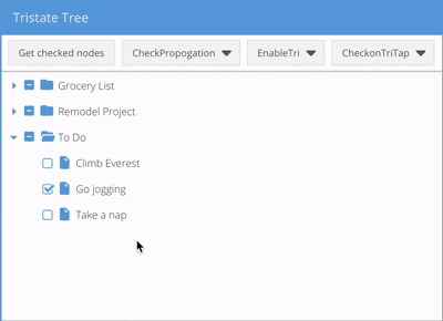
TreePanel checkboxes now support tri-state (checked, unchecked, indeterminate).
Key Aspects:
enableTri: true enables feature. Ext.create('Ext.tree.Panel', {
title: 'Tri-State Tree Example',
width: 400,
height: 300,
rootVisible: false,
renderTo: Ext.getBody(),
enableTri: true,
checkable: true,
checkOnTriTap: false,
store: {
root: {
expanded: true,
children: [
{
text: 'Parent Node',
expanded: true,
children: [
{ text: 'Child 1', leaf: true, checked: true },
{ text: 'Child 2', leaf: true, checked: false }
]
}
]
}
}
});


 Ext JS | Terms of Use
