Layouts & Styling
Many classes have shortcut names used when creating (instantiating) a class with a
configuration object. The shortcut name is referred to as an alias (or xtype if the
class extends Ext.Component). The alias/xtype is listed next to the class name of
applicable classes for quick reference.
Framework classes or their members may be specified as private or protected. Else,
the class / member is public. Public, protected, and private are access
descriptors used to convey how and when the class or class member should be used.
Public classes and class members are available for use by any other class or application code and may be relied upon as a stable and persistent within major product versions. Public classes and members may safely be extended via a subclass.
Protected class members are stable public members intended to be used by the
owning class or its subclasses. Protected members may safely be extended via a subclass.
Private classes and class members are used internally by the framework and are not intended to be used by application developers. Private classes and members may change or be omitted from the framework at any time without notice and should not be relied upon in application logic.
static label next to the
method name. *See Static below.Below is an example class member that we can disect to show the syntax of a class member (the lookupComponent method as viewed from the Ext.button.Button class in this case).
Let's look at each part of the member row:
lookupComponent in this example)( item ) in this example)Ext.Component in this case). This may be omitted for methods that do not
return anything other than undefined or may display as multiple possible values
separated by a forward slash / signifying that what is returned may depend on the
results of the method call (i.e. a method may return a Component if a get method calls is
successful or false if unsuccessful which would be displayed as
Ext.Component/Boolean).PROTECTED in
this example - see the Flags section below)Ext.container.Container in this example). The source
class will be displayed as a blue link if the member originates from the current class
and gray if it is inherited from an ancestor or mixed-in class.view source in the example)item : Object in the example).undefined a "Returns" section
will note the type of class or object returned and a description (Ext.Component in the
example)Available since 3.4.0 - not pictured in
the example) just after the member descriptionDefaults to: false)The API documentation uses a number of flags to further commnicate the class member's function and intent. The label may be represented by a text label, an abbreviation, or an icon.
classInstance.method1().method2().etc();false is returned from
an event handler- Indicates a framework class
- A singleton framework class. *See the singleton flag for more information
- A component-type framework class (any class within the Ext JS framework that extends Ext.Component)
- Indicates that the class, member, or guide is new in the currently viewed version
- Indicates a class member of type config
- Indicates a class member of type property
- Indicates a class member of type
method
- Indicates a class member of type event
- Indicates a class member of type
theme variable
- Indicates a class member of type
theme mixin
- Indicates that the class, member, or guide is new in the currently viewed version
Just below the class name on an API doc page is a row of buttons corresponding to the types of members owned by the current class. Each button shows a count of members by type (this count is updated as filters are applied). Clicking the button will navigate you to that member section. Hovering over the member-type button will reveal a popup menu of all members of that type for quick navigation.
Getting and setter methods that correlate to a class config option will show up in the methods section as well as in the configs section of both the API doc and the member-type menus just beneath the config they work with. The getter and setter method documentation will be found in the config row for easy reference.
Your page history is kept in localstorage and displayed (using the available real estate) just below the top title bar. By default, the only search results shown are the pages matching the product / version you're currently viewing. You can expand what is displayed by clicking on the button on the right-hand side of the history bar and choosing the "All" radio option. This will show all recent pages in the history bar for all products / versions.
Within the history config menu you will also see a listing of your recent page visits. The results are filtered by the "Current Product / Version" and "All" radio options. Clicking on the button will clear the history bar as well as the history kept in local storage.
If "All" is selected in the history config menu the checkbox option for "Show product details in the history bar" will be enabled. When checked, the product/version for each historic page will show alongside the page name in the history bar. Hovering the cursor over the page names in the history bar will also show the product/version as a tooltip.
Both API docs and guides can be searched for using the search field at the top of the page.
On API doc pages there is also a filter input field that filters the member rows using the filter string. In addition to filtering by string you can filter the class members by access level, inheritance, and read only. This is done using the checkboxes at the top of the page.
The checkbox at the bottom of the API class navigation tree filters the class list to include or exclude private classes.
Clicking on an empty search field will show your last 10 searches for quick navigation.
Each API doc page (with the exception of Javascript primitives pages) has a menu view of metadata relating to that class. This metadata view will have one or more of the following:
Ext.button.Button class has an alternate class name of Ext.Button). Alternate class
names are commonly maintained for backward compatibility.Runnable examples (Fiddles) are expanded on a page by default. You can collapse and expand example code blocks individually using the arrow on the top-left of the code block. You can also toggle the collapse state of all examples using the toggle button on the top-right of the page. The toggle-all state will be remembered between page loads.
Class members are collapsed on a page by default. You can expand and collapse members using the arrow icon on the left of the member row or globally using the expand / collapse all toggle button top-right.
Viewing the docs on narrower screens or browsers will result in a view optimized for a smaller form factor. The primary differences between the desktop and "mobile" view are:
The class source can be viewed by clicking on the class name at the top of an API doc page. The source for class members can be viewed by clicking on the "view source" link on the right-hand side of the member row.
The default themes available with Ext JS can be used out of the box to create clean, professional looking applications. You may wish to provide your own styling, however, to match your personal design aesthetic or that of an existing enterprise design.
Note: You can build custom themes with our graphical tool Sencha Themer.
Historically, styling an application meant creating style sheets with rules to tweak or decorate individual HTML elements used in the rendering of a component. Several issues arise with this approach. The first being that you're now burdened with styling across all supported browsers. Secondly, as the framework evolves the component's underlying elements may change, leaving you with the unpleasant task of chasing the changes in your style rules. Styling components using the Ext JS Theming API solves these problems for you.
Themes may be shared across any number of Ext JS applications in the workspace (a workspace is a simple file-system structure defined by Sencha Cmd). Themes allow you to style once and apply that styling over and over with confidence in the consistency of your applications' look and feel.
This guide lists the requirements necessary for theming and covers the basics for creating a custom theme. Since many of the details differ based on whether you are using the classic or modern toolkit, this guide focuses on the common principals. The specifics are found in these guides: Theming The Ext JS Modern Toolkit and Theming The Ext JS Classic Toolkit.
Sencha Cmd is a command-line tool used to package and deploy Ext JS applications. To build a theme in Ext JS 6.5+, you must have Sencha Cmd 6.5 or higher installed on your computer. For more information about installing and getting started with Sencha Cmd see Introduction to Sencha Cmd.
The Java JRE is required to run Sencha Cmd. Whenever possible, we
recommend running the latest version of the JRE (version 1.8 as this is written). Version 1.7 or
newer, however, is required to run sencha app watch. This command is run within the application
directory and updates the compiled theme automatically as you modify the theme source. Sencha Cmd
has installers with the JRE included or as a stand-alone installer without the JRE. If you do not
already have a suitable JRE, we recommend using the installer with JRE if one is available for
your platform.
Note: Without Java JRE 1.7+ and sencha app watch you will need to manually rebuild your
application's styling after each change using sencha app build --development.
Custom themes are based on default themes included with the Ext JS SDK.
Download Ext JS and extract the Ext JS
development kit (SDK) to a location of your choosing. We recommend a folder in your home
directory called sencha-sdks.
Once you have installed the above requirements, you can proceed to create your custom theme. A theme is simply a specific type of Sencha Cmd package. All packages can contain JavaScript, CSS styles and resources that will be incorporated into apps when Sencha Cmd builds them. As we will see, theme packages take advantage of all of these types of assets.
Workspaces are Sencha Cmd's way of connecting applications (as well as themes or other code packages) with a shared copy of the Ext JS framework. If you only have one application to build, Sencha Cmd can combine the workspace and application in a single directory.
For this tutorial we'll create a workspace so that the custom theme is accessible to multiple applications. Run the following command from the directory where you want to create your workspace (e.g., "my-workspace"):
$ sencha workspace init
$ sencha framework add ~/sencha-sdks/ext-7.1.0
On Windows, replace ~/sencha-sdks/ with %USERPROFILE%\sencha-sdks\. If you have chosen a
different path, then use the appropriate path here.
The sencha workspace init command will create the scaffolding for a Sencha workspace in the
current directory. The sencha framework add command copies the necessary files from the
Ext JS SDK into the workspace so that the theme and applications can find these dependencies.
This workspace is where your custom theme package will live. You will also create applications here that will use your custom theme. After running the above commands, you will find these files in your workspace directory:
sencha framework add).Sencha Cmd streamlines the process of creating a custom theme by generating a theme package containing all the necessary files. Follow these steps to generate your theme:
sencha generate workspace/path/to/workspacesencha -sdk ../ext generate app NewExtApp new-appsencha workspace initcd new-appsencha generate theme my-themeThis tells Sencha Cmd to generate a theme package named my-theme in the packages/local
directory of the workspace. Let's take a look at the default contents of the custom theme
folder:
sass/var/ - Variable definitions organized by class name.sass/var/all.scss - Global variable settings.sass/src/ - Rules and UI mixin calls using variables defined in sass/var.sass/etc/ - Additional utility functions or mixins.sass/example - Used Sencha Cmd to perform image slicing for IE8/9 (do not delete). (Classic Only)The files and folders in sass/src and overrides should be organized to match the component
class name that you are styling or overriding. For example, theme code related to
Ext.panel.Panel should be placed in a file named sass/src/panel/Panel.scss. It is
important to place mixin calls and style rules in the appropriate file based on the associated
class so that Sencha Cmd can include only the code needed by the application in a build.
The same organization can be applied to sass/var/. Alternatively, you may choose to just use
the sass/var/all.scss file if you only have a small number of variables to set. Because setting
variables does not impact the size of the generated CSS, the choice between keeping all theme
variables in a single file or splitting across multiple files organized by class name is a matter
of personal preference or project guidelines.
All Sencha theme packages are part of a larger hierarchy of themes. Each theme package extends a parent or base theme. The next step in creating your custom theme is to select which theme to extend. Ext JS ships with several themes for each toolkit:
Modern Toolkit
theme-material - Material Design theme.theme-ios - iOS Theme.theme-triton - Modern flat, borderless theme.theme-neptune - Modern borderless theme.
Classic Toolkit
theme-triton - Modern theme using font-icons. Extends "theme-neptune".theme-crisp - Minimalistic Theme. Extends "theme-neptune".theme-crisp-touch - Crisp-Based Touch Theme. Extends "theme-crisp".theme-neptune - Modern borderless theme.theme-neptune-touch - Neptune-Based Touch Theme. Extends "theme-neptune".theme-classic - The classic blue Ext JS theme.theme-gray - Gray theme. Extends "theme-classic".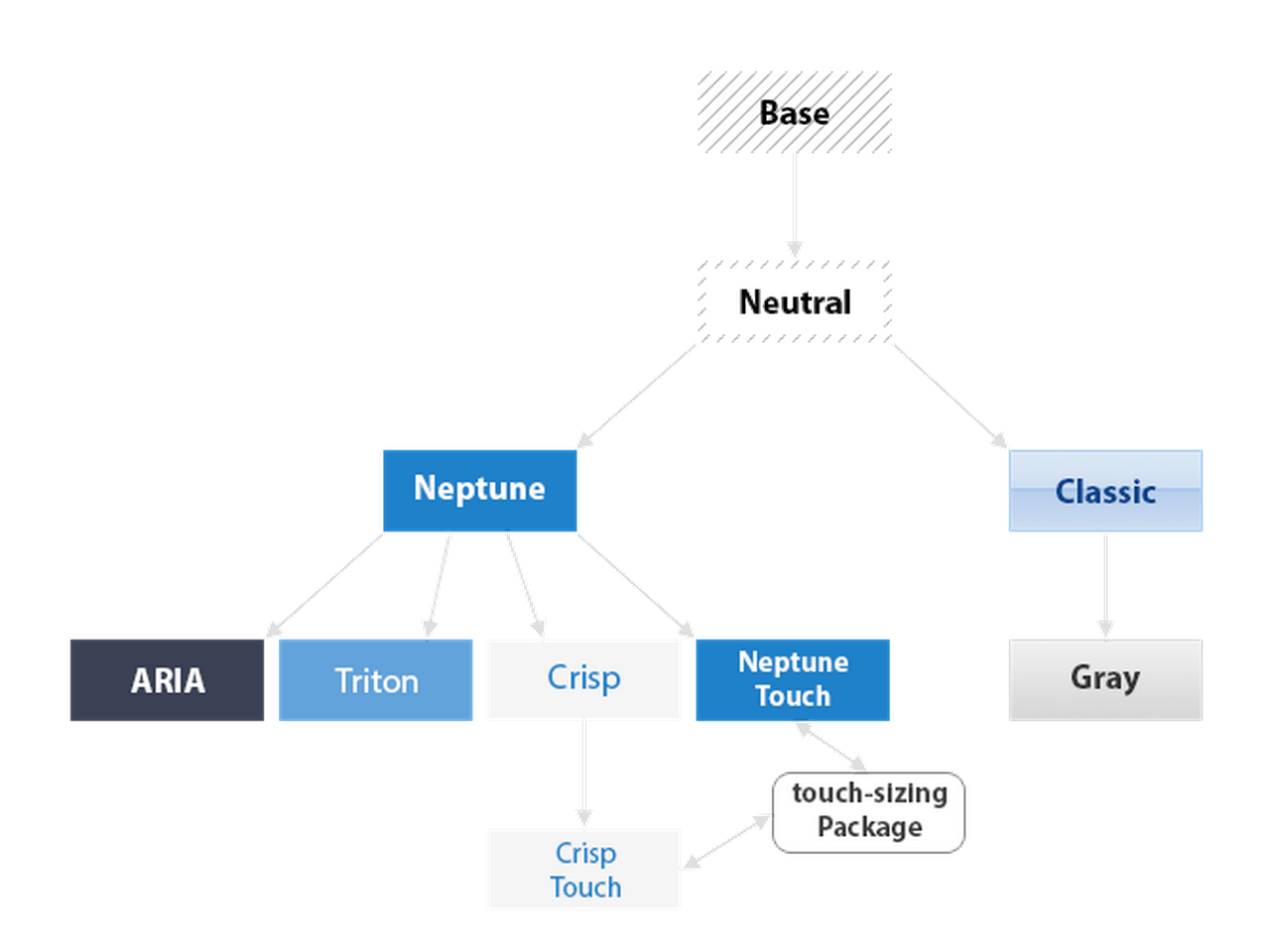
Which theme should your custom theme extend? For the modern toolkit, we recommend using
theme-material or theme-triton, while for the classic toolkit, we recommend using
theme-triton, theme-crisp or theme-neptune as the starting point for custom themes
(or perhaps theme-neptune-touch or theme-crisp-touch when theming for tablets). These
themes contain all the code necessary for creating an attractive theme out of the box.
The theme-base and (in classic) theme-neutral themes should be thought of as abstract
and should not be extended directly.
In this tutorial we will create a custom theme that extends theme-triton. The first step
is to configure your custom theme with the name of the theme it is extending. This is done
by changing the extend property in packages/local/my-theme/package.json from its default
value to the desired value:
"extend": "theme-triton"
Your custom theme is now configured to use the Triton theme as a base. Your custom theme starts off as identical to the default Triton theme. In the following steps you'll make your own changes to begin to differentiate your custom theme.
Building the theme creates a build directory in your theme package directory. Inside
my-theme/build/resources you will find a file named my-theme-all.css. This file
contains all the style rules for all Ext JS components for your theme. The built theme's
files contain all the styles for every Ext JS component and is useful for applications
that do not use Sencha Cmd.
Note: It is not necessary to build a theme when that theme is used in a Sencha Cmd
application. When Sencha Cmd builds an application it incorporates the .js and .scss
files needed directly from the theme's sources.
To rapidly develop and test our custom theme we need to host it in an Ext JS application. The application should be setup to use the modern or classic toolkit as appropriate for your needs. To create the application, run these commands from the workspace directory:
$ mkdir demo-app
$ cd demo-app

$ sencha app init --ext65 --modern App
  -- or --
$ sencha app init --ext65 --classic App
To configure the test application to use your custom theme, find the line that sets "theme"
in demo-app/app.json and change it to be:
"theme": "my-theme",
Sencha Cmd has now generated an application named App in this sub-directory. Going forward,
we'll be making changes to the theme and sample application. We'll want Sencha Cmd to detect
these changes and automatically compile them into the output CSS used by the application. To
accomplish this, run the following command:
$ sencha app watch --fashion
Reminder: The sencha app watch command requires Java JRE 1.7 or higher. If you are unable
to run sencha app watch you'll need to run sencha app build --development after each
change to the theme. For brevity, we'll assume you are running sencha app watch.
After running sencha app watch you can load your application in the browser using the URL:
http://localhost:1841/demo-app/
The --fashion switch will instruct the browser to refresh the styling within the application
as you make changes to the application's theme - often in under a second!
Note: Live updates using --fashion are supported on modern browsers only. Most changes
to styling in the theme will update near real time with no browser refresh required. However,
theme changes that modify a component's dimensions may require a manual browser refresh.
Ext JS Classic and Modern toolkits have the same fundamental approach to their API: they define
variables to configure the default appearance of components and they provide mixins that can
generate custom appearances. These custom appearances are assigned names of your choice and
these names are applied to component instances using the ui config property. Due to this
relationship to the ui config, these mixins are often called "UI mixins" or "theme mixins".
The names of these variables differ by toolkit, but there are some common variables like
$base-color that apply to both. For the complete list of variables see Global_CSS.
In the Classic toolkit, the ui config is a single string (such as "custom"). This string
keys to the output of the mixin call where this name was specified. In the Modern toolkit, the
ui config is more like a CSS class. It can be a space-separated set of names. Each name maps
to the name passed to a mixin call, but the outcome of these calls is much more composable. For
more details on the ui config, please consult the appropriate toolkit theme guide and API
documentation.
Let's start by modifying the $base-color which is a value from which many Ext JS components'
colors are derived. Due to the use of $base-color through the default themes, making a global
change to $base-color will have an effect on most all components in the Ext JS library.
Create the file packages/local/my-theme/sass/src/Component.scss and add the following code:
$base-color: #317040;
The value of $base-color must be a valid HTML color code; see the
HTML Color Codes web page.
At this time you should see the green color we specified earlier as $base-color
applied to the components on the screen.
Note: Theme variables are all defined as dynamic and so the dynamic() declaration
is not needed to set them (as show above). If you want to define your own variables,
however, we recommend making them dynamic:
$my-custom-color: dynamic(red);
Sometimes a theme needs to change an aspect of a component that is only configurable via
JavaScript. This is easily accomplished by adding a JavaScript override to your theme package.
To demonstrate how this is done, let's change the titleAlign
config of Panels in the custom theme. Create a new file named my-theme/overrides/panel/Panel.js
and add the following code:
Ext.define('MyTheme.panel.Panel', {
    override: 'Ext.panel.Panel',
    titleAlign: 'center'
});
When you view the application in the browser you'll notice that all Panel headers have centered titles. Although any Ext JS component config can be overridden in this manner, best practice is to only use overrides to change configs that affect the visual appearance (and not the functionality) of a component.
All required image assets are inherited from the parent theme by default, but in some
cases you may need to override an image. This can be easily done by placing the desired
image in my-theme/resources/images/ and giving it the same name as the image it
is intended to override from the base theme.
In many modern themes like theme-triton there are few if any images. These themes use
vector font icons. Therefore the images you can supplant in this way is specific to your
choice of base theme.
If your theme requires functions or mixins that are not related to component styling
(e.g. utilities), these should be placed in the theme's my-theme/sass/etc
directory.
You can organize files in this directory however you like, but the only file that Sencha Cmd
includes in the build is my-theme/sass/etc/all.scss. Any other files must be imported
(@import) by the all.scss file. For an example that follows this pattern see
ext/classic/theme-base/sass/etc/.
Styling that is not shared between applications belongs in the application itself, not in the theme. Sencha Cmd provides an easy way to add application-level styling by allowing you to organize your styles right alongside your JavaScript code.
To write CSS rules associated with an application view, you create an .scss file in the
same folder and with the same base name as the view. For example, to style the view
App.view.main.Main, you may can add Main.scss to that folder:
demo-app/
   app/
      view/
         main/
            Main.js
            Main.scss
            MainController.js
            MainModel.js
While the ability to add arbitrary CSS styles offers maximum flexibility, it is best to avoid directly styling elements owned by Ext JS components. Instead these should be styled using the Ext JS Theming API whenever possible. Using the theming API safeguards your styling against breaking markup changes in future versions of Ext JS.
The application acts as the final level in the theme hierarchy. As such, applications can change theme variables.
Let's continue using the demo-app application created above and override the theme's
$base-color in the application. Create the Application.scss file:
demo-app/
   app/
      Application.js
      Application.scss
The Application.scss file is an easy option for global settings since it matches with the
global nature of the Application class. And add the following to this file:
$base-color: #724289;
View the application in a browser and you will see that the base color has changed to purple.
To do significant theme work in an application, you should create a sass folder structure
in the same manner as a theme and inform Sencha Cmd that your styles apply to all namespaces
(not just the application). The code that would normally be in the theme's sass folder can
then be placed in the application's sass folder.
When Sencha Cmd builds your styles, it looks at all the JavaScript classes that are used in
the application. It then includes all .scss files that coincide with these classes. This
process uses the sass.namespace to align a class name (such as Ext.button.Button) with
files on disk for a package, theme or application.
For example, in a theme you might have the file sass/var/button/Button.scss as well as the
file sass/src/button/Button.scss. These files will be considered matches because the default
sass.namespace for a theme is Ext.
The default sass.namespace for an application, however, is its own namespace (App). This
means Sencha Cmd will not recognize demo-app/sass/var/button/Button.scss as a match for the
Ext.button.Button class. Instead that would match App.button.Button. To include files that
match all namespaces, you need to set sass.namespace to the empty string in app.json:
"sass": {
    "namespace": ""
}
Once this change is made, Sencha Cmd will match demo-app/sass/var/Ext/button/Button.scss and
demo-app/sass/src/Ext/button/Button.scss to Ext.button.Button.
This also means that if you want to use the sass folder to organize styles for your views,
you will need to use App sub-folders. For example sass/src/App/view/main/Main.scss is the
path that will match App.view.main.Main. While this was the pattern in previous releases, and
is still supported, placing view styles in .scss files that reside next to their .js file (as
descried previously) is a more maintainable structure going forward.
Sencha Cmd combines the styling from your theme, your application and from any required packages (see the Sencha Cmd Packages guide) when it compiles your application. It is important to understand the way Sencha Cmd combines these files so that you know what you can use from your theme or required packages and when these things will be available.
The structure of the all.scss file is this:
+---------------------------------------+
| inclusion flags                       |
+-----------+-----------+---------------+
|           |           | base          |
|           | theme     +---------------+
|           |           | derived       |
|           +-----------+---------------+
|           |                           |
|    etc    | packages (dep order)      |
|           |                           |
|           +---------------------------+
|           |                           |
|           | application               |
|           |                           |
+-----------+---------------------------+
|           |           | base          |
|           | theme     +---------------+
|           |           | derived       |
|           +-----------+---------------+
|           |                           |
|    var    | packages (dep order)      |
|           |                           |
|           +---------------------------+
|           |                           |
|           | application               |
|           |                           |
+-----------+-----------+---------------+
|           |           | base          |
|           | theme     +---------------+
|           |           | derived       |
|           +-----------+---------------+
|           |                           |
|    src    | packages (dep order)      |
|           |                           |
|           +---------------------------+
|           |                           |
|           | application (*)           |
|           |                           |
+-----------+---------------------------+

    * - Includes application styles that are placed
        next to their corresponding .js files.
Inside the bands for sass/var and sass/src, the individual .scss files for a given
theme, package and the application are always ordered to match the JavaScript class
hierarchy. For example, if the base theme had .scss files for Ext.Container
and Ext.Component in its sass/var folder, the file for Ext.Component would
be included before the file for Ext.Container since it extends Ext.Component.
The goals and rationale for this structure are as follows:
sass/etc are utilities and the like:sass/var, the concerns are variable control and derived calculation.sass/src this order yields the proper cascade of rules so that:The inclusion flag variables are a set of read-only variables defined to be true or false
for each JavaScript class that may be included. The value of this variable is true if that
class is being included in the application build. The variables are created dynamically by
Sencha Cmd with a prefix of $include- followed by the full class name with its parts
separated by - instead of . and all in lowercase. For example, if the build uses
Ext.Img, you can test for true within a custom mixin:
@if $include-ext-img {
    // styling contingent upon the presence of Ext.Img in the app
}
Note: Through most of the guide we advocate for the use of sencha app watch to build
your application incrementally as changes are made to both the application and the custom
theme. However, the $include- variables are all set to true in development (which is
the environment sencha app watch operates within). In order to test your theme's use of
$include- variable checks you'll need to build your application for testing or production:
$ sencha app build --testing
$ sencha app build --production
It's easy to share the theme you've just built with a second application. Simply navigate
to the workspace directory and run the following command (note: if you're following along
using the steps above and have sencha app watch running you'll first need to end it using
Ctrl+C):
$ mkdir another-app
$ cd another-app

$ sencha app init --ext65 --modern (or --classic) AnotherApp
This tells Sencha Cmd to generate an app in the another-app directory named AnotherApp
and to use the same Ext JS SDK as the first app you created.
The next step is to tell the app to use the custom theme. Edit another-app/app.json
and change the theme to:
"theme": "my-theme",
To ensure changes to the app and theme are picked up as you make them again change your working directory to the application directory and run:
$ sencha app watch --fashion
When you view the another-app/index.html page in your browser you will now see a
starter app that uses the same custom theme as App.
That covers the general concepts and common practices for all Ext JS themes. For specifics on each toolkit, see these guides for Theming The Ext JS Modern Toolkit and Theming The Ext JS Classic Toolkit.
In this guide, we're going to walk through the changes to theming introduced with the modern toolkit in Ext JS 6.2. There are a lot of exciting new changes that provide for easier theming, dynamic updating, and much more. Along with these updates come some new concepts that you should be aware of.
Let's talk about the conventions and best practices for theming in the modern toolkit.
All variables are defined using the dynamic() indicator. This ensures that the last variable declaration wins
and remains valid throughout the entire scope. Additionally, variables may then derive from one another without
concern for ordering.
For example:
$calendar-days-time-color: dynamic($color);
All non-rule-generating code are placed in the theme's sass/var/ directory in a file matching the Component's
class name. This is generally going to include all component variable and UI mixin declarations.
Since all var files are included in the build regardless of whether or not the corresponding class is actually
required, this allows variables to freely derive from any other variable. Including mixins in the sass/var/
directory ensures that a derived theme can override those mixins before they are called by any code in the sass/src/
directory.
All rule-generating code is located in the theme's sass/src/ directory in a file matching the Component's
class name. This includes calls to UI mixins and rules not contained inside the body of a mixin.
At build time, src files are only included if the corresponding Component is required. This ensures that
only the rules needed are included in the CSS output.
Layout-specific styles and styles related to the core functionality of a Component are placed in the
theme-base/sass/src/ folder in a file matching the Component's class name. The properties set in these rules
are not configurable using variables, as changing them would likely break the functionality or layout of
the Component.
Examples of CSS properties that are generally not configurable are:
Configurable styles not related to the core functionality or layout of a component are controlled using
variables. These variables are defined in an scss file matching the component's class name in
the theme-neptune/sass/var directory. The rules that use these variables are contained in a UI mixin in the
same file.
Examples of commonly configurable styles are:
The Neptune theme is the base for all other themes and contains the theming capabilities supported by the framework even though it may not utilize them all itself.
Themes derived from theme-neptune do not typically define new UI mixins or create their own CSS rules. Instead,
they simply set the values of variables defined in theme-neptune.
Component variables begin with an xtype, and end with the CSS property name being styled, for example:
$button-font-family: dynamic(helvetica);
$button-color: dynamic(#fff);
$button-background-color: dynamic(red);
If the component has various states such as hovered, focused, and pressed, the name of the state comes immediately after the xtype, but before the CSS property name:
$button-hovered-background-color: dynamic(blue);
If the component has variables that control the styling of sub-elements, the name of the sub-element being styled are included after the xtype and state (if present).
For example, when styling the button's "badge" element:
$button-badge-color: dynamic(#fff);
$button-hovered-badge-color: dynamic(green);
If the "state" refers to a sub-element's state, it comes after that element's name. For example, if a tab has a close icon that has a separate hover state from the tab:
$tab-close-icon-hovered-background-color: dynamic(red);
Components have separate variables for border-width, border-color, and border-style, and all three properties accept either a single value or a list of values so that 4 sides can be specified separately if needed:
$button-border-color: dynamic(red yellow green blue);
$button-border-width: dynamic(1px 3px);
$button-border-style: dynamic(solid);
Variables use the following names to indicate component state:
Since "focused" can sometimes be combined with other states components may provide variables that indicate a combination of states, for example:
$button-focused-pressed-border-color
Each theme has two modes of sizing: normal and big. Big mode increases spacing and sizing to be more touch-screen
friendly. Themes select whether or not to use big mode by inspecting Ext.platformTags in the
theme'soverrides/init.js and adding a CSS class name of x-big to the <html> element on the page. For example, the
Triton theme only enables big mode when loaded on a phone, otherwise, it uses normal mode.
Ext.theme.getDocCls = function() {
    return Ext.platformTags.phone ? 'x-big' : '';
};
Variables that set properties affecting visual size of a component, like font-size, line-height, and padding
have big counterparts. Big variables always have the -big suffix appended to the end:
$button-padding: dynamic(1rem);
$button-padding-big: dynamic(1.2rem);
CSS rules target big mode using the .x-big selector:
.#{$prefix}button {
    padding: $padding;

    .#{$prefix}big & {
        padding: $padding-big;
    }
}
Most components have a UI mixin for generating multiple visual renditions of that component. These mixins are
named [xtype]-ui. For example button-ui or panel-ui.
UI mixins have a parameter for each of the component's global variables. Additionally, the parameter names are the same as the global variable names. The only exception is that the mixin parameters do not contain the xtype in their names.
For example, a global variable named $button-border-radius, would correspond to a parameter of the button-ui mixin
named $border-radius.
The parameters to the UI mixin default to null and do not produce any output if unspecified by the caller. This
means that when the mixin is invoked, it produces a set of styling that represents a delta from the default UI. This
minimizes the number of CSS rules required to create new UIs since the mixin automatically eliminates any null
values from the output.
The styling for the default UI is applied using CSS class names that do not contain a UI name. For example,
x-button, not x-button-default. This is the key to minimizing the number of rules required to create
additional UIs. For instance, all buttons will have the x-button class in addition to one or more optional
x-button-[ui] classes. It allows the default UI to serve as a base set of styles for all other UIs.
To generate additional UIs, invoke the mixin passing only the parameters that are different from the default UI.
For example, the following mixin call generates a UI named "action" that builds upon the default UI by changing the
background-color to red, but inherits all other properties from the default UI via the cascade. The output from this
UI invocation is minimal. It only contains the rule or rules needed to set the background-color, nothing else.
@include button-ui(
    $ui: 'action',
    $background-color: red
);
Subclasses of Components that have UI mixins typically have their own UI mixin and a complete set of global variables for configuring that mixin.
Subclass variables that do not have different default values from the superclass variables will be null.
This ensures that they will inherit the proper values via the parent CSS class rather than redefining a
redundant value.
Components use classCls set to x-[xtype] to accomplish this inheritance (See section
below on CSS class names).
An example of this pattern is the grid pagingtoolbar component that extends toolbar:
// theme-neptune/sass/var/grid/plugin/PagingToolbar.scss
$pagingtoolbar-background-color: dynamic(null);

@mixin pagingtoolbar-ui(
    $ui: null,
    $xtype: pagingtoolbar,
    $background-color: null,
    $prev-icon: null
) {
    $ui-suffix: ui-suffix($ui);

    // Call base toolbar mixin.
    // Only produces output for non-null parameters
    @include toolbar-ui(
        $ui: $ui,
        $xtype: $xtype,
        $background-color: $background-color
    );

    // paging toolbar specific styles
    .#{$prefix}#{$xtype}#{$ui-suffix} {
        .#{$prefix}icon-prev {
            @include icon($prev-icon);
        }
    }
}

// theme-neptune/sass/src/grid/plugin/PagingToolbar.scss
@include pagingtoolbar-ui(
    $background-color: $pagingtoolbar-background-color;
);
Additional UIs provided by a theme are typically not configurable via global variables or at least not overly configurable. Instead, these UIs are wrapped in a mixin of their own, which can be overridden by derived themes to change the parameters:
@mixin button-action-ui() {
    @include button-ui(
        $ui: 'action',
        $background-color: red
    );
}
Themes provide a single variable for each additional UI that defaults to "true" but can be overridden to "false" to disable generation of the UI. This variable will have the same name as the corresponding mixin:
@if $button-action-ui {
    @include button-action-ui;
}
UIs are generally composable. For example if two separate button renditions are required, a red "action" button, and a rounded red "action" button, simply create an "action" UI and "round" UI:
// sass/var
$button-action-ui: dynamic($enable-default-uis);
$button-confirm-ui: dynamic($enable-default-uis);

@mixin button-action-ui() {
    @include button-ui(
        $ui: 'action',
        $background-color: red
    );
}

@mixin button-round-ui() {
    @include button-ui(
        $ui: 'round',
        $border-radius: 10000px
    );
}

// sass/src
@if $button-action-ui {
    @include button-action-ui
}

@if $button-round-ui {
    @include button-round-ui
}
To compose UIs, simply use any number of UI names, space separated, in your component config:
ui: 'action round'
If multiple UIs set the same properties, the winner is the last one in the cascade, i.e. the one whose mixin was invoked last. Composable UIs typically strive to limit their area of concern to separate aspects of styling (colors, sizing, border-radius, etc), so that there is little ambiguity when combining them.
Using composable UIs ensures that the generated CSS code remains very DRY, by avoiding unnecessary duplication of CSS rules. In the example above, we avoid duplication of the background-color rules for every UI that may optionally need roundness. Any UI can be combined with the "round" UI to add roundness.
It is important to maintain consistency in naming CSS classes since they play a major role in adding semantics and structure to the DOM elements that are generated by Components in the framework. This consistency of naming serves two purposes:
Components have a class name of x-[xtype] on its main element. For example, a Text Field component will
have a CSS class name of x-textfield.
There are two possible ways for Components to set this main CSS class. They can either set classCls or baseCls
on the body of their class definition, though classCls is preferred. Setting either of these will add the CSS
class to the main element and use it as the prefix for UI-specific class names that are also added to the main
element. The classCls and baseCls configs only differ in their inheritability. classCls is inherited by
subclasses and is additional to the classCls of those subclasses, whereas baseCls is not.
Additionally, when using classCls a UI-specific CSS class name will be added for each and every classCls in the
class hierarchy. For example, an Ext.field.Password component with a "ui" set to foo would have the following
UI classes:
This pattern ensures that styling is correctly inherited through the class hierarchy and allows Components to
only provide styling for the functionality that they add. For edge cases where inheriting styling is not desired
Components may set classClsRoot:true to prevent inheritance of classCls from ancestors.
Reference elements follow the pattern x-[referencePrefix]-el. For example the bodyElement reference element
of a form field will have the CSS class x-body-el. For consistency, element references will have the
Element suffix on the JavaScript side. The -el suffix on the CSS class name helps to differentiate the reference
element from a potential Component with an xtype of the same name.
CSS class names that reflect Component configuration follow the pattern x-[configName]-[configValue], and
are placed on the Component's main element. For example a form field with a labelAlign: 'left' config
has a CSS class name of x-label-align-left added to the main element.
CSS class names for boolean configs generally follow one of two patterns:
Truthiness causes a new class to be added. For example, a checkbox with a checked config would have an x-checked
CSS class when the value is true, but would not have the class when false.
Falsiness causes a new class to be added. This is sometimes useful when the default value is true, and the component
needs needs additional styling only in the falsey state. For example, the List component has an x-no-row-lines
CSS class when rowLines is configured as false.
Likewise, class names that reflect Component state follow the pattern x-[state], and are placed on the
Component's main element .
For example, a button that is in pressed state would have the class x-pressed on its main element.
Setting Component state and configuration CSS classes on the main element, rather than on a reference element, allows the state or configuration to be scoped to the Component. This is true even if the classes only affect the styling of a child element or elements. This also results in a more stable DOM structure as these class names do not change location even if the internal dom structure is modified.
Since reference, config, and state CSS classes do not contain xtype info in their name, they must be used in combination
with the Component's classCls or baseCls to avoid colliding with other Components that may have the same config or
state class name. For example to style the pressed state of a button's main element, one would use the following
selector:
.x-button.x-pressed
UI mixins use UI-specific CSS class names in combination with reference, config, and state CSS classes. For example if the ui of a button is 'foo', one would style the pressed state as follows:
.x-button-foo.x-pressed
When styling a component's inner elements, descendant selectors such as .x-foo .x-bar should be preferred over direct
child selectors like .x-foo > .x-bar. This allows for much more flexibility in the markup and allows it to
tolerate more change, such as the insertion of a wrapping element in between x-foo and x-bar without potentially
breaking the styling.
The only exception to this rule is when there is the potential for nesting. For example, a panel might use a selector
such as .x-panel > .x-body-el in order to only style its own body element, and not the body elements of other panels
nested within it. In some cases, when there are a varying number of dom elements in between the container element and
it's child, UI-specific class names are added to the child element.
An example of this is Ext.Container. It adds a UI-specific class for each classCls to its innerElement because
there can be a varying number of DOM ancestors in between the innerElement and the element depending on whether or not
the container has docked items.
This guide is the continuation of the Ext JS Theming guide and is focused on the Theme API for the Ext JS Classic Toolkit, so please read that guide before proceeding. See the Theming The Ext JS Modern Toolkit guide for information about the modern toolkit.
This guide assumes you have met all the Requirements described in the Ext JS Theming guide. To recap:
This guide assumes you have a workspace, the custom my-theme and the demo-app generated as
described in the Ext JS Theming guide.
You should be able to watch the demo application using the following command (or run the
sencha app build --development command to compile your styles):
$ sencha app watch --fashion
After running sencha app watch you can pull up your application using the URL:
http://localhost:1841/demo-app/
The --fashion switch will instruct the browser to refresh the styling within the application
as you make changes to the application's theme - often in under a second! Reminder: This
Live Update feature is supported on modern browsers only (others will require a manual Reload
to see changes).
As discussed in general in the previous guide, the Theme API for components consists of variables and mixins. The default appearance of a component is determined by its variables, while custom appearances can be defined and named by calling the "UI mixin".
Each themeable Ext JS component has a list of variables that can be used to configure its
appearance. Let's change the font-family of Panel Headers in my-theme. Create a
file named my-theme/sass/var/panel/Panel.scss and add the following code:
$panel-header-font-family: Times New Roman;
View your application now and you should see that the panel headers use "Times New Roman" font. You can find the complete list of variables for each component in the "Theme Variables" section of the component's API documentation. For example, see Ext.panel.Panel and scroll to the section titled "Theme Variables"
All components in the Ext JS Classic Toolkit have a ui config property, which defaults to
"default". This config property can be configured on individual component instances to give
them a different appearance from other instances of the same type. This config is used within
the Neptune theme to create different types of Panels and
Buttons. For example, panels with the default ui have dark blue
headers and panels with the 'light' ui have light blue headers. Buttons use ui's to give
toolbar buttons a different appearance from regular buttons.
The theme-neutral theme includes Theme Mixins (or UI Mixins) for many of the different Ext JS
components. You can call these mixins to generate a new ui for components. Available mixins
for each component are listed in the API documentation. For example, see Ext.panel.Panel
and scroll down to the "Theme Mixins" section to see what parameters the Panel UI mixin accepts.
Let's use this mixin to create a custom Panel ui.
Create a file named my-theme/sass/src/panel/Panel.scss and add the following to it:
@include extjs-panel-ui(
    $ui: 'highlight-framed',
    $ui-header-background-color: red,
    $ui-border-color: red,
    $ui-header-border-color: red,
    $ui-body-border-color: red,
    $ui-border-width: 5px,
    $ui-border-radius: 5px,
    $ui-header-color: white
);
This mixin call creates a new Panel ui named "highlight" which has a red header
background, red bordering, 5px border, 5px border-radius, and white text. To use
this ui, configure a Panel with 'highlight' as its ui property (along with
frame: true). Open demo-app/app/view/main/List.js and replace its contents with
the following:
Ext.define('App.view.main.List', {
    extend: 'Ext.grid.Panel',
    xtype: 'mainlist',

    ui: 'highlight',
    frame: true,

    requires: [
        'App.store.Personnel'
    ],

    title: 'Personnel',

    store: {
        type: 'personnel'
    },

    columns: [
        { text: 'Name',  dataIndex: 'name' },
        { text: 'Email', dataIndex: 'email', flex: 1 },
        { text: 'Phone', dataIndex: 'phone', flex: 1 }
    ],

    listeners: {
        select: 'onItemSelected'
    }
});
View your application in a web browser and you should see the red "highlight" Grid.
While UI mixins are a handy way to configure multiple appearances for a component, they should not be overused. Each call to a UI mixin generates additional CSS rules. Excessive calls to UI mixins can produce an overly large CSS file.
In some themes, many components have rounded corners and linear gradient backgrounds. These effects are simple to accomplish in modern browsers using CSS3. However, Ext JS supports IE8 and IE9 and neither of these browsers support these effects (or do so in a way that makes combining the effects problematic).
Sencha Cmd closes this gap by rendering each component requiring these effects in a headless
browser and slicing images from the corners and gradients for use as background images in the
component markup in IE8/9. When adding custom ui's you'll need to include them in the
slicing manifest used by Sencha Cmd so that the component decorated with the custom ui will
be sliced for use in IE8/9.
To do this, we need to tell Sencha Cmd which components and ui's need slicing. In order to
create slices for the rounded corners of the "highlight" panel ui that you created earlier
in the guide, edit the file named my-theme/sass/example/custom.js and add
the following:
Ext.theme.addManifest({
    xtype: 'panel',
    ui: 'highlight'
});
Note: Multiple manifest entries may be added in the same addManifest call like:
Ext.theme.addManifest({
    xtype: 'panel',
    ui: 'highlight'
}, {
    xtype: 'button',
    ui: 'green'
});
If you create an original component that requires slicing you'll need to add any applicable
ui configs to the slicing manifest as demonstrated above. You will also need to add
config entries for the custom component using the Ext.theme.addShortcuts() call in
custom.js.
The shortcut configs along with the ui's passed to the manifest will be used in rendering
the custom component for slicing.
For a more detailed description of how to use Ext.theme.addShortcuts and
Ext.theme.addManifest, refer to the inline documentation descriptions for each method
found in my-theme/sass/example/render.js. You can refer to examples of addShortcuts
for the framework components within the ext/classic/theme-base/sass/example/shortcuts.js file.
As an example of modifying an image asset let's change the info icon of the MessageBox
component. Save the following image as my-theme/resources/images/shared/icon-info.png.
This image asset will take precedence over the one used in the parent Crisp theme at
my-workspace/ext/classic/theme-crisp/resources/images/shared/icon-info.png.
Now modify your test application to show a MessageBox that uses the custom icon. Add the
following tbar config to the "highlight" Grid in your application's
demo-app/app/view/main/List.js file:
...
tbar: [{
    text: 'Show Message',
    handler: function() {
        Ext.Msg.show({
            title: 'Info',
            msg: 'Message Box with custom icon',
            buttons: Ext.MessageBox.OK,
            icon: Ext.MessageBox.INFO
        });
    }
}]
...
Now, view the app in the browser. When you click the "Show Message" button you should see that the MessageBox contains a friendly face.
Styling that is not shared between applications belongs in the application itself, not in the theme. Sencha Cmd provides an easy way to add application-level styling by allowing you to organize your styles right alongside your JavaScript code.
To write CSS rules associated with an application view, you create an .scss file in the
same folder and with the same base name as the view. For example, to style the view
App.view.main.Main, located in demo-app/app/view/main/Main.js, you
would put that code in demo-app/app/view/main/Main.scss.
Let's style the content of the Users tab in the App application:
.content-panel-body h2 {
    color: orange;
}
Add the content-panel-body CSS class to the config of the Users panel in your
application's Main.js file:
...
title: 'Users',
iconCls: 'fa-user',
html: '<h2>Content appropriate for the current navigation.</h2>',
bodyCls: 'content-panel-body'
...
View your application and you'll see that the h2 element in the Users view is now
orange. While the ability to add arbitrary CSS styles offers maximum flexibility, any
styling applied directly to elements owned by Ext JS components should be styled using
the Ext JS theming API whenever possible. Using the theming API safeguards your styling
against breaking markup changes in future versions of Ext JS.
Various components have images relating the the component's "default" ui (Buttons,
Menus, etc.). When you create a custom ui for one of these components you'll notice when
the theme is compiled it warns that images for your theme were not found.
WARNING: @theme-background-image: Theme image not found:
While refreshing the theme or app, Sencha Cmd will be looking for images using the ui name
in place of "default" in the image name. For example, if you create a mixin ui with a
name of "admin" for small Buttons, Sencha Cmd will warn that "admin-small-arrow.png" was
not found.
The solution to this warning is to copy over any image assets with "default" in the file
name from the theme you're extending into the custom theme's resources/images directory.
You'll then rename those files and replace "default" with the name of your custom ui. In
the case of the "admin" button ui in your custom theme extending Neptune you would copy
the "default" images from the ext/classic/theme-neptune/resources/images/button folder
and paste them into packages/local/my-theme/resources/images/button/. You'll
then rename all "default" instances to "admin". For instance:
$ mv default-small-arrow.png admin-small-arrow.png
Button ui images will need to be copied from the parent theme to the custom theme when
creating a custom ui. See the "'default' Component Images" section above for more detail.
Button scale can be configured as small, medium, or large with small being the
default. When creating custom UIs for buttons you'll need to provide a button mixin for
each scale used in your application.
Note: The extjs-button-ui mixin should be avoided in favor styling buttons using
the scale-specific mixins.
@include extjs-button-small-ui(
    $ui: 'green',
    $background-color: green
);

@include extjs-button-medium-ui(
    $ui: 'green',
    $background-color: green
);

@include extjs-button-large-ui(
    $ui: 'green',
    $background-color: green
);
The same applies when using the -toollbar button mixins. Each has a scale and should be
included separately in the Button.scss file in order to support all button scales.
Additionally, when working with the -toolbar button mixins you will need to add -toolbar
to the ui config of the button in your application. Below is an example mixin for a small
toolbar button mixin:
@include extjs-button-toolbar-small-ui(
    $ui: 'green',
    $background-color: green
);
which would decorate a button configured in a toolbar like:
xtype: 'toolbar',
items: [{
    text: 'Toolbar Button',
    ui: 'green-toolbar'
}]
Panels may be configured with frame: true and are frame: false by default. So, by
default if you have a ui config of ui: 'highlight' then the resulting Panel.scss
would look like:
@include extjs-panel-ui(
    $ui: 'highlight',
    $ui-header-background-color: red,
    $ui-border-color: red,
    $ui-header-border-color: red,
    $ui-body-border-color: red,
    $ui-border-width: 5px,
    $ui-border-radius: 5px
);
However, this will only apply styling to non-framed panels. In order to style panels
configured with frame: true and ui: 'highlight' you will need to add -framed to the
$ui name in the Panel.scss file. Commonly both the framed and unframed ui versions will
be represented in Panel.scss
@include extjs-panel-ui(
    $ui: 'highlight',
    $ui-header-background-color: red,
    $ui-border-color: red,
    $ui-header-border-color: red,
    $ui-body-border-color: red,
    $ui-border-width: 5px,
    $ui-border-radius: 5px
);

@include extjs-panel-ui(
    $ui: 'highlight-framed',
    $ui-header-background-color: red,
    $ui-border-color: red,
    $ui-header-border-color: red,
    $ui-body-border-color: red,
    $ui-border-width: 5px,
    $ui-border-radius: 5px
);
Menu ui images will need to be copied from the parent theme to the custom theme when
creating a custom ui. See the "'default' Component Images" section above for more detail.
Breadcrumb ui images will need to be copied from the parent theme to the custom theme
when creating a custom ui. See the "'default' Component Images" section above for more detail.
Tab ui images will need to be copied from the parent theme to the custom theme when
creating a custom ui. See the "'default' Component Images" section above for more detail.
When creating a tab ui be sure to include all applicable state vars you want to style
including the -active tab states such as $ui-color-active, $ui-background-color-active, etc.
TabBar ui images will need to be copied from the parent theme to the custom theme when
creating a custom ui. See the "'default' Component Images" section above for more detail.
Note: When creating a TabBar ui with the extjs-tab-bar-ui mixin, you will need to
create a corresponding tab-ui of the same name.
This will ensure that the tabs render properly in your theme. Not creating a matching tab theme may result in unpredictable tab rendering.
Toolbar ui images will need to be copied from the parent theme to the custom theme when
creating a custom ui. See the "'default' Component Images" section above for more detail.
While most of the updates to themeing occurred behind the scenes between Ext JS 5 and 6, there are a few changes to note when upgrading your theme.
Any variables defined in sass/etc/all.scss should be moved to sass/var/all.scss
(or a .scss file @import-ed by sass/var/all.scss).
(recommended) Remove !default from the end of variable declarations
(recommended) Relocate your custom theme folder from the root packages/ folder in
your application / workspace to packages/local/.


 Ext JS | Terms of Use
