Layouts
The documentation for the ExtReact product diverges somewhat from the
documentation of other Sencha products. The sections below describe
documentation for all products except where indicated as unique to
ExtReact.
Many classes have shortcut names used when creating (instantiating) a class with a
configuration object. The shortcut name is referred to as an alias (or xtype if the
class extends Ext.Component). The alias/xtype is listed next to the class name of
applicable classes for quick reference.
ExtReact component classes list the configurable name prominently at the top of the API class doc followed by the fully-qualified class name.
Framework classes or their members may be specified as private or protected. Else,
the class / member is public. Public, protected, and private are access
descriptors used to convey how and when the class or class member should be used.
Public classes and class members are available for use by any other class or application code and may be relied upon as a stable and persistent within major product versions. Public classes and members may safely be extended via a subclass.
Protected class members are stable public members intended to be used by the
owning class or its subclasses. Protected members may safely be extended via a subclass.
Private classes and class members are used internally by the framework and are not intended to be used by application developers. Private classes and members may change or be omitted from the framework at any time without notice and should not be relied upon in application logic.
ExtReact component classes display
configuration options as props
ExtReact component classes do not list
properties as a dedicated member type, but rather as
read only props
static label next to the
method name. *See Static below.Below is an example class member that we can disect to show the syntax of a class member (the lookupComponent method as viewed from the Ext.button.Button class in this case).
Let's look at each part of the member row:
lookupComponent in this example)( item ) in this example)Ext.Component in this case). This may be omitted for methods that do not
return anything other than undefined or may display as multiple possible values
separated by a forward slash / signifying that what is returned may depend on the
results of the method call (i.e. a method may return a Component if a get method calls is
successful or false if unsuccessful which would be displayed as
Ext.Component/Boolean).PROTECTED in
this example - see the Flags section below)Ext.container.Container in this example). The source
class will be displayed as a blue link if the member originates from the current class
and gray if it is inherited from an ancestor or mixed-in class.view source in the example)item : Object in the example).undefined a "Returns" section
will note the type of class or object returned and a description (Ext.Component in the
example)Available since 3.4.0 - not pictured in
the example) just after the member descriptionDefaults to: false)The API documentation uses a number of flags to further commnicate the class member's function and intent. The label may be represented by a text label, an abbreviation, or an icon.
All ExtReact props are bindable
unless decorated as immutable
Immutable ExtReact props may not be use as a configurable prop when instantiating a component
classInstance.method1().method2().etc();false is returned from
an event handler- Indicates a framework class
- A singleton framework class. *See the singleton flag for more information
- A component-type framework class (any class within the Ext JS framework that extends Ext.Component)
- Indicates that the class, member, or guide is new in the currently viewed version
- Indicates a class member of type config
Or in the case of an ExtReact component class this
indicates a member of type prop
- Indicates a class member of type property
- Indicates a class member of type
method
- Indicates a class member of type event
- Indicates a class member of type
theme variable
- Indicates a class member of type
theme mixin
- Indicates that the class, member, or guide is new in the currently viewed version
Just below the class name on an API doc page is a row of buttons corresponding to the types of members owned by the current class. Each button shows a count of members by type (this count is updated as filters are applied). Clicking the button will navigate you to that member section. Hovering over the member-type button will reveal a popup menu of all members of that type for quick navigation.
Getting and setter methods that correlate to a class config option will show up in the methods section as well as in the configs section of both the API doc and the member-type menus just beneath the config they work with. The getter and setter method documentation will be found in the config row for easy reference.
ExtReact component classes do not hoist the getter /
setter methods into the prop. All methods will be described in the
Methods section
Your page history is kept in localstorage and displayed (using the available real estate) just below the top title bar. By default, the only search results shown are the pages matching the product / version you're currently viewing. You can expand what is displayed by clicking on the button on the right-hand side of the history bar and choosing the "All" radio option. This will show all recent pages in the history bar for all products / versions.
Within the history config menu you will also see a listing of your recent page visits. The results are filtered by the "Current Product / Version" and "All" radio options. Clicking on the button will clear the history bar as well as the history kept in local storage.
If "All" is selected in the history config menu the checkbox option for "Show product details in the history bar" will be enabled. When checked, the product/version for each historic page will show alongside the page name in the history bar. Hovering the cursor over the page names in the history bar will also show the product/version as a tooltip.
Both API docs and guides can be searched for using the search field at the top of the page.
On API doc pages there is also a filter input field that filters the member rows using the filter string. In addition to filtering by string you can filter the class members by access level, inheritance, and read only. This is done using the checkboxes at the top of the page.
The checkbox at the bottom of the API class navigation tree filters the class list to include or exclude private classes.
Clicking on an empty search field will show your last 10 searches for quick navigation.
Each API doc page (with the exception of Javascript primitives pages) has a menu view of metadata relating to that class. This metadata view will have one or more of the following:
Ext.button.Button class has an alternate class name of Ext.Button). Alternate class
names are commonly maintained for backward compatibility.Runnable examples (Fiddles) are expanded on a page by default. You can collapse and expand example code blocks individually using the arrow on the top-left of the code block. You can also toggle the collapse state of all examples using the toggle button on the top-right of the page. The toggle-all state will be remembered between page loads.
Class members are collapsed on a page by default. You can expand and collapse members using the arrow icon on the left of the member row or globally using the expand / collapse all toggle button top-right.
Viewing the docs on narrower screens or browsers will result in a view optimized for a smaller form factor. The primary differences between the desktop and "mobile" view are:
The class source can be viewed by clicking on the class name at the top of an API doc page. The source for class members can be viewed by clicking on the "view source" link on the right-hand side of the member row.
ExtAngular offers a number of layouts to control the sizing and positioning of components in your app. Assign a layout by setting the layout prop on components derived from Container. The value of the layout prop can either be a string:
<container [layout]="'vbox'">
  ...
</container>
... or an object with type and other configs:
<container [layout]="{ type: 'vbox', align: 'center', pack: 'space-between' }">
  ...
</container>
You can see all of the layouts in action in the ExtAngular Kitchensink
hboxThe hbox layout positions items horizontally. Children are sized proportionally based on the relative values of their flex prop.
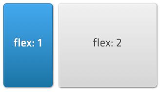
To acheive the relative widths depicted above, with the child on the right occupying twice the space of the child on the left, your code would look like:
<container [layout]="'hbox'">
  <container [flex]="1"></container>
  <container [flex]="2"></container>
</container>
You can also assign a width prop to either child:
<container [layout]="'hbox'">
  <container [width]="200"></container>
  <container [flex]="1"></container>
</container>
... or use a combination of minWidth, maxWidth, and flex to allow a child to grow and shrink within a given size range when the parent container is resized:
<container layout]="hbox">
  <container minWidth=200 maxWidth=300 flex=1></container>
  <container flex=2/></container>
</container>
If none of the children have a flex prop, or their maxWidths prevent them from filling the parent container, they will be positioned on the left side of the parent container by default. You can change this behavior by setting the pack config. Here is an example that spaces children evenly apart to fill the parent container:
<container [layout]="{ type: 'hbox', pack: 'space-between' }">
  <container flex=1></container>
  <container flex=2></container>
</container>
By default, each child fills the vertical space of the parent container. You can change this behavior by setting the align config: Here is an example that aligns children at the top of parent, each taking up the minimum height based on their content:
<container [layout]="{ type: 'hbox', align: 'top' }">
  <container flex=1></container>
  <container flex=2></container>
</container>
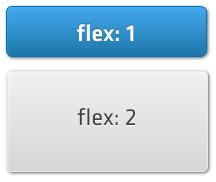
vboxThe vbox layout is similar to the hbox layout. With vbox, children are positioned vertically. The align and pack configs control horizontal alignment and vertical spacing, respectively.
<container layout="vbox">
  <container flex=1></container>
  <container flex=2></container>
</container>
cardA container with a card layout shows only one of its children at a time. Each child fills the full height and width of the parent container.
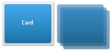
Here the gray box is the Container and the blue box inside it is the currently active card. The three other cards are hidden from view, but can be swapped in later.
The card being shown is determined by the activeItem prop on the parent container. Here is an example with 3 cards. Only the second card is displayed:
<container [layout]="'card'" [activeItem]="1">
  <container></container>
  <container></container>
  <container></container>
</container>
The activeItem prop can either be a zero-based index or the itemId of a child. The following is equivalent to the example above:
<container layout="card" activeItem="step-2">
  <container itemId="step-1"></container>
  <container itemId="step-2"></container>
  <container itemId="step-3"></container>
</container>
Transitions between cards can be animated by setting the animation config. Here is an example that slides out the old card while sliding in the new one:
<container [layout]="{ type: 'card', animation: { type: 'slide' }}">
  <container></container>
  <container></container>
  <container></container>
</container>
The duration and direction of the animation are also configurable.
fitThe fit layout fills the full height and width of the container with a single child component.
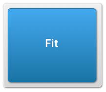
*Note that if container with layout="fit" has more than one child, only the first child will be visible. If you want to switch between multiple items, use the card layout instead.
Every layout is capable of docking children inside it. Docking enables you to place additional components at the top, right, bottom, or left edges of the parent container, resizing the other children as necessary.
For example, we can dock a component at the top of a container with an hbox layout:
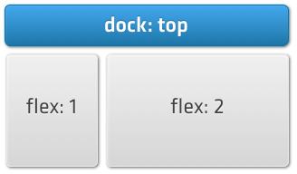
... using the following code ...
<container layout="hbox">
  <toolbar docked="top">...</toolbar>
  <container flex=1></container>
  <container flex=2></container>
</container>
Children can be docked on any side, for example:
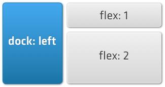
You can dock multiple children on each side. Docked children are ordered top to bottom or left to right depending on the side on which they are docked.


 ExtAngular | Terms of Use
