Many classes have shortcut names used when creating (instantiating) a class with a
configuration object. The shortcut name is referred to as an alias (or xtype if the
class extends Ext.Component). The alias/xtype is listed next to the class name of
applicable classes for quick reference.
Framework classes or their members may be specified as private or protected. Else,
the class / member is public. Public, protected, and private are access
descriptors used to convey how and when the class or class member should be used.
Public classes and class members are available for use by any other class or application code and may be relied upon as a stable and persistent within major product versions. Public classes and members may safely be extended via a subclass.
Protected class members are stable public members intended to be used by the
owning class or its subclasses. Protected members may safely be extended via a subclass.
Private classes and class members are used internally by the framework and are not intended to be used by application developers. Private classes and members may change or be omitted from the framework at any time without notice and should not be relied upon in application logic.
static label next to the
method name. *See Static below.Below is an example class member that we can disect to show the syntax of a class member (the lookupComponent method as viewed from the Ext.button.Button class in this case).
Let's look at each part of the member row:
lookupComponent in this example)( item ) in this example)Ext.Component in this case). This may be omitted for methods that do not
return anything other than undefined or may display as multiple possible values
separated by a forward slash / signifying that what is returned may depend on the
results of the method call (i.e. a method may return a Component if a get method calls is
successful or false if unsuccessful which would be displayed as
Ext.Component/Boolean).PROTECTED in
this example - see the Flags section below)Ext.container.Container in this example). The source
class will be displayed as a blue link if the member originates from the current class
and gray if it is inherited from an ancestor or mixed-in class.view source in the example)item : Object in the example).undefined a "Returns" section
will note the type of class or object returned and a description (Ext.Component in the
example)Available since 3.4.0 - not pictured in
the example) just after the member descriptionDefaults to: false)The API documentation uses a number of flags to further commnicate the class member's function and intent. The label may be represented by a text label, an abbreviation, or an icon.
classInstance.method1().method2().etc();false is returned from
an event handler- Indicates a framework class
- A singleton framework class. *See the singleton flag for more information
- A component-type framework class (any class within the Ext JS framework that extends Ext.Component)
- Indicates that the class, member, or guide is new in the currently viewed version
- Indicates a class member of type config
- Indicates a class member of type property
- Indicates a class member of type
method
- Indicates a class member of type event
- Indicates a class member of type
theme variable
- Indicates a class member of type
theme mixin
- Indicates that the class, member, or guide is new in the currently viewed version
Just below the class name on an API doc page is a row of buttons corresponding to the types of members owned by the current class. Each button shows a count of members by type (this count is updated as filters are applied). Clicking the button will navigate you to that member section. Hovering over the member-type button will reveal a popup menu of all members of that type for quick navigation.
Getting and setter methods that correlate to a class config option will show up in the methods section as well as in the configs section of both the API doc and the member-type menus just beneath the config they work with. The getter and setter method documentation will be found in the config row for easy reference.
Your page history is kept in localstorage and displayed (using the available real estate) just below the top title bar. By default, the only search results shown are the pages matching the product / version you're currently viewing. You can expand what is displayed by clicking on the button on the right-hand side of the history bar and choosing the "All" radio option. This will show all recent pages in the history bar for all products / versions.
Within the history config menu you will also see a listing of your recent page visits. The results are filtered by the "Current Product / Version" and "All" radio options. Clicking on the button will clear the history bar as well as the history kept in local storage.
If "All" is selected in the history config menu the checkbox option for "Show product details in the history bar" will be enabled. When checked, the product/version for each historic page will show alongside the page name in the history bar. Hovering the cursor over the page names in the history bar will also show the product/version as a tooltip.
Both API docs and guides can be searched for using the search field at the top of the page.
On API doc pages there is also a filter input field that filters the member rows using the filter string. In addition to filtering by string you can filter the class members by access level, inheritance, and read only. This is done using the checkboxes at the top of the page.
The checkbox at the bottom of the API class navigation tree filters the class list to include or exclude private classes.
Clicking on an empty search field will show your last 10 searches for quick navigation.
Each API doc page (with the exception of Javascript primitives pages) has a menu view of metadata relating to that class. This metadata view will have one or more of the following:
Ext.button.Button class has an alternate class name of Ext.Button). Alternate class
names are commonly maintained for backward compatibility.Runnable examples (Fiddles) are expanded on a page by default. You can collapse and expand example code blocks individually using the arrow on the top-left of the code block. You can also toggle the collapse state of all examples using the toggle button on the top-right of the page. The toggle-all state will be remembered between page loads.
Class members are collapsed on a page by default. You can expand and collapse members using the arrow icon on the left of the member row or globally using the expand / collapse all toggle button top-right.
Viewing the docs on narrower screens or browsers will result in a view optimized for a smaller form factor. The primary differences between the desktop and "mobile" view are:
The class source can be viewed by clicking on the class name at the top of an API doc page. The source for class members can be viewed by clicking on the "view source" link on the right-hand side of the member row.
The class system is one of the most powerful features of the Ext JS and Sencha Touch frameworks. It brings the structure, flexibility, and re-usability of classical inheritance to your JavaScript applications. This class system is fundamental to all Ext JS applications.
For more background, see the following guides:
Architect generates standard Ext JS code, and so it also supports the class system. Architect also provides a number of facilities for reusing classes within your application.
This document describes:
Building an application in such a way that code can be re-used is a fundamental element of creating maintainable software. Sencha Architect helps you segment your application into reusable classes.
Every top level instance in Architect's inspector represents a class.
Architect enables you to build your application from the top down or from the bottom up. If you start with a single view container, you will later want to break out portions of the application (via Promote to Class). If you start designing your application by focusing on building individual specific screens and then want to assemble it later, you can do this with Linked Instances.
Beginning with Sencha Architect 3.0, you can also create a User Extension package that includes one or several classes. This can be published on its own and then imported to other projects; once installed, the User Extension components can be dragged from the Toolbox to any compatible project. For more information about creating User Extension packages, see Creating User Extensions.
When you add items from the Toolbox to your project, anything added as a top-level item within the Controllers, Views, Stores, or Models Inspector nodes becomes a class in your generated application code. For example, if you drag a Panel from the Toolbox to an empty area of the Canvas or to the Views node in the Inspector, then the code generated for that Panel looks something like this:
Ext.define('MyApp.view.MyPanel', {
    extend: 'Ext.panel.Panel',

    height: 250,
    width: 400,
    title: 'My Panel',

    initComponent: function() {
        var me = this;
        Ext.applyIf(me, {
            items: [
                {
                    xtype: 'button',
                    text: 'MyButton'
                }
            ]
        });
        me.callParent(arguments);
    }
});
This is a standard class using the class system's
define API.
When you save your project,
Architect generates a separate file app/view/MyPanel.js for this class.
Let's break down this generated code in more detail.
Ext.define('MyApp.view.MyPanel', {
This line defines a class named MyPanel
within the namespace MyApp.view.
All view components are automatically put into this namespace
per the convention of Sencha's model-view-controller (MVC) package.
The name MyPanel was automatically generated by Architect,
but you can choose your own class name
by modifying the userClassName property in the Config panel.
You are encouraged to choose class names
appropriate to the classes in your application.
extend: 'Ext.panel.Panel',
This specifies that the class inherits
the base configuration and implementation
of the Ext JS standard Ext.panel.Panel class.
This value is generated by Architect
based on the Toolbox type from which the component was created.
It can only be changed by transforming the component to another type
via the Transform list in its context menu.
(Note: see the section below on Custom Classes
for how to extend classes that don't appear in the Toolbox.)
height: 250,
width: 400,
title: 'My Panel',
Your class's simple configuration properties appear here. Only values that you specify and that do not match the inherited default value from their parent class appear here.
initComponent: function() {
    var me = this;
    Ext.applyIf(me, {
        //...
    });
    me.callParent(arguments);
}
Complex configurations such as object literals and child item configs -- anything that should not be shared across instances -- appear here.
In addition to configuration properties, you can also add instance methods to your class by dragging a Basic Function from the Toolbox onto the class or by clicking the Add button ("+") next to the Functions item in the Config panel. Give the resulting function a name and optional parameters and double-click it to open the Architect code editor and edit its implementation code.
Similarly, you can add static methods to your class using the Static Function Toolbox item.
The following class configuration properties can also be set on any top-level class item; these are advanced configs that should only be modified if you have advanced knowledge of Architect and the frameworks.
Another integral part of Sencha's class system is the Dynamic Class Loader. Since Architect generates your classes in separate JavaScript files, each of your application's classes must be declared so that the framework knows to load them.
To simplify this process, Architect automatically adds most of your top-level classes into the Controllers, Views, Stores, and Models arrays in the Application node's config. All classes in these lists are loaded when the app starts up. If you wish, you can instead add individual classes into the corresponding arrays in an individual controller. Architect gives you the option of removing the class from the Application node.
Some classes may not be automatically added to these lists,
in which case you will need to manually add them
to the requires config of the Application node
or of the specific controller, view, model, or store class that uses them.
While the features described here enable the creation of classes from the supported items in the Toolbox, sometimes you may need to create a plain parentless class or a class that extends another class that does not appear in the Toolbox. You can do this in Architect by using the Class item in the Toolbox or the "Class" item in the drop-down list displayed when you click the "+" sign at the top of the Project Inspector.
A custom class can be added to the Controllers, Views, Stores, or Models Inspector nodes. Custom classes can be configured like any other class with the addition of giving you full control over the Ext.Class#cfg-extend config. You can add your own configs using the Config panel's search field and Add button, and add methods as described above.
To have your custom class included in your application,
you can add it to the requires config of the Application
or of the specific controller, view, model, or store class that uses it.
Note that an arbitrary custom class created this way has some limitations.
It cannot be rendered in the Canvas
or used as the parent of a linked instance
because Architect does not know about its base implementation.
This will be improved in a future release.
If you explicitly set the custom class's extend config to a known class,
such as Ext.button.Button,
Architect gives you the option to transform it
to a full-fledged button subclass
and allow it to be used in the canvas
as if you had dragged out the button from the Toolbox.
You can create an override to a framework class by right clicking the class in the Toolbox the clicking on "Create Override for the Class":
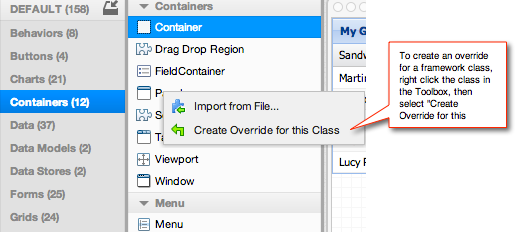
The override appears in the Project Inspector panel under the Resources node with a name such as Panel.js. Select that component and open the Code Panel to modify it.
The override you create this way is then applied to all instances of that framework class throughout the project. This can be used to implement some sort of specialized behavior for a component or to apply a hot fix that repairs a critical bug in the framework.
Note that you can also create an override for just your instance of a class.
Save to Toolbox lets you save a project's top-level components directly to the component Toolbox for later use. This feature enables you to save and reuse components across multiple projects. To save a component you have already built, with all of its configs and any child components, select the top-level component you want to save and go to Actions-->Save to Toolbox. Architect prompts you to rename the component and choose the Toolbox category in which the component will appear, as shown here:
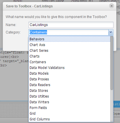
Once you have typed in a name and chosen the appropriate category, click OK and Architect saves the component to the Toolbox. The component is then available for reuse, either in the same or other projects; it appears with your specified name within the specified category, represented by a green component icon. You can find it under the category you chose, or by typing the name you gave the component in the Filter field at the top of the Toolbox.
To update the saved component, make the modifications in your project then save it to the Toolbox again using the same name. Architect lets you overwrite the original and save it to the same category.
Exporting a Component to a file couldn't be easier. Simply right-click the component of interest in the inspector. You'll see an option for "Export to File" as seen below.
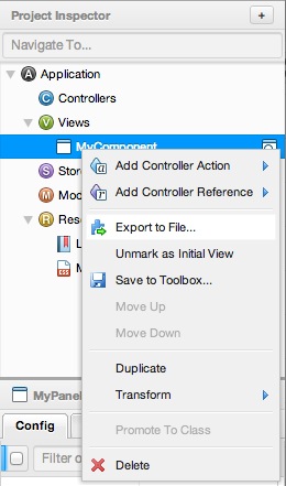
Click "Export to File" and you will be given a prompt to save your file to your machine.
A component that has been exported using the Export to File feature can then be imported into another developer's instance of Architect for further development or reuse in other projects. Note that only components created in the Sencha Architect Ext JS environment can be imported to an Ext JS project.
If another developer adds to the exported component, it can then be re-imported back into Architect and added back to the project. This is a great way to collaborate with other members of a team on a single Architect project. To import a component that has been exported, be sure the exported component has been placed at a location where it can be accessed, either on the desktop or on a server. In Architect, open the Edit menu and select Import Component. Navigate to the location of the component, select it, and click Open. Architect prompts you to rename the component and choose the Toolbox category in which the component will appear, using the same dialog used when you save a component to the Toolbox. See the image just above, under "Save to Toolbox".
After you have typed in a name and chosen the appropriate category, click OK and Architect saves the component to the Toolbox. The component is now available in the Toolbox to add to any Architect project, just as you would any other component.
Linked Instances enable you to create and reuse components within your application. Building large projects in Architect with many views can be simplified by using linked instances. The purpose of the Architect Linked Instance feature is reuse: you build a custom component, or xtype, and then create linked instances of it to reuse the new xtype wherever it is needed in the application.
Classes are intended to be reusable units that can be instantiated multiple times,
so Architect supports the concept of linked instances to allow this.
Any top-level view class can be linked
to one or more locations within other views;
these resulting linked instances will refer to their class by its xtype,
which you can control by setting its userAlias config.
Linked instances can also be created
by selecting any child view component
and choosing Promote to Class from its context menu.
Creating multiple linked instances of the same component enables your to change them all at once by editing the original component, and each linked instance inherits all the changes. You can still edit each linked instance separately. Changes made to the linked instance override the attributes you give the original component. This is particularly useful when you use another Architect feature, Promote To Class, which you access by right-clicking a component in the Inspector.
To learn more about using linked instances, follow this example:
SpecialForm
and set its userAlias to specialform.
Here's what you should see in the Inspector: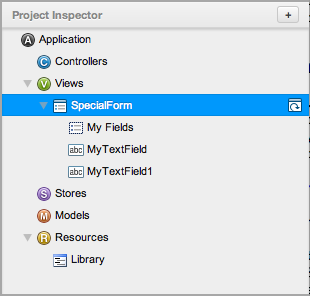
SpecialForm
within MyWindow (called MyForm...)
and also creates an xtype called specialform,
which can be reused elsewhere in the application.
Here's how the Inspector should look now: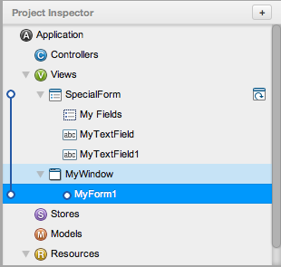
Let's reuse specialform in a Viewport.
SpecialForm into the viewport.SpecialForm
under the viewport (MyForm...).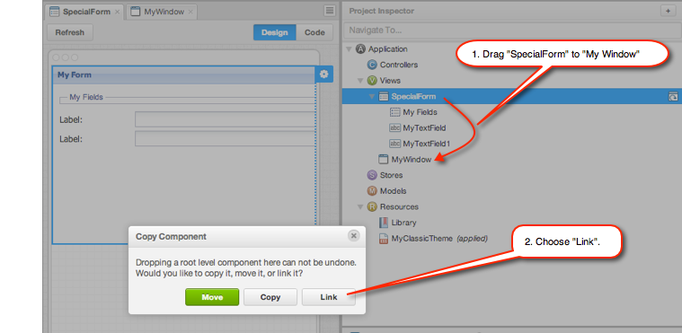
The Inspector for your project should now look something like this:
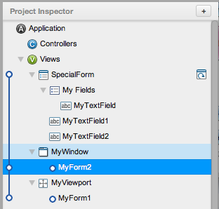
SpecialForm
(MyForm... under the Window and Viewport),
and view it in the Canvas.
Each will have the two fields added to the FieldSet
that is part of the original SpecialForm. SpecialForm
and add a new Text Field to its FieldSet.
In the Inspector,
select the linked instances in the Window and the Viewport again.
You can see in the Canvas that each form also contains the new field.Architect also lets you make changes to each linked instance.
Say you want to change the name of the form in the Viewport.
To do that, select MyForm... under the Viewport
and edit its title config in the Config panel.
The change will be made only to that instance of SpecialForm.
Some things can't be accomplished using the Architect drag-and-drop, visual interface. For example, say you want to add a ComboBox only to the instance of the form in the Viewport (and not to the version in the Window).
To do this, create an override that conditionally includes a ComboBox:
showCombo.
Then you can set the custom configuration on the Viewport instance of the form.
You won't be able to see the ComboBox in the Canvas Design view,
because Architect doesn't know to look for override code.
But, it will work perfectly at runtime,
and the ComboBox will be displayed in the browser as expected.The Architect Kiva example application illustrates the Linked Instance and Promote to Class process. You must specify an override in order to add custom outside libraries to Architect and use those libraries within Architect's components. In the Kiva example application, a special JSONP Proxy library is provided that passes through YQL in order to perform queries that Architect can handle natively.
This is achieved by adding a library, KivaProxy.js, as a resource. Then, rather than adding a JSONP store, a plain store is added and the code is manually overridden to use the code from KivaProxy.js (which is given the alias 'proxy.kiva' within that file) The excerpt from the Architect 2.1 code illustrates this:
Ext.define('Kiva.store.override.Loans', { override: 'Kiva.store.Loans',
    requires: [
        'Kiva.model.Loan'
    ],

    config: {
        autoLoad: true,
        model: 'Kiva.model.Loan',
        remoteFilter: true,
        storeId: 'Loans',
        proxy: {
                type: 'kiva',
                reader: {
                    type: 'json',
                    successProperty: 'success',
                    rootProperty: function(data) {
                            if (data.error || data.query.count === 0) {
                                return [];
                            } else {
                                return data.query.results.loans;
                            }
                        }
                }
            }
       }

});
This method has some serious drawbacks:
For these reasons, the createAlias feature was added to Architect 2.2. These overrides still work in later releases, but the features described below are much easier to maintain for projects being developed.
Sencha Architect 2.2 and later include features called createAlias and createClass that enable developers to bring in external libraries, inserting custom code into components without using code overrides. Many applications use other libraries with the Sencha frameworks and the createAlias and *createClass configs allow simpler integration of these external JavaScript libraries by setting up an xtype or class name for the external component.
The Architect Kiva example application illustrates how to achieve the same effect by using createAlias and no override. Instead, the same affect is achieved through the following:
This is not only faster to implement but it provides the flexibility and comfort of using a simple GUI to continue any further customization of a store, proxy and/or reader. createAlias gives you a name by which to reference the child component and you can then easily reference that child component using this name rather than having to override the store as you did in Architect 2.1.
The process shown above works only for top-level components. A different process is required to save and export child components. For example, if you have a LoginScreen container, and you want to add to it a previously created LoginForm component, you can drag and drop your LoginForm component onto your LoginScreen container and establish a Linked Instance. A linked instance is analogous to an instance of an object when speaking in object-oriented programming terms. Consequently, any changes made directly to your LoginForm component are reflected in the linked instance. You can create as many linked instances as you want, either by drag-and-drop of a top-level component or by duplicating an existing linked instance. By using this technique, you can build each logical piece of your project separately and later view all of these pieces together by establishing linked instances into an aggregate container such as a Viewport.
Architect 2.1 provided the Linked Instance and Promote to Class features that let you create instances of a top-level component as a child item to another top-level component. Note that Architect 2.2 introduced the createAlias feature (discussed below) that is an easier and better way to achieve the same goal.
Linked instances can be very helpful in building complex projects. If you create multiple linked instances of the same component, you can change them all at once by editing the original component, and each linked instance inherits all the changes. You can still edit each linked instance separately; changes made to the linked instance override the attributes you give the original component. This is particularly useful when you use another Architect feature, Promote To Class.
Any child item in a component can be promoted to a top-level component and become its own class in the Architect project directory using the Promote to Class feature. For example, Grid Columns can only be added to Grid Panels or Tree Panels when they are initially created because they do not serve any purpose on their own.
To do this, first drag a Grid Panel to Views in the Inspector. A new Grid Panel receives several columns by default. Right-click “Boolean” -- the header of one of the columns -- in the Inspector -- and choose Promote to Class.
The column becomes its own top-level component and is replaced by a linked instance in the Inspector. When Architect exports the project, it generates a separate .js file for the component/class. This works for most View components in Architect.
Using this feature can make it easier
to share and manage a project if you are working with a team.
In addition to generating more manageable code,
organizing a Architect project
as a collection of top-level components
can make it easier to continue to develop the project.
By using linked instances within main application views,
it is still easy to view all the top-level components in context.
Promote to Class works in tandem
with Linked Instance and lets you convert any nested component
into a top-level component.
When you do this, Architect creates separate .js files
for the component when you save and archive your project.
When you use Promote to Class,
the original component is replaced
by a linked instance to its new top-level version.
This makes it easy to break up a large component
into smaller, reusable, and more manageable subsets.
It also means that you can implement behavior, override functions,
or implement function-typed configuration options on our new component class.