What is a Component?
Most of the visual classes you interact with in Sencha Touch are Components. Every Component in Sencha Touch is a subclass of Ext.Component, which means all have the ability to:
- Render themselves onto the page using a template
- Show and hide themselves at any time
- Center themselves on the screen
- Enable and disable themselves
Components also have a more advanced behavior which enables them to:
- Float above other components (windows, message boxes, and overlays)
- Change size and position on the screen with animation
- Dock other Components inside themselves (this feature is useful for toolbars)
- Align to other components, allow themselves to be dragged around, make their content scrollable, and more
What is a Container?
Every Component you create has all of the previosly mentioned abilities, and applications are made up of lots of components, usually nested inside one another. Containers are similar to Components, but in addition to the capabilities listed previously, they also allow you to render and arrange child Components inside them. Most apps have a single top level Container called a Viewport, which takes up the entire screen. Inside of the Viewport are child components, for example in a mail app the Viewport Container’s two children Components could be a message List and an email preview pane.
Containers provide the following additional functionality:
- Adding child Components at instantiation and at run time
- Removing child Components
- Specifying a Layout
Layouts determine how a container’s child Components are laid out on the screen. In our mail app example we have used use an HBox layout, which enables us to pin the email list to the left hand edge of the screen and allow the preview pane to occupy the rest. There are several layouts available in Sencha Touch, each of which help you achieve your desired application structure, as explained in the Layout guide.
Instantiating Components
Components are created the same way as all other classes in Sencha Touch - using the Ext.create method call. The following code sample illustrates the creation of a Panel:
var panel = Ext.create('Ext.Panel', {
    html: 'This is my panel'
});
This creates a Panel instance, configured with some basic HTML content. A Panel is a simple Component that can render HTML and that also contains other items. In the previous example we have created a Panel instance, but it does not instantly show up on the screen because items are not rendered immediately after being instantiated. This allows us to create some components and move them around before rendering and laying them out, which is significantly faster than moving them after rendering.
To show this panel on the screen we can simply add it to the global Viewport:
Ext.Viewport.add(panel);Panels are also Containers, which means they can contain other Components, arranged by a layout. Let us revisit the previous example, this time creating a panel with two child Components and an hbox layout:
Ext.application({
    name : 'Sencha',

    launch : function() {
        var panel = Ext.create('Ext.Panel', {
            layout: 'hbox',

            items: [
                {
                    xtype: 'panel',
                    flex: 1,
                    html: 'Left Panel, 1/3rd of total size',
                    style: 'background-color: #5E99CC;'
                },
                {
                    xtype: 'panel',
                    flex: 2,
                    html: 'Right Panel, 2/3rds of total size',
                    style: 'background-color: #759E60;'
                }
            ]
        });

        Ext.Viewport.add(panel);
    }
});
This time we created three Panels - the first one is created just as before, but the inner two are declared inline using an xtype. Xtype is a convenient way of creating Components without having to go through the process of using Ext.create and specifying the full class name, instead you can provide the xtype for the class inside an object and the framework creates the components.
We also specified a layout for the top level panel - in this case hbox, which splits the horizontal width of the parent panel based on the ‘flex’ parameter of each child. For example, if the parent Panel above is 300px wide, the first child will be flexed to 100px wide and the second to 200px, because the first one was given flex: 1 and the second flex: 2.
Configuring Components
Whenever you create a new Component you can pass it configuration options. All configurations for a given Component are listed in the “Config options” section of its class documentation page. You can pass in any number of configuration options when you instantiate the Component, and modify any of them at any point later on. For example, you can easily modify the html content of a Panel after having created it, as shown in the following example:
Ext.application({
    name : 'Sencha',

    launch : function() {
        //we can configure the HTML when we instantiate the Component
        var panel = Ext.create('Ext.Panel', {
            fullscreen: true,
            html: 'This is a Panel'
        });

        //we can update the HTML later using the setHtml method:
        panel.setHtml('Some new HTML');

        //we can retrieve the current HTML using the getHtml method:
        Ext.Msg.alert(panel.getHtml()); //alerts "Some new HTML"
    }
});
Every config has a getter method and a setter method - these are automatically generated and always follow the same pattern. For example, a config called ‘html’ automatically receives the getHtml and setHtml methods, while a config called defaultType receives the getDefaultType and setDefaultType methods, and so on.
Using xtype
Xtype is an easy way to create Components without having to use the full class name. This is especially useful when creating a Container that contains child Components. An xtype is simply a shorthand way of specifying a Component, for example you can use xtype: ‘panel’ instead of typing out Ext.Panel.
The following illustrates the use of xtype:
Ext.application({
    name : 'Sencha',

    launch : function() {
        Ext.create('Ext.Container', {
            fullscreen: true,
            layout: 'fit',

            items: [
                {
                    xtype: 'panel',
                    html: 'This panel is created by xtype'
                },
                {
                    xtype: 'toolbar',
                    title: 'So is the toolbar',
                    docked: 'top'
                }
            ]
        });
    }
});
List of xtypes
This is the list of all xtypes available in Sencha Touch:
xtype                   Class
-----------------       ---------------------
actionsheet             Ext.ActionSheet
audio                   Ext.Audio
button                  Ext.Button
component               Ext.Component
container               Ext.Container
image                   Ext.Img
label                   Ext.Label
loadmask                Ext.LoadMask
map                     Ext.Map
mask                    Ext.Mask
media                   Ext.Media
panel                   Ext.Panel
segmentedbutton         Ext.SegmentedButton
sheet                   Ext.Sheet
spacer                  Ext.Spacer
title                   Ext.Title
titlebar                Ext.TitleBar
toolbar                 Ext.Toolbar
video                   Ext.Video
carousel                Ext.carousel.Carousel
carouselindicator       Ext.carousel.Indicator
navigationview          Ext.navigation.View
datepicker              Ext.picker.Date
picker                  Ext.picker.Picker
pickerslot              Ext.picker.Slot
slider                  Ext.slider.Slider
thumb                   Ext.slider.Thumb
tabbar                  Ext.tab.Bar
tabpanel                Ext.tab.Panel
tab                     Ext.tab.Tab
viewport                Ext.viewport.Default

DataView Components
---------------------------------------------
dataview                Ext.dataview.DataView
list                    Ext.dataview.List
listitemheader          Ext.dataview.ListItemHeader
nestedlist              Ext.dataview.NestedList
dataitem                Ext.dataview.component.DataItem

Form Components
---------------------------------------------
checkboxfield           Ext.field.Checkbox
datepickerfield         Ext.field.DatePicker
emailfield              Ext.field.Email
field                   Ext.field.Field
hiddenfield             Ext.field.Hidden
input                   Ext.field.Input
numberfield             Ext.field.Number
passwordfield           Ext.field.Password
radiofield              Ext.field.Radio
searchfield             Ext.field.Search
selectfield             Ext.field.Select
sliderfield             Ext.field.Slider
spinnerfield            Ext.field.Spinner
textfield               Ext.field.Text
textareafield           Ext.field.TextArea
textareainput           Ext.field.TextAreaInput
togglefield             Ext.field.Toggle
urlfield                Ext.field.Url
fieldset                Ext.form.FieldSet
formpanel               Ext.form.Panel
Adding Components to Containers
As mentioned previously, Containers are special Components that can have child Components arranged by a Layout. One of the previous code samples showed how to create a Panel with two child Panels already defined inside it, but this can also be done at run time:
Ext.application({
    name : 'Sencha',

    launch : function() {
        var aboutPanel = Ext.create('Ext.Panel', {
            html: 'About this app'
        });

        //this is the Panel we'll be adding to
        var mainPanel = Ext.create('Ext.Panel', {
            fullscreen: true,

            layout: 'hbox',
            defaults: {
                flex: 1
            },

            items: {
                html: 'First Panel',
                style: 'background-color: #5E99CC;'
            }
        });

        //now we add the first panel inside the second
        mainPanel.add(aboutPanel);
    }
});
In this example we created three Panels in total. First we created the aboutPanel, which we might use to tell the user a little about the app. Then we created another panel called mainPanel, which already contains a third Panel in its items configuration, with some placeholder text (“First Panel”). Finally, we added the first panel to the second panel by calling the add method on mainPanel.
In this case we gave our mainPanel another hbox layout, but we also introduced some defaults. These are applied to every item in the Panel, so in this case every child inside mainPanel will be given a flex: 1 configuration. The effect of this is that when we first render the screen only a single child is present inside mainPanel, so that child takes up the full width available to it. Once the mainPanel.add line is called though, the aboutPanel is rendered inside of it and also given a flex of 1, which causes it and the first panel to both receive half the full width of mainPanel.
Likewise, it is easy to remove items from a Container using a method call such as the following:
mainPanel.remove(aboutPanel);After this line is run, the app reverts to its previous state, with the first child panel once again taking up the full width inside mainPanel.
Showing and Hiding Components
Every Component in Sencha Touch can be shown or hidden with a simple API call. Building on the previous mainPanel example, here is how we can hide it:
mainPanel.hide();This hides the mainPanel itself and any child Components inside it. Showing the Component again is predictably easy:
mainPanel.show();Again, this restores the visibility of mainPanel and any child Components inside it.
Events
All Components fire events, which you can listen to and take action on. For example, whenever a Text field is typed into, its ‘change’ event is fired. You can listen to that event by using a listeners config, as shown in the following example:
Ext.create('Ext.form.Text', {
    label: 'Name',
    listeners: {
        change: function(field, newValue, oldValue) {
            myStore.filter('name', newValue);
        }
    }
});
Every time the value of the text field changes, the ‘change’ event is fired and the specified listener function is called. In this case we filtered a Store by the name typed into it, but we could have provided any other function there.
Lots of events are fired by Sencha Touch components, allowing you to easily hook into most aspects of an Application’s behavior. They can also be specified after the Component has been created.
For example, assuming that you have a dashboard which polls for live updates, and that you do not want it to perform polling when the dashboard is not visible, then you could hook into the dashboard’s show and hide events:
dashboard.on({
    hide: MyApp.stopPolling,
    show: MyApp.startPolling
});
It is easy to apply behaviors like this to your whole app, in this case preserving battery life. Other useful events that are fired are the following:
Each Component has a description of the events it fires listed in its class documentation.
Docking
Sencha Touch has the ability to dock Components within other Containers. For example, assuming we were using an hbox layout and wanted to place a banner to the top, we could use docking which provides a way to do this without having to nest Containers inside one another:
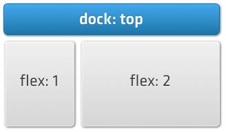
The Layout Guide has a full discussion of docking and all of the other layout options.
Destroying Components
Because most mobile devices have a limited amount of memory, it is often a good idea to destroy Components when they are not needed any more. Although this is not the first thing to consider when creating an app, it is nevertheless a good way to optimize the user experience when you push the app into production. Destroying a Component is done using code as in the following example:
mainPanel.destroy();This removes the mainPanel from the DOM and also removes any event listeners it has set up on specific DOM elements. It also destroy any instances that the Panel uses internally, and it calls the destroy method on all of its child components. After a Component is destroyed, all of its children also no longer available, the component no longer is in the DOM and any references to it are no longer be valid.