Themes
Many classes have shortcut names used when creating (instantiating) a class with a
configuration object. The shortcut name is referred to as an alias (or xtype if the
class extends Ext.Component). The alias/xtype is listed next to the class name of
applicable classes for quick reference.
Framework classes or their members may be specified as private or protected. Else,
the class / member is public. Public, protected, and private are access
descriptors used to convey how and when the class or class member should be used.
Public classes and class members are available for use by any other class or application code and may be relied upon as a stable and persistent within major product versions. Public classes and members may safely be extended via a subclass.
Protected class members are stable public members intended to be used by the
owning class or its subclasses. Protected members may safely be extended via a subclass.
Private classes and class members are used internally by the framework and are not intended to be used by application developers. Private classes and members may change or be omitted from the framework at any time without notice and should not be relied upon in application logic.
static label next to the
method name. *See Static below.Below is an example class member that we can disect to show the syntax of a class member (the lookupComponent method as viewed from the Ext.button.Button class in this case).
Let's look at each part of the member row:
lookupComponent in this example)( item ) in this example)Ext.Component in this case). This may be omitted for methods that do not
return anything other than undefined or may display as multiple possible values
separated by a forward slash / signifying that what is returned may depend on the
results of the method call (i.e. a method may return a Component if a get method calls is
successful or false if unsuccessful which would be displayed as
Ext.Component/Boolean).PROTECTED in
this example - see the Flags section below)Ext.container.Container in this example). The source
class will be displayed as a blue link if the member originates from the current class
and gray if it is inherited from an ancestor or mixed-in class.view source in the example)item : Object in the example).undefined a "Returns" section
will note the type of class or object returned and a description (Ext.Component in the
example)Available since 3.4.0 - not pictured in
the example) just after the member descriptionDefaults to: false)The API documentation uses a number of flags to further commnicate the class member's function and intent. The label may be represented by a text label, an abbreviation, or an icon.
classInstance.method1().method2().etc();false is returned from
an event handler- Indicates a framework class
- A singleton framework class. *See the singleton flag for more information
- A component-type framework class (any class within the Ext JS framework that extends Ext.Component)
- Indicates that the class, member, or guide is new in the currently viewed version
- Indicates a class member of type config
- Indicates a class member of type property
- Indicates a class member of type
method
- Indicates a class member of type event
- Indicates a class member of type
theme variable
- Indicates a class member of type
theme mixin
- Indicates that the class, member, or guide is new in the currently viewed version
Just below the class name on an API doc page is a row of buttons corresponding to the types of members owned by the current class. Each button shows a count of members by type (this count is updated as filters are applied). Clicking the button will navigate you to that member section. Hovering over the member-type button will reveal a popup menu of all members of that type for quick navigation.
Getting and setter methods that correlate to a class config option will show up in the methods section as well as in the configs section of both the API doc and the member-type menus just beneath the config they work with. The getter and setter method documentation will be found in the config row for easy reference.
Your page history is kept in localstorage and displayed (using the available real estate) just below the top title bar. By default, the only search results shown are the pages matching the product / version you're currently viewing. You can expand what is displayed by clicking on the button on the right-hand side of the history bar and choosing the "All" radio option. This will show all recent pages in the history bar for all products / versions.
Within the history config menu you will also see a listing of your recent page visits. The results are filtered by the "Current Product / Version" and "All" radio options. Clicking on the button will clear the history bar as well as the history kept in local storage.
If "All" is selected in the history config menu the checkbox option for "Show product details in the history bar" will be enabled. When checked, the product/version for each historic page will show alongside the page name in the history bar. Hovering the cursor over the page names in the history bar will also show the product/version as a tooltip.
Both API docs and guides can be searched for using the search field at the top of the page.
On API doc pages there is also a filter input field that filters the member rows using the filter string. In addition to filtering by string you can filter the class members by access level, inheritance, and read only. This is done using the checkboxes at the top of the page.
The checkbox at the bottom of the API class navigation tree filters the class list to include or exclude private classes.
Clicking on an empty search field will show your last 10 searches for quick navigation.
Each API doc page (with the exception of Javascript primitives pages) has a menu view of metadata relating to that class. This metadata view will have one or more of the following:
Ext.button.Button class has an alternate class name of Ext.Button). Alternate class
names are commonly maintained for backward compatibility.Runnable examples (Fiddles) are expanded on a page by default. You can collapse and expand example code blocks individually using the arrow on the top-left of the code block. You can also toggle the collapse state of all examples using the toggle button on the top-right of the page. The toggle-all state will be remembered between page loads.
Class members are collapsed on a page by default. You can expand and collapse members using the arrow icon on the left of the member row or globally using the expand / collapse all toggle button top-right.
Viewing the docs on narrower screens or browsers will result in a view optimized for a smaller form factor. The primary differences between the desktop and "mobile" view are:
The class source can be viewed by clicking on the class name at the top of an API doc page. The source for class members can be viewed by clicking on the "view source" link on the right-hand side of the member row.
Choose one of the packaged GXT themes or build your own.
See more on Generating Themes.
Sencha professional services can build the theme for you. Inquire about the professional service options here.
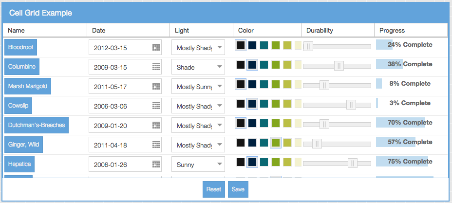
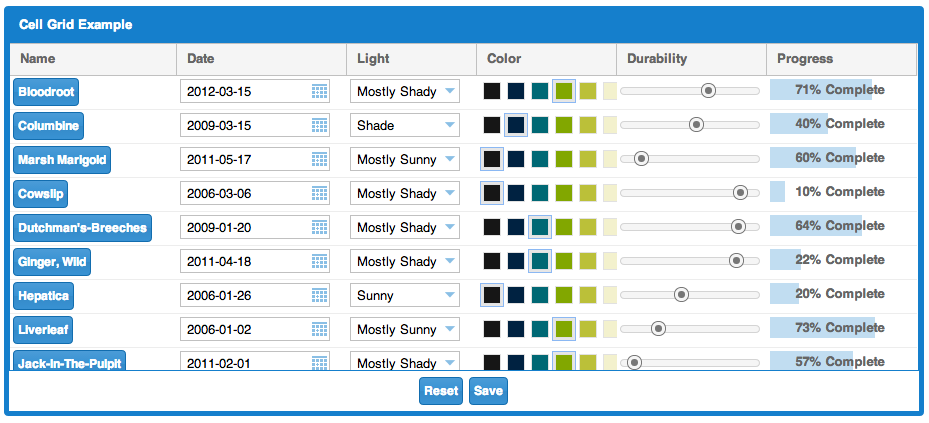
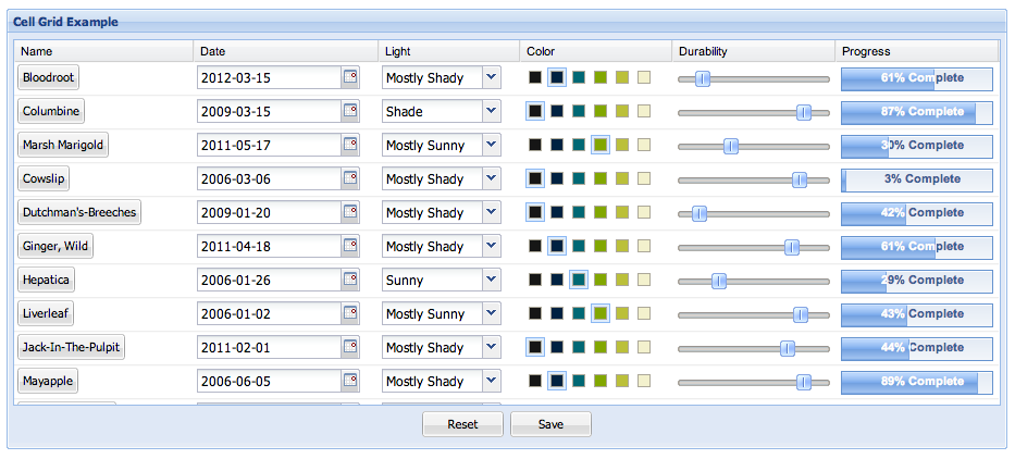
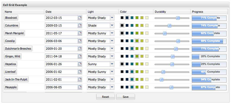
The default theme is Blue. There are four packaged themes available: Blue, Gray,
Neptune, and Triton.
New in GXT 4.0, the Triton theme is complete generated using the new generating themes.
Go to Examples Page and select a theme on the upper right.
gxt-theme-triton.jar to your project's classpath.Add Triton theme module inherits configuration:
<inherits name='com.sencha.gxt.theme.triton.Theme' />
gxt-theme-neptune.jar to your project's classpath.Add Neptune theme module inherits configuration:
<inherits name='com.sencha.gxt.theme.neptune.Theme' />
Blue is the default theme.
Blue theme module inherits configuration:
<inherits name='com.sencha.gxt.theme.blue.Blue'/>
Gray theme module inherits configuration:
<inherits name='com.sencha.gxt.theme.gray.Gray' />
Example configuration using the Neptune theme in the GWT project module:
  <?xml version="1.0" encoding="UTF-8"?>
  <!DOCTYPE module PUBLIC "-//Google Inc.//DTD GWT 2.7.0//EN"
      "http://gwtproject.org/doctype/2.7.0/gwt-module.dtd">
  <module rename-to='project'>
      <!-- Inherit the core Web Toolkit stuff. -->
      <inherits name='com.google.gwt.user.User' />

      <!-- Other module inherits -->
      <inherits name='com.sencha.gxt.ui.GXT' />

      <!-- GXT Stylesheet -->
      <stylesheet src="reset.css" />

      <!-- GXT Theme -->
      <!-- <inherits name='com.sencha.gxt.theme.blue.Blue' /> -->
      <!-- <inherits name='com.sencha.gxt.theme.gray.Gray' /> -->
      <!-- Be sure to include Neptunes gxt-theme-neptune.jar in the classpath -->
      <inherits name='com.sencha.gxt.theme.neptune.Theme' />

      <!-- Specify the app entry point class. -->
      <entry-point class='com.sencha.gxt.project.client.ProjectEntryPoint' />

      <!-- Specify the paths for translatable code -->
      <source path='client' />
      <source path='shared' />
  </module>
The sliced themes will be turned on when using a generated theme and IE8, IE9, gecko1_8, safari3 or safari4 are detected. All other themes will use the CSS3 appearances.
Add this after the generated theme inherits in the project.gwt.xml module.
Turn on sliced for everything
This is on by default. As long as this comes last in your module, this will ovelrride the default slicing. This setting will always turn on serving CSS3 appearances for every browser.
Turn off slicing for every browser and serve the CSS3 appearances.
<set-property name="gxt.css3.enabled" value="true" />
Turn off sliced for everything
Slicing is only turned on by default for these browsers: IE8, IE9, gecko1_8, safari3, safari4.
But if you set gxt.css3.enabled to false deferred binding will use sliced appearances for every browser, which means the new Chrome, Safari, Firefox, IE, and Edge.
Turn on slicing for every browser and serve the sliced appearances.
<set-property name="gxt.css3.enabled" value="false" />
Turn off sliced appearances building
Themebuilder, turn off the sliced appearances from building.
Add the argument -slicedDisabled true to the theme builder CLI config.
-slicedDisabled true


 GXT | Terms of Use
