Layout Containers
Many classes have shortcut names used when creating (instantiating) a class with a
configuration object. The shortcut name is referred to as an alias (or xtype if the
class extends Ext.Component). The alias/xtype is listed next to the class name of
applicable classes for quick reference.
Framework classes or their members may be specified as private or protected. Else,
the class / member is public. Public, protected, and private are access
descriptors used to convey how and when the class or class member should be used.
Public classes and class members are available for use by any other class or application code and may be relied upon as a stable and persistent within major product versions. Public classes and members may safely be extended via a subclass.
Protected class members are stable public members intended to be used by the
owning class or its subclasses. Protected members may safely be extended via a subclass.
Private classes and class members are used internally by the framework and are not intended to be used by application developers. Private classes and members may change or be omitted from the framework at any time without notice and should not be relied upon in application logic.
static label next to the
method name. *See Static below.Below is an example class member that we can disect to show the syntax of a class member (the lookupComponent method as viewed from the Ext.button.Button class in this case).
Let's look at each part of the member row:
lookupComponent in this example)( item ) in this example)Ext.Component in this case). This may be omitted for methods that do not
return anything other than undefined or may display as multiple possible values
separated by a forward slash / signifying that what is returned may depend on the
results of the method call (i.e. a method may return a Component if a get method calls is
successful or false if unsuccessful which would be displayed as
Ext.Component/Boolean).PROTECTED in
this example - see the Flags section below)Ext.container.Container in this example). The source
class will be displayed as a blue link if the member originates from the current class
and gray if it is inherited from an ancestor or mixed-in class.view source in the example)item : Object in the example).undefined a "Returns" section
will note the type of class or object returned and a description (Ext.Component in the
example)Available since 3.4.0 - not pictured in
the example) just after the member descriptionDefaults to: false)The API documentation uses a number of flags to further commnicate the class member's function and intent. The label may be represented by a text label, an abbreviation, or an icon.
classInstance.method1().method2().etc();false is returned from
an event handler- Indicates a framework class
- A singleton framework class. *See the singleton flag for more information
- A component-type framework class (any class within the Ext JS framework that extends Ext.Component)
- Indicates that the class, member, or guide is new in the currently viewed version
- Indicates a class member of type config
- Indicates a class member of type property
- Indicates a class member of type
method
- Indicates a class member of type event
- Indicates a class member of type
theme variable
- Indicates a class member of type
theme mixin
- Indicates that the class, member, or guide is new in the currently viewed version
Just below the class name on an API doc page is a row of buttons corresponding to the types of members owned by the current class. Each button shows a count of members by type (this count is updated as filters are applied). Clicking the button will navigate you to that member section. Hovering over the member-type button will reveal a popup menu of all members of that type for quick navigation.
Getting and setter methods that correlate to a class config option will show up in the methods section as well as in the configs section of both the API doc and the member-type menus just beneath the config they work with. The getter and setter method documentation will be found in the config row for easy reference.
Your page history is kept in localstorage and displayed (using the available real estate) just below the top title bar. By default, the only search results shown are the pages matching the product / version you're currently viewing. You can expand what is displayed by clicking on the button on the right-hand side of the history bar and choosing the "All" radio option. This will show all recent pages in the history bar for all products / versions.
Within the history config menu you will also see a listing of your recent page visits. The results are filtered by the "Current Product / Version" and "All" radio options. Clicking on the button will clear the history bar as well as the history kept in local storage.
If "All" is selected in the history config menu the checkbox option for "Show product details in the history bar" will be enabled. When checked, the product/version for each historic page will show alongside the page name in the history bar. Hovering the cursor over the page names in the history bar will also show the product/version as a tooltip.
Both API docs and guides can be searched for using the search field at the top of the page.
On API doc pages there is also a filter input field that filters the member rows using the filter string. In addition to filtering by string you can filter the class members by access level, inheritance, and read only. This is done using the checkboxes at the top of the page.
The checkbox at the bottom of the API class navigation tree filters the class list to include or exclude private classes.
Clicking on an empty search field will show your last 10 searches for quick navigation.
Each API doc page (with the exception of Javascript primitives pages) has a menu view of metadata relating to that class. This metadata view will have one or more of the following:
Ext.button.Button class has an alternate class name of Ext.Button). Alternate class
names are commonly maintained for backward compatibility.Runnable examples (Fiddles) are expanded on a page by default. You can collapse and expand example code blocks individually using the arrow on the top-left of the code block. You can also toggle the collapse state of all examples using the toggle button on the top-right of the page. The toggle-all state will be remembered between page loads.
Class members are collapsed on a page by default. You can expand and collapse members using the arrow icon on the left of the member row or globally using the expand / collapse all toggle button top-right.
Viewing the docs on narrower screens or browsers will result in a view optimized for a smaller form factor. The primary differences between the desktop and "mobile" view are:
The class source can be viewed by clicking on the class name at the top of an API doc page. The source for class members can be viewed by clicking on the "view source" link on the right-hand side of the member row.
Each container has its own specific uses, and these uses should be described in that container's documentation. When looking at any container and its layout features, keep in mind how it sizes and positions its children and what layout data it uses to be more specific.
Containers can be used with the UiBinder.
Choose the UiBinder xmlns imports needed in the <ui:UiBinder/> tag for the containers below.
The containers below have the import tag name which can be matched up with the import needed.
  <!-- these are the imports for the containers below -->
  xmlns:container="urn:import:com.sencha.gxt.widget.core.client.container"
  xmlns:button="urn:import:com.sencha.gxt.widget.core.client.button"
  xmlns:core="urn:import:com.sencha.gxt.widget.core.client"
  xmlns:form="urn:import:com.sencha.gxt.widget.core.client.form"
  xmlns:toolbar="urn:import:com.sencha.gxt.widget.core.client.toolbar"
UiBinder example using the imports for containers.
  <!DOCTYPE ui:UiBinder SYSTEM "http://dl.google.com/gwt/DTD/xhtml.ent">
  <ui:UiBinder
      xmlns:ui="urn:ui:com.google.gwt.uibinder"
      xmlns:g="urn:import:com.google.gwt.user.client.ui"
      xmlns:container="urn:import:com.sencha.gxt.widget.core.client.container"
      xmlns:button="urn:import:com.sencha.gxt.widget.core.client.button"
      xmlns:core="urn:import:com.sencha.gxt.widget.core.client"
      xmlns:form="urn:import:com.sencha.gxt.widget.core.client.form"
      xmlns:toolbar="urn:import:com.sencha.gxt.widget.core.client.toolbar">

      <container:SimpleContainer addStyleNames="{style.widget}" ui:field="container" />
  </ui:UiBinder>
The hierarchy of the GXT containers.
Choose the containers best suited for layout.
Container sized layout consumes the size of the browser or parent container and does not flow like a page.
Document layout flows like a document or most often like a long page.
Submit a wireframe with colored borders boundaries for the widgets and containers to a support ticket or premium forum and we can provide example mock ups with layout options.
A base class for HTML layout containers. Provides behavior common to all HTML layout containers, including the attachment of of the widget element to the container's parent element.
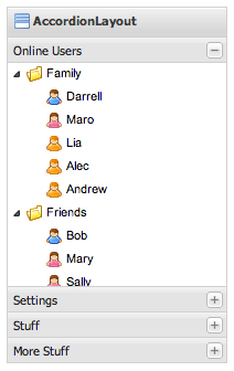
A layout container that manages multiple content panels in an expandable accordion style such that only one panel can be expanded at any given time (by default). Each panel has built-in support for expanding and collapsing. Note: Only ContentPanel's and subclasses may be used in an accordion layout container. Each content panel should be created with AccordionLayoutContainer.AccordionLayoutAppearance to produce the expected accordion panel look and feel.
UiBinder:
<container:AccordionLayoutContainer />
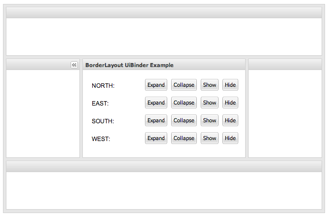
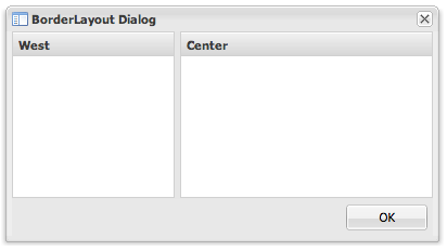
A multi-pane, application-oriented layout container that supports multiple regions, automatic split bars between regions and built-in expanding and collapsing of regions.
Region positions are specified using compass points (e.g. north for top, west for left, east for right, south for bottom) and center. The center region is a privileged position that receives the remaining space not allocated to other regions. Border layout containers should generally specify a center region and one or more other regions.
Region layout parameters are specified using BorderLayoutData which controls the margin between the regions, the size of the region, the minimum and maximum size, whether the region has a split bar, whether the region is collapsible and other details.
Region size may be specified as a percent of the parent container size or a fixed number of pixels. The region size is specified as a single value that describes the orientation associated with the region (height for north and south, width for west and east).
UiBinder:
<container:BorderLayoutContainer />
A base class for box layout containers. Provides behavior common to all box layout containers, including packing, padding and the action to take on insert and remove.
A horizontal row of buttons.
UiBinder:
<button:ButtonBar />
A group of buttons.
UiBinder:
<button:ButtonGroup />
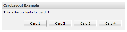
A layout container that contains multiple widgets, each fit to the container, where only a single widget can be visible at any given time. This layout style is most commonly used for wizards, tab implementations, etc.
UiBinder:
<container:CardLayoutContainer />
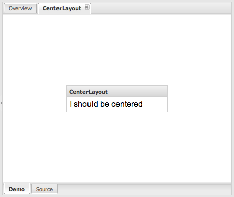
A layout container that centers its single widget.
UiBinder:
<container:CenterLayoutContainer />
Base class for all GXT widgets.
Abstract base for components that can contain child widgets.
ContentPanel is a component container that has specific functionality and structural components that make it the perfect building block for application-oriented user interfaces. A content panel contains separate header, footer and body sections. The header may contain an icon, text and a tool area that can be wired up to provide customized behavior. The footer contains buttons added using addButton(Widget). The body contains a single widget, added using SimpleContainer.add(Widget). The widget is resized to match the size of the container. A content panel provides built-in expandable and collapsible behavior.
UiBinder:
A layout container that uses the CSS float style to enable widgets to float around other widgets.
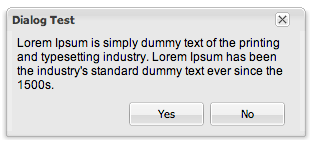
A Window with specialized support for buttons. Defaults to a dialog with an 'ok' button.
UiBinder:
<core:Dialog />
Form field wrapper to add a label and validation error text.
UiBinder:
<form:FieldLabel />
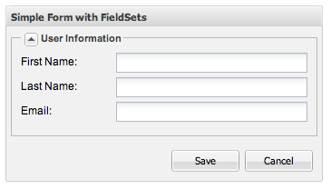
A simple container that wraps its content in a HTML fieldset.
UiBinder:
<form:FieldSet />
A flow layout container that supports scrolling and lays out its widgets using the default HTML layout behavior.
UiBinder:
<container:FlowLayoutContainer />
A panel that wraps an HTML form. The field names and data on the form can be submitted to an HTTP server. A form panel is a SimpleContainer, which contains only a single widget. Multiple fields can be added to a form panel by adding them first to another container and then adding that container to the form panel.
UiBinder:
<form:FormPanel />
A ContentPanel that internally uses a @link FramedPanel.FramedPanelAppearance.
UiBinder:
<core:FramedPanel />
A layout container for horizontal rows of widgets. Provides support for automatic overflow.
UiBinder:
<container:HBoxLayoutContainer />
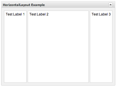
A layout container that lays out its children in a single row. The layout properties for each child are specified using HorizontalLayoutContainer.HorizontalLayoutData.
UiBinder:
<container:HorizontalLayoutContainer />
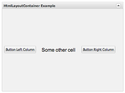
A layout container that lays out its children using an HTML template. The mapping of each child to a corresponding selector is specified using HtmlData.
UiBinder:
<container:HtmlLayoutContainer HTML="Test" />
A base class for layout containers that can insert widgets.
A base class for layout containers that can insert widgets and honor the RequiresResize contract.
A layout container that supports north (top) and south (bottom) regions.
UiBinder:
<container:NorthSouthContainer />
A specialized toolbar that is bound to a PagingLoader and provides automatic paging controls.
UiBinder:
<toolbar:PagingToolBar pageSize="10" />
A panel that can be displayed over other widgets.
UiBinder:
<core:Popup />
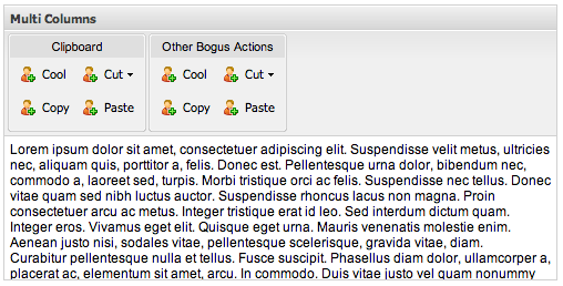
A layout container that lays out its children in in multiple columns, each containing zero or more Portlets. Supports drag and drop of child Portlets between columns as well as modifying the order within columns.
UiBinder:
<container:PortalLayoutContainer numColumns="2" />
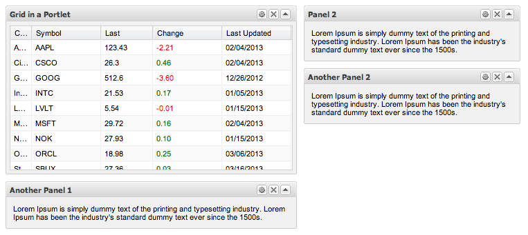
A framed panel that is managed by a PortalLayoutContainer.
UiBinder:
<core:Portlet />
A base class for layout containers that require resize support.
SimpleContainer takes one child and sizes it to match the container size.
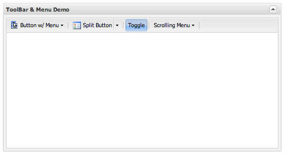
A standard tool bar.
UiBinder:
<toolbar:ToolBar />
A layout container for vertical columns of widgets.
UiBinder:
<container:VBoxLayoutContainer />
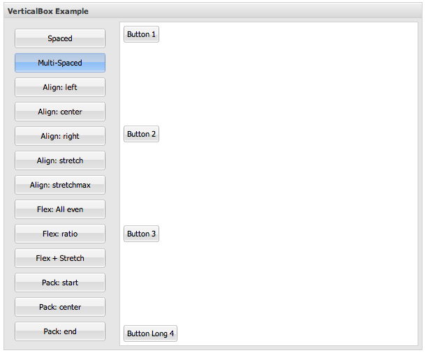
A layout container that lays out its children in a single column. The lay out properties for each child are specified using VerticalLayoutContainer.VerticalLayoutData.
UiBinder:
<container:VerticalLayoutContainer />

A LayoutContainer that fills the browser window and monitors window resizing. Viewports are best used for applications that will fill the browser without window scrolling. Children of the viewport can allow scrolling.
UiBinder:
<container:Viewport />
Refers to the GWT Widget.
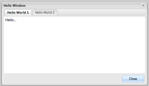
A specialized content panel intended for use as an application window.
UiBinder:
<core:Window />


 GXT | Terms of Use