Grid Editing
Many classes have shortcut names used when creating (instantiating) a class with a
configuration object. The shortcut name is referred to as an alias (or xtype if the
class extends Ext.Component). The alias/xtype is listed next to the class name of
applicable classes for quick reference.
Framework classes or their members may be specified as private or protected. Else,
the class / member is public. Public, protected, and private are access
descriptors used to convey how and when the class or class member should be used.
Public classes and class members are available for use by any other class or application code and may be relied upon as a stable and persistent within major product versions. Public classes and members may safely be extended via a subclass.
Protected class members are stable public members intended to be used by the
owning class or its subclasses. Protected members may safely be extended via a subclass.
Private classes and class members are used internally by the framework and are not intended to be used by application developers. Private classes and members may change or be omitted from the framework at any time without notice and should not be relied upon in application logic.
static label next to the
method name. *See Static below.Below is an example class member that we can disect to show the syntax of a class member (the lookupComponent method as viewed from the Ext.button.Button class in this case).
Let's look at each part of the member row:
lookupComponent in this example)( item ) in this example)Ext.Component in this case). This may be omitted for methods that do not
return anything other than undefined or may display as multiple possible values
separated by a forward slash / signifying that what is returned may depend on the
results of the method call (i.e. a method may return a Component if a get method calls is
successful or false if unsuccessful which would be displayed as
Ext.Component/Boolean).PROTECTED in
this example - see the Flags section below)Ext.container.Container in this example). The source
class will be displayed as a blue link if the member originates from the current class
and gray if it is inherited from an ancestor or mixed-in class.view source in the example)item : Object in the example).undefined a "Returns" section
will note the type of class or object returned and a description (Ext.Component in the
example)Available since 3.4.0 - not pictured in
the example) just after the member descriptionDefaults to: false)The API documentation uses a number of flags to further commnicate the class member's function and intent. The label may be represented by a text label, an abbreviation, or an icon.
classInstance.method1().method2().etc();false is returned from
an event handler- Indicates a framework class
- A singleton framework class. *See the singleton flag for more information
- A component-type framework class (any class within the Ext JS framework that extends Ext.Component)
- Indicates that the class, member, or guide is new in the currently viewed version
- Indicates a class member of type config
- Indicates a class member of type property
- Indicates a class member of type
method
- Indicates a class member of type event
- Indicates a class member of type
theme variable
- Indicates a class member of type
theme mixin
- Indicates that the class, member, or guide is new in the currently viewed version
Just below the class name on an API doc page is a row of buttons corresponding to the types of members owned by the current class. Each button shows a count of members by type (this count is updated as filters are applied). Clicking the button will navigate you to that member section. Hovering over the member-type button will reveal a popup menu of all members of that type for quick navigation.
Getting and setter methods that correlate to a class config option will show up in the methods section as well as in the configs section of both the API doc and the member-type menus just beneath the config they work with. The getter and setter method documentation will be found in the config row for easy reference.
Your page history is kept in localstorage and displayed (using the available real estate) just below the top title bar. By default, the only search results shown are the pages matching the product / version you're currently viewing. You can expand what is displayed by clicking on the button on the right-hand side of the history bar and choosing the "All" radio option. This will show all recent pages in the history bar for all products / versions.
Within the history config menu you will also see a listing of your recent page visits. The results are filtered by the "Current Product / Version" and "All" radio options. Clicking on the button will clear the history bar as well as the history kept in local storage.
If "All" is selected in the history config menu the checkbox option for "Show product details in the history bar" will be enabled. When checked, the product/version for each historic page will show alongside the page name in the history bar. Hovering the cursor over the page names in the history bar will also show the product/version as a tooltip.
Both API docs and guides can be searched for using the search field at the top of the page.
On API doc pages there is also a filter input field that filters the member rows using the filter string. In addition to filtering by string you can filter the class members by access level, inheritance, and read only. This is done using the checkboxes at the top of the page.
The checkbox at the bottom of the API class navigation tree filters the class list to include or exclude private classes.
Clicking on an empty search field will show your last 10 searches for quick navigation.
Each API doc page (with the exception of Javascript primitives pages) has a menu view of metadata relating to that class. This metadata view will have one or more of the following:
Ext.button.Button class has an alternate class name of Ext.Button). Alternate class
names are commonly maintained for backward compatibility.Runnable examples (Fiddles) are expanded on a page by default. You can collapse and expand example code blocks individually using the arrow on the top-left of the code block. You can also toggle the collapse state of all examples using the toggle button on the top-right of the page. The toggle-all state will be remembered between page loads.
Class members are collapsed on a page by default. You can expand and collapse members using the arrow icon on the left of the member row or globally using the expand / collapse all toggle button top-right.
Viewing the docs on narrower screens or browsers will result in a view optimized for a smaller form factor. The primary differences between the desktop and "mobile" view are:
The class source can be viewed by clicking on the class name at the top of an API doc page. The source for class members can be viewed by clicking on the "view source" link on the right-hand side of the member row.
Using the grid to edit data.
Two Grid editing options are available, Inline or Row editing.
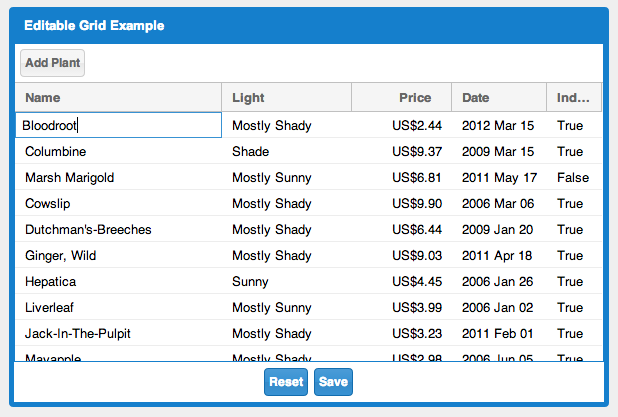
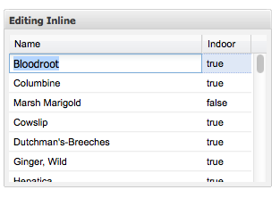
Editing the grid inputs individually in a line.
Inline editing initialization:
GridEditing<Plant> editing = new GridInlineEditing<Plant>(Grid<M> editableGrid);
Example of setting up inline editing:
  private void createInlineEditingGrid() {
    // Define the column(s).
    ColumnConfig<Plant, String> colName = new ColumnConfig<Plant, String>(properties.name(), 220, "Name");
    ColumnConfig<Plant, Boolean> colIndoor = new ColumnConfig<Plant, Boolean>(properties.indoor(), 55, "Indoor");

    // Initialize the columns.
    List<ColumnConfig<Plant, ?>> columns = new ArrayList<ColumnConfig<Plant, ?>>();
    columns.add(colName);
    columns.add(colIndoor);
    ColumnModel<Plant> columnModel = new ColumnModel<Plant>(columns);

    // Initialize the Store.
    ListStore<Plant> store = new ListStore<Plant>(properties.key());
    store.addAll(TestData.getPlants());

    // Initialize the Grid.
    Grid<Plant> grid = new Grid<Plant>(store, columnModel);
    grid.getView().setAutoExpandColumn(colName);

    // Setup the editors. Designate the input type per column.
    GridEditing<Plant> editing = new GridInlineEditing<Plant>(grid);
    editing.addEditor(colName, new TextField());
    editing.addEditor(colIndoor, new CheckBox());

    // Put the grid in a container.
    FramedPanel framedPanel = new FramedPanel();
    framedPanel.setHeadingText("Editing Inline");
    framedPanel.setPixelSize(300, 200);
    framedPanel.add(grid);

    widget.add(framedPanel);
  }
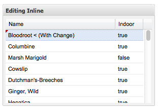
Example of the Inline editing:
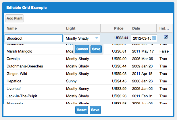
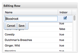
Editing the entire grid row at one time.
Row editing initialization:
GridEditing<Plant> editing = new GridRowEditing<Plant>(Grid<M> editableGrid);
Example of setting up row editing:
  private void createRowEditingGrid() {
    // Define the column(s).
    ColumnConfig<Plant, String> colName = new ColumnConfig<Plant, String>(properties.name(), 220, "Name");
    ColumnConfig<Plant, Boolean> colIndoor = new ColumnConfig<Plant, Boolean>(properties.indoor(), 55, "Indoor");

    // Initialize the columns.
    List<ColumnConfig<Plant, ?>> columns = new ArrayList<ColumnConfig<Plant, ?>>();
    columns.add(colName);
    columns.add(colIndoor);
    ColumnModel<Plant> columnModel = new ColumnModel<Plant>(columns);

    // Initialize the Store.
    ListStore<Plant> store = new ListStore<Plant>(properties.key());
    store.addAll(TestData.getPlants());

    // Initialize the Grid.
    Grid<Plant> grid = new Grid<Plant>(store, columnModel);
    grid.getView().setAutoExpandColumn(colName);

    // Setup the editors. Designate the input type per column.
    GridEditing<Plant> editing = new GridRowEditing<Plant>(grid);
    editing.addEditor(colName, new TextField());
    editing.addEditor(colIndoor, new CheckBox());

    // Put the grid in a container.
    FramedPanel framedPanel = new FramedPanel();
    framedPanel.setHeadingText("Editing Row");
    framedPanel.setPixelSize(300, 200);
    framedPanel.add(grid);

    widget.add(framedPanel);
  }
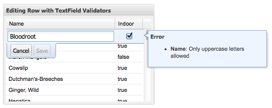
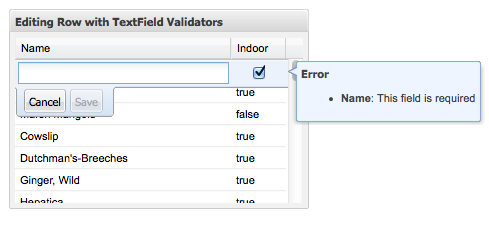
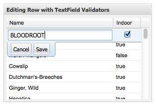
Example of row editing:
Cell changed notification is on by default and is displayed with a red triangle in the upper left corner.
Each cell can have field validators which test the validation on the value change.
More on Field Validation.
Text field validators:
    // Add field validators to the text field
    TextField textField = new TextField();
    textField.addValidator(new EmptyValidator<String>()); // or textField.setAllowBlank(false);
    textField.addValidator(new RegExValidator("^[^a-z]+$", "Only uppercase letters allowed"));
Example of field validators added to the text field:
  private void createRowEditingGridWithValidation() {
    // Define the column(s).
    ColumnConfig<Plant, String> colName = new ColumnConfig<Plant, String>(properties.name(), 220, "Name");
    ColumnConfig<Plant, Boolean> colIndoor = new ColumnConfig<Plant, Boolean>(properties.indoor(), 55, "Indoor");

    // Initialize the columns.
    List<ColumnConfig<Plant, ?>> columns = new ArrayList<ColumnConfig<Plant, ?>>();
    columns.add(colName);
    columns.add(colIndoor);
    ColumnModel<Plant> columnModel = new ColumnModel<Plant>(columns);

    // Initialize the Store.
    ListStore<Plant> store = new ListStore<Plant>(properties.key());
    store.addAll(TestData.getPlants());

    // Initialize the Grid.
    Grid<Plant> grid = new Grid<Plant>(store, columnModel);
    grid.getView().setAutoExpandColumn(colName);

    // Add field validators to the text field
    TextField textField = new TextField();
    textField.addValidator(new EmptyValidator<String>()); // or textField.setAllowBlank(false);
    textField.addValidator(new RegExValidator("^[^a-z]+$", "Only uppercase letters allowed"));

    // Setup the editors. Designate the input type per column.
    GridEditing<Plant> editing = new GridRowEditing<Plant>(grid);
    editing.addEditor(colName, textField);
    editing.addEditor(colIndoor, new CheckBox());

    // Put the grid in a container.
    FramedPanel framedPanel = new FramedPanel();
    framedPanel.setHeadingText("Editing Row with TextField Validators");
    framedPanel.setPixelSize(300, 200);
    framedPanel.add(grid);

    widget.add(framedPanel);
  }
Example of the RegExValidator validator:
  // Add field validators to the text field
  TextField textField = new TextField();
  textField.addValidator(new RegExValidator("^[^a-z]+$", "Only uppercase letters allowed"));
Example of the EmptyValidator:
  // Add field validators to the text field
  TextField textField = new TextField();
  textField.addValidator(new EmptyValidator<String>()); // or textField.setAllowBlank(false);
Iterate and process modified records before committing them. This could be used to persist changes to a remote server before committing the record back to the store.
Auto commit must be false when retrieving modifications. The default is false.
store.setAutoCommit(false);
Getting the records that have been modified.
Collection<Store<Plant>.Record> recordsModified = store.getModifiedRecords();
Iterating modified records.
  private void persistChanges() {
    Collection<Store<Plant>.Record> recordsModified = store.getModifiedRecords();

    for (Store<Plant>.Record record : recordsModified) {
      Plant unChangedPlantModel = record.getModel();

      // record.getValue(...) will return null if it has not been changed
      Date available = record.getValue(properties.available());
      Boolean indoor = record.getValue(properties.indoor());
      //...

      // Once the changes have been dealt with, commit them to the local store.
      // This will add the changed values to the model in the local store.
      record.commit(true);
    }
  }
Commit all the changes at once.
listStore.commitChanges();
To get all the changes for a changed Record.
  for (Store<LinkUserJso>.Record record : recordsModified) {
    // get all the changes for the record
    Collection<Change<LinkUserJso, ?>> changes = record.getChanges();
  }
Fires before start, unless the before event is canceled:
  editing.addBeforeStartEditHandler(new BeforeStartEditHandler<Plant>() {
    @Override
    public void onBeforeStartEdit(BeforeStartEditEvent<Plant> event) {
    }
  });
Fires on cancel:
  editing.addCancelEditHandler(new CancelEditHandler<Plant>() {
    @Override
    public void onCancelEdit(CancelEditEvent<Plant> event) {
    }
  });
Fires on complete:
  editing.addCompleteEditHandler(new CompleteEditHandler<Plant>() {
    @Override
    public void onCompleteEdit(CompleteEditEvent<Plant> event) {
    }
  });
Fires on start:
  editing.addStartEditHandler(new StartEditHandler<Plant>() {
    @Override
    public void onStartEdit(StartEditEvent<Plant> event) {
      GridCell editingCell = event.getEditCell();
    }
  });
Editing operations:
  // Adds an editor for the given column.
  editing.addEditor(columnConfig, field)

  // Cancels an active edit.
  editing.cancelEditing();

  // Completes the active edit.
  editing.completeEditing();

  // Returns the converter for the given column.
  editing.getConverter(columnConfig);

  // Returns the target grid.
  editing.getEditableGrid();

  // Sets the target grid to be edited.
  editing.setEditableGrid(editableGrid);

  // Returns the editor for the given column.
  editing.getEditor(columnConfig);

  // Returns true if editing is active.
  editing.isEditing();

  // Removes the editor for the given column.
  editing.removeEditor(columnConfig);

  // Sets the target grid to be edited.
  editing.setEditableGrid(editableGrid);

  // Starts editing for the given cell.
  editing.startEditing(cell);


 GXT | Terms of Use
