Fields
Many classes have shortcut names used when creating (instantiating) a class with a
configuration object. The shortcut name is referred to as an alias (or xtype if the
class extends Ext.Component). The alias/xtype is listed next to the class name of
applicable classes for quick reference.
Framework classes or their members may be specified as private or protected. Else,
the class / member is public. Public, protected, and private are access
descriptors used to convey how and when the class or class member should be used.
Public classes and class members are available for use by any other class or application code and may be relied upon as a stable and persistent within major product versions. Public classes and members may safely be extended via a subclass.
Protected class members are stable public members intended to be used by the
owning class or its subclasses. Protected members may safely be extended via a subclass.
Private classes and class members are used internally by the framework and are not intended to be used by application developers. Private classes and members may change or be omitted from the framework at any time without notice and should not be relied upon in application logic.
static label next to the
method name. *See Static below.Below is an example class member that we can disect to show the syntax of a class member (the lookupComponent method as viewed from the Ext.button.Button class in this case).
Let's look at each part of the member row:
lookupComponent in this example)( item ) in this example)Ext.Component in this case). This may be omitted for methods that do not
return anything other than undefined or may display as multiple possible values
separated by a forward slash / signifying that what is returned may depend on the
results of the method call (i.e. a method may return a Component if a get method calls is
successful or false if unsuccessful which would be displayed as
Ext.Component/Boolean).PROTECTED in
this example - see the Flags section below)Ext.container.Container in this example). The source
class will be displayed as a blue link if the member originates from the current class
and gray if it is inherited from an ancestor or mixed-in class.view source in the example)item : Object in the example).undefined a "Returns" section
will note the type of class or object returned and a description (Ext.Component in the
example)Available since 3.4.0 - not pictured in
the example) just after the member descriptionDefaults to: false)The API documentation uses a number of flags to further commnicate the class member's function and intent. The label may be represented by a text label, an abbreviation, or an icon.
classInstance.method1().method2().etc();false is returned from
an event handler- Indicates a framework class
- A singleton framework class. *See the singleton flag for more information
- A component-type framework class (any class within the Ext JS framework that extends Ext.Component)
- Indicates that the class, member, or guide is new in the currently viewed version
- Indicates a class member of type config
- Indicates a class member of type property
- Indicates a class member of type
method
- Indicates a class member of type event
- Indicates a class member of type
theme variable
- Indicates a class member of type
theme mixin
- Indicates that the class, member, or guide is new in the currently viewed version
Just below the class name on an API doc page is a row of buttons corresponding to the types of members owned by the current class. Each button shows a count of members by type (this count is updated as filters are applied). Clicking the button will navigate you to that member section. Hovering over the member-type button will reveal a popup menu of all members of that type for quick navigation.
Getting and setter methods that correlate to a class config option will show up in the methods section as well as in the configs section of both the API doc and the member-type menus just beneath the config they work with. The getter and setter method documentation will be found in the config row for easy reference.
Your page history is kept in localstorage and displayed (using the available real estate) just below the top title bar. By default, the only search results shown are the pages matching the product / version you're currently viewing. You can expand what is displayed by clicking on the button on the right-hand side of the history bar and choosing the "All" radio option. This will show all recent pages in the history bar for all products / versions.
Within the history config menu you will also see a listing of your recent page visits. The results are filtered by the "Current Product / Version" and "All" radio options. Clicking on the button will clear the history bar as well as the history kept in local storage.
If "All" is selected in the history config menu the checkbox option for "Show product details in the history bar" will be enabled. When checked, the product/version for each historic page will show alongside the page name in the history bar. Hovering the cursor over the page names in the history bar will also show the product/version as a tooltip.
Both API docs and guides can be searched for using the search field at the top of the page.
On API doc pages there is also a filter input field that filters the member rows using the filter string. In addition to filtering by string you can filter the class members by access level, inheritance, and read only. This is done using the checkboxes at the top of the page.
The checkbox at the bottom of the API class navigation tree filters the class list to include or exclude private classes.
Clicking on an empty search field will show your last 10 searches for quick navigation.
Each API doc page (with the exception of Javascript primitives pages) has a menu view of metadata relating to that class. This metadata view will have one or more of the following:
Ext.button.Button class has an alternate class name of Ext.Button). Alternate class
names are commonly maintained for backward compatibility.Runnable examples (Fiddles) are expanded on a page by default. You can collapse and expand example code blocks individually using the arrow on the top-left of the code block. You can also toggle the collapse state of all examples using the toggle button on the top-right of the page. The toggle-all state will be remembered between page loads.
Class members are collapsed on a page by default. You can expand and collapse members using the arrow icon on the left of the member row or globally using the expand / collapse all toggle button top-right.
Viewing the docs on narrower screens or browsers will result in a view optimized for a smaller form factor. The primary differences between the desktop and "mobile" view are:
The class source can be viewed by clicking on the class name at the top of an API doc page. The source for class members can be viewed by clicking on the "view source" link on the right-hand side of the member row.
GXT user interaction widget options.
The available GXT field widget options.
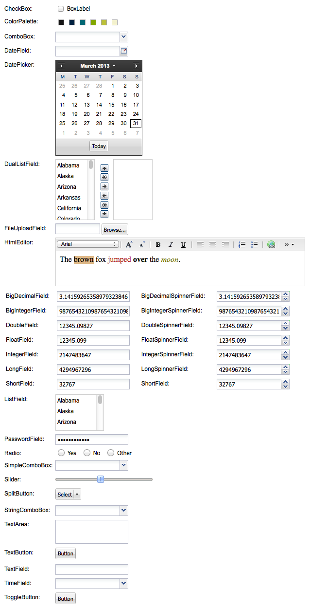
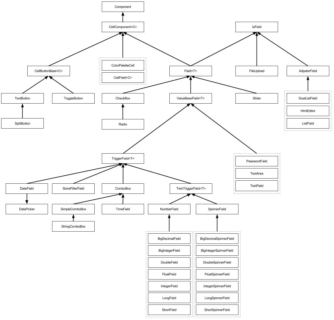
The field widgets are mainly mixed around CellComponent<C>, Field<T> and IsField<T>.
Some containers worth noting, are useful when configuring the interaction widgets.
Using the fields below will require the xmlns forms import.
Add the xmlns import xmlns:form="urn:import:com.sencha.gxt.widget.core.client.form":
  <!DOCTYPE ui:UiBinder SYSTEM "http://dl.google.com/gwt/DTD/xhtml.ent">
  <ui:UiBinder xmlns:ui='urn:ui:com.google.gwt.uibinder'
    xmlns:g='urn:import:com.google.gwt.user.client.ui'
    xmlns:gxt='urn:import:com.sencha.gxt.widget.core.client'
    xmlns:util='urn:import:com.sencha.gxt.core.client.util'
    xmlns:form='urn:import:com.sencha.gxt.widget.core.client.form'
    xmlns:button='urn:import:com.sencha.gxt.widget.core.client.button'>

      <g:HTMLPanel ui:field="widget">
          <!-- fields -->
      </g:HTMLPanel>
  </ui:UiBinder>
Form field wrapper to add a label and validation error text.
Example:
  private void createTextField() {
    TextField textField = new TextField();

    FieldLabel fieldLabel = new FieldLabel(textField, "TextField");
    widget.add(fieldLabel);
  }
UiBinder example:
  <!DOCTYPE ui:UiBinder SYSTEM "http://dl.google.com/gwt/DTD/xhtml.ent">
  <ui:UiBinder
      xmlns:ui="urn:ui:com.google.gwt.uibinder"
      xmlns:form="urn:import:com.sencha.gxt.widget.core.client.form">
      <form:FieldLabel text="Text" ui:field="fieldlabel">
          <form:widget>
              <form:TextField ui:field="input" />
          </form:widget>
      </form:FieldLabel>
  </ui:UiBinder>
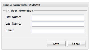
A simple container that wraps its content in a HTML fieldset.
Example:
  private void createFieldSet() {
    //...
    FieldSet fieldSet = new FieldSet();
    fieldSet.setHeadingText("User Information");
    fieldSet.setCollapsible(true);
    form.add(fieldSet);
    //...
  }
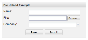
A panel that wraps an HTML form.
Example:
  private void createFormPanel() {
    //...
    FramedPanel panel = new FramedPanel();
    panel.setHeadingText("File Upload Example");

    final FormPanel formPanel = new FormPanel();
    formPanel.setAction("myurl");
    formPanel.setEncoding(Encoding.MULTIPART);
    formPanel.setMethod(Method.POST);
    panel.add(formPanel);
    //...
  }
Runtime styles can be applied, although keep in mind the appearance may change it back. If the appearance does clobber your change, find the end of the path and add your runtime change there.
The fields are wrapped with elements, so use a input DOM query from the parent element or getInputElement to get the
input element for use in styling.
Noticed the example uses the getInputElement to set the styles to.
While the example shows inline styles, I would suggest using CssResources to add the styles to the element.
Applying Inline Styles Example
  import com.google.gwt.core.client.EntryPoint;
  import com.google.gwt.dom.client.Style;
  import com.google.gwt.user.client.ui.RootPanel;
  import com.sencha.gxt.widget.core.client.form.TextField;

  public class TextFieldInputCss implements EntryPoint {
    @Override
    public void onModuleLoad() {
      TextField text = new TextField();
      // Add inline styles to the input element
      // This could also be done with getInputElement().setClassName(cssResourceStyleName);
      text.getCell().getInputElement(text.getElement()).getStyle().setProperty("textTransform", "uppercase");
      text.getCell().getInputElement(text.getElement()).getStyle().setTextAlign(Style.TextAlign.RIGHT);
      RootPanel.get().add(text);
    }
  }
The available GXT interaction widgets comprise mainly of the classes listed below. Some of the classes are meant to be extended and some are ready to go.
Wraps a Widget so that it can be used like a Field.
Cell button base.
A Component that wraps a Cell.
A cell field.
Simple checkbox field. ValueChangeEvents are fired when the checkbox state is changed by the user, instead of waiting for a BlurEvent.
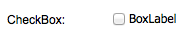
Example:
  private void createCheckBox() {
    CheckBox checkBox = new CheckBox();
    checkBox.setTitle("GXT CheckBox");
    checkBox.setBoxLabel("BoxLabel");

    FieldLabel fieldLabel = new FieldLabel(checkBox, "CheckBox");
    widget.add(fieldLabel);
  }
UiBinder example (When boxLabel="" it will align to the left, otherwise it centers.):
<form:CheckBox ui:field="checkBox" boxLabel="label" enabled="true" />
A cell component that displays a palette of colors and allows the user to select one.
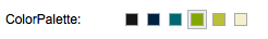
Example:
  private void createColorPalette() {
    ColorPalette colorPalette = new ColorPalette(COLORS, COLORS);

    FieldLabel fieldLabel = new FieldLabel(colorPalette, "ColorPalette");
    widget.add(fieldLabel);
  }
UiBinder example:
<gxt:ColorPalette ui:field="colorPalette" />
A combobox control with support for autocomplete, remote loading, and many other features.
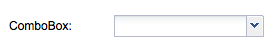
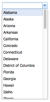
Example:
  private void createComboBox() {
    StateProperties properties = GWT.create(StateProperties.class);
    ListStore<State> states = new ListStore<State>(properties.abbr());
    states.addAll(TestData.getStates());

    ComboBox<State> comboBox = new ComboBox<State>(states, properties.name());

    FieldLabel fieldLabel = new FieldLabel(comboBox, "ComboBox");
    widget.add(fieldLabel);
  }
UiBinder file example:
  <!-- FieldsUiBinderExample.ui.xml file -->
  <!DOCTYPE ui:UiBinder SYSTEM "http://dl.google.com/gwt/DTD/xhtml.ent">
  <ui:UiBinder xmlns:ui='urn:ui:com.google.gwt.uibinder'
    xmlns:g='urn:import:com.google.gwt.user.client.ui'
    xmlns:form='urn:import:com.sencha.gxt.widget.core.client.form'>

    <ui:with type="com.sencha.gxt.data.shared.LabelProvider" field="labelProvider" />
    <ui:with type="com.sencha.gxt.data.shared.ListStore" field="listStore" />

    <g:VerticalPanel ui:field="widget" spacing="2">
      <g:cell>
        <form:ComboBox ui:field="comboBox" store="{listStore}" labelProvider="{labelProvider}" />
      </g:Cell>
    </g:VerticalPanel>
  </ui:UiBinder>
UiBinder use example:
  public class FieldsUiBinderExample implements IsWidget, EntryPoint {
    private static StateProperties properties = GWT.create(StateProperties.class);

    interface StateProperties extends PropertyAccess<State> {
      ModelKeyProvider<State> abbr();
      LabelProvider<State> name();
      @Path("name")
      ValueProvider<State, String> nameProp();
    }

    interface MyUiBinder extends UiBinder<VerticalPanel, FieldsUiBinderExample> {}
    private static MyUiBinder uiBinder = GWT.create(MyUiBinder.class);

    @UiField(provided = true)
    LabelProvider<State> labelProvider = properties.name();
    @UiField(provided = true)
    ListStore<State> listStore = new ListStore<State>(properties.abbr());
    @UiField
    ComboBox<State> comboBox;

    @Override
    public void onModuleLoad() {
      RootPanel.get().add(asWidget());
    }

    @Override
    public Widget asWidget() {
      listStore.addAll(TestData.getStates());
      widget = uiBinder.createAndBindUi(this);
      return widget;
    }
  }
Base class for all GXT widgets.
Provides a date input field with a DatePicker dropdown and automatic date validation.
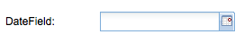
Example:
  private void createDateField() {
    DateField dateField = new DateField();

    FieldLabel fieldLabel = new FieldLabel(dateField, "DateField");
    widget.add(fieldLabel);
  }
UiBinder example:
<form:DateField ui:field="dateField" />
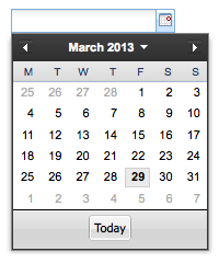
A date picker that displays a calendar for the specified month and provides the user the ability to select the month, year and day.
Example:
  private void createDatePicker() {
    DatePicker datePicker = new DatePicker();

    FieldLabel fieldLabel = new FieldLabel(datePicker, "DatePicker");
    widget.add(fieldLabel);
  }
UiBinder example:
<gxt:DatePicker ui:field="datePicker" />
Combines two list view fields and allows selections to be moved between fields either using buttons or by dragging and dropping selections
Example:
  private void createDualListField() {
    StateProperties properties = GWT.create(StateProperties.class);
    ListStore<State> states = new ListStore<State>(properties.abbr());
    states.addAll(TestData.getStates());

    ListStore<State> toStates = new ListStore<State>(properties.abbr());

    final DualListField<State, String> dualListField = new DualListField<State, String>(states, toStates,
        properties.nameProp(), new TextCell());
    dualListField.addValidator(new EmptyValidator<List<State>>());
    dualListField.setEnableDnd(true);
    dualListField.setMode(DualListField.Mode.INSERT);

    FieldLabel fieldLabel = new FieldLabel(dualListField, "DualListField");
    widget.add(fieldLabel);
  }
UiBinder file example:
  <!-- FieldsUiBinderExample.ui.xml file -->
  <!DOCTYPE ui:UiBinder SYSTEM "http://dl.google.com/gwt/DTD/xhtml.ent">
  <ui:UiBinder xmlns:ui='urn:ui:com.google.gwt.uibinder'
    xmlns:g='urn:import:com.google.gwt.user.client.ui'
    xmlns:gxt='urn:import:com.sencha.gxt.widget.core.client'
    xmlns:form='urn:import:com.sencha.gxt.widget.core.client.form'>

    <ui:with type="com.sencha.gxt.core.client.ValueProvider" field="valueProvider" />
    <ui:with type="com.google.gwt.cell.client.Cell" field="textCell" />
    <ui:with type="com.sencha.gxt.data.shared.ListStore" field="listStore" />
    <ui:with type="com.sencha.gxt.data.shared.ListStore" field="toStates" />

    <g:VerticalPanel ui:field="widget" spacing="2">
      <g:cell>
        <form:DualListField ui:field="dualListField" fromStore="{listStore}" toStore="{toStates}"
          valueProvider="{valueProvider}" cell="{textCell}" />
      </g:Cell>
    </g:VerticalPanel>
  </ui:UiBinder>
UiBinder use example:
  public class FieldsUiBinderExample implements IsWidget, EntryPoint {
    private static StateProperties properties = GWT.create(StateProperties.class);

    interface StateProperties extends PropertyAccess<State> {
      ModelKeyProvider<State> abbr();
      LabelProvider<State> name();
      @Path("name")
      ValueProvider<State, String> nameProp();
    }

    interface MyUiBinder extends UiBinder<VerticalPanel, FieldsUiBinderExample> {}
    private static MyUiBinder uiBinder = GWT.create(MyUiBinder.class);

    @UiField(provided = true)
    LabelProvider<State> labelProvider = properties.name();
    @UiField(provided = true)
    ListStore<State> listStore = new ListStore<State>(properties.abbr());
    @UiField(provided = true)
    ListStore<State> toStates = new ListStore<State>(properties.abbr());
    @UiField(provided = true)
    Cell<String> textCell = new TextCell();

    @UiField
    DualListField<State, String> dualListField;

    @Override
    public void onModuleLoad() {
      RootPanel.get().add(asWidget());
    }

    @Override
    public Widget asWidget() {
      listStore.addAll(TestData.getStates());
      widget = uiBinder.createAndBindUi(this);
      return widget;
    }
  }
Base class for all cell based fields. Adapts these fields for use as widgets, adding validation features, and the ability to interact with the GWT Editor framework.
A file upload field.
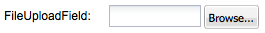
Example:
  private void createFileUpload() {
    FileUploadField fileUploadField = new FileUploadField();

    FieldLabel fieldLabel = new FieldLabel(fileUploadField, "FileUploadField");
    widget.add(fieldLabel);
  }
UiBinder example:
<form:FileUploadField ui:field="fileUploadField" />
Provides an HTML-based rich text editor with a tool bar for selecting formatting options, including fonts, text justification, lists, hyperlinks and text color. Enables switching between formatted and HTML editing modes. Supports copy and paste from Web pages as well as text editing features provided by the browser (e.g. spell checking, text search).
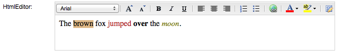
Example:
  private void createHtmlEditor() {
    String htmlEditorText = "The <span style=\"background-color: rgb(222, 184, 135);\">brown</span> " +
            "fox <font color=\"B22222\">jumped</font> <b>over</b> the <i><font color=\"808000\">moon</font></i>.<br>";
    HtmlEditor htmlEditor = new HtmlEditor();
    htmlEditor.setValue(htmlEditorText);
    htmlEditor.setHeight(100);

    FieldLabel fieldLabel = new FieldLabel(htmlEditor, "HtmlEditor");
    widget.add(fieldLabel);
  }
UiBinder example:
<form:HtmlEditor ui:field="htmlEditor" />
Field<T> is a Field<T>.
A ListView provides support for displaying a list of data.
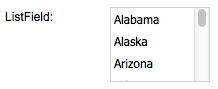
Example:
  private void createListField() {
    StateProperties properties = GWT.create(StateProperties.class);
    ListStore<State> states = new ListStore<State>(properties.abbr());
    states.addAll(TestData.getStates());

    ListView<State, String> listView = new ListView<State, String>(states, properties.nameProp());

    ListField<State, String> listField = new ListField<State, String>(listView);
    listField.setPixelSize(100, 75);

    FieldLabel fieldLabel = new FieldLabel(listField, "ListField");
    widget.add(fieldLabel);
  }
UiBinder example:
  <!-- FieldsUiBinderExample.ui.xml file -->
  <!DOCTYPE ui:UiBinder SYSTEM "http://dl.google.com/gwt/DTD/xhtml.ent">
  <ui:UiBinder
      xmlns:ui="urn:ui:com.google.gwt.uibinder"
      xmlns:form="urn:import:com.sencha.gxt.widget.core.client.form">
      <form:ListField ui:field="listField" />
  </ui:UiBinder>
UiBinder use example:
  public class FieldsUiBinderExample implements IsWidget, EntryPoint {
    private static StateProperties properties = GWT.create(StateProperties.class);

    interface StateProperties extends PropertyAccess<State> {
      ModelKeyProvider<State> abbr();
      LabelProvider<State> name();
      @Path("name")
      ValueProvider<State, String> nameProp();
    }

    interface MyUiBinder extends UiBinder<VerticalPanel, FieldsUiBinderExample> {}
    private static MyUiBinder uiBinder = GWT.create(MyUiBinder.class);

    @UiField(provided = true)
    ListStore<State> listStore = new ListStore<State>(properties.abbr());

    // initialize listField
    @UiField(provided = true)
    ListField<State, String> listField;

    @Override
    public void onModuleLoad() {
      RootPanel.get().add(asWidget());
    }

    @Override
    public Widget asWidget() {
      listStore.addAll(TestData.getStates());

      ListView<State, String> listView = new ListView<State, String>(listStore, properties.nameProp());
      listField = new ListField<State, String>(listView);

      widget = uiBinder.createAndBindUi(this);
      return widget;
    }
  }
A numeric text field that provides automatic keystroke filtering to disallow non-numeric characters, and numeric validation to limit the value to a range of valid numbers.
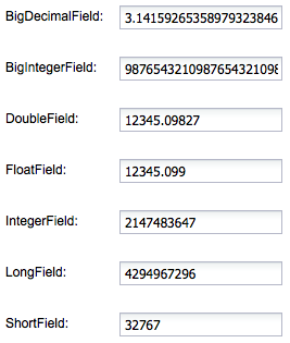
Example:
  private VerticalPanel createNumberFields() {
    BigDecimalField bigDecimalField = new BigDecimalField();
    bigDecimalField.setValue(new BigDecimal("3.1415926535897932384626433832795028841971"));

    BigIntegerField bigIntegerField = new BigIntegerField();
    bigIntegerField.setValue(new BigInteger("9876543210987654321098765432109876543210"));

    DoubleField doubleField = new DoubleField();
    doubleField.setValue(12345.09827D);

    FloatField floatField = new FloatField();
    floatField.setValue(12345.09827F);

    IntegerField integerField = new IntegerField();
    integerField.setValue(2147483647);

    LongField longField = new LongField();
    longField.setValue(4294967296L);

    ShortField shortField = new ShortField();
    shortField.setValue(Short.parseShort("32767"));

    FieldLabel bigDecimalFieldLabel = new FieldLabel(bigDecimalField, "BigDecimalField");
    FieldLabel bigIntegerFieldLabel = new FieldLabel(bigIntegerField, "BigIntegerField");
    FieldLabel doubleFieldLabel = new FieldLabel(doubleField, "DoubleField");
    FieldLabel floatFieldLabel = new FieldLabel(floatField, "FloatField");
    FieldLabel integerFieldLabel = new FieldLabel(integerField, "IntegerField");
    FieldLabel longFieldLabel = new FieldLabel(longField, "LongField");
    FieldLabel shortFieldLabel = new FieldLabel(shortField, "ShortField");

    VerticalPanel widget = new VerticalPanel();
    widget.setSpacing(VERTICAL_SPACING);
    widget.add(bigDecimalFieldLabel);
    widget.add(bigIntegerFieldLabel);
    widget.add(doubleFieldLabel);
    widget.add(floatFieldLabel);
    widget.add(integerFieldLabel);
    widget.add(longFieldLabel);
    widget.add(shortFieldLabel);

    return widget;
  }
UiBinder example:
  <!-- Number Fields -->
  <form:BigDecimalField ui:field="bigDecimalField" />
  <form:BigIntegerField ui:field="bigIntegerField" />
  <form:DoubleField ui:field="doubleField" />
  <form:IntegerField ui:field="integerField" />
  <form:LongField ui:field="longField" />
  <form:ShortField ui:field="shortField" />
A single line input field where the characters are masked to prevent them from being visible to others.
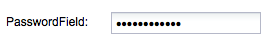
Example:
  private void createPasswordField() {
    PasswordField passwordField = new PasswordField();
    passwordField.setValue("abcdefghijkl");

    FieldLabel fieldLabel = new FieldLabel(passwordField, "PasswordField");
    widget.add(fieldLabel);
  }
UiBinder example:
<form:PasswordField ui:field="passwordField" />
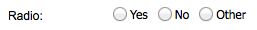
Single radio field. ValueChangeEvents are fired when the checkbox state is changed by the user, instead of waiting for a BlurEvent. Radio grouping is handled automatically by the browser if you give each radio in a group the same name or use ToggleGroup.
Example:
  private void createRadio() {
    Radio radio1 = new Radio();
    Radio radio2 = new Radio();
    Radio radio3 = new Radio();

    ToggleGroup toggleGroup = new ToggleGroup();
    toggleGroup.add(radio1);
    toggleGroup.add(radio2);
    toggleGroup.add(radio3);

    radio1.setBoxLabel("Yes");
    radio2.setBoxLabel("No");
    radio3.setBoxLabel("Other");

    HorizontalPanel horizontalPanel = new HorizontalPanel();
    horizontalPanel.add(radio1);
    horizontalPanel.add(radio2);
    horizontalPanel.add(radio3);

    FieldLabel fieldLabel = new FieldLabel(horizontalPanel, "Radio");
    widget.add(fieldLabel);
  }
UiBinder example:
  <g:HorizontalPanel>
    <g:cell>
      <form:Radio boxLabel="yes" />
    </g:cell>
    <g:cell>
      <form:Radio boxLabel="no" />
    </g:cell>
    <g:cell>
      <form:Radio boxLabel="other" />
    </g:cell>
  </g:HorizontalPanel>
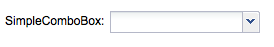
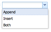
A combo box that creates and manages a ListStore of
Example:
  private void createSimpleComboBox() {
    SimpleComboBox<Feedback> simpleComboBox = new SimpleComboBox<Feedback>(new LabelProvider<Feedback>() {
      @Override
      public String getLabel(Feedback item) {
        return item.toString().substring(0, 1) + item.toString().substring(1).toLowerCase();
      }
    });
    simpleComboBox.add(Feedback.APPEND);
    simpleComboBox.add(Feedback.INSERT);
    simpleComboBox.add(Feedback.BOTH);

    FieldLabel fieldLabel = new FieldLabel(simpleComboBox, "SimpleComboBox");
    widget.add(fieldLabel);
  }
UiBinder file example:
  <!-- FieldsUiBinderExample.ui.xml file -->
  <!DOCTYPE ui:UiBinder SYSTEM "http://dl.google.com/gwt/DTD/xhtml.ent">
  <ui:UiBinder xmlns:ui='urn:ui:com.google.gwt.uibinder'
    xmlns:g='urn:import:com.google.gwt.user.client.ui'
    xmlns:gxt='urn:import:com.sencha.gxt.widget.core.client'
    xmlns:util='urn:import:com.sencha.gxt.core.client.util'
    xmlns:form='urn:import:com.sencha.gxt.widget.core.client.form'>

    <ui:with type="com.sencha.gxt.data.shared.LabelProvider" field="labelProvider" />

    <g:VerticalPanel ui:field="widget" spacing="2">
      <g:cell>
        <form:SimpleComboBox ui:field="simpleComboBox" labelProvider="{labelProvider}"/>
      </g:cell>

    </g:VerticalPanel>
  </ui:UiBinder>
UiBinder use example:
  public class FieldsUiBinderExample implements IsWidget, EntryPoint {

    private static StateProperties properties = GWT.create(StateProperties.class);

    interface StateProperties extends PropertyAccess<State> {
      ModelKeyProvider<State> abbr();

      LabelProvider<State> name();

      @Path("name")
      ValueProvider<State, String> nameProp();
    }

    interface MyUiBinder extends UiBinder<VerticalPanel, FieldsUiBinderExample> {
    }

    private static MyUiBinder uiBinder = GWT.create(MyUiBinder.class);

    @UiField(provided = true)
    LabelProvider<State> labelProvider = properties.name();

    @UiField
    SimpleComboBox simpleComboBox;

    @Override
    public void onModuleLoad() {
      RootPanel.get().add(asWidget());
    }

    @Override
    public Widget asWidget() {
      listStore.addAll(TestData.getStates());
      widget = uiBinder.createAndBindUi(this);
      return widget;
    }
  }
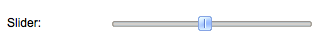
Lets the user select a value by sliding an indicator within a bounded range.
Example:
  private void createSlider() {
    Slider slider = new Slider();

    FieldLabel fieldLabel = new FieldLabel(slider, "Slider");
    widget.add(fieldLabel);
  }
UiBinder example:
<gxt:Slider ui:field="slider" />
A single line input field with up / down arrows that enable incrementing / decrementing a numeric value. A spinner field uses a number property editor to increment, decrement and format the value. See the nested classes at NumberPropertyEditor for number property editors you can use with spinner field.
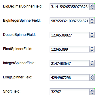
Example:
  private VerticalPanel createNumberSpinnerFields() {
    BigDecimalSpinnerField bigDecimalSpinnerField = new BigDecimalSpinnerField();
    bigDecimalSpinnerField.setValue(new BigDecimal("3.1415926535897932384626433832795028841971"));

    BigIntegerSpinnerField bigIntegerSpinnerField = new BigIntegerSpinnerField();
    bigIntegerSpinnerField.setValue(new BigInteger("9876543210987654321098765432109876543210"));

    DoubleSpinnerField doubleSpinnerField = new DoubleSpinnerField();
    doubleSpinnerField.setValue(12345.09827D);

    FloatSpinnerField floatSpinnerField = new FloatSpinnerField();
    floatSpinnerField.setValue(12345.09827F);

    IntegerSpinnerField integerSpinnerField = new IntegerSpinnerField();
    integerSpinnerField.setValue(2147483647);

    LongSpinnerField longSpinnerField = new LongSpinnerField();
    longSpinnerField.setValue(4294967296L);

    ShortSpinnerField shortSpinnerField = new ShortSpinnerField();
    shortSpinnerField.setValue(Short.parseShort("32767"));

    FieldLabel bigDecimalFieldLabel = new FieldLabel(bigDecimalSpinnerField, "BigDecimalSpinnerField");
    FieldLabel bigIntegerFieldLabel = new FieldLabel(bigIntegerSpinnerField, "BigIntegerSpinnerField");
    FieldLabel doubleFieldLabel = new FieldLabel(doubleSpinnerField, "DoubleSpinnerField");
    FieldLabel floatFieldLabel = new FieldLabel(floatSpinnerField, "FloatSpinnerField");
    FieldLabel integerFieldLabel = new FieldLabel(integerSpinnerField, "IntegerSpinnerField");
    FieldLabel longFieldLabel = new FieldLabel(longSpinnerField, "LongSpinnerField");
    FieldLabel shortFieldLabel = new FieldLabel(shortSpinnerField, "ShortField");

    bigDecimalFieldLabel.setLabelWidth(150);
    bigIntegerFieldLabel.setLabelWidth(150);
    doubleFieldLabel.setLabelWidth(150);
    floatFieldLabel.setLabelWidth(150);
    integerFieldLabel.setLabelWidth(150);
    longFieldLabel.setLabelWidth(150);
    shortFieldLabel.setLabelWidth(150);

    VerticalPanel widget = new VerticalPanel();
    widget.setSpacing(VERTICAL_SPACING);
    widget.add(bigDecimalFieldLabel);
    widget.add(bigIntegerFieldLabel);
    widget.add(doubleFieldLabel);
    widget.add(floatFieldLabel);
    widget.add(integerFieldLabel);
    widget.add(longFieldLabel);
    widget.add(shortFieldLabel);

    return widget;
  }
UiBinder example:
  <!-- Spinner Fields -->
  <form:BigDecimalField ui:field="bigDecimalSpinnerField" />
  <form:BigIntegerSpinnerField ui:field="bigIntegerSpinnerField" />
  <form:DoubleSpinnerField ui:field="doubleSpinnerField" />
  <form:IntegerSpinnerField ui:field="integerSpinnerField" />
  <form:LongSpinnerField ui:field="longSpinnerField" />
  <form:ShortSpinnerField ui:field="shortSpinnerField" />
Note: before GXT 3.0.4 SpinnerField
  SpinnerField<N> spinnerField = new SpinnerField<N>(propertEditor);
  SpinnerField<Double> spinnerField = new SpinnerField<Double>(new DoublePropertyEditor());
A split button that provides a built-in dropdown arrow that can fire an event separately from the default click event of the button.
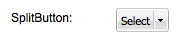
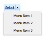
Example:
  private void createSplitButton() {
    Menu menu = new Menu();
    menu.add(new MenuItem("Menu Item 1"));
    menu.add(new MenuItem("Menu Item 2"));
    menu.add(new MenuItem("Menu Item 3"));

    SplitButton splitButton = new SplitButton();
    splitButton.setValue("Select");
    splitButton.setMenu(menu);

    FieldLabel fieldLabel = new FieldLabel(splitButton, "SplitButton");
    widget.add(fieldLabel);
  }
UiBinder example:
<button:SplitButton ui:field="splitButton" />
UiHandler example observing the splitButton select event:
  @UiHandler("splitButton")
  public void onSelectionEvent(SelectEvent event) {
  }
An abstract base class for an input field that can be bound to one or more stores to filter values, thus affecting the values displayed in any widgets associated with those stores. Store filter fields generally consist of one line of input with a trigger button for clearing the filter value. Derived classes must override doSelect(com.sencha.gxt.data.shared.Store
A combo box that displays a drop down list of Strings, optionally allowing the user to type arbitrary values in the combo box text field and adding these to the drop down list. This can be useful for saving user entered search history, recent URLs, etc.
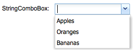
Example:
  private void createStringComboBox() {
    StringComboBox stringComboBox = new StringComboBox();
    stringComboBox.add("Apples");
    stringComboBox.add("Oranges");
    stringComboBox.add("Bananas");

    FieldLabel fieldLabel = new FieldLabel(stringComboBox, "StringComboBox");
    widget.add(fieldLabel);
  }
UiBinder example:
<form:StringComboBox ui:field="stringComboBox" />
A multiple line text input field.
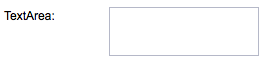
Example:
  private void createTextArea() {
    TextArea textArea = new TextArea();

    FieldLabel fieldLabel = new FieldLabel(textArea, "TextArea");
    widget.add(fieldLabel);
  }
UiBinder example:
<form:TextArea ui:field="textArea" />
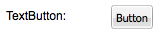
A text button.
Example:
  private void createTextArea() {
    TextArea textArea = new TextArea();

    FieldLabel fieldLabel = new FieldLabel(textArea, "TextArea");
    widget.add(fieldLabel);
  }
UiBinder example:
<button:TextButton ui:field="textButton" text="TextButton" />
UiHandler example observing the textButton select event:
  @UiHandler("textButton")
  public void onSelectionEvent(SelectEvent event) {
  }
A single line input field.
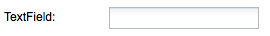
Example:
  private void createTextField() {
    TextField textField = new TextField();

    FieldLabel fieldLabel = new FieldLabel(textField, "TextField");
    widget.add(fieldLabel);
  }
UiBinder example:
<form:TextField ui:field="textField" />
Provides a time input field with a time dropdown and automatic time validation.
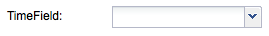
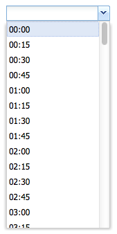
Example:
  private void createTimeField() {
    TimeField timeField = new TimeField();

    FieldLabel fieldLabel = new FieldLabel(timeField, "TimeField");
    widget.add(fieldLabel);
  }
UiBinder example:
<form:TimeField ui:field="timeField" />
A 2-state toggle button.
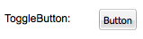
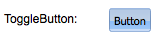
Example:
  private void createToggleButton() {
    ToggleButton toggleButton = new ToggleButton("Button");

    FieldLabel fieldLabel = new FieldLabel(toggleButton, "ToggleButton");
    widget.add(fieldLabel);
  }
UiBinder example:
<button:ToggleButton ui:field="toggleButton" text="ToggleButton" />
UiHandler example observing the toggleButton select event:
  @UiHandler("toggleButton")
  public void onSelectionEvent(SelectEvent event) {
  }
An abstract base class for an input field and a clickable trigger. The purpose of the trigger is defined by the derived class (e.g. displaying a drop down or modifying the value of the input field).
An abstract base class for an input field and two clickable triggers. The purpose of the triggers is defined by the derived class (e.g. modifying the value of the input field).
Abstract base class for fields that have a single value.


 GXT | Terms of Use
