Charts Overview
Many classes have shortcut names used when creating (instantiating) a class with a
configuration object. The shortcut name is referred to as an alias (or xtype if the
class extends Ext.Component). The alias/xtype is listed next to the class name of
applicable classes for quick reference.
Framework classes or their members may be specified as private or protected. Else,
the class / member is public. Public, protected, and private are access
descriptors used to convey how and when the class or class member should be used.
Public classes and class members are available for use by any other class or application code and may be relied upon as a stable and persistent within major product versions. Public classes and members may safely be extended via a subclass.
Protected class members are stable public members intended to be used by the
owning class or its subclasses. Protected members may safely be extended via a subclass.
Private classes and class members are used internally by the framework and are not intended to be used by application developers. Private classes and members may change or be omitted from the framework at any time without notice and should not be relied upon in application logic.
static label next to the
method name. *See Static below.Below is an example class member that we can disect to show the syntax of a class member (the lookupComponent method as viewed from the Ext.button.Button class in this case).
Let's look at each part of the member row:
lookupComponent in this example)( item ) in this example)Ext.Component in this case). This may be omitted for methods that do not
return anything other than undefined or may display as multiple possible values
separated by a forward slash / signifying that what is returned may depend on the
results of the method call (i.e. a method may return a Component if a get method calls is
successful or false if unsuccessful which would be displayed as
Ext.Component/Boolean).PROTECTED in
this example - see the Flags section below)Ext.container.Container in this example). The source
class will be displayed as a blue link if the member originates from the current class
and gray if it is inherited from an ancestor or mixed-in class.view source in the example)item : Object in the example).undefined a "Returns" section
will note the type of class or object returned and a description (Ext.Component in the
example)Available since 3.4.0 - not pictured in
the example) just after the member descriptionDefaults to: false)The API documentation uses a number of flags to further commnicate the class member's function and intent. The label may be represented by a text label, an abbreviation, or an icon.
classInstance.method1().method2().etc();false is returned from
an event handler- Indicates a framework class
- A singleton framework class. *See the singleton flag for more information
- A component-type framework class (any class within the Ext JS framework that extends Ext.Component)
- Indicates that the class, member, or guide is new in the currently viewed version
- Indicates a class member of type config
- Indicates a class member of type property
- Indicates a class member of type
method
- Indicates a class member of type event
- Indicates a class member of type
theme variable
- Indicates a class member of type
theme mixin
- Indicates that the class, member, or guide is new in the currently viewed version
Just below the class name on an API doc page is a row of buttons corresponding to the types of members owned by the current class. Each button shows a count of members by type (this count is updated as filters are applied). Clicking the button will navigate you to that member section. Hovering over the member-type button will reveal a popup menu of all members of that type for quick navigation.
Getting and setter methods that correlate to a class config option will show up in the methods section as well as in the configs section of both the API doc and the member-type menus just beneath the config they work with. The getter and setter method documentation will be found in the config row for easy reference.
Your page history is kept in localstorage and displayed (using the available real estate) just below the top title bar. By default, the only search results shown are the pages matching the product / version you're currently viewing. You can expand what is displayed by clicking on the button on the right-hand side of the history bar and choosing the "All" radio option. This will show all recent pages in the history bar for all products / versions.
Within the history config menu you will also see a listing of your recent page visits. The results are filtered by the "Current Product / Version" and "All" radio options. Clicking on the button will clear the history bar as well as the history kept in local storage.
If "All" is selected in the history config menu the checkbox option for "Show product details in the history bar" will be enabled. When checked, the product/version for each historic page will show alongside the page name in the history bar. Hovering the cursor over the page names in the history bar will also show the product/version as a tooltip.
Both API docs and guides can be searched for using the search field at the top of the page.
On API doc pages there is also a filter input field that filters the member rows using the filter string. In addition to filtering by string you can filter the class members by access level, inheritance, and read only. This is done using the checkboxes at the top of the page.
The checkbox at the bottom of the API class navigation tree filters the class list to include or exclude private classes.
Clicking on an empty search field will show your last 10 searches for quick navigation.
Each API doc page (with the exception of Javascript primitives pages) has a menu view of metadata relating to that class. This metadata view will have one or more of the following:
Ext.button.Button class has an alternate class name of Ext.Button). Alternate class
names are commonly maintained for backward compatibility.Runnable examples (Fiddles) are expanded on a page by default. You can collapse and expand example code blocks individually using the arrow on the top-left of the code block. You can also toggle the collapse state of all examples using the toggle button on the top-right of the page. The toggle-all state will be remembered between page loads.
Class members are collapsed on a page by default. You can expand and collapse members using the arrow icon on the left of the member row or globally using the expand / collapse all toggle button top-right.
Viewing the docs on narrower screens or browsers will result in a view optimized for a smaller form factor. The primary differences between the desktop and "mobile" view are:
The class source can be viewed by clicking on the class name at the top of an API doc page. The source for class members can be viewed by clicking on the "view source" link on the right-hand side of the member row.
In the drawing and charts guide, we provided an introduction to the Sencha GXT charting library. However, there is far more to the charting library than was previously covered. This article discusses the more intermediate and advanced features that you can use — including tweaking the data store backing your chart. With some simple changes to the basic chart setup, you can make your visualizations even more explanatory and expressive.
Filtering is one of the more powerful tools of the store API. Store data can be filtered without having to remove it. Here is an example of a scatter chart with a large number of points.
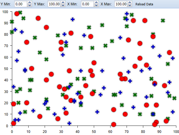
It would be useful to let the user focus on a specific range of points. This can easily be done using filters. First, be sure to enable filters on your store.
store.setEnableFilters(true);
Then, for example, you might want to display only data ranging from 0 to 50 in the first field.
store.addFilter(new StoreFilter<Data>() {
  @Override
  public boolean select(Store<Data> store, Data parent, Data item) {
    double data1 = dataAccess.data1().getValue(item);
    if (data1 < 0 || data1 > 50) {
      return false;
    } else {
      return true;
    }
  }
});
The filter chart example does similar filtering based on the values in the spinner fields. Notice the series is removed when all store items are filtered out.
Sometimes, the problem is not an over abundance of data in your store, but a lack thereof, such as when the data you are representing has gaps in its recording. In this case, the data lacks a value, so it is best for the point not to be rendered at all. Representing no value as zero can be misleading. LineSeries and ScatterSeries provide the ability to do this.
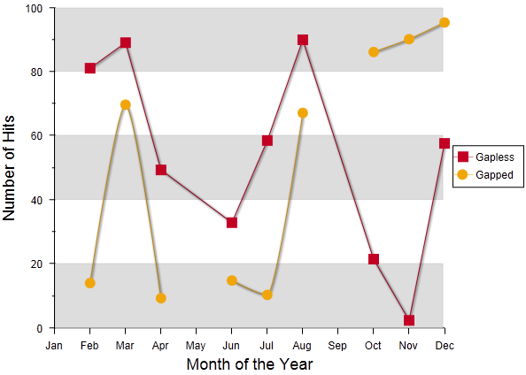
In the line gap chart example, data with gaps is simulated by storing Double.NaN every four items. Null values are also applicable for gaps in data.
for (int i = 0; i < 12; i++) {
  if (i % 4 != 0) {
    store.add(new GapData(monthsFull[i % 12], Math.random() * 100, Math.random() * 100));
  } else {
    store.add(new GapData(monthsFull[i % 12], Double.NaN, Double.NaN));
  }
}
The first series “Gapless” represents the default response where the line is still drawn over the point, but a marker is not drawn. The second series “Gapped” has the gapless flag set to false.
series2.setGapless(false);

This changes the line series to use a moveto command for the next point creating a
more visible gap in the chart.
Another great feature of the chart store relationship is integration with other GXT data widgets. Here we have a more complex example, the dashboard example, which uses two charts in collaboration with a grid.
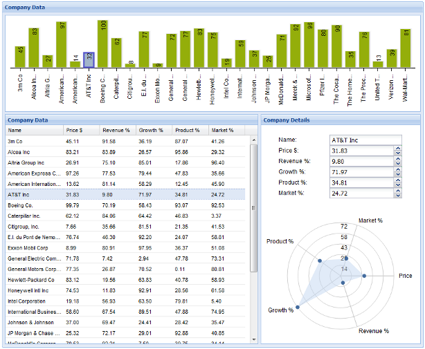
First, let’s take a look at the bar chart. It represents the overarching value and the price for each company. Because it uses the same store as the grid, this allows for easy cross widget selection. The following handler selects the appropriate grid item when a bar is selected.
bar.addSeriesSelectionHandler(new SeriesSelectionHandler<Data>() {
  @Override
  public void onSeriesSelection(SeriesSelectionEvent<Data> event) {
    grid.getSelectionModel().select(event.getIndex(), false);
  }
});
To the right of the grid, there are a set of widgets to display the finer details of the currently selected company. The radar chart is perfect for showing the relationship between the five properties of each company. You can do this by setting up the radar chart with a separate store that updates with the data that is currently in focus.
private void updateRadarStore(int index) {
  radarStore.clear();
  Data data = store.get(index);
  name.setValue(data.getName());
  radarStore.add(new RadarData(radarLabels[0], data.getData1()));
  price.setValue(data.getData1());
...
Also, notice the variable “price”. This is one of the spinner fields, which is used to manipulate the properties of the currently selected company. Each spinner field uses its value change event to update the store and the relevant chart.
price.addValueChangeHandler(new ValueChangeHandler<Double>() {
  @Override
  public void onValueChange(ValueChangeEvent<Double> event) {
    if (currentData != null) {
      Double value = event.getValue();
      if (value != null) {
        int storeIndex = store.indexOf(currentData);
        currentData.setData1(value);
        store.update(currentData);
        bar.drawSeries();
        bar.highlight(storeIndex);
        updateRadarStore(storeIndex);
        radarChart.redrawChart();
      }
    }
  }
});
Using the currently selected store item, it replaces the stored value and updates the store for that item. It then redraws the radar chart and the bar chart for the new data.
Now, looking at the core of the example, the grid, we see that both charts respond to changes in the grid. Because they use the same store, anything that alters the store on the grid also affects the bar chart, so sorting or filtering the grid causes the bar chart to respond in kind.
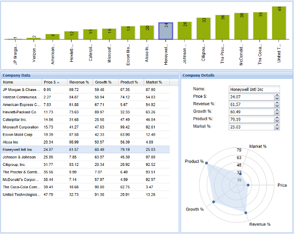
Also, when a grid row is selected, it saves the respective store item, highlights the appropriate bar and updates the company detail pane.
grid.getSelectionModel().addSelectionChangedHandler(new SelectionChangedHandler<Data>() {
  @Override
  public void onSelectionChanged(SelectionChangedEvent<Data> event) {
    if (event.getSelection().size() > 0) {
      int index = store.indexOf(event.getSelection().get(0));
      if (currentData != null) {
        bar.unHighlight(store.indexOf(currentData));
        currentData = null;
      }
      if (index >= 0) {
        bar.highlight(index);
        currentData = event.getSelection().get(0);
        // update radar chart
        updateRadarStore(index);
        radarChart.redrawChart();
      }
    }
  }
});
Hooking up these widgets makes for a more interactive and responsive application.
Finally, let’s take a look at an example of how to dynamically create line series beyond the initial number of value provider fields. All of the examples in this article use the property access method of generating value providers. However, that is not the only way to provide data fields to your charts. Value provider is simply an interface that allows you to get data from some other data.
In the dynamic line chart example, we avoid property access altogether and simply use a Map for our store items.
public class ModelItem extends HashMap<String, Double> {
  private String key;

  public ModelItem(String key) {
    this.key = key;
  }

  public String getKey() {
    return key;
  }
}

public class MapValueProvider implements ValueProvider<ModelItem, Double> {
  private String field;

  public MapValueProvider(String field) {
    this.field = field;
  }

  @Override
  public String getPath() {
    return field;
  }

  @Override
  public Double getValue(ModelItem object) {
    return object.get(field);
  }

  @Override
  public void setValue(ModelItem object, Double value) {
    object.put(field, value);
  }
}

...

ListStore<ModelItem> store = new ListStore<ModelItem>(new ModelKeyProvider<ModelItem>() {
  @Override
  public String getKey(ModelItem item) {
  return String.valueOf(item.getKey());
  }
});
This makes for a less readable but more dynamic value provider that can be created during run time; but first, the store needs to be initialized with the maps where the field data will be stored.
for (int i = 0; i < 12; i++) {
  ModelItem item = new ModelItem("item" + i);
  item.put("first", Math.random() * 100);
  store.add(item);
}
Then, let’s write a method to create a line series given an arbitrary field. Notice the new value provider is also added to the axis.
private LineSeries<ModelItem> createLine(String field) {
MapValueProvider valueProvider = new MapValueProvider(field);

LineSeries<ModelItem> series = new LineSeries<ModelItem>();
series.setYAxisPosition(Position.LEFT);
Color color = new RGB((int) (Math.random() * 255), (int) (Math.random() * 255), (int) (Math.random() * 255));
series.setStroke(color);
series.setYField(valueProvider);
Next, to make the first line using the data setup for the “first” field, we only need to call.
LineSeries<ModelItem> series = createLine("first");
chart.addSeries(series);
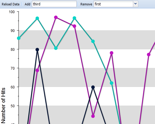
Now, when the user wants to add a new line in the example, we simply add new data to the maps in the store and create a new line with a value provider that accesses that data.
TextButton add = new TextButton("Add");
add.addSelectHandler(new SelectHandler() {
  @Override
  public void onSelect(SelectEvent event) {
    String field = fieldInput.getValue();
    if (field.length() > 0 && fieldStore.findModelWithKey(field) == null && fieldStore.size() < 10) {
      for (int i = 0; i < store.size(); i++) {
        ModelItem item = store.get(i);
        item.put(field, Math.random() * 100);
      }
      LineSeries<ModelItem> series = createLine(field);
      fieldStore.add(series);
      axis.addField(series.getYField());
      chart.addSeries(series);
      chart.redrawChart();
    }
  }
});
In this article, you got to see some of the ways you can leverage the power of Sencha GXT 3 Charts to quickly and easily develop rich, informative visualizations for your web application. We’re proud of the set of tools we’ve made available as part of GXT, and we can’t wait to see the applications you build with them.


 GXT | Terms of Use
