Appearance
Many classes have shortcut names used when creating (instantiating) a class with a
configuration object. The shortcut name is referred to as an alias (or xtype if the
class extends Ext.Component). The alias/xtype is listed next to the class name of
applicable classes for quick reference.
Framework classes or their members may be specified as private or protected. Else,
the class / member is public. Public, protected, and private are access
descriptors used to convey how and when the class or class member should be used.
Public classes and class members are available for use by any other class or application code and may be relied upon as a stable and persistent within major product versions. Public classes and members may safely be extended via a subclass.
Protected class members are stable public members intended to be used by the
owning class or its subclasses. Protected members may safely be extended via a subclass.
Private classes and class members are used internally by the framework and are not intended to be used by application developers. Private classes and members may change or be omitted from the framework at any time without notice and should not be relied upon in application logic.
static label next to the
method name. *See Static below.Below is an example class member that we can disect to show the syntax of a class member (the lookupComponent method as viewed from the Ext.button.Button class in this case).
Let's look at each part of the member row:
lookupComponent in this example)( item ) in this example)Ext.Component in this case). This may be omitted for methods that do not
return anything other than undefined or may display as multiple possible values
separated by a forward slash / signifying that what is returned may depend on the
results of the method call (i.e. a method may return a Component if a get method calls is
successful or false if unsuccessful which would be displayed as
Ext.Component/Boolean).PROTECTED in
this example - see the Flags section below)Ext.container.Container in this example). The source
class will be displayed as a blue link if the member originates from the current class
and gray if it is inherited from an ancestor or mixed-in class.view source in the example)item : Object in the example).undefined a "Returns" section
will note the type of class or object returned and a description (Ext.Component in the
example)Available since 3.4.0 - not pictured in
the example) just after the member descriptionDefaults to: false)The API documentation uses a number of flags to further commnicate the class member's function and intent. The label may be represented by a text label, an abbreviation, or an icon.
classInstance.method1().method2().etc();false is returned from
an event handler- Indicates a framework class
- A singleton framework class. *See the singleton flag for more information
- A component-type framework class (any class within the Ext JS framework that extends Ext.Component)
- Indicates that the class, member, or guide is new in the currently viewed version
- Indicates a class member of type config
- Indicates a class member of type property
- Indicates a class member of type
method
- Indicates a class member of type event
- Indicates a class member of type
theme variable
- Indicates a class member of type
theme mixin
- Indicates that the class, member, or guide is new in the currently viewed version
Just below the class name on an API doc page is a row of buttons corresponding to the types of members owned by the current class. Each button shows a count of members by type (this count is updated as filters are applied). Clicking the button will navigate you to that member section. Hovering over the member-type button will reveal a popup menu of all members of that type for quick navigation.
Getting and setter methods that correlate to a class config option will show up in the methods section as well as in the configs section of both the API doc and the member-type menus just beneath the config they work with. The getter and setter method documentation will be found in the config row for easy reference.
Your page history is kept in localstorage and displayed (using the available real estate) just below the top title bar. By default, the only search results shown are the pages matching the product / version you're currently viewing. You can expand what is displayed by clicking on the button on the right-hand side of the history bar and choosing the "All" radio option. This will show all recent pages in the history bar for all products / versions.
Within the history config menu you will also see a listing of your recent page visits. The results are filtered by the "Current Product / Version" and "All" radio options. Clicking on the button will clear the history bar as well as the history kept in local storage.
If "All" is selected in the history config menu the checkbox option for "Show product details in the history bar" will be enabled. When checked, the product/version for each historic page will show alongside the page name in the history bar. Hovering the cursor over the page names in the history bar will also show the product/version as a tooltip.
Both API docs and guides can be searched for using the search field at the top of the page.
On API doc pages there is also a filter input field that filters the member rows using the filter string. In addition to filtering by string you can filter the class members by access level, inheritance, and read only. This is done using the checkboxes at the top of the page.
The checkbox at the bottom of the API class navigation tree filters the class list to include or exclude private classes.
Clicking on an empty search field will show your last 10 searches for quick navigation.
Each API doc page (with the exception of Javascript primitives pages) has a menu view of metadata relating to that class. This metadata view will have one or more of the following:
Ext.button.Button class has an alternate class name of Ext.Button). Alternate class
names are commonly maintained for backward compatibility.Runnable examples (Fiddles) are expanded on a page by default. You can collapse and expand example code blocks individually using the arrow on the top-left of the code block. You can also toggle the collapse state of all examples using the toggle button on the top-right of the page. The toggle-all state will be remembered between page loads.
Class members are collapsed on a page by default. You can expand and collapse members using the arrow icon on the left of the member row or globally using the expand / collapse all toggle button top-right.
Viewing the docs on narrower screens or browsers will result in a view optimized for a smaller form factor. The primary differences between the desktop and "mobile" view are:
The class source can be viewed by clicking on the class name at the top of an API doc page. The source for class members can be viewed by clicking on the "view source" link on the right-hand side of the member row.
This guide is most relevant for GXT 3.0+.
In GXT 2.0, widgets are responsible for creating their DOM structure directly. This is done either by manually creating the elements or by using an HTML fragment. The HTML can be generated directly or by using an XTemplate. The CSS class names are then applied to the elements by the widgets. With this approach, a widget's view is tightly bound to the widget itself, and CSS class names are generally hardcoded into the widget.
Although this approach works, there are a few limitations. First, it is very difficult to change the DOM structure of a component because the widget is tightly bound to the its current DOM structure. Second, it's also difficult to change the style or look and feel of a widget because the CSS styles are part of the widget and are added directly to the widget's elements.
GXT 3.0 introduces a new way of rendering the view and styling a widget. This approach is very flexible and has many advantages to the previous method. It supports swapping in different DOM structures (markup) with different styles.
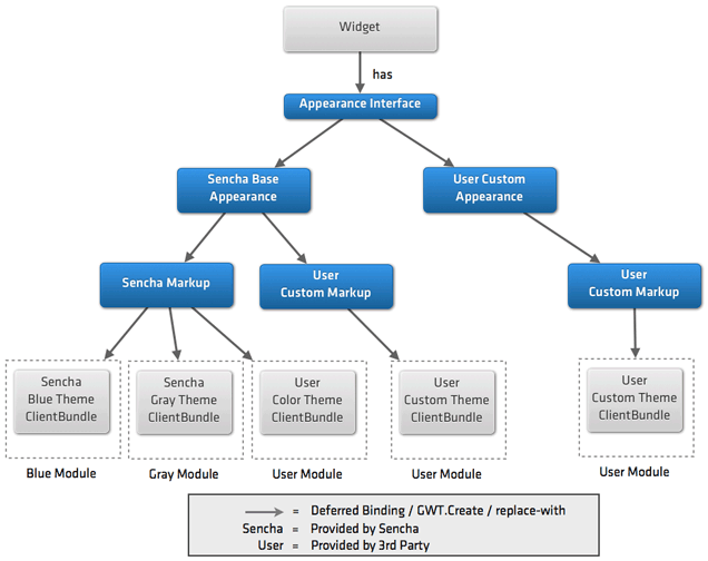
The design revolves around a concept called an appearance which is based on a new design introduced by Google. An appearance is simply a class that controls the HTML structure and style of a view implementation for a widget. An appearance is a design pattern, rather than a concrete implementation. More on GWT appearance pattern.
The best way to show how Appearances work is to walk though an example. There are many moving parts, but once you are comfortable with the concepts, it is very straightforward.
First, we create a simple widget that creates its DOM manually, and the CSS class names are assigned in the widget.
Component example:
  public class PushButton extends Component implements HasClickHandlers {
    private Element imageWrap;
    private Element textWrap;

    public PushButton(String text) {
      setElement(DOM.createDiv());

      imageWrap = DOM.createDiv();
      imageWrap.setClassName("testImage");
      getElement().appendChild(imageWrap);

      textWrap = DOM.createDiv();
      textWrap.setClassName("testText");
      getElement().appendChild(textWrap);

      setText(text);
      setStyleName("testButton");
      sinkEvents(Event.ONCLICK);
    }

    public void setText(String text) {
      textWrap.setInnerText(text);
    }

    public void setIcon(Image icon) {
      imageWrap.setInnerHTML("");
      imageWrap.appendChild(icon.getElement());
    }

    @Override
    public HandlerRegistration addClickHandler(ClickHandler handler) {
      return addDomHandler(handler, ClickEvent.getType());
    }
  }

  public class Test implements EntryPoint {
    @Override
    public void onModuleLoad() {
      PushButton button = new PushButton("Click Me");
      button.setIcon(new Image(ExampleImages.INSTANCE.add16()));
      button.setWidth(100);
      button.addClickHandler(new ClickHandler() {
          @Override
          public void onClick(ClickEvent event) {
              Info.display("Message", "The button was clicked");
          }
      });
      RootPanel.get().add(button);
    }
  }
CSS example:
  .testButton {
    border: 1px solid navy;
    font-size: 12px;
    padding: 4px;
  }

  .testButton .testImage {
    float: left;
  }

  .testButton .testText {
    text-align: center;
  }
Here is a screen shot of the widget: 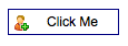
PushButton is a simple widget that displays an icon and text and fires a click event when fired. In the constructor, we manually create the DOM elements and assign the CSS class names.
Although this approach works, there are a few issues. First, since the widget creates the DOM directly, it is very difficult to change the appearance. In addition, the widget interacts with the elements directly as in the setText method. Also, the CSS for the widget is in an external CSS file. It will be better if the CSS could be part of a GWT CssResource to take advantage of the optimizations and features CssResource provides.
Now, let's take this example and apply the appearance design to it.
The first step is to create an interface that defines the interaction between the widget and an appearance instance.
public interface ExampleAppearance {
  void render(SafeHtmlBuilder sb);
  void onUpdateText(XElement parent, String text);
  void onUpdateIcon(XElement parent, Image icon);
}
When the render method is called by the parent widget, the appearance returns the HTML markup for the widget.
This is done via a SafeHtmlBuilder instance which facilitates the building up of XSS-safe HTML from text snippets.
The onUpdateText and onUpdateIcon methods are called when the appearance needs to update the button's text and icon.
Next, we create the default implementation of the appearance interface.
public static class DefaultAppearance implements Appearance {
  public interface Template extends XTemplates {
    @XTemplate(source = "DefaultAppearance.html")
    SafeHtml template(Style style);
  }

  public interface Style extends CssResource {
    String testButton();
    String testButtonText();
    String testButtonImage();
  }

  private final Style style;
  private final Template template;

  public interface Resources extends ClientBundle {
    @Source("DefaultAppearance.css")
    Style style();
  }

  public DefaultAppearance() {
    this((Resources) GWT.create(Resources.class));
  }

  public DefaultAppearance(Resources resources) {
    this.style = resources.style();
    this.style.ensureInjected();

    this.template = GWT.create(Template.class);
  }

  @Override
  public void onUpdateIcon(XElement parent, Image icon) {
    XElement element = parent.selectNode("." + style.testButtonImage());
    element.removeChildren();
    element.appendChild(icon.getElement());
  }

  @Override
  public void onUpdateText(XElement parent, String text) {
    parent.selectNode("." + style.testButtonText()).setInnerText(text);
  }

  @Override
  public void render(SafeHtmlBuilder sb) {
    sb.append(template.template(style));
  }
}
There are many parts to the default appearance. Let's walk through them:
We define our Style interface which is a CssResource. We will define the CSS that will be used by our component. By using CssResource, we are associating the CSS to our component directly rather than referencing styles pulled from an external style sheet. The CSS will be minimized and obfuscated. In addition, the CSS will be part of the application download and not retrieved via an additional HTTP request. If this widget is not used by an application, the CSS will not be part of the download. This is a vast improvement over the monolithic CSS file used in previous versions of GXT.
public interface Style extends CssResource {
  String testButton();
  String testButtonText();
  String testButtonImage();
}
Next, we create a ClientBundle subclass which will serve up any resources our widget needs.
public interface Resources extends ClientBundle {
  @Source("DefaultAppearance.css")
  Style style();
}
The CSS of DefaultAppearance is identical to the CSS used by our first example.
The appearance uses an XTemplate to generate the DOM structure. The XTemplate is passed an instance of Style to be applied to the markup.
XTemplate example:
  public interface Template extends XTemplates {
    @XTemplate(source = "DefaultAppearance.html")
    SafeHtml template(Style style);
  }
XTemplate external source example:
  <!-- file: ./DefaultAppearance.html -->
  <div class="{style.testButton}">
    <div class="{style.testImage}"></div>
    <div class="{style.testText}"></div>
  </div>
Take notice in how the class names are pulled from the Style instance passed to the template.
This is important as the actual CSS class names will be obfuscated. Also the {style.styleMethodName} are derived
from the CSSResources style. We like use a helper class StyleInjectorHelper.ensureInjected(this.style, true);
to inject that CSS immediately. With out injecting CSSResource first, cause the style calculations to be off at times.
We then create two constructors, one that accepts an appearance instance, and one that creates a default appearance instance.
Using GWT.create is important as it allows different Resource instances to be specified using deferred binding rules.
public DefaultAppearance() {
   this((Resources) GWT.create(Resources.class));
}

public DefaultAppearance(Resources resources) {
   this.style = resources.style();
   this.style.ensureInjected();
   this.template = GWT.create(Template.class);
}
Next we create our Template instance using GWT.create().
We implement the methods of the appearance interface.
@Override
public void onUpdateIcon(XElement parent, Image icon) {
  XElement element = parent.selectNode("." + style.testButtonImage());
  element.removeChildren();
  element.appendChild(icon.getElement());
}

@Override
public void onUpdateText(XElement parent, String text) {
  parent.selectNode("." + style.testButtonText()).setInnerText(text);
}

@Override
public void render(SafeHtmlBuilder sb) {
  sb.append(template.template(style));
}
The render method uses the XTemplate to generate the HTML markup. The text and image methods are implemented by working against the parent element that is passed to the methods.
Appearances are not passed the parent widget and should not maintain state, so they can be reused and also be used without the parent widget as in GWT Cells. For example, you may want to insert a push button into a grid cell.
Now that we have defined our appearance and have a concrete implementation, we can implement the widget.
private final Appearance appearance;

public AppearancePushButton(String text) {
  this(text, (Appearance) GWT.create(DefaultAppearance.class));
}

public AppearancePushButton(String text, Appearance appearance) {
  this.appearance = appearance;

  SafeHtmlBuilder sb = new SafeHtmlBuilder();
  this.appearance.render(sb);

  setElement(XDOM.create(sb.toSafeHtml()));
  setText(text);
  sinkEvents(Event.ONCLICK);
}

@Override
public HandlerRegistration addClickHandler(ClickHandler handler) {
  return addDomHandler(handler, ClickEvent.getType());
}

public void setText(String text) {
  appearance.onUpdateText(getElement(), text);
}

public void setImage(Image icon) {
  appearance.onUpdateIcon(getElement(), icon);
}
You will notice that the widget is not bound to the DOM or styles of the appearance directly. Rather, the widget delegates its view work to the appearance.
Now, using deferred binding, or directly, PushButton can work with different appearances.
There are several reason to have multiple appearances:
Different browser capabilities. You may have an appearance that uses CSS3 gradients and CSS3 rounded corners and a different appearance that uses images and a different DOM structure to look the same as the CSS3 version.
You can have different appearances for different devices such as desktop and mobile. This is great as you can have a single widget that works in both desktop and browser rather than having two different components.
Theming is also supported. A theme module can override the default styles or markup used by a widget.
The appearance design is a very flexible way to generate the view for a widget. The customizations can happen at three levels:
An example rule might look like this:
<replace-with class="PushButton.CustomAppearance">
<when-type-is class="PushButton.Appearance">
<any>
<when-property-is name="user.agent" value="ie6">
<when-property-is name="user.agent" value="ie8">
</when-property-is></when-property-is></any>
</when-type-is></replace-with>
We are applying the Appearance pattern to all widgets in the library. This will result in both better performance and customization possibilities.


 GXT | Terms of Use
