Theming
The documentation for the ExtReact product diverges somewhat from the
documentation of other Sencha products. The sections below describe
documentation for all products except where indicated as unique to
ExtReact.
Many classes have shortcut names used when creating (instantiating) a class with a
configuration object. The shortcut name is referred to as an alias (or xtype if the
class extends Ext.Component). The alias/xtype is listed next to the class name of
applicable classes for quick reference.
ExtReact component classes list the configurable name prominently at the top of the API class doc followed by the fully-qualified class name.
Framework classes or their members may be specified as private or protected. Else,
the class / member is public. Public, protected, and private are access
descriptors used to convey how and when the class or class member should be used.
Public classes and class members are available for use by any other class or application code and may be relied upon as a stable and persistent within major product versions. Public classes and members may safely be extended via a subclass.
Protected class members are stable public members intended to be used by the
owning class or its subclasses. Protected members may safely be extended via a subclass.
Private classes and class members are used internally by the framework and are not intended to be used by application developers. Private classes and members may change or be omitted from the framework at any time without notice and should not be relied upon in application logic.
ExtReact component classes display
configuration options as props
ExtReact component classes do not list
properties as a dedicated member type, but rather as
read only props
static label next to the
method name. *See Static below.Below is an example class member that we can disect to show the syntax of a class member (the lookupComponent method as viewed from the Ext.button.Button class in this case).
Let's look at each part of the member row:
lookupComponent in this example)( item ) in this example)Ext.Component in this case). This may be omitted for methods that do not
return anything other than undefined or may display as multiple possible values
separated by a forward slash / signifying that what is returned may depend on the
results of the method call (i.e. a method may return a Component if a get method calls is
successful or false if unsuccessful which would be displayed as
Ext.Component/Boolean).PROTECTED in
this example - see the Flags section below)Ext.container.Container in this example). The source
class will be displayed as a blue link if the member originates from the current class
and gray if it is inherited from an ancestor or mixed-in class.view source in the example)item : Object in the example).undefined a "Returns" section
will note the type of class or object returned and a description (Ext.Component in the
example)Available since 3.4.0 - not pictured in
the example) just after the member descriptionDefaults to: false)The API documentation uses a number of flags to further commnicate the class member's function and intent. The label may be represented by a text label, an abbreviation, or an icon.
All ExtReact props are bindable
unless decorated as immutable
Immutable ExtReact props may not be use as a configurable prop when instantiating a component
classInstance.method1().method2().etc();false is returned from
an event handler- Indicates a framework class
- A singleton framework class. *See the singleton flag for more information
- A component-type framework class (any class within the Ext JS framework that extends Ext.Component)
- Indicates that the class, member, or guide is new in the currently viewed version
- Indicates a class member of type config
Or in the case of an ExtReact component class this
indicates a member of type prop
- Indicates a class member of type property
- Indicates a class member of type
method
- Indicates a class member of type event
- Indicates a class member of type
theme variable
- Indicates a class member of type
theme mixin
- Indicates that the class, member, or guide is new in the currently viewed version
Just below the class name on an API doc page is a row of buttons corresponding to the types of members owned by the current class. Each button shows a count of members by type (this count is updated as filters are applied). Clicking the button will navigate you to that member section. Hovering over the member-type button will reveal a popup menu of all members of that type for quick navigation.
Getting and setter methods that correlate to a class config option will show up in the methods section as well as in the configs section of both the API doc and the member-type menus just beneath the config they work with. The getter and setter method documentation will be found in the config row for easy reference.
ExtReact component classes do not hoist the getter /
setter methods into the prop. All methods will be described in the
Methods section
Your page history is kept in localstorage and displayed (using the available real estate) just below the top title bar. By default, the only search results shown are the pages matching the product / version you're currently viewing. You can expand what is displayed by clicking on the button on the right-hand side of the history bar and choosing the "All" radio option. This will show all recent pages in the history bar for all products / versions.
Within the history config menu you will also see a listing of your recent page visits. The results are filtered by the "Current Product / Version" and "All" radio options. Clicking on the button will clear the history bar as well as the history kept in local storage.
If "All" is selected in the history config menu the checkbox option for "Show product details in the history bar" will be enabled. When checked, the product/version for each historic page will show alongside the page name in the history bar. Hovering the cursor over the page names in the history bar will also show the product/version as a tooltip.
Both API docs and guides can be searched for using the search field at the top of the page.
On API doc pages there is also a filter input field that filters the member rows using the filter string. In addition to filtering by string you can filter the class members by access level, inheritance, and read only. This is done using the checkboxes at the top of the page.
The checkbox at the bottom of the API class navigation tree filters the class list to include or exclude private classes.
Clicking on an empty search field will show your last 10 searches for quick navigation.
Each API doc page (with the exception of Javascript primitives pages) has a menu view of metadata relating to that class. This metadata view will have one or more of the following:
Ext.button.Button class has an alternate class name of Ext.Button). Alternate class
names are commonly maintained for backward compatibility.Runnable examples (Fiddles) are expanded on a page by default. You can collapse and expand example code blocks individually using the arrow on the top-left of the code block. You can also toggle the collapse state of all examples using the toggle button on the top-right of the page. The toggle-all state will be remembered between page loads.
Class members are collapsed on a page by default. You can expand and collapse members using the arrow icon on the left of the member row or globally using the expand / collapse all toggle button top-right.
Viewing the docs on narrower screens or browsers will result in a view optimized for a smaller form factor. The primary differences between the desktop and "mobile" view are:
The class source can be viewed by clicking on the class name at the top of an API doc page. The source for class members can be viewed by clicking on the "view source" link on the right-hand side of the member row.
ExtReact includes a theming API that allows you to configure the look and feel of components. This guide explains the basics of the ExtReact theming API and walks you through the process of creating a custom theme.
Custom themes for ExtReact can also be created without writing code using Sencha Themer.
ExtReact contains several built in themes:
| Theme | Description |
|---|---|
| theme-material | The default theme - based on Google's material design guidelines |
| theme-ios | Based on the look and feel of iOS |
| theme-triton | A simple, flat theme |
| theme-neptune | A theme with gradients |
Set the theme for your application using the ExtReact webpack plugin:
// example webpack.config.js

const ExtReactWebpackPlugin = require('@extjs/reactor-webpack-plugin');

module.exports = {
  ...
  plugins: [
    new ExtReactWebpackPlugin({
      theme: 'theme-material' // this is the default
    })
  ]
  ...
}
Built-in themes can be extended to create a custom theme. With the @extjs/reactor package installed, you can create a custom theme by running the following command:
npm install -g @extjs/reactor # adds ext-react cli to your path

ext-react generate theme --name <theme-name> --baseTheme <theme-material|theme-ios|theme-triton (optional, defaults to theme-material)>
This will create a new custom theme in ext-react/packages/<theme-name>.
For example, to create a new theme called "my-theme" which extends the material theme, you would run:
ext-react generate theme --name my-theme
Apply the theme to your app by updating your ExtReactWebpackPlugin settings:
new ExtReactWebpackPlugin({
  theme: './ext-react/packages/<theme-name>' // this is the default
})
*Note: theme-triton and theme-ios are separate npm packages that are not included with ExtReact by default. You can install them by running:
npm install --save @extjs/ext-react-theme-triton @extjs/ext-react-theme-ios
An ExtReact theme is made up of files that use the Fashion syntax, Sencha's own dialect of SASS. Files use the .scss extension and are organized in the following directory structure:
/sass
  /etc
  /src
  /var
The etc directory contains additional utility functions or mixins. The all.scss file is automatically included in the build if present. Additional files can be included via an @import directive or added to the theme's package.json under sencha/sass/etc.
The src directory contains rules and UI mixin calls that can use the variables defined in sass/var/. File paths correspond to ExtReact namespaces and are only included in the build if the corresponding class is used in your application. The namespace for each component can be found in the API documentation. For example, to define a ui for a List, which has a fully qualified name of Ext.dataview.List, create:
/sass
  /src
    /Ext
      /dataview
        List.scss
In addition to including files based on fully-qualified name, you can also add individual files to the theme's package.json, under sencha.sass.src, or use the @import directive.
The var directory contains global variables. As with src, file paths correspond to the component namespaces. In addition to including files based on fully-qualified name, you can add individual files to the theme's package.json, under sencha.sass.var, or use the @import directive.
The best way to start customizing a theme is to set the values of global variables. Each component has it's own set of global variables that affect the look and feel of all instances of that component. For example, we can change the font-family for Panel headers by creating:
/sass
  /var
    /Ext
      /Panel.scss
...and adding the following content...
// Panel.scss
$panel-header-font-family: 'Comic Sans';
In addition to the variables provided for each component, there are a number of variables that affect all components. These are listed in Global_CSS in the API documentation.
For example, to set a new $base-color for the theme, create:
/sass
  /var
    /Ext
      /Component.scss
...and add the following content...
// Component.scss
$base-color: #025B80;
Some developers may prefer to put all of their global variables in a single file. This can be done by simply putting them all in var/Ext/Component.scss or by creating a file of your choice and adding it to sencha.sass.var in the theme's package.json.
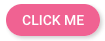
Each component can be configured with a ui prop that accepts the names of one or more uis used to style the component. UIs are essentially a set of css classes created using mixins provided by the theming API. UIs are defined in the theme's sass/src directory. For example, if we wanted to create a button that looked like this:

We could do so by creating:
/sass
  /src
    /Ext
      /Button.scss
...and adding the following content...
// Button.scss
@include button-ui(
  $ui: 'pink',
  $background-color: #E91E63,
  $color: white
)
We would then apply the "pink" ui to Buttons as follows:
<Button ui="pink" text="Click Me"/>
Components can be configured with multiple UIs. For example, we can add the built-in round and raised uis to make our button round and raised:
<Button ui="pink round raised" text="Click Me"/>
Many variables and ui mixin parameters have a corresponding variable or parameter with the suffix -big. The -big variables take effect when the x-big css class is applied to the html body element. This automatically occurs when your application is viewed on a mobile device (tablet or phone). The variables without the -big suffix take effect when the application is viewed on the desktop.


 ExtReact | Terms of Use
