What's New in Ext JS 5.1
Many classes have shortcut names used when creating (instantiating) a class with a
configuration object. The shortcut name is referred to as an alias (or xtype if the
class extends Ext.Component). The alias/xtype is listed next to the class name of
applicable classes for quick reference.
Framework classes or their members may be specified as private or protected. Else,
the class / member is public. Public, protected, and private are access
descriptors used to convey how and when the class or class member should be used.
Public classes and class members are available for use by any other class or application code and may be relied upon as a stable and persistent within major product versions. Public classes and members may safely be extended via a subclass.
Protected class members are stable public members intended to be used by the
owning class or its subclasses. Protected members may safely be extended via a subclass.
Private classes and class members are used internally by the framework and are not intended to be used by application developers. Private classes and members may change or be omitted from the framework at any time without notice and should not be relied upon in application logic.
static label next to the
method name. *See Static below.Below is an example class member that we can disect to show the syntax of a class member (the lookupComponent method as viewed from the Ext.button.Button class in this case).
Let's look at each part of the member row:
lookupComponent in this example)( item ) in this example)Ext.Component in this case). This may be omitted for methods that do not
return anything other than undefined or may display as multiple possible values
separated by a forward slash / signifying that what is returned may depend on the
results of the method call (i.e. a method may return a Component if a get method calls is
successful or false if unsuccessful which would be displayed as
Ext.Component/Boolean).PROTECTED in
this example - see the Flags section below)Ext.container.Container in this example). The source
class will be displayed as a blue link if the member originates from the current class
and gray if it is inherited from an ancestor or mixed-in class.view source in the example)item : Object in the example).undefined a "Returns" section
will note the type of class or object returned and a description (Ext.Component in the
example)Available since 3.4.0 - not pictured in
the example) just after the member descriptionDefaults to: false)The API documentation uses a number of flags to further commnicate the class member's function and intent. The label may be represented by a text label, an abbreviation, or an icon.
classInstance.method1().method2().etc();false is returned from
an event handler- Indicates a framework class
- A singleton framework class. *See the singleton flag for more information
- A component-type framework class (any class within the Ext JS framework that extends Ext.Component)
- Indicates that the class, member, or guide is new in the currently viewed version
- Indicates a class member of type config
- Indicates a class member of type property
- Indicates a class member of type
method
- Indicates a class member of type event
- Indicates a class member of type
theme variable
- Indicates a class member of type
theme mixin
- Indicates that the class, member, or guide is new in the currently viewed version
Just below the class name on an API doc page is a row of buttons corresponding to the types of members owned by the current class. Each button shows a count of members by type (this count is updated as filters are applied). Clicking the button will navigate you to that member section. Hovering over the member-type button will reveal a popup menu of all members of that type for quick navigation.
Getting and setter methods that correlate to a class config option will show up in the methods section as well as in the configs section of both the API doc and the member-type menus just beneath the config they work with. The getter and setter method documentation will be found in the config row for easy reference.
Your page history is kept in localstorage and displayed (using the available real estate) just below the top title bar. By default, the only search results shown are the pages matching the product / version you're currently viewing. You can expand what is displayed by clicking on the button on the right-hand side of the history bar and choosing the "All" radio option. This will show all recent pages in the history bar for all products / versions.
Within the history config menu you will also see a listing of your recent page visits. The results are filtered by the "Current Product / Version" and "All" radio options. Clicking on the button will clear the history bar as well as the history kept in local storage.
If "All" is selected in the history config menu the checkbox option for "Show product details in the history bar" will be enabled. When checked, the product/version for each historic page will show alongside the page name in the history bar. Hovering the cursor over the page names in the history bar will also show the product/version as a tooltip.
Both API docs and guides can be searched for using the search field at the top of the page.
On API doc pages there is also a filter input field that filters the member rows using the filter string. In addition to filtering by string you can filter the class members by access level, inheritance, and read only. This is done using the checkboxes at the top of the page.
The checkbox at the bottom of the API class navigation tree filters the class list to include or exclude private classes.
Clicking on an empty search field will show your last 10 searches for quick navigation.
Each API doc page (with the exception of Javascript primitives pages) has a menu view of metadata relating to that class. This metadata view will have one or more of the following:
Ext.button.Button class has an alternate class name of Ext.Button). Alternate class
names are commonly maintained for backward compatibility.Runnable examples (Fiddles) are expanded on a page by default. You can collapse and expand example code blocks individually using the arrow on the top-left of the code block. You can also toggle the collapse state of all examples using the toggle button on the top-right of the page. The toggle-all state will be remembered between page loads.
Class members are collapsed on a page by default. You can expand and collapse members using the arrow icon on the left of the member row or globally using the expand / collapse all toggle button top-right.
Viewing the docs on narrower screens or browsers will result in a view optimized for a smaller form factor. The primary differences between the desktop and "mobile" view are:
The class source can be viewed by clicking on the class name at the top of an API doc page. The source for class members can be viewed by clicking on the "view source" link on the right-hand side of the member row.
Since Ext JS 5.0.1, we've been hard at work adding exciting new features and responding to all the great feedback from the Sencha Community. Ext JS 5.1 comes with an entirely new selection mode for our grids (the spreadsheet model), along with other new components, and enhancements including:
You can get started with Ext JS 5.1 by visiting the product page.
For information about updating to Ext JS 5.1, please read our Ext JS Upgrade Guide.
Now let's take a look as some of the new features in Ext JS 5.1!
Note: Ext JS 5.1 does require the newest version of Sencha Cmd, which is Sencha Cmd 5.1.
The Ext JS Grid has always been the centerpiece of the framework. With Ext JS 5.1, we're adding a brand new selection model that mimics the experience of a spreadsheet. The spreadsheet model. Using this model, users can select cell ranges as seen below.
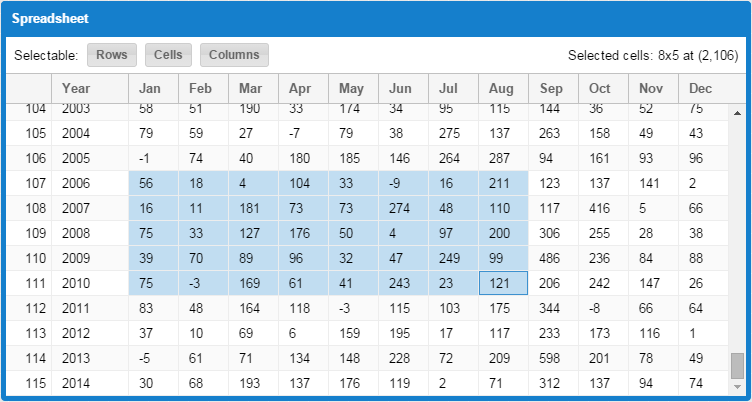
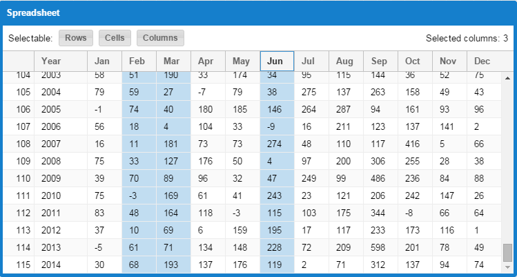
Users may also select cell ranges as entire columns, rows or the entire data set.
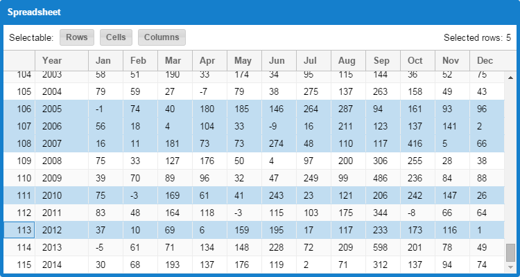
You can even enable row check-boxes such that spreadsheet may be the only selection model you'll ever need.
When using the spreadsheet selection model, you can also add the new clipboard plugin. This plugin enables exchange between your grid and other applications running outside the browser. Users can select a range of data, then press CTRL+C (or Command+C on Mac) to copy those cells to the system clipboard. Users may then switch to an application such as Microsoft Excel and paste their data.
Of course, the reverse also works. Users can copy data to the clipboard in an external application and then select the target cell in the grid and press CTRL+V (or Command+V on Mac) to paste.
All of this functionality can be added to a grid like so:
requires: [

    'Ext.grid.selection.SpreadsheetModel',

    'Ext.grid.plugin.Clipboard'

],

selModel: {

    type: 'spreadsheet',

    columnSelect: true  // replaces click-to-sort on header

},

plugins: 'clipboard'
By default, the clipboard plugin uses your system clipboard. However, you may also use an internal buffer to exchange custom data formats between grids within your application.
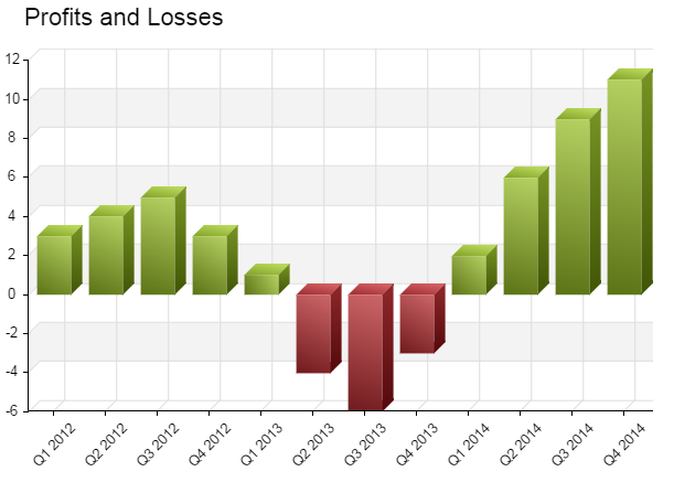
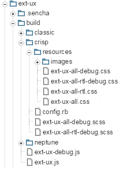
The sencha-charts package now provides a "bar3d" series and a "numeric3d" axis. These new additions combine to produce some beautiful results like the following stacked column chart.

By providing a custom renderer method, you can simply adjust the fillStyle of a column and still get all the proper gradients to maintain the 3D appearance:
And let's not forget bar charts:

Stacked charts have two new configs in addition to 3D support:
These configs allow the chart to have any data in the store and instruct the series to dynamically scale the data at display time to fit a specified range (typically 0% to 100%).
To enable full stacking, just set the series fullStack config to true. By default, all y fields of the series are stacked with a total of 100, to represent percentages. Using fullStackTotal, you can, however, scale the axis to any range.
Finally, with charts, you can now wire up item-level events such as itemtap and itemmousemove by adding the new "chartitemevents" plugin to your chart.
You may recall the color picker component we introduced in a previous article:
Now, there are actually three color picker components. The above example shows the colorfield and colorselector. The colorfield component is the form field that displays the color value and a sample swatch. The colorselector is presented in the popup window.
The third color picker is the colorbutton which is just the color swatch that reacts to clicks to display a colorselector.
These components are part of the Ext.ux namespace and now live in the framework's "ext-ux" package. More on "ext-ux" package below.
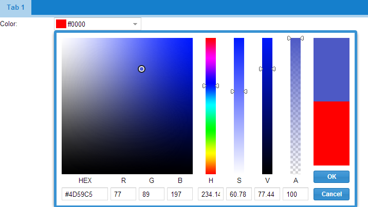
The new rating widget (from this previous article) is now also part of the "ext-ux" package:
The rating widget is like a slider that allows the user to quickly pick a value in a limited range. Unlike a slider, a rating uses repeated glyphs (web fonts) to represent a selection and a single click adjusts the value.
One of the frequently requested features for Direct subsystem was support for
passing metadata with CRUD operations in a Proxy. Previously this was implemented
only for Read operations using extraParams property on the Proxy; unfortunately
that approach made it near impossible to support CUD operations as well.
Starting with Ext JS 5.1, any Direct method invocation can be supplied with metadata
that will be passed to the server side separately from method arguments. This
feature is immediately available with Direct proxy as well via the new metadata
property that can be used instead of extraParams with full range of CRUD operations.
Previously the only pattern available to use with Direct Remoting providers was to include a link to the Provider's API declaration in application's HTML boilerplate and create a Provider instance manually. That approach was often cumbersome, prone to race conditions, and hard to fit in an application built to MVC standards.
The new loadProvider method of the Ext.direct.Manager singleton helps to make
using Direct providers easier by handling the complexity behind the scenes.
The old Direct examples have been moved to KitchenSink to showcase Direct enabled MVC application and new features described above.
In previous versions of the framework, the Ext.ux namespace was developed in the "examples/ux" folder. This has always been a challenge for theme interaction, so with Ext JS 5.1 we have added an "ext-ux" package to contain these components. Over time, the existing members of Ext.ux will either be migrated to "ext-ux" or promoted to the framework proper.
To use "ext-ux" package in a Sencha Cmd application, you simple add it to your app.json file:
"requires": [

    "ext-ux"

]
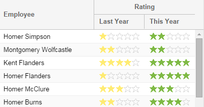
As a standard package, the ext-ux build outputs are available to those not using Sencha Cmd as well. The "build" folder looks like this:
The JavaScript files "ext-ux.js" and "ext-ux-debug.js" are in the top-level build folder. Based on your application's theme, you would then select from the three theme subfolders with compiled CSS and resources.
The Ext.draw package in "sencha-charts" also has some exciting new features for those going beyond simple charts.
You can now process sprite events such as itemtap or itemmouseover by adding the "spriteevents" plugin to the Ext.draw.Container.
We've added new APIs to allow you to hit test points against complex paths: pointInPath and pointOnPath. Also, here are a couple of examples to show the new APIs at work:
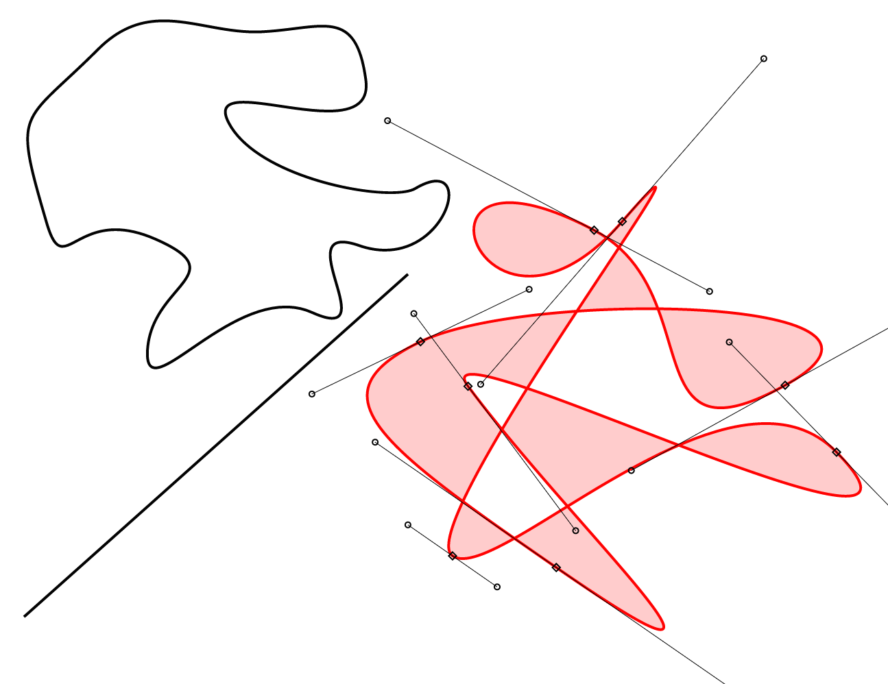
You can also intersect two entire paths and process their intersection points. In another new example, you can drag paths around and see the intersections highlighted as you move.
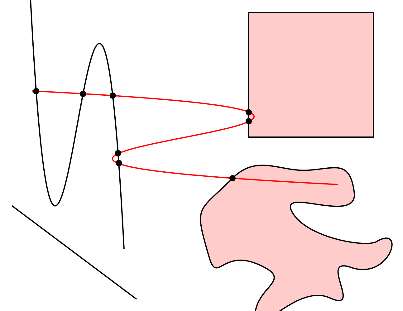
The details of intersecting simple lines or complex shapes that consist of multiple bezier curve segments are hidden away, so you won't need to worry about the content of paths.
As you may already know, with Ext JS 5.x, we've been working on a shared "sencha-core" package. In this release, we are moving Ext.app (our MVC and MVVM classes) to the core and finalizing the event system.
Originally found in Sencha Touch, Ext.app.Profile is now in sencha-core along with the rest of the Ext.app namespace. In other words, the unified MVC/MVVM feature set is now in the shared code arena. So now that Ext JS 5.1 applications have access to Ext.app.Profile, the logical questions are "how does it work" and "what does it provide".
If you've never used Sencha Touch profiles before, they are basically like miniature applications. Applications then list the desired profiles in their profiles config. At launch time, the framework will create an instance of all of these profiles. It will then iterate the list in order and call the isActive method. The first profile instance to return true is considered the active (or current) profile.
One obvious use for a profile (say for "tablet" or "desktop") is to control the top-level view to present to the user. With Ext JS 5.1, there is a new mainView config that the application or profile can specify. This config supersedes the "autoCreateViewport" config for older Ext JS applications.
Prior to Ext.app.Profile, Ext JS 5.0 applications could use responsiveConfig (via a plugin or mixin) for run-time choices or Sencha Cmd build profiles to generate target-specific builds. Application profiles sit in the middle of these two options.
Application profiles are executed at load time and hence can do whatever is needed. They aren't limited to setting config properties like a responsiveConfig. Because they must be included in the build, however, they will add to the size and space requirements of your application regardless of the device on which it is run. Using a build profile, however, you would be able to remove Android-specific content from an iOS-only build for the Apple App Store.
With Ext JS 5.0, we introduced the new multi-device, touch-enabled event system derived from Sencha Touch. This supported the momentum scroller and gesture recognition system and the delegated event model of Ext.Element. The entry point of the new event system was Ext.mixin.Observable. The original Ext JS event system, however, was provided by Ext.util.Observable. The APIs for these two classes were mostly the same, but they differed on some of the less common uses cases.
The unified event system in Ext JS 5.1 still provides these two classes (for compatibility reasons), but now the only difference between them is that Ext.mixin.Observable calls initConfig in its constructor whereas Ext.util.Observable uses the legacy Ext.apply approach to copy config object properties onto the instance.
In the process of completing the unification, we were able to optimize event listening and firing, thereby reducing overhead in these critical areas. Be sure to check the Ext JS Upgrade Guide for known compatibility issues.
Ext JS 5.1 continues to expand on the major accessibility support delivered in Ext JS 5.0.1. In particular, handling of various popup elements (from ComboBox to various menus) has been improved. The way cascades of such popups process focus and blur events has also been hardened.
With many touch-enabled devices, special logic is needed to efficiently manage scrolling. To normalize all this device-specific behavior, Ext JS 5.1 adds Ext.scroll.Scroller. An instance of this class is created by the framework when using configs like autoScroll, overflowX and overflowY configs, but it can now be more fully controlled using the new scrollable config.
If you are familiar with Sencha Touch, you will likely recognize this config. With Ext JS 5.1, however, it can now be a config object for the Scroller. To retrieve the Scroller, you call getScrollable. This object provides useful APIs like scrollTo and scrollBy, so you no longer need to worry about how the scrolling is managed on the current device.
If you have configs like these in your application...
autoScroll: true

// or perhaps just horizontal:
overflowX: true

// or maybe just vertical:
overflowY: true
The above notation will continue to work. However, the following would be equivalent and preferred in Ext JS 5.1:
scrollable: true  // equivalent to autoScroll: true

scrollable: 'x'   // equivalent to overflowX: true

scrollable: 'y'   // equivalent to overflowY: true
Last but not least, Sencha Cmd 5.1 is also now available. This release is focused on performance and introduces a new compiler optimization. The new optimization, called "cssPrefix", optimizes framework code that supports using multiple versions of Ext JS on the same page. Called "sandboxing", it requires code like this:
rowCls: Ext.baseCSSPrefix + 'grid-row',
The new optimization replaces the above with something like:
rowCls: 'x-grid-row',
This eliminates hundreds of such concatenations in a normal app (over a thousand for the entire framework). To take advantage of this optimization, you should see something like this in your app.json:
"output": {
    "js": {
        "optimize": true
    }
}
To expand all the optimizations available at present, you would have this:
"output": {
    "js": {
        "optimize": {
            "callParent": true,
            "cssPrefix": true,
            "defines": true
        }
    }
}
If you use Sencha Cmd, you will need this version to work with Ext JS 5.1. As always, Sencha Cmd 5.1 supports all the previous framework versions from
In addition to all the new features mentioned above, there are numerous bug fixes and other enhancements. Let us know what you think by submitting comments on the forums.


 Ext JS | Terms of Use
