Ext JS 4.2 to 5
Many classes have shortcut names used when creating (instantiating) a class with a
configuration object. The shortcut name is referred to as an alias (or xtype if the
class extends Ext.Component). The alias/xtype is listed next to the class name of
applicable classes for quick reference.
Framework classes or their members may be specified as private or protected. Else,
the class / member is public. Public, protected, and private are access
descriptors used to convey how and when the class or class member should be used.
Public classes and class members are available for use by any other class or application code and may be relied upon as a stable and persistent within major product versions. Public classes and members may safely be extended via a subclass.
Protected class members are stable public members intended to be used by the
owning class or its subclasses. Protected members may safely be extended via a subclass.
Private classes and class members are used internally by the framework and are not intended to be used by application developers. Private classes and members may change or be omitted from the framework at any time without notice and should not be relied upon in application logic.
static label next to the
method name. *See Static below.Below is an example class member that we can disect to show the syntax of a class member (the lookupComponent method as viewed from the Ext.button.Button class in this case).
Let's look at each part of the member row:
lookupComponent in this example)( item ) in this example)Ext.Component in this case). This may be omitted for methods that do not
return anything other than undefined or may display as multiple possible values
separated by a forward slash / signifying that what is returned may depend on the
results of the method call (i.e. a method may return a Component if a get method calls is
successful or false if unsuccessful which would be displayed as
Ext.Component/Boolean).PROTECTED in
this example - see the Flags section below)Ext.container.Container in this example). The source
class will be displayed as a blue link if the member originates from the current class
and gray if it is inherited from an ancestor or mixed-in class.view source in the example)item : Object in the example).undefined a "Returns" section
will note the type of class or object returned and a description (Ext.Component in the
example)Available since 3.4.0 - not pictured in
the example) just after the member descriptionDefaults to: false)The API documentation uses a number of flags to further commnicate the class member's function and intent. The label may be represented by a text label, an abbreviation, or an icon.
classInstance.method1().method2().etc();false is returned from
an event handler- Indicates a framework class
- A singleton framework class. *See the singleton flag for more information
- A component-type framework class (any class within the Ext JS framework that extends Ext.Component)
- Indicates that the class, member, or guide is new in the currently viewed version
- Indicates a class member of type config
- Indicates a class member of type property
- Indicates a class member of type
method
- Indicates a class member of type event
- Indicates a class member of type
theme variable
- Indicates a class member of type
theme mixin
- Indicates that the class, member, or guide is new in the currently viewed version
Just below the class name on an API doc page is a row of buttons corresponding to the types of members owned by the current class. Each button shows a count of members by type (this count is updated as filters are applied). Clicking the button will navigate you to that member section. Hovering over the member-type button will reveal a popup menu of all members of that type for quick navigation.
Getting and setter methods that correlate to a class config option will show up in the methods section as well as in the configs section of both the API doc and the member-type menus just beneath the config they work with. The getter and setter method documentation will be found in the config row for easy reference.
Your page history is kept in localstorage and displayed (using the available real estate) just below the top title bar. By default, the only search results shown are the pages matching the product / version you're currently viewing. You can expand what is displayed by clicking on the button on the right-hand side of the history bar and choosing the "All" radio option. This will show all recent pages in the history bar for all products / versions.
Within the history config menu you will also see a listing of your recent page visits. The results are filtered by the "Current Product / Version" and "All" radio options. Clicking on the button will clear the history bar as well as the history kept in local storage.
If "All" is selected in the history config menu the checkbox option for "Show product details in the history bar" will be enabled. When checked, the product/version for each historic page will show alongside the page name in the history bar. Hovering the cursor over the page names in the history bar will also show the product/version as a tooltip.
Both API docs and guides can be searched for using the search field at the top of the page.
On API doc pages there is also a filter input field that filters the member rows using the filter string. In addition to filtering by string you can filter the class members by access level, inheritance, and read only. This is done using the checkboxes at the top of the page.
The checkbox at the bottom of the API class navigation tree filters the class list to include or exclude private classes.
Clicking on an empty search field will show your last 10 searches for quick navigation.
Each API doc page (with the exception of Javascript primitives pages) has a menu view of metadata relating to that class. This metadata view will have one or more of the following:
Ext.button.Button class has an alternate class name of Ext.Button). Alternate class
names are commonly maintained for backward compatibility.Runnable examples (Fiddles) are expanded on a page by default. You can collapse and expand example code blocks individually using the arrow on the top-left of the code block. You can also toggle the collapse state of all examples using the toggle button on the top-right of the page. The toggle-all state will be remembered between page loads.
Class members are collapsed on a page by default. You can expand and collapse members using the arrow icon on the left of the member row or globally using the expand / collapse all toggle button top-right.
Viewing the docs on narrower screens or browsers will result in a view optimized for a smaller form factor. The primary differences between the desktop and "mobile" view are:
The class source can be viewed by clicking on the class name at the top of an API doc page. The source for class members can be viewed by clicking on the "view source" link on the right-hand side of the member row.
With Ext JS 5, we have tried to maximize backwards compatibility, while:
Ext JS 5 introduces support for the MVVM architecture as well as improvements on the (C) in MVC. While we encourage you to investigate and take advantage of these improvements, it is important to note that we have made every effort to ensure existing Ext JS 4 MVC applications continue to function unmodified.
This guide lays out the major areas to be aware of when planning your upgrade to Ext JS 5.
The ideal starting point for migrating an existing Ext JS 4.x application to Ext JS 5 is
to enable the new compatibility layer. This is similar to the compatibility layer we had
for Ext JS 4, except that we have moved the logic into the framework itself. This makes it
simpler to enable and disable the compatibility layer. It also helps ensure that it is
kept up-to date with the framework during maintenance releases. Sencha Cmd can eliminate
all of the overhead when we build ext-all.js or when you build your application. This
means the compatibility layer is only "live" during the development phase.
The primary goal of the compatibility layer is to help you identify calls to methods that need attention. This identification comes in the form of console messages and/or descriptive errors. In some cases, the former behavior is also reinstated by the compatibility layer so you can move forward and make those adjustments later in the migration process.
In development mode, without specifying a compatibility level (see below) you will receive errors if you call a method that has been removed in Ext JS 5. For example, getTriggerWidth() in Ext.form.field.Trigger is one such method. When called it will generate the error:
Ext.form.field.Trigger#getTriggerWidth has been deprecated.
By enabling the compatibility layer this error will be turned into a console message and the old behavior restored. When you have resolved all of these issues, you can disable the compatibility layer and you should get no further errors.
If you are using Sencha Cmd to build your application, you can enable Ext JS 4.2 level compatibility simply set the following property in your application's app.json:
compatibility: {
    ext: '4.2'
}
If you do not use Sencha Cmd to build your application, you may specify your "manifest" object before loading the framework:
var Ext = Ext || {};
Ext.manifest = { // the same content as "app.json"
    compatibility: {
        ext: '4.2'
    }
}
We have removed support for IE6 and IE7. Our Supported browsers are now:

Note: Ext JS 5 currently does not support phones.
The first change to make is adding the DOCTYPE. We recommend the usage of the HTML5
doctype. To ensure the Internet Explorer does not activate "Compatibility Mode", we
also recommend the X-UA-Compatible meta tag. For example:
<!DOCTYPE html>
<html>
<head>
    <meta http-equiv="X-UA-Compatible" content="IE=edge">
Omitting the doctype is not supported and will result in a non-functioning application on legacy browsers.
We imagine this part of the upgrade should also be relatively straightforward. If your application has a lot of CSS geared specifically at IE6-7, changing the doctype might be a bit more cumbersome.
With Ext JS 5, the framework is now contained in a Sencha Cmd package named "ext". This means we can now automate the download of the framework when you:
Generate your application. Just run sencha generate app -ext and Sencha Cmd will
download the latest version of Ext JS and use it to generate the application.
Build your application. When you commit your app to source control, you can now
easily ignore the "ext" folder and sencha app build will download and extract the
framework you need.
Upgrade your application. Using sencha app upgrade -ext, as with generation, the
upgrade process will now download the framework you need
The move to being a package means the build outputs are stored in a "build" folder. This folder is useful if you want to use Ext JS 5 directly without Sencha Cmd.

The "packages" and "src" folders are used by Sencha Cmd applications to build only what your application requires.
If you are using Sencha Cmd to build your application, please refer to the Sencha Cmd 5 Upgrade Guide. If not, read on.
Sencha Touch consolidated "-debug" and "-dev" to simply "-debug". The distinction between these two files created more confusion than benefit. So Ext JS 5 also removes the "-dev" files and the "-debug" files contain the appropriate debug only safety checks.
Themes often contain JavaScript overrides to primarily to tune default configs for some components. This requirement was introduced in Ext JS 4.2's Neptune theme and with Ext JS 5 this will shift to give default status to Neptune. In general, to include the JavaScript portion of a theme, you need a script tag following "ext*.js":
packages/{theme}/build/{theme}(-debug).js
The -debug token is optional and when present it selects the uncompressed JavaScript
build of the theme overrides.
{theme}.css
The compiled theme files are now present in the following folder off the root of the distribution:
packages/{theme}/build/resources/{theme}-all(-rtl)(-debug).css
The "-rtl" and "-debug" tokens are optional. If you need RTL support, add "-rtl". If you want uncompressed CSS, add "-debug". You can add either, both or neither.
The "User eXtensions" are provided as a starting point in building useful components. They are often useful as-is but are intended to serve as examples of how to go beyond the core framework. The ux folder is basically the same as before but will likely be converted into an "ext-ux" package in the near future.
Sencha Touch developers should be intimately familiar with the class definition config syntax. Ext JS 5 extends the config system to make it more backwards compatible and now calls initConfig in the Component constructor (before calling initComponent). This change will likely affect custom components that use the config system so be sure to check your components as the timing of config property initialization will likely be different.
Declaring new config properties is the same as always, but derived classes can now set these directly on their class body. This approach allows derived classes to remain compatible with their base class even when the base class converts an old-style property to a config system config property.
One internal change to the config system that will be of benefit to some classes is that a custom set method can now use "callParent" to call the generated set method. Unless the class inherits the set method in which case the generated set method won't be applied.
In prior versions of Ext JS, listeners declared on the class body would be overwritten by listener declarations on subclasses or instance configs.
As of Ext JS 5, listeners declared on the class body will never be overwritten. Instead, listeners defined on suclasses or in instance configs will be added to any existing listeners inherited from superclasses and/or mixins. This enables listeners to be safely defined in a declarative manner.
In the following example all three listeners will be called:
Ext.define('SuperButton', {
    extend: 'Ext.button.Button',
    listeners: {
        click: function() {
            console.log('button clicked (superclass handler)');
        }
    }
});

Ext.define('SubButton', {
    extend: 'SuperButton',
    listeners: {
        click: function() {
            console.log('button clicked (subclass handler)');
        }
    }
});

Ext.create('SubButton', {
    renderTo: Ext.getBody(),
    text: 'click me',
    listeners: {
        click: function() {
            console.log('button clicked (instance handler)');
        }
    }
});
Users who were dependent upon the past behavior of declarative listeners that overrode their parent classes' listeners will need to change their code to override the handler method instead.
Since all supported browsers now have querySelector(), Ext JS 5 has removed Ext.dom.Query as a default requirement. This means that if you still need to use Ext.dom.Query, you'll need to include it manually. It is also now recommended that you use only Ext.Element methods, (e.g. select(), selectNode() and query()) rather than relying on Ext.dom.Query directly.
We recommend replacing all usages of Ext.dom.Query, but there are circumstances where it may still be needed. If you may also opt to require Ext.dom.Query at application start. The most likely reasons to continue using Ext.dom.Query would be:
There is a minor change in DomHelper behavior with regards to generating HTML markup: for
element attributes whose values are undefined, no attribute markup will be generated.
When a valueless atribute is desired, use an empty string instead:
el.createChild({
    tag: 'div',
    foo: '',
    bar: undefined
});
The new DOM element will look like this: <div foo=""></div>.
Directly setting extraParams on a proxy is no longer the preferred method of appending extraParams in Ext JS 5. Please utilize the setExtraParams() / getExtraParams() methods to get and set your proxy's extraParams.
For instance:
Ext.Ajax.setExtraParams({
    foo: "bar"
});
In ExtJS 5, each row is a separate table element. This improves browser layout performance.
The "bufferedrenderer" grid plugin is now enabled by default. This means that only the set of visible rows, and a small, configurable zone of extra rows to allow scrolling are rendered. New rows are added when the grid is scrolled. Rows on the trailing edge are removed when they move outside this extra zone.
This can be disabled by setting bufferedRenderer to false on the grid. For example:
Ext.create({
    xtype: 'grid',
    bufferedRenderer: false,
    ...
});
Grid row updating does not cause layouts unless there is the possibility of variable row heights. That is, some cells may contain arbitrary HTML such as variable sized fonts, wrapping text or images. If any of these are being used, you should configure that column with
variableRowHeight: true
If any visible column does specify that it may cause variable row heights, then an update which affects that column will trigger a layout. The layout is required to account for changes in overall height, scrollbar presence and column width (reacting to scrollbar presence).
Column cell renderers my now be specified as a string specifying the name of a method
in the column's configured scope, or if no scope is specified, in the either the
ViewController or the closest ancestor component with defaultListenerScope.
A cell formatter is specified as a format specification as would be used in a
Ext.Template formatted token. For example formatter: 'round(2)' to round numbers to 2
decimal places or formatter: 'date("Y-m-d")' to format a Date.
When the value begins with "this." (for example, "this.foo(2)"), the implied scope on
which "foo" is found is the scope config for the column. If the scope is not given,
then either the ViewController or the closest ancestor component with
defaultListenerScope is assumed to be the object with the method.
Columns may now be configured with an updater. This is a method which is only called
when a record is modified and an existing grid row needs to be updated. It is passed the
HTML cell element and the new value, and may manipulate the DOM structure in any way.
If any visible columns use a custom renderer which declares extra arguments in addition to the value, then the updater is not used since these arguments may be used to affect the generated HTML of a row, therefore a full new HTML row must be rendered, and the renderer will be used.
If a store is being updated very rapidly, then updates to a view may be throttled so that
changes are batched and flushed on a configurable interval. A Grid may be configured with
throttledUpdate: true to enable this. By default, the delay between flushes is 200
milliseconds. This is configurable using the updateDelay config.
The Ext.grid.column.Widget is a column which may be configured with a config object which contains an xtype. This config object is used to create a Component or Widget in each rendered cell of that column.
If the Component has a defaultBindProperty, the column's dataIndex field is bound to
that property, and the Component will be updated whenever that field changes.
Coming soon: Widgets and components in a widget column can use the bind config to bind
to a ViewModel which encapsulates the current row's record.
Grid filters have been changed to be a plugin instead of a feature. This means that grids previously using a Grid Filter Feature will need to update the syntax to indicate that grid filter is a plugin. Grid filters will also need to be defined on the column. It is no longer possible to pass them in as a config to the grid filter's constructor. Grid Filter implementation should now look like this:
{
    text: 'Origin',
    dataIndex: 'origin',
    filter: {
        type: 'string',
        value: 'in'
    }
}, {
    text: 'Age',
    dataIndex: 'age',
    filter: {
        type: 'numeric',
        value: {
            gt: 100
        }
    }
}
The type of the filter is deduced from the Model of the Store if there is a field defined
by name of the dataIndex given on the column.
We introduced a new, high performance, touch-optimized charts package in Sencha Touch 2.1. We have now enhanced that charts package to work with Ext JS 5 and Sencha Touch. This brings lots of new capabilities, as well as great performance on tablet devices.
The legacy Ext JS 4 charts have been converted into a separate package. This means that you can still use them when upgrading to Ext JS 5 if you'd like to minimize your conversion effort. The process of updating to the new charts package simply requires switching the ext-charts package for the new sencha-charts package. Many of the APIs remain the same. For details on upgrading from Ext JS charts to the new Sencha Charts, see the Charts Guide.
Our current Ext JS charts will remain in the framework for legacy support until Ext JS 5.1 (at the least). However, they will not gain any of the new features or functionality included with Sencha Charts.
While the new charting package has many similarities with the legacy charts, users should expect to find some API differences.
The internals of Ext.data.Model have been heavily optimized to include support for calculated fields, better identity ("id" property) management and undeclared fields.
This last item takes a bit of unpacking. Basically if the following are true for a field then that field no longer has to be listed in the fields array:
data: In Ext JS 5, undeclared model fields will remain intact where they were
previously pruned in Ext 4. This is allows Models to only define the fields that need to
be processed in some way. The data object passed to the constructor simply becomes the
data property and defaulting and conversions are applied in place.
raw: Because of the changes to the data property, there is no longer a separate raw data property tracked on each record. Should your existing applications rely on this previously Reader-generated property, you can approximate the old behavior during the transition with a simple override to copy the data before it is updated:
  Ext.define('App.overrides.data.Model', {
      override: 'Ext.data.Model',
      constructor: function (data) {
          this.raw = Ext.apply({}, data);
          this.callParent(arguments);
      }
  });
id / internalId: When a record is created and no "id" is given, one will be generated. This is handled by the Model's "identifier" config (from Sencha Touch and formerly "idgen" in Ext JS 4). This is placed as "id" on the record (accessed using "getId") as well as in the "data" object as the "idProperty". In Ext JS 4, the id would often be copied to the internalId. This is no longer the case. The internalId is a separately generated value that is unique across all records and should never be changed. The id, however, may be changed.
clientIdProperty is now a config for Writer that is used to rename "id" as it is sent to the server for create operations. If now present, the generated "id" will be sent. As with Ext JS 4, the server's response is used to send back the server-generated id as needed. The id sent to the server is read back using the existing "clientIdProperty" on Model. When using a Session, the "foreign key" fields of all associated records will be updated, if maintained within the same session.
modified: Ext.data.Model previously returned an empty object for the
modified property if no records had changed. In Ext JS 5, accessing the Model's
modified property will return undefined if no changed records have been appended.
Changes such as these allow the Data package to remain as slim as possible.
Users should now utilize the model's "modified" methods to ascertain change. These include:
belongsTo: Deprecated in favor of "reference" config on field. See below.
hasMany: Typical use is deprecated in favor of "reference" config on field. See below. The use of hasMany to describe child items that do not contain a foreign key is supported.
associations: Same as above since this config is just an alternative way of expressing belongsTo and hasMany.
persistenceProperty: This property has been removed.
validations: Supported but deprecated for creating validators associated with a single field. For these use the validators config object which is keyed by field name.
constructor: To construct a record, you simply pass the data object. The second argument is the owning Session (see below) and should not be passed by user code - it is intended for use by Session.
destroy / erase / drop: There was a conflict between this "destroy" method meaning "remove record on server" and Ext.Base which defines "destroy" for all objects to mean "clean up the local resources used by an object". For this reason, Sencha Touch renamed Model's "destroy" method to "erase". This rename is now part of the merged data package and there is now also a "drop" method that marks the record to be removed, but does not save it immediately. So, "erase" is the same as "drop" then "save". "destroy" is now inline with the rest of the framework, which means to clean up an object.
One of the biggest changes to fields is that the various field types are now defined as classes in a small class hierarchy (Ext.data.field.*). Now you can write custom field types and use them in your Models by simply giving them an alias (for example, 'data.field.foo') and using that name as the type config on a field (for example, 'foo').
depends: You can now declare the field names that a "convert" function uses to calculate its value and this field will automatically be updated whenever any of these fields are set.
calculate: This new config allows you to write a simple function that produces the value of a field given the record's data object. Instead of declaring a "convert" function and the "depends" array, this text of this function is parsed to extract the field dependencies.
reference: To make it simple to relate one Model with another, when a field contains the id of another record (a "foreign key"), you can add this config and simply give the name of the Model being referenced. This is enough to populate association data for both this Model and the referenced Model.
validators: This config is typically used when deriving a custom field type, but this is an easy way to list the rules that describe a valid field value.
useNull: This config is now named allowNull.
The ability to derive custom field types replaces the Ext.data.Types static class which has been deprecated.
There are several internal changes to stores in Ext JS 5. Many are inherited from Sencha Touch and others are to support chained stores.
"getById" / "getByInternalId": In Ext JS 4, only getByInternalId was a map lookup, and since internalId was not always the same as id, applications needed to call getById. In Ext JS 4 that was a linear search, but in Ext JS 5 both are backed by maps.
"remove" event: In Ext JS 4.x, store fired the remove event for every record. However, in Ext JS 5, record removals only fire one event for an array of records.
"add" event: Previously the index sent with an add event only matched the first record even if the records were not contiguous. Now the add event is sent once per contiguous range.
"datachanged" event: In some cases, previous Ext 4 releases did not always fire this event consistently. Ext 5 now assures that this event is raised for all manual bulk load methods such as "loadData", "add", or "insert". Note that this event is not raised initially when a Store is instantiated with inline data: [ ].
"destroy" / "destroyStore": In ExtJS 4, the "destroy" method was used to send a remote request to the server to delete records. This conflicts with the common usage of "destroy" across the framework to mean to clean up resources. To bring this in line, the "destroy" method now cleans up a store. To send a delete request to the server, the "erase" method (same as model) should be used. "destroyStore" is deprecated.
"buffered" config: This config is supported for Ext.create and operator new, but is
deprecated. It is recommended to create a buffered store using type: "buffered". If you
are deriving a store from Ext.data.Store, the "buffered" config is not supported. Instead
derive from Ext.data.BufferedStore. For example, a grid store config:
  store: {
      type: 'buffered',  // was "buffered: true",
      ...
  }
groupers: Support for multiple grouping levels was never realized in Ext JS 4 and groupers was really nothing more than extra sorters. This has been replaced by the "grouper" config and the getGroupString method that was previously configured on Store is now configured on the grouper. The internal structures are now much closer to being able to support nested groupers and this config will most likely be restored when that functionality is available.
If you have written custom Store classes and perhaps used AbstractStore or if you have extended TreeStore, the changes to the Store class hierarchy will probably have some impact. Otherwise, you can probably skip this.
The new classes in the hierarchy (beyond ChainedStore) are the private classes: ProxyStore and LocalStore. While direct use of these is labeled private, their methods and properties are public parts of their derived classes. The ProxyStore class contains those things that manage remoteness, making this class the closest to the AbstractStore from Ext JS 4, while the LocalStore mixin provides the methods for managing a local collection of records.
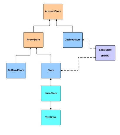
The change to TreeStore is perhaps more interesting than the others. Now that the TreeStore is the actual record store for a view, your listeners on TreeStore will work, whereas before, listeners often had to be placed on the NodeStore since that was the store connected to the view.
get/setRootNode: Supported but deprecated in favor of get/setRoot. This is because "root" is now a config system config property and these are the standard get/set methods.
load event: TreeStore load event now dispatches with arguments that match Ext.data.Store. New argument order is [store, records, successful, operation, node]
Different levels of trees may contain different node types.
The type of node to create may be defined on the store's model class. A TreeModel (Base
class of models to be used in a TreeStore) may be configured with a childType which is
the short name of the TreeModel class to be used when reading its child nodes.
Another way to specify the node type to read is by configuring the Reader of the store
with a typeProperty. This specifies the property name in incoming raw record data which
provides the short name of the TreeModel class to be read.
node events are no longer relayed unchanged through the TreeStore This is because the TreeStore is now the View's driving Store, and events named 'remove', 'insert', 'sort' etc are significant to listening Views because they are native Store events.
Node events are prepended with 'node' before being relayed through the TreeStore.
Ext.data.Operation has now been split into 4 subclasses, one for each type of CRUD operation.
These operation classes should be used in favor of Ext.data.operation.Operation directly.
"destroy" / "erase": Similar to model & store, the destroy method has been corrected to mean clean up any resources. To send a delete request to the server, the "erase" method should be used.
"doRequest": Now takes a single argument, an Ext.data.operation.Operation. Callbacks
should be attached to operation directly.
true and is now false to optimize
data transfer. This config is used to tell the Writer to send all fields on an update even
if those fields have not changed.The new Session class will help manage editing of multiple records and their associations. If you are manually saving records and stores and have to work out the proper sequence to save all of your edits, the Session class will likely be very helpful. Check out the API documentation on Ext.data.Session to determine if you might benefit from coordinated Model management.
Collecting and managing all of your Model definitions and their associations is now handled by the Schema class Ext.data.schema.Schema. The Schema class knows, for example, when one class declares an association with another and ensures that both classes are "decorated" with appropriate accessor methods - regardless of the order in which those classes are loaded.
The Ext.data.ModelManager class is deprecated. Its features have been replaced by Schema.
The way you declare associations has been streamlined. The old syntax is supported but, in many cases, field's new "reference" config makes the declaration much simpler. Further, Ext JS 5 now supports "many-to-many" associations using the "manyToMany" Model config.
The contents of this namespace have been replaced by Schema. Direct use of these classes in applications is rare and the configs that corresponded to these classes ("belongsTo", etc) are still supported though most deprecated.
This class has been removed and merged with Element (see below).
The Ext.dom.Element class has been merged between Ext JS and Sencha Touch. In this process a handful of methods had to change in mostly minor ways.
In Ext JS 4, the Ext.dom.Element constructor would return an element from the element cache, if one existed in the cache, unless "true" was passed as the "forceNew" parameter. As of Ext JS 5 this behavior has changed to always construct a new Ext.dom.Element instance, and the "forceNew" parameter has been removed. This helps avoid a redundant cache lookup, since the most common path is for the Element constructor to be called from Ext.get() which has already performed cache lookup. Users are advised to avoid calling the Ext.dom.Element constructor directly and always use Ext.get() or Ext.fly() if an Element instance is required. The constructor has been tagged as "private" in the docs to reflect this change.
In Ext JS 4 Ext.get() would return null if a DocumentFragment was passed. In Ext JS 5 DocumentFragments are allowed to be wrapped in an Ext.dom.Element instance using Ext.get(), so that they can take full advantage of the Ext.dom.Element API.
Ext.dom.Fly is now a separate class, and just like Ext.dom.Element it should not be instantiated by calling the constructor. Always use Ext.fly() to retrieve a flyweight element instance. The major change in behavior for flyweight Elements between Ext JS 4 and 5 is that in version 5 you can no longer attach event listeners (addListener and removeListener raise errors in development mode). Always use Ext.get() to retrieve an Element instance if it will be used to attach event listeners. Using Ext.get() adds the Element to the internal Element cache which allows its listeners to be cleansed upon destruction. While adding listeners to flyweight Elements was not recommended in v4, it is now strictly enforced.
Another minor change to the behavior of Ext.fly() is that it will no longer allow text nodes to be wrapped, but will return null if a text node is passsed. This was done for consistency with the behavior of Ext.get().
In Ext JS 4 Ext.dom.Element inherited the default static create() method generated by the class system. As a result it was possible (though not recommended) to instantiate an Element instance using Ext.dom.Element.create(). Sencha Touch has a private overridden create() method on Ext.dom.Element which is used as part of the rendering process for components. This conflict has been resolved in favor of Sencha Touch. To retrieve an Element wrapping a node or id, use Ext.get() or Ext.fly().
In 4.x the select() and query() methods used Ext.dom.Query under the covers. This was done primarily to allow them to work in older browsers that did not support querySelector and querySelectorAll, but this had the side-effect of enabling a few advanced selectors not supported by the native querySelector and querySelectorAll.
In Ext JS 5 all supported browsers have querySelector and querySelectorAll, and so using Ext.dom.Query for processing element selectors is not typically necessary. As a result, we have changed the select() and query() methods to use querySelector or querySelectorAll, and have removed the requirement of Ext.dom.Query. Users who require the advanced selectors supported by Ext.dom.Query can use Ext.dom.Query directly, or they can restore the old functionality of Ext.dom.Element's query() and select() methods, using an override such as the following:
Ext.define('Ext.ElementCompat', {
    override: 'Ext.dom.Element',
    requires: [ 'Ext.dom.Query' ],

    select: function(selector, composite) {
        var elements;

        if (typeof selector == "string") {
            elements = Ext.dom.Query.select(selector, this.dom);
        }
        else if (selector.length !== undefined) {
            elements = selector;
        }
        return composite ? new Ext.CompositeElement(elements)
                  : new Ext.CompositeElementLite(elements);
    }
}, function(DQ) {
    Ext.query = function(selector, root, type, single) {
        return DQ.select(selector, root, type, single);
    };
});
We have removed the following private or undocumented methods from Ext.dom.Element:
Instance methods: getViewWidth, getViewHeight, getStyles, addToCache, updateCacheEntry, hasMetrics
Static methods: addUnits, isAncestor, getX, getY, getXY
As part of our performance optimization efforts in Ext JS 5, we have removed the overhead
for handling identifiers with invalid characters from certain core areas. To help catch
such ids before they fail, we have added checks in key places such as Ext.get() and the
Ext.Component constructor. These checks use Ext.validIdRe, which is defined as:
validIdRe: /^[a-z_][a-z0-9\-_]*$/i
In a nutshell, create ids that adhere to the above regex in order to future-proof your application.
The new event system does not utilize Ext.EventManager, and so it has been deprecated. If you are using Ext.EventManager to attach event listeners to Elements please use the Ext.dom.Element (Observable) api instead. For help upgrading legacy applications a deprecated version of Ext.EventManager is provided, but it must be explicitly required since it is no longer used by the framework internally
This class has been removed and merged with Component (see below).
The most important change to Component is that the constructor now calls initConfig. Derived classes that use the config system will need to account for the potential change in timing that this may cause. These classes should no longer call initConfig themselves.
As part of the config system support, initConfig for Component actually performs its task two different ways, depending on whether a property is using the config system. Consider this derived component:
Ext.define('CustomComponent', {
    extend: 'Ext.Component',
    config: {
        foo: 42
    },

    bar: 'value'
});

var cc = new CustomComponent({
    foo: 427,
    bar: 'other'
});
It is unlikely that a class would declare two config properties, one using the config system and one not like the above. However, Ext JS components are a mixture like this so it is important to understand how this is processed.
The "foo" value of 427 will be passed to the generated setFoo method during the constructor. If this class had supplied setFoo, applyFoo and/or updateFoo, all of these methods would be called as the config system normally would. The "bar" value of "other", however, will be set on the instance before the config system properties are processed.
In other words, the config object passed to the constructor is handled in almost the same way as previous versions: properties are copied onto the instance. The only difference is that config system properties are instead passed through the proper setters, appliers and updaters. All of this is handled by initConfig.
Another important change to Component is the removal of the margins config, as well
as the defaultMargins config of all container layouts. The margin config is now the
only way to configure margins on Components. Applications that previously used margins
should change to using margin instead. Applications that used defaultMargins on the
layout should instead configure a margin in the Container's defaults block.
This class has been removed and merged with Container.
This class has been removed and merged with Panel.
Panel Header titles are now instances of Ext.panel.Title. This means additional flexibility
in configuring the Header's title, however, it also means that header.title will refer
to an instance of Ext.panel.Title instead of the actual title text. For maximium compatibility
the title property of Ext.panel.Panel will still refer to the title text, but applications
that use a Header instance to access the title text will need to use header.getTitle().getText().
Panel Header icons are now part of the Header's Ext.panel.Title component, and so they
no longer participate as an item in the Header. This means that the behavior of titlePosition
will off by one compared to version 4 when there is an icon present. Applications that
use titlePosition to control the position of the title relative to the icon will need to
change to use iconAlign instead.
When panels are using inside a Border layout, there are extra methods available. To get along with the config system, two setters were renamed
region config. This method should be used instead of setBorderRegion.weight config. This method should be used instead of setRegionWeight.Form field layouts underwent a major refactor to take advantage of more advanced CSS features available in IE8+. This enabled us to completely eliminate JavaScript involvement in the layout of the internal elements of form fields, and also resulted in the elimination of the table elements that were used for form field layout in Ext JS 4. The end goal was for the functionality of form fields to remain the same, but there was one minor change in their behavior.
In v4, if the width of the form field's parent element was smaller than the field's default width, the form field would become smaller as well, fitting inside the containing element. This allowed configurations such as the following to work:
Ext.create('Ext.panel.Panel', {
    renderTo: document.body,
    title: 'Field Test',
    width: 100,
    bodyPadding: 10,
    items: [{
        xtype: 'textfield',
        margin: 0
    }]
});
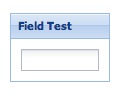
In v5, the field is not allowed to be smaller than it's default width, unless a width is configured on the field itself, or set by the containing layout. This means that the above configuration results in a field that overflows outside the container.
There are 3 possible solutions to this problem:
This class is deprecated because any text field can now be configured with triggers. These new triggers are much more easily declared and managed (for example, they can easily be shown and hidden as needed). This is a welcome improvement over Ext JS 4 where only TriggerField and derived classes could have triggers, and those triggers were configured in a very rigid manner.
Creating a field with custom triggers is now as simple as:
Ext.create('Ext.form.field.Text', {
    renderTo: Ext.getBody(),
    fieldLabel: 'My Custom Field',
    triggers: {
        foo: {
            cls: 'my-foo-trigger',
            weight: 1, // controls display order
            hideOnReadOnly: false, //always visible
            handler: function() {
                console.log('foo trigger clicked');
            }
        },
        bar: {
            cls: 'my-bar-trigger',
            hidden: true,
            handler: function() {
                console.log('bar trigger clicked');
            }
        }
    }
});
Use of "trigger1Cls" and related configs is supported but deprecated in favor of named triggers and their config properties.
This class is seldom used directly by applications, but its internals have been streamlined and it no longer provides a HashMap of components. Instead look at the methods this class provides to access the registered components.
This class was renamed to Ext.util.StoreHolder to remove confusion with the new Ext.mixin.Bindable
that supports data binding. This was intended to be an internal helper class used by various components
to add support for a store config and was never intended for public use.
The experimental $tab-left-rotate-direction and $tab-right-rotate-direction SASS
variables were removed in favor of the new rotation config of Ext.tab.Tab and
tabRotation config of Ext.tab.Panel and Ext.tab.Bar. The new configs provide
much more flexibility in that they allow tabs to be rotated in any direction regardless
of which side the tab bar is docked to.
Tab and Button styling was unified to use a common set of rules and a similar API, as a result
the $tab-text-padding SASS variable and the $ui-text-padding parameter to the
extjs-tab-ui mixin were changed to accept a number, not a list.
Styling of Box layout overflow scrollers for Ext.menu.Menu and Ext.toolbar.Toolbar was
changed to use UI-specific path names for the scroller icons. This means that themes
that provided their own custom scroller icons for the default UI of Menu or Toolbar will
have to rename those images to include the UI name as follows:
Panel headers now support an iconAlign config, and this alignment is relative to
the header's title. This means that the icon is no longer a separate component in the
panel header, but instead it is part of the Ext.panel.Title component. As a result,
when headers are rotated vertically, the title and icon are both rotated (previously only
the title would be rotated, and the icon would not be rotated).
As part of the effort to simplify Panel Header markup, the "body" element of Panel Headers
was removed. For consistency, the $tip-header-body-padding SASS variable was renamed
to $tip-header-padding, and the $ui-header-body-padding parameter of the extjs-tip-ui()
SASS mixin was renamed to $ui-header-padding.
For consistency with the new form-field SASS mixins the following SASS variables were removed:
$form-field-font$form-toolbar-field-fontUse $form-field-font-size, $form-field-font-family, etc. instead.
The classic theme now contains overrides for several classes. Users of ext-theme-classic and ext-theme-gray themes who are not using Sencha Cmd to build their apps will need to include ext-theme-classic.js or ext-theme-gray.js in order for those themes to work as they did in version 4. This portion of the upgrade will be seamless for users who use Sencha Cmd to build their apps, since Cmd automatically includes theme overrides.
In Ext JS 5 Form Fields and Buttons use "liquid" CSS layout. This means that their layouts
are achieved using CSS only with no JavaScript intervention needed. When these "liquid
layout" components are used in certain container layouts like "form" and "auto", the layout
engine can completely skip their layout runs. The side effect of this new behavior is that
application developers can no longer rely on the afterComponentLayout, onBoxReady, and
onResize template methods or the resize and boxready events of Buttons and Form Fields.
In simple cases afterRender can often be used as a replacement for onBoxReady.
It is possible (although not recommended) to re-enable all of these missing events and
template methods by setting the liquidLayout config of the Form Field or Button to false;
however, be advised that disabling liquid layout can cause the application to incur a
performance penalty since the layout system may have to read the DOM to determine the
Component's size.
One of the biggest improvements in Ext JS 5.0.1 is better support for keyboard navigation, a key feature of any accessible application. Perhaps the most commonly cited reason for making an application keyboard-navigable is accessibility, or ARIA support. However, many users accustomed to using the keyboard will find keyboard navigation to be a generally useful productivity feature. The main goal of keyboard navigation support is for all functionality to be accessible using the keyboard, and this means every actionable element must be focusable, and have a distinct focus style.
We expect support for keyboard navigation to be a welcome change for many applications, making them more accessible to more users. At the same time, we understand that all applications have different needs and requirements. In some cases, the default focus styling may not be desired, so we have provided the ability to customize the focus styling of any component using a robust API of SASS variables and mixins.
Check out our Accessibility Guide to learn more about changing focus styling in your application.
For more information about the Upgrade process, please check out these guides:


 Ext JS | Terms of Use
