Sencha
Welcome to Ext JS 4!
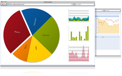
Ext JS 4 is a pure JavaScript application framework that works everywhere from IE6 to Chrome 11. It enables you to create the best cross-platform applications using nothing but a browser, and has a phenomenal API.
This is the biggest upgrade we've ever made to Ext JS and we think you're going to love it.
What’s New
We have also been posting summaries of new features and changes to our blog:
Upgrading
First, check out our overview guide to see what has changed.
Sencha also offers training courses and professional services for companies wishing to use Ext JS 4.