Layouts
Many classes have shortcut names used when creating (instantiating) a class with a
configuration object. The shortcut name is referred to as an alias (or xtype if the
class extends Ext.Component). The alias/xtype is listed next to the class name of
applicable classes for quick reference.
Framework classes or their members may be specified as private or protected. Else,
the class / member is public. Public, protected, and private are access
descriptors used to convey how and when the class or class member should be used.
Public classes and class members are available for use by any other class or application code and may be relied upon as a stable and persistent within major product versions. Public classes and members may safely be extended via a subclass.
Protected class members are stable public members intended to be used by the
owning class or its subclasses. Protected members may safely be extended via a subclass.
Private classes and class members are used internally by the framework and are not intended to be used by application developers. Private classes and members may change or be omitted from the framework at any time without notice and should not be relied upon in application logic.
static label next to the
method name. *See Static below.Below is an example class member that we can disect to show the syntax of a class member (the lookupComponent method as viewed from the Ext.button.Button class in this case).
Let's look at each part of the member row:
lookupComponent in this example)( item ) in this example)Ext.Component in this case). This may be omitted for methods that do not
return anything other than undefined or may display as multiple possible values
separated by a forward slash / signifying that what is returned may depend on the
results of the method call (i.e. a method may return a Component if a get method calls is
successful or false if unsuccessful which would be displayed as
Ext.Component/Boolean).PROTECTED in
this example - see the Flags section below)Ext.container.Container in this example). The source
class will be displayed as a blue link if the member originates from the current class
and gray if it is inherited from an ancestor or mixed-in class.view source in the example)item : Object in the example).undefined a "Returns" section
will note the type of class or object returned and a description (Ext.Component in the
example)Available since 3.4.0 - not pictured in
the example) just after the member descriptionDefaults to: false)The API documentation uses a number of flags to further commnicate the class member's function and intent. The label may be represented by a text label, an abbreviation, or an icon.
classInstance.method1().method2().etc();false is returned from
an event handler- Indicates a framework class
- A singleton framework class. *See the singleton flag for more information
- A component-type framework class (any class within the Ext JS framework that extends Ext.Component)
- Indicates that the class, member, or guide is new in the currently viewed version
- Indicates a class member of type config
- Indicates a class member of type property
- Indicates a class member of type
method
- Indicates a class member of type event
- Indicates a class member of type
theme variable
- Indicates a class member of type
theme mixin
- Indicates that the class, member, or guide is new in the currently viewed version
Just below the class name on an API doc page is a row of buttons corresponding to the types of members owned by the current class. Each button shows a count of members by type (this count is updated as filters are applied). Clicking the button will navigate you to that member section. Hovering over the member-type button will reveal a popup menu of all members of that type for quick navigation.
Getting and setter methods that correlate to a class config option will show up in the methods section as well as in the configs section of both the API doc and the member-type menus just beneath the config they work with. The getter and setter method documentation will be found in the config row for easy reference.
Your page history is kept in localstorage and displayed (using the available real estate) just below the top title bar. By default, the only search results shown are the pages matching the product / version you're currently viewing. You can expand what is displayed by clicking on the button on the right-hand side of the history bar and choosing the "All" radio option. This will show all recent pages in the history bar for all products / versions.
Within the history config menu you will also see a listing of your recent page visits. The results are filtered by the "Current Product / Version" and "All" radio options. Clicking on the button will clear the history bar as well as the history kept in local storage.
If "All" is selected in the history config menu the checkbox option for "Show product details in the history bar" will be enabled. When checked, the product/version for each historic page will show alongside the page name in the history bar. Hovering the cursor over the page names in the history bar will also show the product/version as a tooltip.
Both API docs and guides can be searched for using the search field at the top of the page.
On API doc pages there is also a filter input field that filters the member rows using the filter string. In addition to filtering by string you can filter the class members by access level, inheritance, and read only. This is done using the checkboxes at the top of the page.
The checkbox at the bottom of the API class navigation tree filters the class list to include or exclude private classes.
Clicking on an empty search field will show your last 10 searches for quick navigation.
Each API doc page (with the exception of Javascript primitives pages) has a menu view of metadata relating to that class. This metadata view will have one or more of the following:
Ext.button.Button class has an alternate class name of Ext.Button). Alternate class
names are commonly maintained for backward compatibility.Runnable examples (Fiddles) are expanded on a page by default. You can collapse and expand example code blocks individually using the arrow on the top-left of the code block. You can also toggle the collapse state of all examples using the toggle button on the top-right of the page. The toggle-all state will be remembered between page loads.
Class members are collapsed on a page by default. You can expand and collapse members using the arrow icon on the left of the member row or globally using the expand / collapse all toggle button top-right.
Viewing the docs on narrower screens or browsers will result in a view optimized for a smaller form factor. The primary differences between the desktop and "mobile" view are:
The class source can be viewed by clicking on the class name at the top of an API doc page. The source for class members can be viewed by clicking on the "view source" link on the right-hand side of the member row.
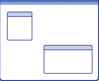
In Architect, layouts control the size and position of the components within an application. Configuring a layout on
each container lets you manage how that container's children are rendered. The layout for the top-level (parent) container
determines the size and position configuration options that can be set on its child components. To set the layout for a container,
use either the container's Flyout Config button (the gear-shaped button to the right of the component as displayed in the Canvas)
or the component's layout property in Config.
Ext JS provides a number of basic container layouts, which you can select and configure using Architect. The modern toolkit supports a subset of the classic layouts appropriate for mobile UI design. Some layouts support specific, commonly used presentation models (such as accordions and cards) while others provide more general-purpose models (such as HBox and VBox that arrange the child components either horizontally or vertically) that can be used for a variety of applications.
The following table summarizes the layout options supported for Ext JS:
| Layout | Description | classic | modern |
|---|---|---|---|
| Auto / Default | Default layout that renders child components sequentially | Ext.layout.container.Auto | Ext.layout.Default |
| Absolute | Arrange components using explicit x/y positions relative to the container | Ext.layout.container.Absolute | No Analog |
| Accordion | Arrange panel components in a vertical stack with only one panel expanded at a time | Ext.layout.container.Accordion | No Analog |
| Anchor | Arrange components relative to the sides of the container | Ext.layout.container.Anchor | No Analog |
| Border | Arrange panel components by region | Ext.layout.container.Border | No Analog |
| Card | Arrange child components so that only one can be visible at a time, filling the entire area of the component | Ext.layout.container.Card | Ext.layout.Card |
| Column | Arrange components in a multicolumn layout | Ext.layout.container.Column | No Analog |
| Fit | Expand a single child component to fill the available space | Ext.layout.container.Fit | Ext.layout.Fit |
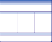
| Table | Arrange components in an HTML table | Ext.layout.container.Table | No Analog |
| HBox | Arrange the child components horizontally. Use the stretch alignment of the container to make the child components fill the available vertical space; use the flex attribute to control the proportion of the horizontal space each component fills |
Ext.layout.container.HBox | Ext.layout.HBox |
| VBox | Arrange the child components vertically. Use the stretch alignment of the container to make the child components fill the available horizontal space; use the flex attribute to control the proportion of the vertical space filled by each component |
Ext.layout.container.VBox | Ext.layout.VBox |
To get you started, the end of this guide includes three examples that illustrate how to use layouts.
You can use the Ext JS Layout Browser to get a more complete picture of how the various layouts work. Although the Layout Browser is written for Ext JS, the information is also valid for the subset of layouts that are supported for the modern toolkit. The examples at the end of the guide use the Ext JS framework.
The following are the basic Ext JS layouts you can use to start configuring View components.

supported by both toolkits.
For general-purpose containers such as a Panel, using the Auto layout means child components are rendered sequentially. Some containers are automatically configured to use a layout other than the default Auto. For example, TabPanel defaults to the Card layout and Toolbar defaults to the HBox layout.
supported only by classic
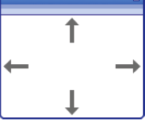
Arranges components using explicit x/y positions relative to the container. This enables explicit repositioning and resizing of components within the container, providing precise control. Absolute-positioned components remain fixed even if their parent container is resized.
Architect displays a grid within a container that uses Absolute layout. By default, components snap to the grid as they are repositioned. Clicking the container's Flyout Config button enables resizing or disabling the grid. The grid is only displayed as a layout guide in the Design view. It is not visible when the component is rendered.
supported only by classic
Arranges panel components in a vertical stack where only one panel is expanded at a time. Only panels (including sub-classes thereof, for example, TabPanel) can be added to a container that uses the Accordion layout.
supported only by classic
Arranges components relative to the sides of the container. Specify the width and height of child components as a percentage of the container or specify offsets from the right and bottom edges of the container. If the container is resized, the relative percentages or offsets are maintained.
supported only by classic
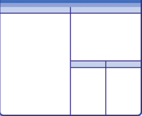
Arranges panel components in a multipanel layout according to one of five regions:
A container that uses the Border layout must have a child assigned to the Center region. The Center region is
automatically sized to fit the available space. Resize the North, South, East, and West regions on the canvas
by clicking and dragging the right or bottom edge of the panel. Make any of the regions in a Border layout collapsible
by enabling the collapsible attribute. When rendered, child panels automatically resize
when the container is resized.
supported by both both toolkits
Allows users to step through a series of components, one at a time, by arranging child components so that only one can
be visible at a time, filling the entire area of the container. Specify the component to make visible with the
setActiveItem method. This behavior is typically attached to a UI navigation element, such as Previous and Next
buttons in the footer of the container. It is commonly used to create wizards; see an example later in this guide.
supported only by classic
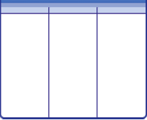
Arranges components in a multi-column layout. The width of each column can be specified either as a percentage (column width)
or an absolute pixel width (width). The column height varies based on the contents. Enable autoScroll if the
application data requires viewing column contents that exceed the container height.
supported by both toolkits.
Expands a single child component to fill the available space. For example, use this layout to create a dialog box that contains a single TabPanel. If the container is a type of panel component, you can also add and dock additional child components, such as a Toolbar, to the top, left, right, or bottom of the panel.
Supported only by classic
Arranges components in an HTML table. Specify the number of columns in the table. Architect enables creation of
complex layouts by specifying the child component rowspan and colspan attributes.
supported by both toolkits.
Arranges the child components horizontally. Setting the alignment of the container to stretch
causes the child components to fill the available vertical space. Setting the flex attribute of the child components
controls the proportion of the horizontal space each component fills.
supported by both toolkits.
Arranges the child components vertically. Setting the alignment of the container to stretch causes the child components
to fill the available horizontal space. Setting the flex attribute of the child components controls the proportion
of the vertical space each component fills.
When containers are nested, the layout configuration for the parent container manages the layout of whatever child components it contains, including other containers.
The layout does not affect the contents of any child containers, only the containers themselves. This allows for nested, complex layouts to be created.
With HBox and VBox layouts, child components can be resized to fit the available space in a container using the
flex attribute. The flex attribute is a numerical value that represents the proportion of the available space
that will be allotted to a component. Set the attribute to any floating point value, including whole numbers and fractions.
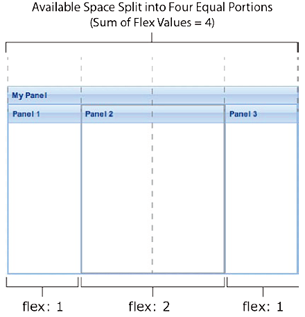
Consider a component with three sub-panels in which flex is set to 1 for Panel 1 and Panel 3
and flex is set to 2 for Panel 2. The available space is divided into four equal portions (the sum of the flex values),
and Panel 1 and Panel 3 each get one portion while Panel 2 gets two, as shown here:
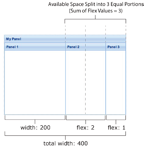
Setting an absolute width or height for some components and a flex value for others causes the absolute sizes to be
subtracted from the total available space and the remaining space to be allotted to the flexed components. For example,
if the container is 400 pixels wide and the width of Panel 1 is set to 200 pixels, the panels with flex attributes
set share the remaining 200 pixels. If Panel 2 has a flex of 2 and Panel 3 has a flex of 1, Panel 2 gets
two-thirds of the space and Panel 3 gets one-third of the space, as shown here:
If neither an absolute size nor a flex value are specified for a component, the framework checks to see if the size is
defined in the application's CSS. If no size is specified in the CSS, the framework assigns the minimum necessary
space to the item.
If stretch is specified as the alignment option for a container that uses the HBox or VBox layout, its
sub-components are automatically stretched to horizontally or vertically fit the size of the container. When HBox is
used, sub-components are stretched vertically. With VBox, sub-components are stretched horizontally. For example,
when stretch is set on a panel that uses HBox, each of the subpanels is automatically stretched to fill the
available vertical space. The stretchmax option works just like stretch, except it stretches sub-components to
the size of the tallest or widest component, rather than the size of the container, like this.
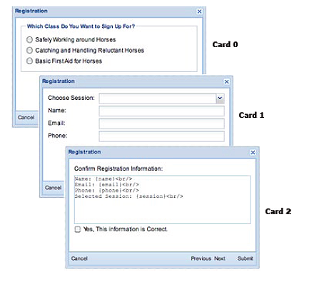
If a component uses the Card layout, its children are visible one at a time, making it an ideal option for creating a wizard. This example shows how to create a three-step registration wizard using the Card layout.
The basic approach is
setActiveItem function to display the appropriate panel when the user clicks a
navigation button within the Window.Start by adding a Window container to Architect, either through the Toolbox or the Canvas. A Window can only be added
as a top-level component; it cannot be added as a child of an existing component. Click the Window's Flyout Config
button and select card from the layout menu to apply the Card layout to the Window. Also, name the wizard by setting
its title property in Config to a title of your choice, or by double-clicking its title in the Canvas and
over-writing MyWindow there.
Next, drag a Panel container onto the Window; this subpanel is used to create the first step in the wizard. Panels in a
Card layout are numbered in the order they are added to the container, starting with item 0. By default, item 0 is
set as the active item. To change the active item within Architect, select the Window and set the activeItem
attribute to the panel to be made active.
Add two more panels to the Window for the second and third steps of the Wizard. Either drag them onto the title bar of the Window on the Canvas or onto the Window in the Inspector Views node.
As sub-panels are added, hide their title bars. First select each sub-panel in the Inspector. Then, either scroll through
Config to the title attribute under Ext.panel.Panel, or type title in the filter field. Then, either select the
text in the field (My Panel) next to the title attribute and erase it, or click the x just to the right of the
title Value field.
The wizard needs navigation buttons to move from one step to the next. Add them by adding a Toolbar component from
Toolbox to the top-level Window and docking it at the bottom of the Window by choosing bottom in the Flyout
Config menu.
Then, add four buttons to the Toolbar and name the buttons Cancel, Previous, Next, and Submit.
Double-click the first button label on the Canvas and type over to name it, and use tab to move to the next button in
the Toolbar until you’ve named each button.
The buttons need a little more work to make them more usable by both the user and the developer. First, align the buttons by adding a Fill component between the Cancel and Previous button and a Spacer of width 20 between the Next and Submit buttons.
Then, using Config, scroll down to the itemid attributes (under Ext.AbstractComponent) for each
button and set each to a name that can be easily referenced in the navigation handler. For example, set the itemid
attributes to cancelBtn, prevBtn, nextBtn, and submitBtn respectively.
Now add content for the wizard to each card. Since the wizard needs to gather user input, each card should be a
Form Panel rather than a Panel. Fortunately, in Architect it is easy to change one type of component into another.
To change the Panels into Form Panels, right-click each one and choose Transform, then Ext.form.Panel.
For this example, we built a registration wizard for a series of horsemanship clinics with the three cards shown below.
By default, Card 0 is the active card. To add form fields to Card 1 and Card 2, select the Window and set its
activeItem attribute to the panel you want to work on.
The HBox layout enables horizontal arrangement of sub-components, while VBox lays out sub-components vertically. These general-purpose layouts provide a lot of control over how components are positioned without having to resort to using absolute positioning.
This example arranges several related checkboxes in multiple columns to conserve space. Start with a Form Panel container,
then add a FieldSet container to the Form Panel parent for the checkboxes. Set the layout of the FieldSet to hbox.
Next, add a Container component to the FieldSet for each column. Select each Container in the Inspector,
set flex to 1, and set the height to accommodate all the checkboxes that will be added. For example, 60 pixels
accommodates three rows of checkboxes.
It's easier to select the column containers in the Components tab. When they are first added to the FieldSet, their height defaults to 2 pixels, making them hard to select in the Canvas -- a good reason to select components in the Inspector.
Finally, add checkboxes to each column container and set the boxLabel attribute for each. To specify margins around
the checkboxes, change the layout of the column containers from auto to vbox, and then set the margin attribute
for each individual checkbox.
To create applications that need the entire content area in a browser window (that is, the entire browser viewport),
use the Viewport container. A Viewport usually uses the Border layout to arrange a collection of sub-panels according
to the regions North, South, East, West, or Center. With the Border layout, a Panel sub-component must be assigned to
the Center region, which is automatically sized to fit the available space. Let’s step through an example that takes
this approach: a viewer students use to register for classes. Start building the viewer by adding a Viewport to a new
Architect project. A Viewport can only be added as a top-level component; it cannot be added as a child of an
existing component. Select the Border layout by clicking the Viewport Flyout Config button and selecting border from
the layout menu. Next, drag a Panel into the Viewport. Because this is the only component currently in the layout, it
is automatically assigned to the Center region. This Panel will display information about people who have signed up for
one of our classes, so name the Panel Student Information.
Add a TreePanel to the Viewport by selecting the Viewport and double-clicking Tree Panel in the Toolbox to add it as a
child of the Viewport. Alternately, you can drag the Tree Panel onto the Viewport in the Inspector. Architect
automatically assigns the Tree Panel to the West region. Students will use the tree to navigate through the classes
they can take, so name it Class List.
Note: It is possible to change the region to which a sub-component is assigned. To do so, set its region attribute
in Config.
The next step would be to configure the Class List tree and the Student Information Panel to display content about classes. A template could be used to display data for individual students in the Student Information Panel.


 Architect | Terms of Use
