Introduction to Views
Many classes have shortcut names used when creating (instantiating) a class with a
configuration object. The shortcut name is referred to as an alias (or xtype if the
class extends Ext.Component). The alias/xtype is listed next to the class name of
applicable classes for quick reference.
Framework classes or their members may be specified as private or protected. Else,
the class / member is public. Public, protected, and private are access
descriptors used to convey how and when the class or class member should be used.
Public classes and class members are available for use by any other class or application code and may be relied upon as a stable and persistent within major product versions. Public classes and members may safely be extended via a subclass.
Protected class members are stable public members intended to be used by the
owning class or its subclasses. Protected members may safely be extended via a subclass.
Private classes and class members are used internally by the framework and are not intended to be used by application developers. Private classes and members may change or be omitted from the framework at any time without notice and should not be relied upon in application logic.
static label next to the
method name. *See Static below.Below is an example class member that we can disect to show the syntax of a class member (the lookupComponent method as viewed from the Ext.button.Button class in this case).
Let's look at each part of the member row:
lookupComponent in this example)( item ) in this example)Ext.Component in this case). This may be omitted for methods that do not
return anything other than undefined or may display as multiple possible values
separated by a forward slash / signifying that what is returned may depend on the
results of the method call (i.e. a method may return a Component if a get method calls is
successful or false if unsuccessful which would be displayed as
Ext.Component/Boolean).PROTECTED in
this example - see the Flags section below)Ext.container.Container in this example). The source
class will be displayed as a blue link if the member originates from the current class
and gray if it is inherited from an ancestor or mixed-in class.view source in the example)item : Object in the example).undefined a "Returns" section
will note the type of class or object returned and a description (Ext.Component in the
example)Available since 3.4.0 - not pictured in
the example) just after the member descriptionDefaults to: false)The API documentation uses a number of flags to further commnicate the class member's function and intent. The label may be represented by a text label, an abbreviation, or an icon.
classInstance.method1().method2().etc();false is returned from
an event handler- Indicates a framework class
- A singleton framework class. *See the singleton flag for more information
- A component-type framework class (any class within the Ext JS framework that extends Ext.Component)
- Indicates that the class, member, or guide is new in the currently viewed version
- Indicates a class member of type config
- Indicates a class member of type property
- Indicates a class member of type
method
- Indicates a class member of type event
- Indicates a class member of type
theme variable
- Indicates a class member of type
theme mixin
- Indicates that the class, member, or guide is new in the currently viewed version
Just below the class name on an API doc page is a row of buttons corresponding to the types of members owned by the current class. Each button shows a count of members by type (this count is updated as filters are applied). Clicking the button will navigate you to that member section. Hovering over the member-type button will reveal a popup menu of all members of that type for quick navigation.
Getting and setter methods that correlate to a class config option will show up in the methods section as well as in the configs section of both the API doc and the member-type menus just beneath the config they work with. The getter and setter method documentation will be found in the config row for easy reference.
Your page history is kept in localstorage and displayed (using the available real estate) just below the top title bar. By default, the only search results shown are the pages matching the product / version you're currently viewing. You can expand what is displayed by clicking on the button on the right-hand side of the history bar and choosing the "All" radio option. This will show all recent pages in the history bar for all products / versions.
Within the history config menu you will also see a listing of your recent page visits. The results are filtered by the "Current Product / Version" and "All" radio options. Clicking on the button will clear the history bar as well as the history kept in local storage.
If "All" is selected in the history config menu the checkbox option for "Show product details in the history bar" will be enabled. When checked, the product/version for each historic page will show alongside the page name in the history bar. Hovering the cursor over the page names in the history bar will also show the product/version as a tooltip.
Both API docs and guides can be searched for using the search field at the top of the page.
On API doc pages there is also a filter input field that filters the member rows using the filter string. In addition to filtering by string you can filter the class members by access level, inheritance, and read only. This is done using the checkboxes at the top of the page.
The checkbox at the bottom of the API class navigation tree filters the class list to include or exclude private classes.
Clicking on an empty search field will show your last 10 searches for quick navigation.
Each API doc page (with the exception of Javascript primitives pages) has a menu view of metadata relating to that class. This metadata view will have one or more of the following:
Ext.button.Button class has an alternate class name of Ext.Button). Alternate class
names are commonly maintained for backward compatibility.Runnable examples (Fiddles) are expanded on a page by default. You can collapse and expand example code blocks individually using the arrow on the top-left of the code block. You can also toggle the collapse state of all examples using the toggle button on the top-right of the page. The toggle-all state will be remembered between page loads.
Class members are collapsed on a page by default. You can expand and collapse members using the arrow icon on the left of the member row or globally using the expand / collapse all toggle button top-right.
Viewing the docs on narrower screens or browsers will result in a view optimized for a smaller form factor. The primary differences between the desktop and "mobile" view are:
The class source can be viewed by clicking on the class name at the top of an API doc page. The source for class members can be viewed by clicking on the "view source" link on the right-hand side of the member row.
Sencha Architect enables the rapid assembly of application user interface features for either desktop or mobile devices. You can put together a UI using Architect views capabilities with little or no knowledge of Sencha frameworks, or the JavaScript underlying those views.
This makes Architect perfect for quickly prototyping the visible pieces of an application. It also means design teams can work separately on the application human interface while other members of the team focus on the other parts of the application. Developers can focus on building controllers to implement the business rules and application logic, while data architects can work on defining the data side of an application with models and stores.
You can drag view components, such as containers, grids, forms, and charts, into the Project Inspector, view them on the Canvas, apply layouts to them, and configure their properties through Config. You can add also add your own custom JavaScript.
Each time you build the project, Architect generates the code for the project as it currently stands. You can also develop your own custom view components and export them for reuse in other projects and by other developers.
Architect enables flexible assembly of web page elements, easy reuse of view components, and simplified maintenance of your UI. When laying out UI components with Architect, you find components, such as Window or Form Panel containers, in the Toolbox, drag them to the Inspector or Canvas, and add additional components from there, either as top-level parents or as "child" components nested inside the parents.
By adding additional top-level containers to a project, you can lay out the different parts of the UI as separate entities. When you build your project, each top-level container is represented by a class with the code for that class in its own separate file.
When you drag components into your project, Architect prevents nesting of incompatible components. For example, Window or Viewport components can not be dropped into a Container. Dragging components from the Toolbox that can not be added to the component selected in the Canvas causes Architect to display an icon indicating the incompatibility.
Let's take a hands-on look at building a UI with views in Architect. The following sections take you through the first steps of building the example Ext JS-based desktop application called Car Listings used throughout Architect documentation.
Go to Architect. Make sure it's open to an Ext JS-based project for the desktop. Then follow these instructions.
In the Toolbox, locate a Panel container. There are several ways to do this:
Panel into the filter field at the top of the Toolbox.Drag the Panel to the Views node in the Inspector.
You can also drag it into the Canvas,
which accomplishes the same thing.
Note that when you start to drag Panel,
an icon appears indicating that you can't drop it yet, like this:
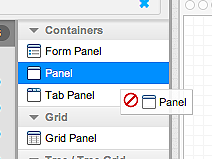
When you drag Panel over either the Views node or the Canvas, the icon changes to indicate that you can drop it at that location. Every component in the Toolbox works this way to help you understand which components work together.
You might need to delete a UI component after you have added it. Here's how to do that: Drag a second Panel into the project. It turns out we don't really need it, so let's delete it. Do that by right-clicking the Panel in the Inspector to open its context menu and selecting Delete. You can also do the same thing in the Canvas. You can also delete a just-added component by using the ⌘Z keyboard shortcut on Mac systems or the (Ctrl+z keyboard shortcut in Windows and Linux). Or you can press Shift+Delete with the component selected in the Inspector.
Build or save your project, and save it regularly after this; we'll cover what that does later in this guide.
Locate a Grid Panel in the Toolbox and drop it on the Panel container, either in the Inspector or the Canvas. Another way to accomplish the same thing is to select the Panel in either place and then double-click Grid Panel in the Toolbox.
Now drag two additional Panels onto the first Panel container. If you drop them onto the Canvas, be sure to drop them onto the Panel somewhere other than over the Grid Panel (“My Grid Panel”), or they will become children of the Grid Panel instead of the first panel.
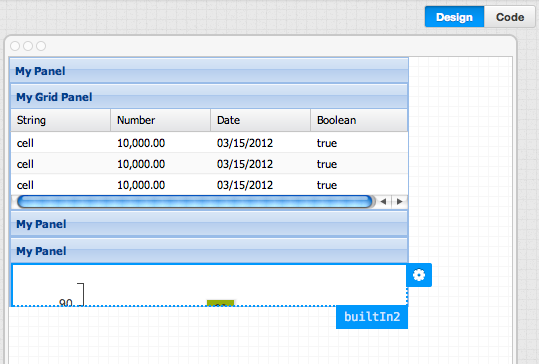
Next, drag a Column Chart onto the third Panel, the last Panel you added, which should be the bottom-most Panel in the Canvas or the inspector. Again, be careful about where you drop it. If you drop it on the heading of the last Panel in the Canvas, it becomes a child of that panel. If you drop it on the white space below the heading, it becomes a child of the first panel you added. It is safest to drag components to the Inspector, since you can be sure you are dropping them on the intended component.
The Canvas should now look like this:
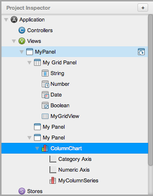
And the Inspector will look like the following. Note that the selected component is highlighted in dark blue and its top-level parent is highlighted in lighter blue. Also note that the Inspector provides a precise view of the project tree: the ColumnChart is a child of the last Panel added, which in turn is a child of the first-added panel. If you wish to reorder the views, you need to do that in the Inspector, where you can drag them up or down the tree.
Once you've added views to your project, the next step is to configure them for use in the application you're building, selecting the appropriate layout and setting other configs. Let's configure a few of the components we just added to Architect.
If at any time you need more information about configs in Architect, place your cursor over the question mark next to the name of the config. After a second or two, Architect displays a description of the config and a link to the API documentation for it.
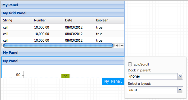
The third (last, or bottom) Panel should still be selected in the Canvas or the Inspector. If not, select it in either place. Look for the Flyout Config button for the Panel -- it is the small wheel just outside the top right corner of the Panel in the Canvas. Click it to open the Flyout Config window, which contains a small set of frequently-used properties. Here's how it looks when it's open:
Scroll through the list under Select a layout and select fit.
This sets the layout property to fit.
You can accomplish the same thing in the Config panel under the Inspector,
where you either scroll down the list of properties to find layout
or type layout in the filter box.
Next, select the top-level Panel (top-most in the Canvas and Inspector) and click the Flyout Config button. Set the layout to vbox. Click Flyout Config again, set alignment to stretch, and check autoScroll. (You can leave the Pack set to its default, which is start.) This arranges the Grid and sub-Panels vertically. To learn more about layouts, see Layouts.
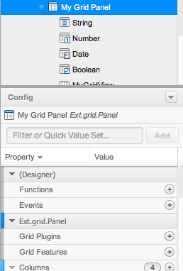
We'll use the Config panel to set the next properties. Select the Grid Panel in the Inspector. Architect displays the Config panel for Grid Panel, shown in the next image. Scroll through it to review the standard configs you can set for the component.
Name the top-level (first) Panel and give it an ID.
Double-click its title bar in the Canvas
and change its title by typing Car Listings over MyPanel.
You can also do this by selecting the Panel
and setting the title property in Config.
In Config, set the Panel id property to carlistings.
Note: This ID is global and must be unique. Whatever ID you set here cannot be used for other components to be sure that Architect does not create multiple components using the same ID.
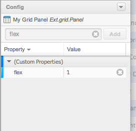
Next, look for the flex property.
Click the Value field to the right of the property name
(which currently contains the text (none)).
Type 1, hit the Return key,
and the Grid Panel will now have a flex of 1.
The Config panel will look like this:
Do the same for each of the bottom two Panels.
For advanced use of Architect, you can add your own custom configs. If you don't see the config you need for a component, type the name of the custom config into the Filter field at the top of the Config panel and click Add. The config will now be available for setting in Config.
Events include mouse clicks, mouseovers, taps, pinches, and swipes. When the user does one of these, the application must respond appropriately. This is implemented using the components listed under the Architect "Behavior" group in the toolbox:
In other words, use a basic event binding when an event triggered by a view only affects that same view. The simple event binding shown next is actually a good example of this; the button only affects the size of its parent panel and does not touch any other part of the application.
Events are added to views through the Config panel. Look for the Event property, click the add button to the right under Value, with a plus sign ("+") enclosed in a circle, click the arrow in empty field under Step 1 of 1 to open the scrolling list of events, and select the event you want to use. You can remove the event if needed by clicking the clear button to its right under Value in Config. Add custom code to the event by double-clicking it in the Inspector (or right click on the event in the Inspector and select Edit Code) to open the code editor.
It's important to set the initial view for a project. That's the UI component that will appear when users open your application for the first time. Architect makes it easy to do that: You select the top-level view that you want to appear first, find its initial view property in the Config panel, and put a check in the box next to it. You can also right click on the view in the Inspector to open its context menu and select Mark as Initial View.
Only views that appear at the top-level of the Inspector can become initial views. Notice that in the example that we're building, only the first Panel, which we just renamed Car Listings, appears at the top level. By default, it is the initial view for the project, and the initial views icon appears to the right of its name in the Inspector, which you can see in the image of the Project Inspector, above, or in Architect if you've been following along.
To see how this works, drag another Panel to the Views node, dropping it directly onto Views. This creates a second top-level Panel. Right click it and select Mark as Initial View. Architect assigns it the initial views icon. Since we only added this Panel for the purpose of this example and we don't need it for our project, delete it. Right-click the original top-level Panel (Car Listings), select Mark as Initial View, and it will be designated with the initial view icon.
A good way to create a universal initial view for your project is to add a Viewport to your project from the Toolbox and set it to be the initial view. Then, anything inside it will be seen first.
That's as far as we'll go here. For an in-depth look at building both a desktop and mobile app including controllers, datastores, and models, see Build Your First Desktop App and Build Your First Mobile App.
Here are some ways you can work with views that will become useful as you learn more about creating applications in Architect:
Creating Linked Instances
This feature of Architect becomes more useful if you need to elevate take a part of a component -- let's say a grid that's inside a container, or one kind of container that's a child of a top-level container -- and move it up in the project hierarchy to become a top-level component (and make it its own class). Basically, this abstracts the behavior into its own individual subclass.
Go to Architect and look at the views we started to build earlier in this guide. Drag the top-level Panel (called “MyPanel”) and drop it on Views. Click Link in the dialog that appears. Architect creates a linked instance of the Panel -- an exact copy of the original Panel at the top level of the project.
Linked instances like the one we just created can be very helpful in building complex projects. If you create multiple linked instances of the same component, you can change them all at once by editing the original component, and each linked instance inherits all the changes. You can still edit each linked instance separately; changes made to the linked instance override the attributes you give the original component. This is particularly useful when you use the Promote To Class feature.
Promote to Class
Any child item in a component can be promoted to a top-level component and become its own class in the Architect project directory. For example, Grid Columns can only be added to Grid Panels or Tree Panels when they are initially created because they don't serve any purpose own their own.
To do this, first drag a Grid Panel to Views in the Inspector. A new Grid Panel receives several columns by default. Right-click “Boolean” -- the header of one of the columns -- in the Inspector -- and choose Promote to Class.
The column becomes own top-level component and is replaced by a linked instance in the Inspector. When Architect exports the project, it generates a separate .js file for the component/class. This works for most view components in Architect.
Using this feature can make it easier to share and manage a project if you're working with a team. In addition to generating more manageable code, organizing an Architect project as a collection of top-level components can make it easier to continue to develop the project. By using linked instances within main application views, it's still easy to view all the top-level components in context.
Creating Overrides
For advanced users, Architect enables the overwriting of all or part of the code for any component, including views. To do that, select a component, go to its code view, and click Create Override . You'll be warned that this feature is for advanced users and asked if you want to continue. Click Yes to open the Architect code editor and create your own code. Later, you can remove the override by selecting the component, going to code view, and selecting Remove Override.


 Architect | Terms of Use
