Touch Overlays
Many classes have shortcut names used when creating (instantiating) a class with a
configuration object. The shortcut name is referred to as an alias (or xtype if the
class extends Ext.Component). The alias/xtype is listed next to the class name of
applicable classes for quick reference.
Framework classes or their members may be specified as private or protected. Else,
the class / member is public. Public, protected, and private are access
descriptors used to convey how and when the class or class member should be used.
Public classes and class members are available for use by any other class or application code and may be relied upon as a stable and persistent within major product versions. Public classes and members may safely be extended via a subclass.
Protected class members are stable public members intended to be used by the
owning class or its subclasses. Protected members may safely be extended via a subclass.
Private classes and class members are used internally by the framework and are not intended to be used by application developers. Private classes and members may change or be omitted from the framework at any time without notice and should not be relied upon in application logic.
static label next to the
method name. *See Static below.Below is an example class member that we can disect to show the syntax of a class member (the lookupComponent method as viewed from the Ext.button.Button class in this case).
Let's look at each part of the member row:
lookupComponent in this example)( item ) in this example)Ext.Component in this case). This may be omitted for methods that do not
return anything other than undefined or may display as multiple possible values
separated by a forward slash / signifying that what is returned may depend on the
results of the method call (i.e. a method may return a Component if a get method calls is
successful or false if unsuccessful which would be displayed as
Ext.Component/Boolean).PROTECTED in
this example - see the Flags section below)Ext.container.Container in this example). The source
class will be displayed as a blue link if the member originates from the current class
and gray if it is inherited from an ancestor or mixed-in class.view source in the example)item : Object in the example).undefined a "Returns" section
will note the type of class or object returned and a description (Ext.Component in the
example)Available since 3.4.0 - not pictured in
the example) just after the member descriptionDefaults to: false)The API documentation uses a number of flags to further commnicate the class member's function and intent. The label may be represented by a text label, an abbreviation, or an icon.
classInstance.method1().method2().etc();false is returned from
an event handler- Indicates a framework class
- A singleton framework class. *See the singleton flag for more information
- A component-type framework class (any class within the Ext JS framework that extends Ext.Component)
- Indicates that the class, member, or guide is new in the currently viewed version
- Indicates a class member of type config
- Indicates a class member of type property
- Indicates a class member of type
method
- Indicates a class member of type event
- Indicates a class member of type
theme variable
- Indicates a class member of type
theme mixin
- Indicates that the class, member, or guide is new in the currently viewed version
Just below the class name on an API doc page is a row of buttons corresponding to the types of members owned by the current class. Each button shows a count of members by type (this count is updated as filters are applied). Clicking the button will navigate you to that member section. Hovering over the member-type button will reveal a popup menu of all members of that type for quick navigation.
Getting and setter methods that correlate to a class config option will show up in the methods section as well as in the configs section of both the API doc and the member-type menus just beneath the config they work with. The getter and setter method documentation will be found in the config row for easy reference.
Your page history is kept in localstorage and displayed (using the available real estate) just below the top title bar. By default, the only search results shown are the pages matching the product / version you're currently viewing. You can expand what is displayed by clicking on the button on the right-hand side of the history bar and choosing the "All" radio option. This will show all recent pages in the history bar for all products / versions.
Within the history config menu you will also see a listing of your recent page visits. The results are filtered by the "Current Product / Version" and "All" radio options. Clicking on the button will clear the history bar as well as the history kept in local storage.
If "All" is selected in the history config menu the checkbox option for "Show product details in the history bar" will be enabled. When checked, the product/version for each historic page will show alongside the page name in the history bar. Hovering the cursor over the page names in the history bar will also show the product/version as a tooltip.
Both API docs and guides can be searched for using the search field at the top of the page.
On API doc pages there is also a filter input field that filters the member rows using the filter string. In addition to filtering by string you can filter the class members by access level, inheritance, and read only. This is done using the checkboxes at the top of the page.
The checkbox at the bottom of the API class navigation tree filters the class list to include or exclude private classes.
Clicking on an empty search field will show your last 10 searches for quick navigation.
Each API doc page (with the exception of Javascript primitives pages) has a menu view of metadata relating to that class. This metadata view will have one or more of the following:
Ext.button.Button class has an alternate class name of Ext.Button). Alternate class
names are commonly maintained for backward compatibility.Runnable examples (Fiddles) are expanded on a page by default. You can collapse and expand example code blocks individually using the arrow on the top-left of the code block. You can also toggle the collapse state of all examples using the toggle button on the top-right of the page. The toggle-all state will be remembered between page loads.
Class members are collapsed on a page by default. You can expand and collapse members using the arrow icon on the left of the member row or globally using the expand / collapse all toggle button top-right.
Viewing the docs on narrower screens or browsers will result in a view optimized for a smaller form factor. The primary differences between the desktop and "mobile" view are:
The class source can be viewed by clicking on the class name at the top of an API doc page. The source for class members can be viewed by clicking on the "view source" link on the right-hand side of the member row.
The small screen size of mobile devices sometimes dictates that touch interfaces hide content, options, or actions by default and display them in an overlay only when a user takes some kind of action. Sencha Touch 2.n provides three main components for presenting overlay content:
This guide shows how to use Sencha Architect to define and invoke these three types of overlays.
Use a Panel
as a normal container within the flow of other content.
It is a great choice for using as an overlay
because it can be positioned with an arrow
pointing to a certain context element.
For example you can have a toolbar button that,
when tapped, calls the panel's
[[touch:Ext.Panel-method-showBy showBy]]
method with the button as its first argument;
this causes the panel to display near the button
with its arrow pointing to the button.
A Panel
can be used as a normal container within the flow of other content.
It is a great choice for using as an overlay,
because it can be positioned with an arrow
pointing to a certain context element.
For example you can have a toolbar button that,
when tapped, calls the panel's
[[touch:Ext.Panel-method-showBy showBy]]
method with the button as its first argument;
this causes the panel to be displayed
near the button with its arrow pointing to the button.
Let's create that behavior in Architect.
Begin by launching Architect, starting a new Sencha Touch 2 project, and setting its URL Prefix in the Project Settings.
Add a Container to the project and drag a Toolbar onto it.
Drag a Button onto the toolbar,
remove the button's text config,
and set its iconCls config to settings.
Drag a Panel to an empty area of the Canvas
to make it a top-level component.
Change the its userClassName to "SettingsPanel"
and set its userAlias to settings.
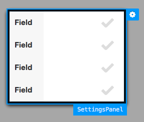
Drag four Checkboxes to the panel.
Note: Each checkbox has a label of Field.
At this point the panel looks like a normal container.
Turn it into a floating overlay
by checking its centered, modal, and hideOnMaskTap configs.
Set its width to 240.
The panel should look like this in the Canvas:
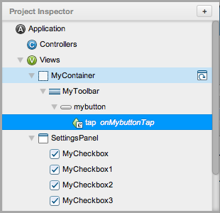
Add an event handler to the toolbar button to show the panel overlay.
Select the toolbar button (MyButton) in the Inspector and find its Events
item in Config. Click the add button ("+"), select Basic Event Binding, and
choose an event type of tap. The Inspector should now look like this:
Double-click the button's new tap child in the Inspector to open the code
editor, and enter the following code:
var settings = button.settingsPanel;
if (!settings) {
    settings = button.settingsPanel = Ext.widget('settings');
}
settings.showBy(button);
This code looks to see if the settings panel has already been instantiated.
If not, it creates it by referencing the userAlias we gave it earlier. It
then calls its showBy method, passing it the button as its context element.
When you save and preview this project in a browser, you will see that tapping the settings button displays the settings panel with its arrow pointing to the button. The panel is modal and tapping any of the darkened area outside the panel hides it.
The next common overlay type is Action Sheet. Action sheets are modal, slide in from the bottom of the screen, and usually contain a series of buttons for choosing an action to perform. Let's create an example.
Begin by launching Architect, starting a new Sencha Touch 2 project, and setting its URL Prefix in the Project Settings.
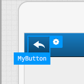
Drag a Container to the Canvas and drag a Toolbar onto it. Drag a Button onto
the toolbar, remove the button's text config, and set its iconCls config
to reply. In the Canvas, the button will now have a reply arrow, like this:
Create an ActionSheet as a top-level class by dragging an ActionSheet
component onto an empty area of the canvas. Note that Architect adds an
ActionSheet along with a button to the Inspector. Set the ActionSheet's
userClassName to ReplyOptions and set its userAlias to replyOptions.
Set the action sheet's initial button text config to Reply. Add a second
button to the action sheet and set its text to Reply All. Add a third
button, set its text to Cancel, and set its UI config to decline.
Add an event handler to the button in the toolbar that opens the ReplyOptions action sheet. Also add an event handler to the Cancel button in the sheet to close it.
Select the toolbar button (MyButton) in the Inspector and find its Events
item in Config. Click the add button ("+"), select Basic Event Binding, and
choose an event type of tap. Double-click the button's new tap child in
the Inspector to open the code editor, and enter the following code:
var sheet = button.actionSheet;
if (!sheet) {
    sheet = button.actionSheet = Ext.Viewport.add(Ext.widget('replyOptions'));
}
sheet.show();
This code looks to see if the sheet has already been created. If not, it creates
it by referencing the userAlias we gave it earlier and adds it to the
main Ext.Viewport of the application. It then calls the sheet's show()
method, which causes it to slide in from the bottom of the screen.
Finally, select the Cancel button in the Inspector, add an event of
type tap to it, and add the following code:
this.hide();
This causes the ActionSheet to be hidden, because the button's event handler
is executed in the scope of its top-level class. In this case, the this
keyword corresponds to the ActionSheet instance.
Save and preview this project in a browser and tap the toolbar button to display the ActionSheet. Click the Cancel button in the sheet to hide it. If this were a real application, you would also implement tap event listeners for the Reply and Reply All buttons.
The third common type of overlay is the
Picker.
Much like an ActionSheet,
it is modal and slides up from the bottom of the screen,
but instead of buttons,
it presents a list of value options in a spinner.
It also exposes a change event for handling the user's selection.
Pickers are not commonly created directly. Instead, they are usually used implicitly by Select Fields and Date Picker Fields where the Sencha Touch framework creates and displays them automatically when the user taps the fields. But just in case, let's create a custom picker using Architect.
Begin by launching Architect, starting a new Sencha Touch 2 project, and setting its URL Prefix in the Project Settings.
Create a top-level Container and add a Button to it. Double-click the button
on the Canvas and change its text to Choose Two Numbers.
Now create a picker as a top level class
by dragging a Picker component from the Toolbox
to an empty area of the canvas.
Change the picker's userClassName to NumbersPicker
and change its userAlias to numbersPicker.
Notice that the Picker has been automatically given a Picker Slot child in the Inspector. This slot corresponds to a single spinner list within the picker. A picker can have multiple slots that are distinguished by their name configs.
Create a second slot by clicking the add button ("+") next to the Slots item in
Config. Select the first slot in the Inspector and set its name config
to number1. Set the second slot's name to number2. These names are used in
the picker's change event handler.
(Note: By default, each slot is given three numeric list options.
This example uses the default options, but you will most likely customize them
for a real application. Do this by modifying the value of the data config for
each slot.)
Select the NumberPicker again and check its useTitles config, which displays
each slot's title in the picker. Double-click the first slot's title on the
Canvas and change its value to Number 1, then change the second slot's title
to Number 2. The picker should now look like this in the Canvas:

Add an event handler to the Choose a Number button that creates and shows the picker and listens for its change event to handle the user's selection.
Select the Choose Two Numbers button in the Inspector and find its Events item
in the Config pane. Click the add button ("+"), select Basic Event Binding, and
choose an event type of tap. Double-click the button's new tap child in the
Inspector and enter the following code into the code editor:
var picker = button.numberPicker;

if (!picker) {
    picker = button.numberPicker = Ext.Viewport.add({
        xtype: 'numbersPicker',
        listeners: {
            change: function(picker, values) {
                var n1 = values.number1,
                    n2 = values.number2;
                Ext.Msg.alert(
                    'Numbers Selected',
                    'You chose the numbers ' + n1 + ' and ' + n2 +
                    ', which add up to ' + (n1 + n2) + '.'
                );
            }
        }
    });
}

picker.setValue({
    number1: 1,
    number2: 1
});

picker.show();
This code checks to see if the picker has been created. If not, it creates the
picker using an xtype to reference the userAlias we gave it earlier. It also
adds a listener for the picker's
[[touch:Ext.picker.Picker-event-change change]]
event, which takes the selected values of the two slots and displays them in
a popup alert message. It then sets the initial values of both slots to 1
and shows the picker.
Save and preview this project in a browser. Tap the Choose Two Numbers button to display the Picker, select values for the two numbers in the spinner slots, and then tap Done to display a message.


 Architect | Terms of Use
